Perforce JViews Charts sample gallery
How to run the samples is explained in the starting the samples page.
Types of Charts
There are many types of charts, and each type has its own benefits.
Generally, a chart is more appropriate for providing an overview and a quick intuitive understanding of a collection of numbers, whereas a table is better for looking up information when details matter. Applications where overview and details equally matter often have a combination of chart and table, or a chart with tooltips and navigation interactions.
3D charts are more elaborate than plain 2D charts. Note that 3D pie charts and 3D polyline charts can easily convey wrong information to the human eye: in a 3D pie chart, slices that happen to lie in the front half of the pie appear larger than they really are, and in a 3D polyline chart certain angle slopes are emphasized.
Similarly, a stacked 3D bar chart can be misleading: it emphasizes the top slice of each bar, even if this slice is numerically irrelevant. For these reasons, 2D charts are still more used than 3D charts.
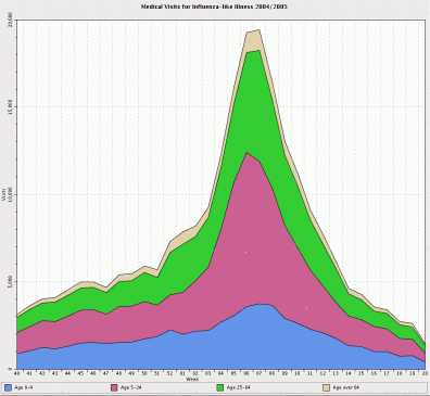
Bar charts, polyline charts and filled area charts are primarily used to show trends. To display a value over time, the preferred choice is a polyline chart. To display accumulating value over time (such as interest or consumption), you can choose a filled area chart; a polyline chart is also possible. A bar chart is used when the data set is small, namely composed of 5 values or less.
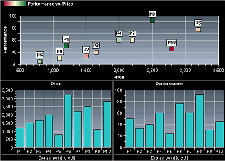
Parametric charts are appropriate for showing the correlation between two parameters. The parameters are assigned to the x axis and the y axis, respectively.
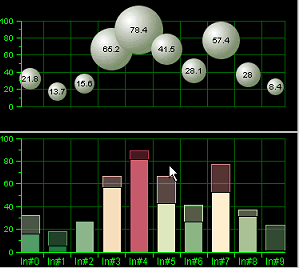
Bubble charts, like parametric charts, show the correlation between two parameters, and emphasize some data points.
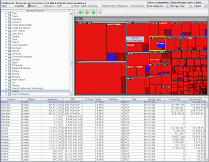
Treemap charts show data attributes according to their importance.
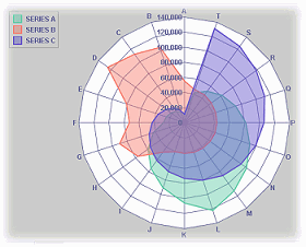
Radar charts are like transposed polyline charts: they show different parameters on different axes that emerge radially from a center. A data point slice - that is a vertical cut in a polyline chart - here corresponds to a polygon around the center. This kind of chart is common in some application areas, such as biology. However, for those unfamiliar with radar charts, they may be difficult to understand. Note that choosing an appropriate order for the parameters around the circle is important for understanding the chart. Note also that a radar chart with filled areas can easily convey wrong information, since the eye focuses on the areas surface, which are meaningless in the case of a radar chart.
Polar charts are like parametric charts, when one of the two parameters has a circular or "periodically repeatable" semantics.
High-low charts are used for displaying fluctuating values such as stock values over time.
Multiple pie charts, side-by-side, should be avoided: A bar chart in stacked 100% mode conveys the same information in an easier way (because it is easier to visually compare the lengths of parallel bars than rotated angles).
Charts Gallery
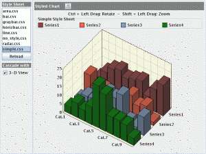
This sample shows a gallery of various JViews Charts projects.
Parametric Charts
This sample shows a parametric chart that displays a set of values against a set of other values.
Bubble Charts
This sample shows how to display data with a bubble renderer.
Bubble charts show, like parametric charts, the correlation between two parameters, and emphasize some data points.
Treemap Charts
This sample demonstrates a treemap chart.
Treemap charts show data attributes according to their importance.
Radar Charts
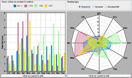
This sample displays two representations of the same data set. When a legend item is clicked, the graphical representations of the corresponding data set are changed to reflect the selected state of the data set: the bar chart renderer is filled with a hatched pattern, and the area chart renderer draws a white circle for each point of the data set.
Radar charts are like transposed polyline charts: they show different parameters on different axes that emerge radially from a center. A data point slice - that is a vertical cut in a polyline chart - here corresponds to a polygon around the center. This kind of chart is common in some application areas, such as biology. However, it may be difficult to understand for those people that are not familiar with it. Note that choosing the good order of parameters around the circle is important for understanding the chart. Note also that a radar chart with filled areas can easily convey wrong information, since the eye catches the surface of the areas, which are meaningless in the case of a radar chart.
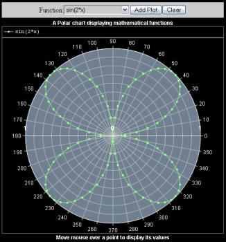
Polar Charts
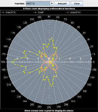
This sample shows how a Polar chart can be used to display mathematical functions.
Polar charts are like parametric charts, when one of the two parameters has a circular or "periodically repeatable" semantics.
Logarithmic Scales
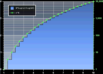
This sample shows how to use a logarithmic scale in a chart.
Combined Data Sets
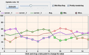
This sample displays three dynamic data sets whose minimum, maximum, and average values for each category are computed dynamically and indicated by the square scatter renderer, the circle scatter renderer, and the gray polyline renderer respectively.
Customizing Rendering
You can customize the rendering of a chart in different ways:
- Many graphical parameters can be set through CSS or through setter methods in the API. CSS - Cascading Style Sheets - allows to develop the look of a chart without Java coding, and to store a complete chart look as a plain file. The sample Chart CSS Styling shows CSS styling; whereas the sample Logarithmic Scales shows how to perform basic customizations through the API. For a comparison between these two approaches, see Next Steps After the Designer > Styling: CSS versus API section in Using the designer documentation.
- The IlvStyle class, which performs all basic drawing operations in terms of AWT/Java2D primitives, can be subclassed. This can yield elaborate drawings. See the sample Custom Style.
- You can change the presentation of a chart also by adding synthetic data sets and reusing existing renderers. The IlvDataSet is an abstract interface; this makes it easy to create data sets whose values implicitly depend on values in other data sets. Furthermore any number of data set renderings can be superimposed in a chart. The sample Combined Data Sets illustrates this technique.
Using the CSS SDK
This sample demonstrates the styling capabilities of the chart component.
Using the Java SDK
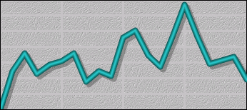
This sample shows how you can define a custom style to render pretty line charts.
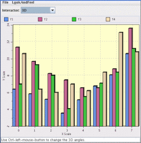
Using 3-D Effects (SDK)
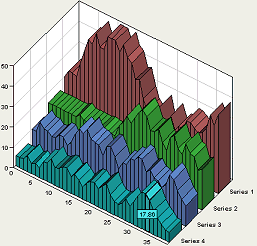
This sample shows the available 3-D representations.
3-D charts are fancier than plain 2D charts. Note that 3D pie charts and 3D polyline charts can easily convey wrong information to the human eye: in a 3-D pie chart, slices that lie on the front half of the circle appear larger; in a 3-D polyline chart, the top and down sides of a particular angle are emphasized. Similarly, a stacked 3-D bar chart can be fallacious: it emphasizes the top slice of each bar, even if this slice is numerically irrelevant. For these reasons, 2-D charts are still more used than 3-D charts. Bar charts, polyline charts and filled area charts are primarily used to show trends. To display a value over time, the preferred choice is a polyline chart. To display accumulating value over time (such as interests or consumption), the preferred choice is a filled area chart; a polyline chart is also possible. A bar chart is used when the data set is small, namely composed of 5 values or less.
Using a Styling Customizer
This sample shows how to use the standalone customizer for a chart.
Customizing Interaction
The samples shown so far have presented a static chart. However, it is also possible to let the user interact with the chart. Perforce JViews Charts has an extensible system of interactors.
Highlight interaction demonstrates how to change the look of a chart in response to user interactions.
Interactors demonstrates each of the predefined interactors. It also includes the source code of these interactors.
Accessibility demonstrates techniques to make a chart usable by people with certain common disabilities.
Adding Highlight Interaction
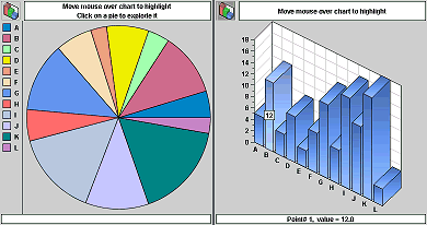
This sample shows a data set rendered as two different graphical representations (as a pie chart and a bar chart). These charts react to mouse movements by highlighting the data point over which the mouse cursor is placed.
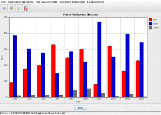
Interactors
This sample shows the interactors that are built-in in Perforce JViews Charts. It also contains their source code.
Accessibility in a Chart
This sample shows how to enable and utilize various accessibility features, such as keyboard navigation and redundant colors, in a chart.
Real-time Updates
A chart is automatically updated when the data in the data set changes.
The following samples show such updates: Memory Monitor and Data Set Listeners. In these samples the updates are not particularly fast as they have not been optimized.
Additional optimization techniques are illustrated in the samples Real-time Supervision and Sound Player.
Real-time Supervision
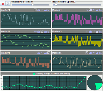
This sample simulates a real-time supervision system. Data is generated randomly by a sinusoidal value generator and added to the data sets each time a timer event occurs.
Memory Monitor
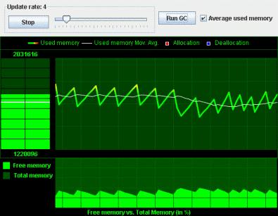
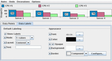
This sample displays the memory usage of the current JVM (the one executing the sample) over time. The information shown in the sample is:
- The instant memory used (as a gradient bar chart).
- The memory used (as a gradient polyline) compared to the moving average of the memory used (as a white polyline) over time.
- The free memory compared to the total memory over time.
Data Set Listeners
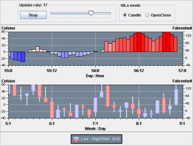
This sample shows how to synchronize several datasets. It simulates the visualization of successive temperature samples. A first chart (on the top) is used to display the actual temperature measurements carried out every hour of the day. A second one is used to display the temperature variations during the day.
Sound Player
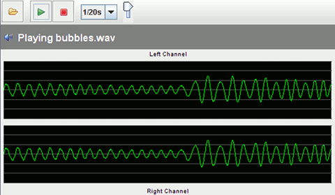
This sample shows how to handle real-time audio data. It is a simple sound player based on the Java Sound Technology. Audio data is read from an audio input stream and displayed in two charts, one for each channel.
Connecting to the Data
You can connect a chart to a data source in different ways. The following samples show the different technologies involved:
- JDBC Data Source shows JDBC connections (to a data base or an Excel file).
- Importing a Swing TableModel shows a Swing TableModel connection.
- Reading XML Chart Data Model shows the reading of data from an XML file.
- Stock Viewer shows the reading of data from CSV files, transferred over the Internet.
- Treemap shows the reading of data from an Excel XML file.
These data sources are small enough and can be loaded into memory at once. When data is too large and spread over a long x axis, JViews Charts provides a load-on-demand data source. This is shown in Using Load-On-Demand.
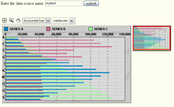
JDBC Data Source
This sample displays data imported from two CSV (Comma Separated Value) files. Each file contains one set of data, and each one rendered in its own chart.
Using Load-On-Demand
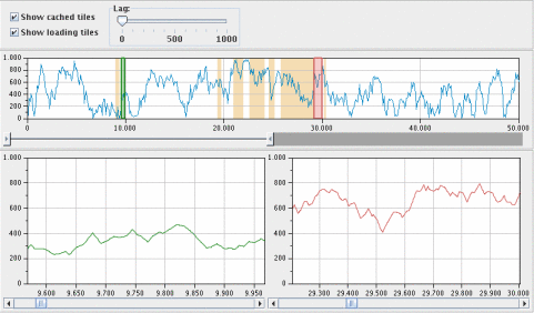
This sample demonstrates how to use the load-on-demand mechanism available in Perforce JViews Charts. Two binary files hold the data displayed by this sample:
- lodData.dat - Contains 100 000 32-bit integer records that will be loaded according to the visible range displayed by the charts located at the bottom of the panel.
- sampleData.dat - Contains 1000 sample records computed from the data stored in the lodData.dat file. The top-most chart displays the contents of this file, thus providing an overview of all the data. Several controls and interactions let you change the behavior of the load-on-demand mechanism as well as the visible data displayed by the charts.
Importing a Swing Table Model
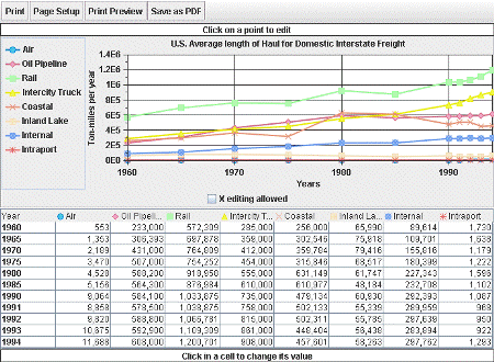
This sample loads data stored in a Swing TableModel and displays it in a chart as polylines. It also shows how to print the chart to PDF.
Reading XML Chart Data Model
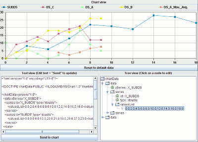
This sample displays the contents of an XML document (the DOM) in three different representations: as a text view, as a tree view, and as a chart.
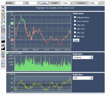
Stock Viewer
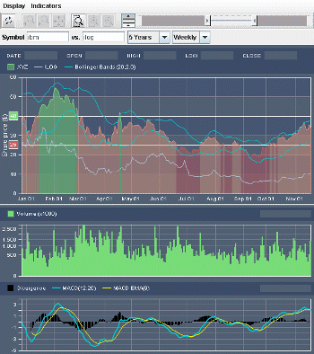
This sample allows you to display the stock quotes of one or several companies, as well as several technical market indicators. Two kinds of charts are used to display the stock data:
- The upper chart, which displays the stock data of the company being analyzed. Several other companies can be displayed in overlay,as well as indicators such as moving averages.
- Two lower charts, each of them displaying one technical indicator (Volume, RSI,MACD, and so on).
JSF samples
These Web application samples are based on Perforce JViews Charts JavaServer Faces. These components are using JSF as a server side component framework and render themselves on the client using different client-side technologies.
The following samples are based on JSF components rendering raster images:
You will find more details about these technologies in the Developing JViews Charts JSF Web applications section of Building Web Applications documentation.
Stock Viewer (JSF and JavaScript)
This sample shows how to generate server-side charts using
the JavaServer Faces framework environment. A servlet retrieves quotes from
barchart.com and generates the corresponding stock prices
chart and various financial indicators on-the-fly.
The charts are then displayed on the client side by JViews Charts Faces
components.
Polar Chart (JSF and JavaScript)
This sample shows how a polar chart can be used to display mathematical functions using the JViews Charts Faces component.
Image Map (JSF and JavaScript)
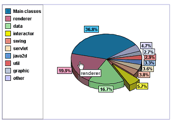
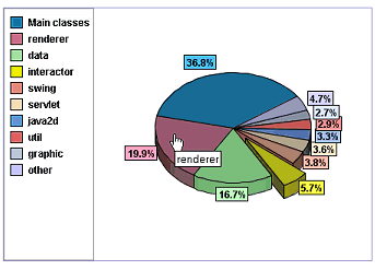
This sample shows how to use image maps with the JavaServer Faces chart view component. A managed bean loads data from an XML file and fills a pie chart displayed by the JavaServer Faces Chart view component. An image map is displayed on top of the chart image to display tooltips and to show the reference manual of the selected package.
Treemap (JSF and JavaScript)
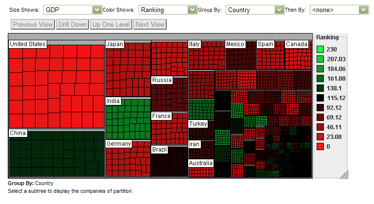
This sample shows how to use treemap charts for navigation in a thin-client environment, with the JSF chart component. A servlet loads a tree-structured model and generates an image of a treemap chart and its corresponding client-side image map.
JDBC Sample (JSF and JavaScript)
This sample displays data imported from a CSV file. The set of data is displayed by a JViews Charts Faces component.
JavaScript samples
These Web application samples are based on JavaScript.
- Hitmap Sample shows how to use hitmaps with JViews charts.
Hitmap (Servlet and JavaScript)
This sample shows how to generate client-side Hitmap in a thin-client web application. A servlet loads data from an XML file and generates an image of a Pie chart and its corresponding client-side Hitmap.