Perforce JViews Charts Sample: Radar Charts
Description
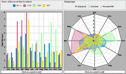 |
This sample displays two representations of the same data set. When a legend item is clicked, the graphical representations of the corresponding data set are changed to reflect the selected state of the data set: the bar chart renderer is filled with a hatched pattern, and the area chart renderer draws a white circle for each point of the data set.
Radar charts are like transposed polyline charts: they show different parameters on different axes that emerge radially from a center. A data point slice - that is a vertical cut in a polyline chart - here corresponds to a polygon around the center. This kind of chart is common in some application areas, such as biology. However, it may be difficult to understand for those people that are not familiar with it. Note that choosing the good order of parameters around the circle is important for understanding the chart. Note also that a radar chart with filled areas can easily convey wrong information, since the eye catches the surface of the areas, which are meaningless in the case of a radar chart.
How to Use the Sample
- Click a legend item to select in the charts the renderers used to render this data set.
- Click one of the Display Type radio buttons to change the renderer type.
How to Run the Sample as an Application
This sample can
be run as an application.
The installation directory contains
an executable JAR file,
radar.jar,
that allows you to execute the sample with a double click from a
file browser. Note that if you are using Internet Explorer, you can
open the installation directory
and execute the JAR file from the browser. This
technique may not work in other Web browsers.
Alternatively, you
can run the sample application from the command line.
First check that the Ant utility is properly configured. If not, see the
instructions on how to configure Ant for Perforce JViews.
Then, go to the installation directory
of the sample and type:
ant run
Topics Covered
- Changing the rendering styles of chart renderers.
- Handling legend item events.
- Adding markers to polyline renderers.
- Using two charts to display the same data.
-
Subclassing the
IlvChartEditPointInteractorclass to display and validate the values of the point being edited.
Detailed Description
This sample displays two different graphical representations of the same data sets:
- A bar renderer in a Cartesian chart. When selected, its rendering style is changed for a hatched pattern filled style.
- An area renderer in a radar chart. When selected, it draws one white
circle
IlvMarkeron every data point in addition to the standard area representation.
SUPERIMPOSED for the area renderer and
CLUSTERED for the bar renderer) to a STACKED
representation mode. When using this mode, each child renderer displays
the contribution of a Y value in a set of several Y values.
The renderer selection is performed using a LegendListener
that is notified whenever a legend item has been clicked. The legend
items (instances of IlvRendererLegendItem) are created
automatically by the legend each time a renderer is added to a chart.
In this sample, the items of the legend associated with the Cartesian
chart will match the rendering of the data sets. For example, when an
item is clicked, the style of its associated bar renderer is changed for
a hatched style, and a marker is set on the polyline renderer that
renders the selected data set.
Installation Directory
The Radar Charts sample is installed here.
Classes Involved
- ilog.views.chart.IlvChart
- ilog.views.chart.interactor.IlvChartEditPointInteractor
- ilog.views.chart.renderer.IlvBarChartRenderer
- ilog.views.chart.renderer.IlvAreaChartRenderer
- ilog.views.chart.renderer.IlvPolylineChartRenderer
- ilog.views.chart.IlvLegendItem
- ilog.views.chart.event.LegendListener