Adding charts to dashboard pages
Add charts to dashboard pages to display meaningful data in a visual way. A page can contain an unlimited number of charts and several types of charts are available. See Dashboard chart types.

Note: You can also add item views to dashboard pages, which are lists of Hansoft items. See Adding item views to dashboard pages.
1. Click Dashboards.
The Dashboards area opens.
2. Click the tab for the dashboard page to add the chart to. If you need to add a page, see Adding dashboard pages.
3. Click Chart in the toolbar.
A new chart is added to the page.
Note: You can also add charts from templates. See Adding charts and item views to dashboard pages from templates
4. Select a chart type in the Edit chart pane. The chart type specifies how the data will be presented visually on the dashboard. See Dashboard chart types.
5. Click Options and select any options. The available options depend on the chart type. See Dashboard chart types.
6. Select the filters, dimensions, and measures to use for the chart.
- Filters control the items to include in the chart. For example, you may want to see all items in a specific sprint. You can select projects and reports to use as filters. See Selecting dashboard chart and item view filters.
- Dimensions are non-numerical attributes and columns used to group items in the chart. For example, Bug Severity and Assigned User are project columns you can use as dimensions. See Selecting dashboard chart dimensions.
- Measures are the numerical attributes to display in the chart. For example, Number of items is a count of items in a project. See Selecting dashboard chart measures.
7. Optionally change the chart color theme. See Changing dashboard chart color themes.
Bar chart
You want to add a bar chart that shows the number of bugs tagged to a specific release by severity level. To do this, use the following chart configuration.
| Chart component | Select: |
|---|---|
| Chart type | Bar |
| Filter | A report that selected all QA bugs tagged to the specific release |
| Dimension | Sprint/Iterations and Status completion |
| Measure | Number of items |

|

|
You decide to change the chart to show the number of bugs assigned to each user for each severity for the specific release. You can add the Assigned to dimension before the Severity dimension. A chart can use more than one dimension or measure. To do this, use the following configuration.
| Chart component | Select: |
|---|---|
| Chart type | Bar |
| Filter | A report that selected all QA bugs tagged to the specific release |
| Dimension | Assigned to, Severity |
| Measure | Number of items |

|

|
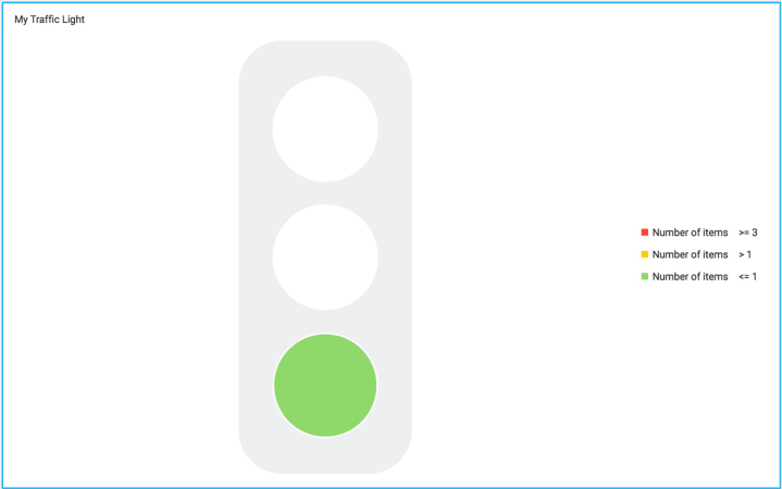
Gauge (traffic light) chart
You want to add a gauge chart that turns the traffic light red if the number of Severity A bugs in a project are more than three items. To do this, use the following chart configuration.
| Chart component | Select: |
|---|---|
| Chart type | Gauge |
| Filter | The project and filter it to only show the QA view. You can also use any report. If you use multiple, OR criteria is used, which means that the chart will show items from both projects and reports. |
| Dimension | Severity column filtered by Severity A bugs. |
| Measure | Number of items |
You also need to set the color bounds for the chart to specify the limits reached when the traffic light turns red, yellow, and green. See Setting gauge dashboard chart color bounds. For this example, set the bounds to turn red at 3 and turn green at 1.

|
|


