 |
Views Foundation Package API Reference Guide |
Views Documentation Home |
|
|
Views Style Sheets ReferenceCustomizing Padding, Margin and Borders with the Box ModelWhen styling Views gadgets, each gadget is comprised of four enclosed rectangles, the margin rectangle, the border rectangle, the padding rectangle and finally, the content rectangle. The four rectangles together make up the box model. 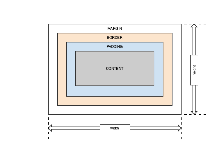
Each of the rectangles of the box model are styled with specific CSS attributes including defining the width and height of each of the rectangles. By default, the width and height of the margin, border and padding rectangles are zero. In most cases the width and height of the gadget is set programmatically and is not controlled by CSS. Some free floating gadgets that are part of a parent gdget's bounding box allow changing the width and height of the gadget. The size of the inner content region is the space left over after defining the size of the margin, border, and padding for the gadget. This differs from the typical definition of width and height used by elements displayed by web browsers where the width and height of the component defines the size of the content region and the padding, border, and margin add to the width and height. Margin RectangleThe outermost rectangle of the box model is the margin. It provides a transparent space around the gadget. The default width of the margin is zero pixels but is overridden with the margin, margin-top, margin-right, margin-bottom and margin-left attributes. The following table summarizes the margin properties:
Border RectangleThe border rectangle is used to draw an optional border inside the margin rectangle but outside the padding rectangle of the gadget. By default, the thickness or width of the border is zero pixels but, as with margin, it is overridden with the border, border-top, border-right, border-bottom and border-left attributes. The width, color, line style and corner radius of the border are styled using the following attributes.
border-style dotted | dashed | solid | inset | outset | none | hiddenSets the display style of the border for one to four values for each of the border edges (top border, right border, bottom border, left border). border-color name | HEX | RGBThe border-color property is used to set the color of the four borders of a gadget. Colors can be set by a name, such as "red", HEX, a hexadecimal value such as #eeff00, an RGB value, such as rgb(238, 255, 0) or transparent. One to four values for each of the border edges (top border, right border, bottom border, left border) can be specified. border(-top | -right | -bottom | -left) border-width border-style border-colorShorthand border property that allows border width, style and color to be specified at one time. Use border-top, border-right, border-bottom and border-left to define a border style for a specific border edge. border-radiusThe border-radius property is used to add rounded corners to the gadget. One to four values for each of the border corners (top border, right border, bottom border, left border) can be specified. A border radius can only be applied to uniform borders that share the same color, width and only on solid, dotted and dashed line styles. Padding RectangleThe padding property is used to define space around the gadget's content and inside the border. As with margin, padding can be defined for each edge of the gadget or all of them at once. The default width of the padding is zero pixels but is overridden with the padding, padding-top, padding-right, padding-bottom and padding-left attributes. The following table summarizes the padding property:
Content RectangleThe content region of a gadget is the inner most rectangle. It is the region left after the space from the margin, border and padding have been subtracted from the overall width and height of the gadget. This definition of width and height of the content region is different from the traditional CSS definitions used by browsers where the width and height of the component defines the size of the content region.
IlvGadget CSS StatesThe following table summarizes the different states, represented through pseudo classes, that an IlvGadget can be in. The states are used in CSS selectors to define different styles based on the state of the gadget.
NOTE: The CSS order is important when specifying multiple different styles with different CSS pseudo classes (states). They are equal in specificity so the order matters. State :active must be specified before :hover to make both rules work. For example, IlvButton during clicking has :active pseudo class, but since clicking involves hovering mouse pointer over the button it also has :hover state. If they are specified in the wrong order, :hover rule will override :active and any common style properties between the rules will be taken from :hover. This overriding behaviour comes from CSS standard but Views differs from standard because the order in which the rules must be specified is reversed.
IlvGadgetItem, IlvTreeGadgetItem, and IlvNotebookPageItem CSS StatesIlvGadgetItem, IlvTreeGadgetItem, and IlvNotebookPageItem supports the following CSS states, represented through pseudo classes. The states are used in CSS selectors to define different styles based on the state of the gadget.
IlvMenuItem and IlvMenuItemPath CSS StatesIlvMenuItem supports the following CSS states, represented through pseudo classes. The states are used in CSS selectors to define different styles based on the state of the gadget.
List of Views CSS PropertiesThe following CSS properties are supported by all Views gadgets:
Styling Gadgets with CSS Look and Feel versus Traditional Gadget StylingViews developers using the new CSS styling capabilities introduced in Views 7.0, should use the IlvStylable inteface, accessed through the IlvGadget::style() method to define a gadgets look and feel. If not using CSS Look and Feel, developers should use the traditional IlvPalette method for assigning style properties. The following provides an example of using the traditional gadget look and feel methods to define the style versus using CSS Look and Feel and style(). The following code snippets show getting and setting of gadgets properties using traditional styling capabilities: // Get the background color for the toolbar
auto* oldColor = toolBar->getBackground();
// Set the background color to red on the toolbar
toolBar->setBackground(display->getColor("red"));
// Get the horizontal and vertical margin for the toolbar
auto marginH = toolBar->getHMargin();
auto marginV = toolBar->getVMargin();
// Get the font for the toolbar
auto* font = toolBar->getPalette()->getFont();
When using CSS Look and Feel, the style() method is used to get and set the gadget's CSS properties: // Get the background color for the toolbar
auto* oldCssColor = toolBar->style().getBackgroundColor();
// Set the background color to red on the toolbar
toolBar->style().setBackgroundColor(display->getColor("blue"));
// Get the horizontal and vertical margin for the toolbar
auto marginHCss = toolBar->style().getMargin(IlvHorizontal);
auto marginVCss = toolBar->style().getMargin(IlvVertical);
// Get the font for the toolbar
auto* cssFont = toolBar->style().getFont();
|
|
Copyright 2021 Rogue Wave Software, Inc., a Perforce company. All Rights Reserved. |

|