 |
Views Foundation Package API Reference Guide |
Views Documentation Home |
|
Views Style Sheets ExamplesStyle Sheet Usage
Customizing Padding, Margin and Borders with the Box ModelWhen styling Views gadgets, each gadget is comprised of four enclosed rectangles, the margin rectangle, the border rectangle, the padding rectangle and finally, the content rectangle. The four rectangles together make up the box model. 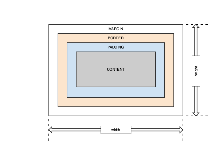
Each of the rectangles of the box model are styled with specific CSS attributes including defining the width and height of each of the rectangles. By default, the width and height of the margin, border and padding rectangles are zero. The absolute width and height of the gadget is determined by the various combined widths and heights of the four rectangles. This definition of width and height is different from the traditional CSS definitions used by browsers where the width and height of the component defines the size of the content region. Additional widths of the padding, border or margin rectangles add to the width and height of the content rectangle. For Views gadgets, with and height define the overall width of the gadget and the widths and heights of the margin, border and padding rectangles reduce the size of the final content area. Margin RectangleThe outermost rectangle of the box model is the margin. It provides a transparent space around the gadget. The default width of the margin is zero pixels but is overridden with the margin, margin-top, margin-right, margin-bottom and margin-left attributes. The following are some examples of setting a gadgets margin: /* Set a 5 pixel margin around all IlvFrames */
IlvFrame {
margin: 5px;
}
/* Set a 5 pixel top and bottom margin and 10 pixel left and right margin around all IlvFrames */
IlvFrame {
margin: 5px 10px;
}
/* Set a 1, 2, 3 and 4 pixel margin on the top, right, bottom and left margins respectively */
IlvFrame {
margin: 1px 2px 3px 4px;
}
/* Set a 1, 2, 3 and 4 pixel margin on the top, right, bottom and left margins using the long form */
IlvFrame {
margin-top: 1px;
margin-right: 2px;
margin-bottom: 3px;
margin-left: 4px;
}
Border RectangleThe border rectangle is used to draw an optional border inside the margin rectangle but outside the padding rectangle of the gadget. By default, the thickness or width of the border is zero pixels but, as with margin, it is overridden with the border, border-top, border-right, border-bottom and border-left attributes. The width, color, line style and corner radius of the border are styled using the following attributes. border-style dotted | dashed | solid | double | groove | ridge | inset | outset | none | hiddenSets the display style of the border for one to four values for each of the border edges (top border, right border, bottom border, left border). /* Set dashed border for all IlvFrames */
IlvFrame {
border-style: dashed;
}
border-color name | HEX | RGBThe border-color property is used to set the color of the four borders of a gadget. Colors can be set by a name, such as "red", HEX, a hexadecimal value such as #eeff00, an RGB value, such as rgb(238, 255, 0) or transparent. One to four values for each of the border edges (top border, right border, bottom border, left border) can be specified. /* Set each of the borders of the IlvFrame's to different colors */
IlvFrame {
border-color: red #0f0 rgb(0,255,0) transparent;
}
/* Set the top/bottom left/right borders to red and blue */
IlvFrame {
border-color: red blue;
}
/* Set the border color to green */
IlvFrame {
border-color: green;
}
border(-top | -right | -bottom | -left) border-width border-style border-colorShorthand border property that allows border width, style and color to be specified at one time. Use border-top, border-right, border-bottom and border-left to define a border style for a specific border edge. /* Set a 3 pixel red dashed border around all IlvFrames */
IlvFrame {
border: 3px dashed red;
}
/* Set a bottom 2 pixel blue solid border around all IlvFrames */
IlvFrame {
border-bottom: 2px solid blue;
}
border-radiusThe border-radius property is used to add rounded corners to the gadget. One to four values for each of the border corners (top border, right border, bottom border, left border) can be specified. A border radius can only be applied to uniform borders that share the same color, width and only on solid, dotted and dashed line styles. /* Set a 3 pixel border radius for all corners in the gadget */
IlvFrame {
border-radius: 3px;
}
/* Set a 2, 3, 4 and 5 pixel border radius for the corners in the gadget */
IlvFrame {
border-radius: 2px 3px 4px 5px;
}
Padding RectangleThe padding property is used to define space around the gadget's content and inside the border. As with margin, padding can be defined for each edge of the gadget or all of them at once. The default width of the padding is zero pixels but is overridden with the padding, padding-top, padding-right, padding-bottom and padding-left attributes. The following are some examples: /* Set a 5 pixel padding around all IlvFrames */
IlvFrame {
padding: 5px;
}
/* Set a 5 pixel top and bottom padding and 10 pixel left and right padding around all IlvFrames */
IlvFrame {
padding: 5px 10px;
}
/* Set a 1, 2, 3 and 4 pixel padding on the top, right, bottom and left paddings respectively */
IlvFrame {
padding: 1px 2px 3px 4px;
}
/* Set a 1, 2, 3 and 4 pixel padding on the top, right, bottom and left paddings using the long form */
IlvFrame {
padding-top: 1px;
padding-right: 2px;
padding-bottom: 3px;
padding-left: 4px;
}
Content RectangleThe content region of a gadget is the inner most rectangle. It is the region left after the space from the margin, border and padding have been subtracted from the overall width and height of the gadget. This definition of width and height of the content region is different from the traditional CSS definitions used by browsers where the width and height of the component defines the size of the content region.
Customizing Foreground and Background ColorsText color and background colors are controlled with the color and background-color CSS attributes. For example, to set the color of all IlvButton gadgets to blue the following CSS rule would be used. IlvButton {
color: blue;
}
To change all the background colors to #cecece simply add background-color to the rule. IlvButton {
color: blue;
background-color: #cecece;
}
Setting Background ImagesA background image can be set on a gadget with the background-image property. Background images are drawn inside the border rectangle. The size of the image is controlled with the background-size property. By default, the auto property value is used. The following background size property values are supported:
Here are some examples of setting backgrounds with CSS. /* Specify the background image to be logo.png. Size is auto, the size of the image. */
IlvFrame {
background-image: url(/images/logo.png);
}
/* Set the background to logo.png and set the width to 300 pixels and height to 200 pixels. */
IlvFrame {
background-image: url(/images/logo.png);
background-size: 300px 200px;
}
The starting position of background is controlled with the background-position property. By default, the background-image is placed in the top-left corner of a gadget and is repeated both verrtically and horizontally. The following property values are supported:
Here are some examples of setting background position with CSS. /* Specify the background image to be logo.png and centers the image within the frame. */
IlvFrame {
background-image: url(/images/logo.png);
background-position: center center;
}
/* Set the background to logo.png and sets its starting position to 30 pixels horizontally and 60 pixels vertically. */
IlvFrame {
background-image: url(/images/logo.png);
background-position: 30px 60px;
}
Customizing GadgetsThis section provides examples on customizing Views gadgets using Style Sheets. IlvArrowButtonIlvArrowButton gadgets subclass IlvButton and are used to display an arrow. They are a subcomponent of IlvSpinBox gadgets. An IlvArrowButton gadget is styled using the box model. It also supports selector states IlvArrowButton:active, IlvArrowButton:disabled, and IlvArrowButton:enabled. An IlvArrowButton with specific directional internal type can be referred to by using the class accessors:
IlvArrowButton has support for Focus subcomponent and it is accessed through the CSS rule IlvArrowButton > Focus. See IlvSpinBox for examples of styling IlvArrowButton gadgets.
IlvButtonButtons are rectangular areas that users can click. They are comprised of three regions, an outer button layer, a middle message item layer used to display text on the button and an outer focus area. 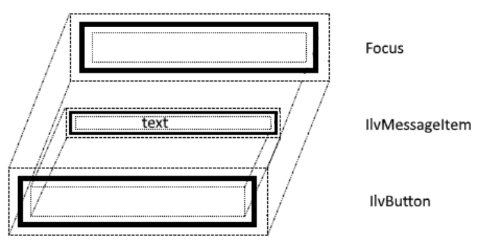
An IlvButton gadget is styled using the box model. All non-inherited text styling must be set with the IlvMessageLabel selector. The following example styles the overall outer button, and the inner IlvMessageItem area. IlvButton {
color: #4F2222;
background-color: #FFAAAA;
border: 4px #CC8888 solid;
padding: 5px;
margin: 1px;
}
/* IlvButton has an internal item that can also be styled: */
IlvButton IlvMessageItem {
border: 4px #CC8888 solid;
background-color: #FFCCCC;
margin-right: 20px;
margin-left: 20px;
padding: 5px;
}
The following image shows the styling of the button using the above CSS rules. 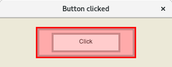
Button click and hover styles can also be styled using the :active and :hover pseudo-classes. /* Button style during mouse click: */
IlvButton:active IlvMessageItem {
background-color: #FFBBBB;
}
/* Button style on mouse hover: */
IlvButton:hover IlvMessageItem {
background-color: #FFDDDD;
}
IlvButton:hover {
background-color: #FFBBBB;
}
IlvButton:active {
background-color: #FF9999;
}
For a complete example see the IlvButton_css_sample sample application.
IlvComboBox and IlvScrolledComboboxThe IlvComboBox class combines a text field (IlvTextField) with a pop-up menu displaying a set of predefined entries from which the user can choose. IlvScrolledComboBox is a subclass of IlvComboBox that combines a text field (IlvTextField) with a scrollable string list. The user can enter a character string in the combo box text field, or click on the arrow that appears on the right side of the field to display a string list of the class IlvStringList providing a set of predefined choices. Both IlvComboBox and IlvScrolledComboBox gadgets are styled using the box model. The following CSS shows how to set the various parts of an IlvComboBox and IlvScrolledComboBox. /* Style for combo boxes */
IlvComboBox,
IlvScrolledComboBox {
background: GhostWhite;
border: 1px gray solid;
font-family: Arial;
font-size: 12px;
}
/* Style for text field of combo boxes */
IlvComboBox Text,
IlvScrolledComboBox Text {
background: GhostWhite;
border-right: 1px gray solid;
}
/* Style for buttons of combo boxes */
IlvComboBox OpenMenu,
IlvScrolledComboBox OpenMenu {
background: GhostWhite;
background-image: url(css/motif/combobox-openmenu.png);
background-position: center center;
}
/* Style for pressed buttons of combo boxes */
IlvComboBox OpenMenu:active,
IlvScrolledComboBox OpenMenu:active {
background-image: url(css/motif/combobox-openmenu-active.png);
}
/* Border style for combo boxes dropdown list */
IlvComboBox IlvPopupMenu,
IlvScrolledComboBox IlvStringList {
border: 1px gray solid;
}
/* Black text on a white background for combo boxes items */
IlvComboBox IlvPopupMenu > IlvMenuItem,
IlvScrolledComboBox IlvStringList > IlvGadgetItem {
background: GhostWhite;
color: black;
padding: 4px;
}
/* White text on a blue background for selected combo boxes items */
IlvComboBox IlvPopupMenu > IlvMenuItem:hover,
IlvScrolledComboBox IlvStringList > IlvGadgetItem:active {
background: SteelBlue;
color: white;
}
/* Scrollbar styling for IlvScrolledComboBox */
IlvScrollBar {
padding: 1px;
background: Gainsboro;
}
IlvScrollBar > Slider {
border: 1px white outset;
background: Silver;
}
IlvScrollBar > Scroller {
background-size: 100% 100%;
background: Gainsboro;
}
IlvScrollBar > Scroller.top {
background-image: url(css/motif/scrollbar-arrow-up32x32.png);
}
IlvScrollBar > Scroller.bottom {
background-image: url(css/motif/scrollbar-arrow-down32x32.png);
}
The following images show the styling of a IlvComboBox and IlvScrolledComboBox using the above CSS rules. 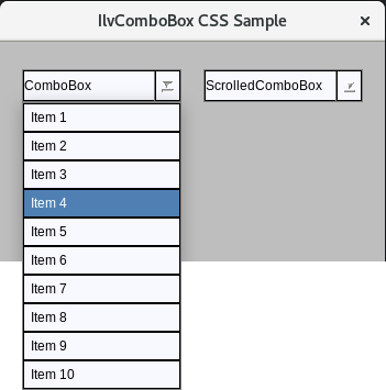
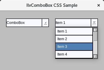
For a complete example see the IlvComboBox_css_sample sample application.
IlvDateFieldIlvDateField is a subclass of IlvTextField and defines a specialized text field gadget for editing a date. It is styled using the same CSS rules as IlvTextField.
IlvDockableContainerThe IlvDockableContainer class is a subclass of IlvPanedContainer for managing docking panes. A docking pane is a pane that can be moved to any dockable area in an interactive way. The following stylable areas exist for IlvDockableContainers.
The following CSS demonstrates styling of IlvDockableContainer. /* Background color for main window of the application */
IlvDockableMainWindow {
background: #34495e;
}
/* Background color for dockable containers */
IlvDockableContainer {
background: White;
}
/* Background color for dockable container that holds menu bar */
IlvDockableContainer#MenuBar {
background: White;
}
/* Background color for undocked containers */
IlvUndockedTopContainer {
background: White;
}
/* Style for slider. A dragging area between panes to resize them */
IlvDockableMainWindow IlvPaneSlider {
background: #2471a3;
border: 1px #3481b3;
}
/* Style for the title of the containers */
IlvDockableContainerTitle {
background: #5499c7;
}
/* Style for a close button of the title and toolbar that holds this button */
IlvDockableContainerTitle IlvButton,
IlvDockableContainerTitle IlvToolbar,
IlvDockableContainerTitle IlvToolbar > IlvMenuItem {
background: #5499c7;
}
/* Style for title label */
IlvDockableContainerTitle IlvMessageItem,
IlvDockableContainerTitle IlvMessageLabel {
font-family: Arial;
font-size: 12px;
color: White;
background: #5499c7;
}
/* Style for active state of the close button */
IlvDockableContainerTitle IlvButton:active IlvMessageItem {
padding-top: 2px;
padding-left: 2px;
}
/* Title height of vertically docked containers */
IlvDockableContainerTitle.vertical {
height: 25px;
}
/* Title width of horizontally docked containers */
IlvDockableContainerTitle.horizontal {
width: 25px;
}
/* Style for Gripper of containers */
IlvUndockedTopContainer Gripper ,
IlvDockableContainer Gripper {
border: 1px #1f618d;
background: #5499c7;
}
/* Height and margins for Gripper of vertically docked containers */
IlvUndockedTopContainer Gripper.vertical{
margin: 4px 16px 4px 16px;
height: 12px;
}
/* Height and margins for Gripper of vertically docked menu bar */
IlvDockableContainer Gripper.vertical{
margin: 2px;
height: 8px;
}
/* Width and margins for Gripper of horizontally docked menu bar */
IlvDockableContainer Gripper.horizontal{
margin: 2px;
width: 8px;
}
/**********************************************
** IlvToolbar
**********************************************/
/* Menu bar background color and border style */
IlvMenuBar {
background: GhostWhite;
border: none;
}
/* Black text on a white background for menu items. Font and padding are also styled. */
IlvMenuBar > IlvMenuItem {
font-family: Arial;
font-size: 12px;
padding: 0px 10px;
background: GhostWhite;
color: black;
border: none;
margin: 2px;
}
/* Black text on a light blue background for active menu items */
IlvMenuBar > IlvMenuItem:active {
background: #c7e7f7;
color: black;
}
The following image shows the styling of an IlvDockableContainer gadget using the above CSS rules. 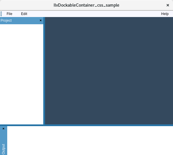
For a complete example see the IlvDockableContainer_css_sample sample application.
IlvFrameThe IlvFrame class is a gadget class that draws a frame with a label. Overall styling of IlvFrame is accomplished using the box model. An IlvFrame consists of two elements and properties that can be set on the elements: IlvFrame element - The body element of the IlvFrame, which provides the frame of the gadget. It is styled with the following properties:
IlvFrame > IlvMessageItem - The frame label element. It is styled with the following properties:
To make the label overlap with the frame border, it is necessary to move the border down by setting margin-top on the IlvFrame css selector. The label can also be moved by setting the appropriate margins for IlvFrame > IlvMessageItem, but putting negative top margin to move it up onto the frame will result the message label going out of the gadget bounding box and as a result will be clipped. The following CSS demonstrates styling of IlvFrame. IlvFrame {
border: 1px solid #020202;
border-radius: 3px;
/* Moving the top of the frame down so it would overlap with the message item */
margin-top: 9px;
}
/* The message item is drawn on top of the frame and will clip the frame's border */
IlvFrame > IlvMessageItem {
margin-left: 10px;
font-style: italic;
border: none;
padding: 2px;
}
The following image shows the styling of an IlvFrame gadget using the above CSS rules. 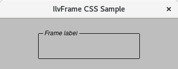
For a complete example see the IlvFrame_css_sample sample application.
IlvHierarchicalSheetThe IlvHierarchicalSheet class implements a special sheet that handles a tree hierarchy. IlvHierarchicalSheet is a subclass of IlvSheet and all the same CSS properties are supported. In addition to the IlvSheet CSS properties, IlvHierarchicalSheet has stylable tree of gadget items. The following are the stylable elements of the tree:
The following CSS demonstrates styling of IlvHierarchicalSheet. /* Set border and background style for IlvHierarchicalSheet */
IlvHierarchicalSheet {
background: white;
border: none;
}
/*
* Set border and background style for Content box of IlvHierarchicalSheet
* (The area where the sheet cells are drawn and displayed).
*/
IlvHierarchicalSheet > Content {
background: white;
border: none;
}
/*
* Set style for sheet items. Use *MatrixItem because IlvHierarchicalSheet is derived from IlvMatrix.
* Use IlvTreeGadgetItem for styling tree items.
*/
IlvHierarchicalSheet > IlvIntMatrixItem,
IlvHierarchicalSheet > IlvTreeGadgetItem,
IlvHierarchicalSheet > IlvLabelMatrixItem {
color: black;
background: white;
border: none;
}
IlvHierarchicalSheet > IlvIntMatrixItem:active,
IlvHierarchicalSheet > IlvTreeGadgetItem:active {
color: white;
background: lightblue;
}
/*
* Relief items (set with IlvHierarchicalSheet::setItemRelief) have a CSS class relief.
* Styling selected state is done with pseudoclass :active.
*/
IlvHierarchicalSheet > IlvLabelMatrixItem.relief {
border: 2px white outset;
background: #f6f4e9;
}
/* Styling sheet grid line (if IlvHierarchicalSheet::showGrid is set to true) */
IlvHierarchicalSheet > Grid {
border: 1px solid whitesmoke;
}
/*
* Style for the sheet items editors.
* This is an IlvTextField for editing table items.
* This is an IlvEditItemView > IlvEditionTextField for editing tree items.
*/
IlvEditItemView {
background: white;
border: none;
}
IlvEditItemView > IlvEditionTextField,
IlvHierarchicalSheet > IlvTextField{
background: whitesmoke;
color: black;
border: 1px solid gray;
}
IlvEditItemView > IlvEditionTextField > Text,
IlvHierarchicalSheet > IlvTextField > Text{
border: none;
}
/* Style for the line drawn between tree items */
IlvHierarchicalSheet > Line {
border: 1px solid gray;
}
/* Style for the expand button of tree item */
IlvHierarchicalSheet > Button {
background-image: url(css/views/plus-sign9x9.png);
background-position: center center;
background-size: 100% 100%;
width: 9px;
height: 9px;
background-color: LightBlue;
border: 1px solid gray;
}
/* Style for the shrink button of tree item */
IlvHierarchicalSheet > Button:active {
background-image: url(css/views/minus-sign9x9.png);
}
/* Style for relief lines */
IlvHierarchicalSheet > MatrixRelief,
IlvHierarchicalSheet > TitleRelief,
IlvHierarchicalSheet > RowRelief,
IlvHierarchicalSheet > ColumnRelief {
border: none;
}
The following image shows the styling of an IlvHierarchicalSheet gadget using the above CSS rules. 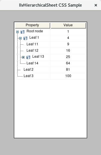
For a complete example see the IlvHierarchicalSheet_css_sample sample application.
IlvMatrixThe IlvMatrix gadgets define a rectangular grid, made up of rows and columns, which can contain many different types of matrix objects, called matrix items. Matrix items include labels, graphic objects, and other gadgets. Overall styling of IlvMatrix is accomplished using the box model. The IlvMatrix also has a content and focus layer that are styled with the IlvMatrix > Content and IlvMatrix > Focus subcomponent selectors respectively. IlvMatrix scrollbars are styled with the IlvMatrix > IlvScrollBar subcontrol. See IlvScrollBar for styling scrollbars including the specific vertical and horizontal specific style sheet rules. Individual IlvMatrix cell objects are styled using the IlvMatrix > IlvAbstractMatrixItem selector. Only border, background and margin style attributes are supported on individual cell objects. Several matrix cell objects support more specific styling, as referenced in the table below.
IlvMatrix gadget item reliefs, set with IlvMatrix::setItemRelief, are styled through the CSS class relief selector. Matrix item selected states are styled with the :active pseudo class. The IlvMatrix grid is styled using the IlvMatrix > Grid selector and border styling attribute. Grids must have been turned on using IlvMatrix::showGrid. In addition to controling padding and margins for IlvLabelMatrixItem items, there is also a default spacing between matrix cells of 1 pixel. Use IlvMatrix::setSpacing to adjust this additional spacing. IlvMatrix text editors are styled using the IlvMatrix > IlvTextField selector. See IlvTextField for more information on how to style text fields. The following CSS demonstrates styling of IlvMatrix and matrix items within it. /* Set border and background style for IlvMatrix */
IlvMatrix {
background: white;
border: none;
}
/*
* Set border and background style for Content box of IlvMatrix
* (The area where the matrix cells are drawn and displayed).
*/
IlvMatrix > Content {
background: white;
border: none;
}
/* Set style for matrix items */
IlvLabelMatrixItem {
color: black;
background: whitesmoke;
border: none;
}
IlvIntMatrixItem {
color: black;
background: white;
border: none;
}
IlvLabelMatrixItem:active {
color: white;
background: lightblue;
}
/*
* Relief items (set with matrix::setItemRelief) have a CSS class relief.
* Styling selected state is done with pseudoclass :active.
*/
.relief {
border: 2px white outset;
background: #f6f4e9;
}
.relief:active {
border: 2px white inset;
background: #d9d6d1;
}
/* Styling matrix grid line (if IlvMatrix::showGrid is set to true) */
IlvMatrix > Grid {
border: 1px black solid;
}
/* Style for the matrix item editor. This is an IlvTextField for editing items */
IlvMatrix > IlvTextField{
background: white;
color: black;
border: 1px solid gray;
}
IlvMatrix > IlvTextField > Text{
border: none;
}
The following image shows the styling of an IlvMatrix gadget using the above CSS rules. 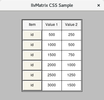
For a complete example see the IlvMatrix_css_sample sample application.
IlvMenuBarThe IlvMenuBar gadget provides a menu bar that is composed of a number of items that provide access to menus from which the user can select a command. An IlvMenuBar gadget is styled using borders, background, background-image, padding and margin properties of the box model. Menu bar scrollers, indicators used when elements do not fit into the menu bar, menu items separators and popup menus are styled using the following selectors:
The following CSS rules provide examples on how to style an IlvMenuBar and subgadgets within it. /* Menu bar background color and border style */
IlvMenuBar {
background: GhostWhite;
border: 1px gray solid;
}
/* Black text on a white background for menu items. Font and padding are also styled. */
IlvMenuBar > IlvMenuItem {
font-family: Arial;
font-size: 12px;
padding: 0px 10px;
background: GhostWhite;
color: black;
border: none;
}
/* Black text on a light blue background for active menu items */
IlvMenuBar > IlvMenuItem:active {
background: #c7e7f7;
color: black;
}
/* Menu separator style */
IlvMenuBar > IlvSeparatorItem {
border: 1px white inset;
}
/* Submenu border style */
IlvPopupMenu {
border: 1px gray solid;
}
/* Black text on a white background for submenu items */
IlvPopupMenu > IlvMenuItem {
background: GhostWhite;
color: black;
padding: 2px 4px;
border: none;
}
/* White text on a blue background for submenu items on hover */
IlvPopupMenu > IlvMenuItem:hover {
background: SteelBlue;
color: white;
}
The following image shows the styling of an IlvMenuBar gadget using the above CSS rules. 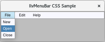
For a complete example see the IlvMenuBar_css_sample sample application.
IlvMenuItemThe IlvMenuItem gadget implements the items appearing in pop-up menus (IlvPopupMenu) or in menu bars (IlvMenuBar, IlvToolBar). A menu item displays a label, a bitmap, a graphic object and can be used as a separator. An IlvMenuItem gadget is styled using borders, background, background-image, padding and margin properties of the box model.
IlvMessageLabelMessage labels are used to display a message and an optional bitmap. They are constructed of an outer main label box area and an internal IlvMessageItem area that displays the label text. An IlvMessageLabel gadget is styled using the box model. All non-inherited text styling must be set with the IlvMessageItem selector. IlvMessageLabel {
color: #4F2222;
background-color: #FFAAAA;
border: 4px #CC8888 solid;
padding: 5px;
margin: 1px;
}
/* IlvMessageLabel has an internal item that can also be styled: */
IlvMessageLabel IlvMessageItem {
font-family: Arial;
font-size: 16px;
font-style: italic;
font-weight: bold;
text-decoration: underline;
border: 4px #CC8888 solid;
background-color: #FFCCCC;
margin-right: 20px;
margin-left: 20px;
padding: 5px;
}
IlvMessageLabel IlvMessageItem:hover {
font-family: Arial;
font-size: 16px;
font-style: italic;
font-weight: bold;
text-decoration: underline;
border: 4px #CC8888 solid;
background-color: red;
margin-right: 20px;
margin-left: 20px;
padding: 5px;
}
For a complete example see the IlvMessageLabel_css_sample sample application.
IlvNotebookIlvNotebook is a predefined gadget class that simulates a real notebook. It allows the user to select the pages of the notebook by using the pointing device. An IlvNotebook gadget is styled using the box model. The background of the IlvNotebook can be overwritten by the IlvNotebookPage or the contained IlvGadgetContainer. The following table summarizes the inner regions that can be styled for an IlvNotebook.
The following CSS shows how to style the various parts of an IlvNotebook. IlvNotebook {
border: none;
padding: 5px;
font-size: 14px;
font-weight: normal;
text-decoration: underline;
}
IlvNotebookPage.horizontal IlvNotebookPageItem
{
color: #5a5a5a;
padding-right: 30px;
border: none;
font-family: Roboto;
font-size: 14px;
}
IlvNotebookPage.horizontal > IlvNotebookPageItem:active
{
color: #2F6DB5;
border-bottom: 3px solid #2F6DB5;
font-weight: bold;
}
IlvNotebookPage.horizontal IlvNotebookPageItem:hover
{
color: #2a2a2a;
border-bottom: 3px solid #2F6DB5;
}
IlvMessageLabel > IlvMessageItem {
color: red;
}
IlvNotebook.top
{
border-top: 1px solid #f1f1f1;
margin-top: -1px;
}
IlvTextField
{
border: 1px solid #cccccc;
background-color: #ffffff;
color: #2b2b2b;
}
IlvTextField > Focus
{
border: none;
}
IlvMessageLabel
{
border: 1px solid #BBE9B6;
border-radius: 3px;
background-color: #FAFFFA;
}
IlvMessageLabel IlvMessageItem
{
color: #43AA60;
border: none;
}
IlvGagdetContainer
{
background-color: #fafafa;
}
html > IlvGagdetContainer
{
background-color: #fafafa;
}
The following image shows the styling of an IlvNotebook gadget using the above CSS rules. 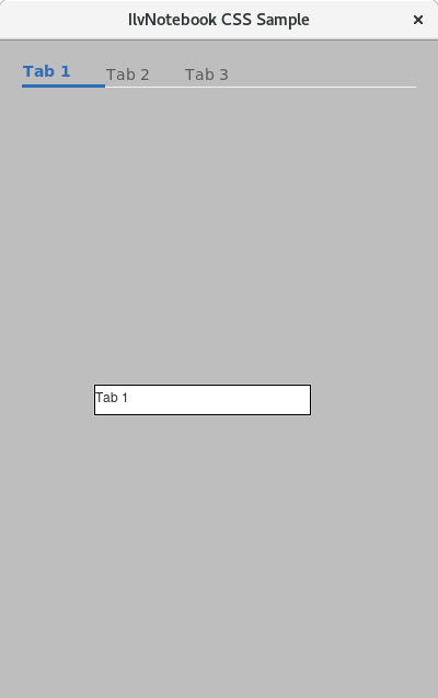
For a complete example see the IlvNotebook_css_sample sample application.
IlvNumberFieldThe IlvNumberField is a subclass of IlvTextField and defines a specialized text field that accommodates numeric values with various formats. It is styled using the same CSS rules as IlvTextField.
IlvPasswordTextFieldThis gadget is a specialized IlvTextField text field gadget that allows the user to enter a password by displaying the same special character instead of the characters the user types. It is styled using the same CSS rules as IlvTextField.
IlvPopupMenuThe IlvPopupMenu gadget is used to provide a list of vertically laid out menu items. As with IlvMenuBar, IlvPopupMenu gadgets are styled using borders, background, background-image, padding and margin properties of the box model. Menu bar scrollers, indicators used when elements do not fit into the menu bar, menu items separators, menu tear off buttons and other parts of the popup menus are styled using the following selectors:
The following CSS rules provide examples on how to style an IlvPopupMenu and subgadgets within it. /* Menu font and border style */
IlvPopupMenu {
font-family: Arial;
font-size: 12px;
border: 1px gray solid;
background: GhostWhite;
}
/* Black text on a white background for menu items */
IlvPopupMenu > IlvMenuItem, IlvPopupMenu > IlvToggleMenuItem, IlvPopupMenu > IlvRadioMenuItem {
background: GhostWhite;
color: black;
padding: 2px 2px 2px 2px;
margin: 1px;
}
/* White text on a blue background for menu items on hover */
IlvPopupMenu > IlvMenuItem:hover, IlvPopupMenu > IlvToggleMenuItem:hover, IlvPopupMenu > IlvRadioMenuItem:hover {
background: SteelBlue;
color: white;
}
/* CheckBox styling */
IlvToggleMenuItem > CheckBox, IlvRadioMenuItem > CheckBox {
width: 12px;
height: 12px;
border: 1px solid black;
background: GhostWhite;
}
IlvToggleMenuItem:hover > CheckBox, IlvRadioMenuItem:hover > CheckBox {
background-color: SteelBlue;
border: 1px solid white;
}
IlvRadioMenuItem > CheckBox {
border-radius: 7px;
}
/* CheckMark styling. */
IlvToggleMenuItem > CheckMark {
margin: 1px 0px 0px 1px;
}
IlvToggleMenuItem:checked > CheckMark {
background-position: center;
background-image: url(css/vx/toggle-check.png);
}
IlvToggleMenuItem:checked:hover > CheckMark {
background-position: center;
background-image: url(css/vx/toggle-check-white.png);
}
IlvRadioMenuItem > CheckMark {
border-radius: 7px;
}
IlvRadioMenuItem:checked > CheckMark {
background-position: center;
background-color: white;
background-image: url(css/views/radio-check.png);
}
IlvRadioMenuItem:checked:hover > CheckMark {
background-position: center;
background-color: SteelBlue;
background-image: url(css/views/radio-check-white.png);
}
/* Gray text for disabled items */
IlvPopupMenu > IlvMenuItem:disabled {
color: gray;
}
/* Set image for sub-menu sign */
IlvPopupMenu > IlvMenuItem > SubMenuSign {
background-position: center;
background-image: url(css/vx/submenu-arrow.png);
}
/* Set image for SubMenuSign on hover */
IlvPopupMenu > IlvMenuItem:hover > SubMenuSign {
background-position: center;
background-image: url(css/vx/submenu-arrow-selected.png);
}
The following image shows the styling of an IlvPopupMenu gadget using the above CSS rules. 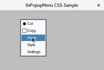
For a complete example see the IlvPopupMenu_css_sample sample application.
IlvScrollBarThe IlvScrollBar gadget displays a rectangular area that contains two direction arrows, one at each end, and a slider that refers to a range. It is mainly used to scroll parts of windows. An IlvScrollBar gadget is styled using the box model. Inner elements within the scrollbar are styled with the following selectors:
The following CSS rules provide examples on how to style an IlvScrollBar and subgadgets within it. /* Border style and font for string list */
IlvStringList {
border: 1px gray solid;
font-family: Arial;
font-size: 12px;
}
/* GhostWhite background for content */
IlvStringList > Content {
background: GhostWhite;
}
/* Black text on a GhostWhite background for string list items */
IlvStringList > IlvGadgetItem {
background: GhostWhite;
color: black;
padding: 4px;
}
/* Black text on a white background for odd string list items */
IlvStringList > IlvGadgetItem:nth-child(odd) {
background: white;
color: black;
}
/* White text on a blue background for selected string list items */
IlvStringList > IlvGadgetItem:active {
background: SteelBlue;
color: white;
}
/* Dotted border frame for focused string list items */
IlvStringList > IlvGadgetItem:focus {
border: 1px gray dotted;
}
/* Scrollbar styling for string list */
IlvScrollBar {
padding: 1px;
background: Gainsboro;
}
/* Set border and background style for slider */
IlvScrollBar > Slider {
border: 1px white outset;
background: Silver;
}
/* Set style for scroller of Scrollbar */
IlvScrollBar > Scroller {
background-size: 100% 100%;
background: Gainsboro;
}
/* Set style for top scroller of Scrollbar */
IlvScrollBar > Scroller.top {
background-image: url(css/motif/scrollbar-arrow-up32x32.png);
}
/* Set style for bottom scroller of Scrollbar */
IlvScrollBar > Scroller.bottom {
background-image: url(css/motif/scrollbar-arrow-down32x32.png);
}
For a complete examples see the IlvStringList_css_sample, IlvText_css_sample and IlvComboBox_css_sample sample applications.
IlvScrolledViewThe IlvScrolledView class is a predefined gadget container class that lets you create scrolled views. This class builds the necessary view hierarchy to create a window with scroll bars. The stylable portions of the IlvScrolledView are defined in the following table.
The following CSS demonstrates styling of IlvScrolledView and items within it. /* IlvScrolledView */
IlvScrolledView {
background: Gainsboro;
}
IlvScrolledView > IlvView {
background: GhostWhite;
}
IlvScrolledView > IlvView > IlvGadgetContainer {
background: GhostWhite;
}
IlvScrolledView > IlvView > IlvGadgetContainer > IlvMessageLabel {
border: none;
}
IlvScrolledView > IlvView > IlvGadgetContainer > IlvMessageLabel > IlvMessageItem {
font-style: italic;
border: none;
}
/* Scrollbar styling for scrolled view */
IlvScrolledView > IlvScrollBar {
padding: 1px;
background: Gainsboro;
}
/* Set border and background style for slider */
IlvScrolledView > IlvScrollBar > Slider {
border: 1px white outset;
background: Silver;
}
/* Set style for scroller of Scrollbar */
IlvScrolledView > IlvScrollBar > Scroller {
background-size: 100% 100%;
background: Gainsboro;
}
/* Set style for top scroller of Scrollbar */
IlvScrolledView > IlvScrollBar > Scroller.top {
background-image: url(css/motif/scrollbar-arrow-up32x32.png);
}
/* Set style for bottom scroller of Scrollbar */
IlvScrolledView > IlvScrollBar > Scroller.bottom {
background-image: url(css/motif/scrollbar-arrow-down32x32.png);
}
/* Set style for left scroller of Scrollbar */
IlvScrolledView > IlvScrollBar > Scroller.left {
background-image: url(css/motif/scrollbar-arrow-left32x32.png);
}
/* Set style for right scroller of Scrollbar */
IlvScrolledView > IlvScrollBar > Scroller.right {
background-image: url(css/motif/scrollbar-arrow-right32x32.png);
}
The following image shows the styling of an IlvScrolledView gadget using the above CSS rules. 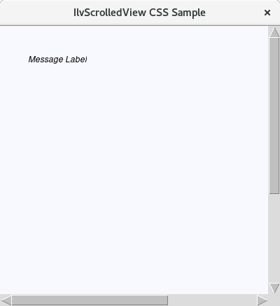
For a complete example see the IlvScrolledView_css_sample sample application.
IlvSheetThe IlvSheet class is a special kind of IlvMatrix that surrounds fixed rows and columns with a relief border to distinguish them from other cells. This class lets you resize rows and columns by using drag and drop. IlvSheet supports all the same CSS properties as IlvMatrix. In addition, IlvSheet allows its relief borders to be styled using the following border properties:
The following CSS demonstrates styling of IlvSheet and relief items within it. /* Set border and background style for IlvSheet */
IlvSheet {
background: white;
border: none;
}
/*
* Set border and background style for Content box of IlvSheet
* (The area where the sheet cells are drawn and displayed).
*/
IlvSheet > Content {
background: white;
border: none;
}
/* Set style for sheet items. Use *MatrixItem because IlvSheet is derived from IlvMatrix */
IlvLabelMatrixItem, IlvIntMatrixItem {
color: black;
background: white;
border: none;
}
/*
* Relief items (set with IlvSheet::setItemRelief) have a CSS class relief.
* Styling selected state is done with pseudoclass :active.
*/
IlvLabelMatrixItem.relief, IlvIntMatrixItem.relief {
border: 2px white outset;
background: #f6f4e9;
}
/* Styling sheet grid line (if IlvSheet::showGrid is set to true) */
IlvSheet > Grid {
border: 1px black solid;
}
/* Style for the sheet item editor. This is an IlvTextField for editing items */
IlvSheet > IlvTextField {
background: whitesmoke;
color: black;
border: 1px solid gray;
}
IlvSheet > IlvTextField > Text {
border: none;
}
IlvSheet > ColumnRelief {
border: 2px white outset;
}
IlvSheet > RowRelief {
border: 2px white outset;
}
IlvSheet > TitleRelief {
border: 2px white outset;
}
IlvSheet > MatrixRelief {
border: 2px white outset;
}
The following image shows the styling of an IlvSheet gadget using the above CSS rules. 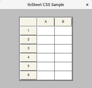
For a complete example see the IlvSheet_css_sample sample application.
IlvSliderThe IlvSlider class displays a rectangle containing a slider box that indicates a value. The slider box can be moved by dragging it along the slider area, therefore changing the current slider value. An IlvSlider gadget is styled using the margin, border, padding, background, and background-image properties of the box model. Subgadgets within the IlvSlider are referenced as defined in the following table:
IlvSlider has the following CSS classes associated with them to define their orientation. You can use the following selectors to select either horizontal or vertical slider.
The following CSS demonstrates styling of IlvSlider and relief items within it. /* Off-white background for the window and the slider */
IlvGadgetContainer {
background: #f0f0f0;
}
IlvSlider {
background: #f0f0f0;
border: none;
}
/* Set thumb icon for horizontal slider.
* Set thumb width equal to icon width and center it vertically with background-position.
*/
IlvSlider.horizontal Thumb {
background-position: 0px 6px;
background-image: url(css/winxp/slider-thumb.png);
width: 11px;
}
/* Another thumb icon for hover state. */
IlvSlider.horizontal:hover Thumb {
background-image: url(css/winxp/slider-thumb-hover.png);
}
/* Another thumb icon for active state. */
IlvSlider.horizontal:active Thumb {
background-image: url(css/winxp/slider-thumb-clicked.png);
}
/* Set thumb icon for vertical slider.
* Set thumb height equal to icon height and center it horizontally with background-position.
*/
IlvSlider.vertical Thumb {
background-position: 4px 0px;
background-image: url(css/winxp/slider-thumb-v.png);
height: 11px;
}
/* Another thumb icon for hover state. */
IlvSlider.vertical:hover Thumb {
background-image: url(css/winxp/slider-thumb-hover-v.png);
}
/* Another thumb icon for active state. */
IlvSlider.vertical:active Thumb {
background-image: url(css/winxp/slider-thumb-clicked-v.png);
}
/* Let the track to be solid bar */
IlvSlider Track {
border: 1px #0078d7 solid;
background: #0078d7;
}
/* Shrink the horizontal track vertically to a height of 2 pixels.
* IlvSlider content height minus margins: 30 - 14*2 = 2
*/
IlvSlider.horizontal Track {
margin: 14px 0px;
}
/* Shrink the vertical track horizontally to a width of 2 pixels.
* IlvSlider content width minus margins: 30 - 14*2 = 2
*/
IlvSlider.vertical Track {
margin: 0px 14px;
}
/* Focus rectangle styling */
IlvSlider Focus {
border: 1px lightgray dotted;
}
The following image shows the styling of an IlvSlider gadget using the above CSS rules. 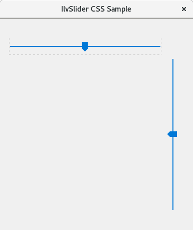
For a complete example see the IlvSlider_css_sample sample application.
IlvSpinBoxIlvSpinBox gadgets define a composite gadget made up of two IlvArrowButton buttons and several fields of the type IlvTextField or IlvNumberField. An IlvSpinBox gadget is styled using the box model. Subgadgets within the IlvSpinBox are referenced as defined in the following table:
The following CSS rules provide examples on how to style an IlvSpinBox and subgadgets within it. /* Basic gadget bounding box styling. */
IlvSpinBox {
border: 1px solid gray;
background-color: LightGrey;
}
/* Style for arrow buttons */
IlvSpinBox > IlvArrowButton {
border: 1px white outset;
background-position: 50% 50%;
width: 28px;
}
/* Make arrow buttons inset when pressed */
IlvSpinBox > IlvArrowButton:active {
background-color: DarkGrey;
border: 1px white inset;
}
/* Set icons on arrow buttons */
IlvSpinBox IlvArrowButton.up {
background-image: url(css/motif/arrowbutton-up32x32.png);
background-size: 16px 16px;
}
IlvSpinBox IlvArrowButton.down {
background-image: url(css/motif/arrowbutton-down32x32.png);
background-size: 16px 16px;
}
/* Make IlvNumberField inset */
IlvSpinBox IlvNumberField {
background-color: WhiteSmoke;
border: 1px white inset;
}
/* Internal number field styling. This is the area where the text is drawn */
IlvSpinBox IlvNumberField > Text {
border: none;
padding-left: 12px;
}
/* Focus rect styling */
IlvSpinBox IlvNumberField > Focus {
border: none;
}
The following image shows the styling of an IlvSpinBox gadget using the above CSS rules. 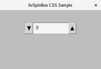
For a complete example see the IlvSpinBox_css_sample sample application.
IlvStringListThe IlvStringList class lets you display and manipulate lists of gadget items. The IlvStringList itself supports the following box model properties:
The following table summarizes other stylable portions of the IlvStringList gadget.
The following CSS shows examples of how to style IlvStringList and classes that inherit from it. /* Border style and font for string list */
IlvStringList {
border: 1px gray solid;
font-family: Arial;
font-size: 12px;
}
/* GhostWhite background for content */
IlvStringList > Content {
background: GhostWhite;
}
/* Black text on a GhostWhite background for string list items */
IlvStringList > IlvGadgetItem {
background: GhostWhite;
color: black;
padding: 4px;
}
/* Black text on a white background for odd string list items */
IlvStringList > IlvGadgetItem:nth-child(odd) {
background: white;
color: black;
}
/* White text on a blue background for selected string list items */
IlvStringList > IlvGadgetItem:active {
background: SteelBlue;
color: white;
}
/* Dotted border frame for focused string list items */
IlvStringList > IlvGadgetItem:focus {
border: 1px gray dotted;
}
/* Scrollbar styling for string list */
IlvScrollBar {
padding: 1px;
background: Gainsboro;
}
/* Set border and background style for slider */
IlvScrollBar > Slider {
border: 1px white outset;
background: Silver;
}
/* Set style for scroller of Scrollbar */
IlvScrollBar > Scroller {
background-size: 100% 100%;
background: Gainsboro;
}
/* Set style for top scroller of Scrollbar */
IlvScrollBar > Scroller.top {
background-image: url(css/motif/scrollbar-arrow-up32x32.png);
}
/* Set style for bottom scroller of Scrollbar */
IlvScrollBar > Scroller.bottom {
background-image: url(css/motif/scrollbar-arrow-down32x32.png);
}
The following image shows the styling of an IlvStringList gadget using the above CSS rules. 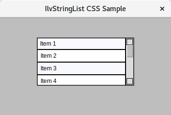
For a complete example see the IlvStringList_css_sample sample application.
IlvTextIlvText gadgets provide a customizable multiline text label with support for word wrapping and truncation. The overall IlvText gadget is styled using the box model. The focus layer of an IlvText gadget is styled with the IlvText > Focus selector. The text context portion of the gadget is styled with the Content selector, enabling independent styling for the text. IlvText scrollbars are styled using the IlvScrollbar selector. The following table summarizes the different stylable portions of an IlvText gadget.
The following CSS shows examples of how to style IlvText and classes that inherit from it. /* Style the overall IlvText gadget and its text */
IlvText {
color: #4F2222;
background-color: #FFAAAA;
border: 4px #CC8888 solid;
border-radius: 4px;
padding: 5px;
margin: 5px;
font-family: Arial;
font-size: 14px;
font-style: italic;
font-weight: normal;
text-decoration: underline;
}
/* Change the text and border when in hover state */
IlvText:hover {
font-family: Arial;
font-size: 16px;
font-style: italic;
font-weight: bold;
text-decoration: underline;
border: 4px #CC8888 solid;
background-color: red;
margin-right: 20px;
margin-left: 20px;
padding: 5px;
}
/* Style the IlvText content */
IlvText > Content {
border: 0px;
}
/* Apply styling to the Focus layer of IlvText */
IlvText > Focus {
border: red 2px;
border-radius: 10px;
}
/* Style the IlvText scrollsbars */
IlvText > IlvScrollBar {
border: none;
}
IlvText > IlvScrollBar > Focus {
border: none;
}
/* Set border and background style for slider */
IlvText > IlvScrollBar > Slider {
border: 1px white outset;
background: red;
border-radius: 5px;
margin: 2px;
}
/* Set style for the scroller of the Scrollbar */
IlvText > IlvScrollBar > Scroller {
background-size: 75% 75%;
background-position: center;
border: 0px;
}
/* Set style for top scroller of Scrollbar */
IlvText > IlvScrollBar > Scroller.top {
background-image: url(css/motif/scrollbar-arrow-up32x32.png);
}
/* Set style for bottom scroller of Scrollbar */
IlvText > IlvScrollBar > Scroller.bottom {
background-image: url(css/motif/scrollbar-arrow-down32x32.png);
}
/* Set style for left scroller of Scrollbar */
IlvText > IlvScrollBar > Scroller.left {
background-image: url(css/motif/scrollbar-arrow-left32x32.png);
}
/* Set style for right scroller of Scrollbar */
IlvText > IlvScrollBar > Scroller.right {
background-image: url(css/motif/scrollbar-arrow-right32x32.png);
}
The following image shows the styling of an IlvText gadget using the above CSS rules. 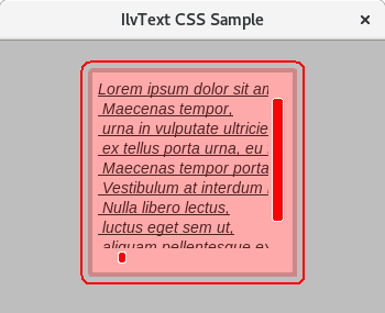
For a complete example see the IlvText_css_sample sample application.
IlvTextFieldIlvTextField gadgets provide a one-line text editor that is used to display and edit a short character string. The gadget is constructed of three layers that can be styled independently. The gadget itself is styled using the box model. The text box portion of the gadget is styled with the Text selector, enabling independent styling for the text. Finally, a focus layer is displayed when the gadget is in focus. It is styled with the Focus selector. IlvPasswordTextField, IlvNumberField, and IlvDateField gadgets inherit from IlvTextField and share all the style styling attributes. The following CSS shows examples of how to style IlvTextField and classes that inherit from it. /* Basic gadget bounding box styling.
* All the text field gadgets behave the same so we can easily group them together.
*/
IlvTextField, IlvPasswordTextField, IlvNumberField, IlvDateField {
background-color: whitesmoke;
border: 1px solid black;
}
/* Internal text field styling. This is the area where the text is drawn */
IlvTextField > Text, IlvPasswordTextField > Text, IlvNumberField > Text, IlvDateField > Text {
margin: 1px;
border: none;
margin-left: 6px;
}
/* Focus rect styling */
IlvTextField > Focus, IlvPasswordTextField > Focus, IlvNumberField > Focus, IlvDateField > Focus {
border: 2px dotted gray;
margin: 4px;
}
The following image shows the styling of an IlvTextField gadget using the above CSS rules. 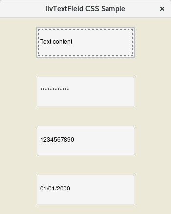
For a complete example see the IlvTextField_css_sample sample application.
IlvToggleIlvToggle gadgets are used to display either toggle or radio buttons. Toggle and radio buttons are made up of a label and a marker that shows a state. When an IlvToggle's isRadio() state is true then the gadget is styled with the IlvRadioButton CSS name. If isRadio() is false, then the CSS name is simply IlvToggle. The following table summarizes the stylable elements of the IlvToggle. Replace IlvToggle with IlvRadioButton if the gadget state is configured as a radio button.
IlvToggle provides the following pseudo-classes to style the gadget when it is in different states:
The following CSS shows examples of styling the IlvToggle gadget when it is configured as a normal check box (referenced as IlvToggle) and as a radio button (referenced as IlvRadioButton). /* Main toggle and radio boundingbox */
IlvToggle, IlvRadioButton {
border: none;
background-color: whitesmoke;
}
/* Toggle and radio label, shifted right to make room for a checkbox */
IlvToggle > Label, IlvRadioButton > Label {
margin-left: 22px;
border: none;
}
/* Check box area. By default it is the size of the entire IlvToggle. Making it smaller */
IlvToggle > CheckBox
{
width: 12px;
height: 12px;
margin-left: 3px;
margin-top: 4px;
}
/* For toggle we add a 1 pixel solid black border */
IlvToggle > CheckBox {
background-color: whitesmoke;
border: 1px solid black;
padding: 1px;
}
/* Making the check area a circle for IlvRadioButton */
IlvRadioButton > CheckBox {
width: 16px;
height: 16px;
margin-top: 2px;
margin-left: 2px;
border-radius: 10px;
border: 1px solid #CECECE;
}
/* Check mark style when toggle is in the checked state */
IlvToggle:checked > CheckMark {
background-image: url(css/vx/toggle-check.png);
background-size: contain;
background-color: whitesmoke;
}
/* Check mark style when the toggle is in the third indeterminate state */
IlvToggle:indeterminate > CheckMark {
background-color: black;
}
/* Drawing the circle to show a checked radio */
IlvRadioButton:checked > CheckMark {
background-color: black;
border-radius: 10px;
margin:1px;
}
/* Drawing a dotted line around the toggle and the radio when it has focus. */
IlvToggle > Focus, IlvRadioButton > Focus {
border: 2px dotted gray;
margin: 3px 18px 3px 24px;
}
For a complete example see the IlvToggle_css_sample sample application.
IlvToolBarThe IlvToolBar gadget provides a typical toolbar. It handles tooltips, toggle buttons, pop-up menus, and any other gadgets. There are many different CSS stylable elements for IlvToolBar gadgets. The following table summarizes the available stylable elements:
Toolbars also have CSS classes associated with them, defining their orientation. You can use the following selectors to select either horizontal or vertical IlvToolBar: IlvToolBar.vertical IlvToolBar.horizontal The following CSS shows examples of styling the IlvToolBar gadget. /* Set 1px outset border and gray background for toolbar */
IlvToolbar {
border: 1px white outset;
background: #f0f0f0;
}
/* 4 pixels separator */
IlvToolbar > IlvSeparatorItem {
margin-left: 4px;
border: none;
}
/* Make the toolbar items look like buttons */
IlvToolbar > IlvMenuItem {
margin: 2px 1px 2px 1px;
padding: 2px;
border: 1px white outset;
}
/* Set light blue background for items on hover */
IlvToolbar > IlvMenuItem:hover {
background: #c7e7f7;
}
/* Style for pressed items */
IlvToolbar > IlvMenuItem:active {
border: 1px white inset;
background: #c0e0f0;
}
The following image shows the styling of an IlvToolBar gadget using the above CSS rules. 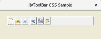
For a complete example see the IlvToolBar_css_sample sample application.
IlvTreeGadgetAn IlvTreeGadget is a gadget that displays a hierarchical list of items. Each tree gadget item displays a label and an optional bitmap and has a list of subitems. The following table summarizes the available stylable elements:
The following CSS shows examples of styling the IlvTreeGadget gadget. /* Style for IlvTreeGadget bounding box */
IlvTreeGadget {
margin: 1px;
background-color: White;
border: 1px solid black;
padding: 5px;
}
/* Style for the line drawn between items */
IlvTreeGadget > Line {
border: 1px dotted black;
}
/* Style for the expand button of tree item */
IlvTreeGadget > Button {
background-image: url(css/views/plus-sign9x9.png);
background-position: center center;
width: 9px;
height: 9px;
background-color: White;
border: 1px solid black;
}
/* Style for the shrink button of tree item */
IlvTreeGadget > Button:active {
background-image: url(css/views/minus-sign9x9.png);
}
/* Style for the area where the tree items are drawn */
IlvTreeGadget > Content {
background-color: White;
}
/* Focus rect styling */
IlvTreeGadget > Focus {
border: none;
}
/* Style for tree items: red text on white background */
IlvTreeGadgetItem {
margin-left: 2px;
background-color: White;
border: 1px solid White;
color: DarkRed;
}
/* Style for the root tree items: black text on white background */
IlvTreeGadget > IlvTreeGadgetItem > IlvTreeGadgetItem {
color: black;
}
/* Set border for selected tree items */
IlvTreeGadgetItem:active {
color: White;
border: 1px dotted DodgerBlue;
background-color: DodgerBlue;
}
/* White text on a blue background for highlighted tree items */
IlvTreeGadgetItem:focus {
border: 1px dotted gray;
margin-left: 2px;
}
The following image shows the styling of an IlvTreeGadget gadget using the above CSS rules. 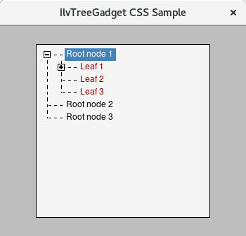
For a complete example see the IlvTreeGadget_css_sample sample application.
IlvViewFrameAn IlvViewFrame is a special Views gadget that encapsulates a client view. It adds a title bar composed of an icon, a label, and several buttons to the client view. The client view is added to the view frame by creating it as a child view of the view frame. A frame can be in one of the three following states: normal, maximized, or minimized. The following table summarizes the available stylable elements:
The following CSS shows examples of styling the IlvViewFrame gadget. /* ViewFrame background and border */
IlvViewFrame Content {
background: white;
border: 1px DarkGray;
}
/* Windowed IlvViewFrame that currently has focus */
IlvViewFrame:focus Content {
border: 1px Gray;
}
/* Maximized IlvViewFrame */
IlvViewFrame:active Content {
border-top: 1px Gray;
}
/* Caption is a rectangle in the top of IlvViewFrame that lies under
Title, Icon and IlvViewFrameButtons*/
IlvViewFrame Caption,
IlvViewFrame Caption IlvMessageItem {
background: WhiteSmoke;
border: none;
}
IlvViewFrame:focus Caption,
IlvViewFrame:focus Caption IlvMessageItem {
background: #F0F0F0;
}
/* Text on the title bar of IlvViewFrame */
IlvViewFrame Title,
IlvViewFrame Title IlvMessageItem {
background: none;
color: gray;
border: none;
}
IlvViewFrame:focus Title IlvMessageItem,
IlvViewFrame:active Title IlvMessageItem
{
color: black;
}
/* Icon on the title bar of IlvViewFrame */
IlvViewFrame Icon,
IlvViewFrame Icon > IlvMessageItem {
background: none;
color: white;
border: none;
}
/* IlvViewFrameButtons is a bar (derived from IlvToolBar) with Maximize, Minimize, Restore and Close buttons */
IlvViewFrameButtons,
IlvViewFrameButtons IlvButton,
IlvViewFrameButtons IlvButton IlvMessageItem {
border: none;
background: none;
}
IlvViewFrameButtons IlvButton:active {
padding-left: 1px;
padding-top: 1px;
}
/* Margin for Maximize, Minimize, Restore and Close buttons */
IlvViewFrameButtons > IlvMenuItem {
margin: 4px 3px 3px 3px;
border: none;
}
/* IlvDesktopManager creates default maximized state panel if no holder was set by
IlvDesktopManager::makeMaximizedStateButtons() */
IlvViewFrameDesktopPanel {
background: #F0F0F0;
}
/* Style for popup menu */
/* Menu border style */
IlvPopupMenu {
border: 1px gray solid;
}
/* Black text on a white background for menu items */
IlvPopupMenu > IlvMenuItem {
background: GhostWhite;
color: black;
padding: 2px 4px;
border: none;
}
/* White text on a blue background for menu items on hover */
IlvPopupMenu > IlvMenuItem:hover {
background: SteelBlue;
color: white;
}
/* Gray text for disabled menu items */
IlvPopupMenu > IlvMenuItem:disabled {
color: gray;
}
The following image shows the styling of an IlvViewFrame gadget using the above CSS rules. 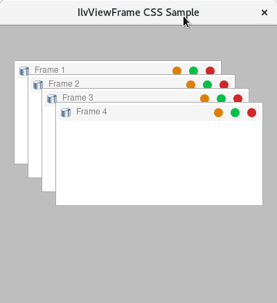
For a complete example see the IlvViewFrame_css_sample sample application.
|
|
Copyright 2021 Rogue Wave Software, Inc., a Perforce company. All Rights Reserved. |

|