Customizing shelf names
In the network and equipment components, shelves do not display
their names. Instead of the shelf name, you see the slot labels,
which are customized by using the property
XSlotLabels
, or by setting the attribute
xSlotIndex
. The properties listed in the following table can be used to
customize slot labels.
CSS properties for slot labels
Property
Name |
Type |
Default
Value |
Description
|
|---|---|---|---|
XSlotNumbersOnTop
|
boolean
|
true
|
Denotes
whether the slot numbers along the x axis are displayed on
top of the shelf or not. |
XSlotNumbersOffset
|
int |
1 |
Denotes
the distance between the slot numbers and the shelf along the
x axis. |
XSlotLabels
|
String[]
|
null
|
Denotes
the labels used on each slot along the x axis. |
labelVisible
|
boolean
|
true
|
Controls
whether the label is shown or not. |
labelAntialiasing
|
boolean
|
true
|
Controls
whether the label is drawn using anti-aliasing or not. |
labelFont
|
Font
|
Helvetica
12, except:
- in IltShelf: Helvetica 10
- in IltShelfItem: Helvetica 11 (Courier New
11 on Windows® )
|
Specifies
the font to use to draw the label. |
labelForeground
|
Color
|
black,
except:
- in IltEmptySlot: 50% gray
|
Gives
the color of the label text. |
How to customize shelf slot labels
object."ilog.tgo.model.IltShelf" {
  labelVisible: true;
  labelForeground: blue;
  XSlotNumbersOffset: 3;
}
In the table and tree components, the shelf name displays with
a tiny representation of the shelf. Instead of the slot labels,
the shelf name is represented using the same CSS properties as
for all the other predefined business objects. For a complete
list of shelf name properties, refer to Customizing the label of a business
object.
Customizing shelf states and alarms
Although states and alarms can be
associated with a shelf, they cannot be displayed in the
graphical representation of the shelf in the network and
equipment components because a shelf is only a container for
cards.
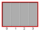
However, in the case of alarms, an alarm
border is displayed around the shelf to indicate the presence of
outstanding alarms (but no alarm balloon or alarm count), as
illustrated below.
The following CSS properties are available
to customize this representation.
CSS properties for the shelf alarm
Property
Name |
Type |
Default
Value |
Description
|
|---|---|---|---|
alarmBorderVisible
|
boolean
|
true
|
Indicates
whether the alarm border is visible or not around the object
base. |
alarmBorderWidth
|
int
|
2
pixels
|
Defines
the width of the alarm border |
alarmBorderColor
|
Color
|
null
(transparent)
|
Defines the color used to represent the alarm border around
the base. Setting the value to
null
resets the alarm border color to its default value
|
alarmColorVisible
|
boolean
|
false
|
Determines
whether the alarm color is visible or not in the object
value. |
How to customize shelf states and alarms
The following CSS extract shows how you
can customize a shelf object to not display alarm information.
object."ilog.tgo.model.IltShelf" {
  alarmBorderVisible: false;
  alarmColorVisible: false;
}
The predefined shelf type has a label and a tooltip specified in
the JViews TGO
resource bundle. For details, see About globalization.
The resources that apply to shelf types
are identified as:
ilog.tgo.Shelf_Type_<TYPE
											NAME>
: shelf type labelsilog.tgo.Shelf_Type_<TYPE NAME>_ToolTip: shelf type tooltips
You can edit the values directly in the JViews TGO resource bundle
file.
When you create new shelf types, the label
and tooltip information will also be retrieved from this resource
bundle to be displayed, for example, in a table cell. As you
declare new shelf types, register the corresponding entries into
the resource bundle file, as follows:
Considering that you have created the
following new shelf type:
IltShelf.Type MyType = new IltShelf.Type("MyType");
You should declare the following properties in the
JTGOMessages.properties
file:
ilog.tgo.Shelf_Type_MyType=My Typeilog.tgo.Shelf_Type_MyType_ToolTip=My New Shelf Type
Customizing shelf types
In JViews TGO, the
shelf type defines how the object base will be represented. Each
shelf type is associated with a specific base renderer that is in
charge of drawing the object according to its type and state
information.
In JViews TGO, you
can customize the base representation of a shelf object by
defining a new implementation of
IltShelfBaseRenderer
. The principle is the same as to create a new
IltNEBaseRenderer
. For details, refer to Extending the class IltNEBaseRenderer.
How to create and register a shelf type (using the API)
IltShelf.Type MyType = new IltShelf.Type("MyType");

IltSettings.SetValue("Shelf.Type.MyType.Renderer",
                     new IltBaseRendererFactory() {
                       public IltBaseRenderer createValue() {
                         return new MyTypeBaseRenderer();
                       }
                     });
How to create and register a shelf type (using CSS)
You can create new shelf types by using
global CSS settings as shown in the following code sample.
setting."ilog.tgo.model.IltShelf"{
   types[0]: @+shelfType0;
}
Subobject#shelfType0 {
  class: 'ilog.tgo.model.IltShelf.Type';
  name: "MyType";
}
For more information, see Using global settings.
How to customize a shelf type (using CSS)
You can customize the shelf renderer using global CSS settings.
To do so, you need to specify the full path to the object to be
customized, as well as the value of its name attribute in order
to match the right type of object in the system. The CSS
property to customize is
renderer
.
setting."ilog.tgo.model.IltShelf.Type"[name="MyType"] {
   renderer: @+shelfRendererFactory;
}
Subobject#shelfRendererFactory {
   class: 'MyShelfRendererFactory';
}
In this code sample, the name of the renderer factory class
that is included in the search path is
MyShelfRendererFactory
.
Customizing shelf tiny types
The shelf object can be represented as
tiny objects in the tree and table components. Each shelf type
can be associated with a tiny base renderer that is responsible
for drawing the tiny graphic representation.
JViews TGO allows you
to customize the tiny type representation by using one of the
predefined base renderer factories, such as IltTinyImageBaseRendererFactory or IltTinySVGBaseRendererFactory, or by
creating your own implementation of IltTinyBaseRenderer. The principle to
create a new
IltTinyBaseRenderer
is the same as to create a new IltNEBaseRenderer.
For details, refer to Extending the class IltNEBaseRenderer.
How to modify a shelf tiny representation (using the API)
IltShelf.Type MyType = new IltShelf.Type("MyType");

IltSettings.SetValue("Shelf.TinyType.MyType.Renderer",
                     new IltTinyImageBaseRendererFactory(YOUR_IMAGE,
YOUR_IMAGE_PARAMETERS));
How to modify a shelf tiny representation (using CSS)
You can customize the renderer using global CSS settings. The
CSS property to customize here is
tinyRenderer
.
In the following example, the name of the renderer factory
class that is included in the search path is
MyShelfTinyRendererFactory
.
setting."ilog.tgo.model.IltShelf.Type"[name="MyType"] {
   tinyRenderer: @+shelfTinyRendererFactory0;
}
Subobject#shelfTinyRendererFactory0 {
   class: 'MyShelfTinyRendererFactory';
}
For details about how to create image base renderers, refer to
Creating network element types from
images and customizing them.