Properties for customizing tooltips
The following properties are used to
customize tooltips.
CSS properties for tooltips
Property
Name |
Type
of Value |
Default
|
Description
|
|---|---|---|---|
toolTipGraphic
|
IlvGraphic
or
JComponent
|
null
|
If the value is other than
null
, the given graphic object is used as the tooltip. If the
value is
null
, the tooltip will be a simple string as configured by the
toolTipText
property.
|
toolTipText
|
String
|
null
|
Tooltip text for the object, used only if toolTipGraphic is
null
. If the values of this property and the toolTipGraphic
property are both
null
, no tooltip is displayed.
|
toolTipFont
|
Font |
null
(the default tooltip font defined in the Java™ environment is
used)
|
Defines
the font to be used when creating text tooltips. |
toolTipForeground
|
Color
|
null
(the default tooltip foreground color defined in the Java
environment is used)
|
Defines
the foreground color to be used when creating text tooltips.
|
toolTipBackground
|
Color
|
null
(the default tooltip background color defined in the Java
environment is used)
|
Defines
the background color to be used when creating text tooltips.
|
How to customize a tooltip
The following example is valid for network
nodes and links, equipment nodes and links, and tree nodes:
object."ilog.tgo.model.IltObject" {
  toolTipText: @name;
}
How to customize tooltips with a specific font
The following example shows you how to
customize your component to display tooltips with a specific font
on the objects:
object."ilog.tgo.model.IltObject" {
  toolTipText: @name;
  toolTipFont: "arial-plain-12";
}
How to create a multiline tooltip
The value of the tooltip string is rendered by default in a
single line of text. If you want a multiline tooltip or you use
fonts with different styles, you can prefix the string with the
tag
<HTML>
and then use HTML notation for text attributes. For example, the
tooltip shown in A two-line tooltip with different font
styles uses the following string:
<HTML>A <b>simple</b> tool tip<br>with <u>two</u> lines</HTML>
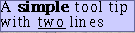
A two-line tooltip with different font
styles
The following example shows how to obtain
this result:
object."ilog.tgo.model.IltObject" {
  toolTipText: "<HTML>A <b>simple</b> tool tip<br>with <u>two</u> lines</
HTML>";
}
How to create a graphic tooltip
You can also customize tooltips that are
IlvGraphic
or
JComponent
instances. Graphic tooltips are customized in CSS through the
property '
toolTipGraphic
' as follows:
object."ilog.tgo.model.IltObject" {
  toolTipGraphic: @+myToolTip;
}

Subobject#myToolTip {
  class: 'ilog.views.graphic.IlvIcon';
  image: '@|image("question.png")';
}
This example creates a graphic tooltip that displays an icon. The
icon graphic is created by the styling engine as a JavaBean™. For
details, see How to Create a New JavaBean Dynamically.
How to customize a tooltip for a table cell
In the table component, you can customize tooltips for an entire
row as explained in previous sections, or you can specify
tooltips for a specific table cell. The following example shows
how to specify tooltips for table cells that represent network
element objects and the
family
attribute.
object."ilog.tgo.model.IltNetworkElement/family" {
  toolTipText: @family;
}
How to customize a tooltip for a specific decoration
In the network and equipment components, you can customize
tooltips for an entire object as explained in previous sections,
or you can specify tooltips for a specific decoration. A
decoration is created to graphically represent an attribute of
the business object. Customizing tooltips for a specific
decoration is accomplished by defining CSS selectors for business
attributes. In the following example, network elements are
customized in a way that their label is truncated when its width
is larger than 50. Besides, a tooltip is defined for the
'name'
attribute displaying the full value of the attribute over the
label decoration so that you can still see the full name of the
object.
object."ilog.tgo.model.IltNetworkElement" {
  label: @name;
  labelWrappingMode: Truncate;
  labelWrappingWidth: 50;
}

object."ilog.tgo.model.IltNetworkElement/name" {
  toolTipText: @name;
}
The following CSS file is provided as part of the JViews TGO demonstration
software at <installdir> /samples/network/decoration.
It illustrates how to define graphic
tooltips for a specific business attribute.
How to customize tooltips for secondary states in predefined business objects
In the network and equipment components,
you can specify that tooltips are to be displayed for secondary
states. A tooltip will be automatically retrieved for each
secondary state that is displayed in the business object graphic
representation.
object."ilog.tgo.model.IltObject/objectState" {
  toolTipGraphic: @+SecStateModifierToolTipGraphic;
}
#SecStateModifierToolTipGraphic {
  class: 'ilog.tgo.graphic.IltSecStateModifierToolTipGraphic';
}
The tooltip graphic displays the description of the state. This
description is defined when the state is created. For all the
predefined states, the description can be modified in the JViews TGO resource bundle
file. For states that you have created using the API, specify the
state description as argument when creating the new state.