In this section, you will extend the progress bar made in Working with symbols to match the progress
bar defined in Definition of the dashboard.
In Transforming symbols using parameters you
were shown how to define the transformation necessary for this
symbol to display percentage progress. You will now concentrate on
updating object graphic styles to match the look and feel defined
in the dashboard definition.
Graphic styles define the appearance of an
object. They are customized using the Paint tab in the Styling
Customizer. The appearance of an object is separated into two
parts: the fill style and the stroke style. The fill style is the
graphic rendering of anything inside an object, the stroke style
defines the object border.
To extend the progress bar, you will
proceed in four stages:
Changing the fill style
To change the fill style for the
basicprogressbar, use the Paint Editor.
-
Open the basicprogressbar symbol from the bampalette.For more information, see Closing and opening symbols and palettes.
-
Select the progressbar object in the Symbol Outline pane.
-
Click the Paint tab in the Styling Customizer.
-
Click the button on the right of the Fill Paint field.The Paint Editor opens.
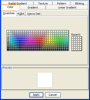 The Paint EditorAs shown in the figure above, the Paint Editor contains tabs for controlling the color, gradient, texture, and pattern of the object. The color can be set using one of the following options:
- Swatches
- HSBA (Hue, Saturation, Brightness, Alpha) codes
- RGBA (Red, Green, Blue, Alpha) codes
- JViews Disk
The gradient can be set using linear, radial or standard tools. -
Click the Pattern tab.
-
Click the button in the Foreground field.The Color dialog box opens.
-
Click the RGB tab.
-
Type
71, 231, 71in the Red, Green, and Blue fields. -
Click OK.
-
Select the bars pattern as shown in the following figure.
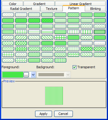 The Paint Editor pattern chooser
 -
Clear the Transparent check box.
-
Click the button in the Background field.The Color dialog box opens.
-
In the Swatches tab, select the color white in the upper left.
-
Click OK.
-
Click Apply.
The color scheme of the progress bar now matches the dashboard
definition in figure A dashboard definition. Before continuing,
save the changes you have made to the symbol by pressing Ctrl+S.
Note
The graphic manipulation shown in this example is very basic.
For information about more advanced graphics, see Exploiting advanced graphics features.
Changing the stroke
The stroke refers to the border
surrounding an object.
To change the stroke for the
basicprogressbar symbol:
-
Open the basicprogressbar symbol.
-
Select the progressbar object in the Symbol Outline pane.The Styling Customizer opens on the last tab you used, in this case, the Paint tab.
-
Click the button next to the Stroke paint field.The Paint Editor opens.
-
Click the Color tab; then click the JViews Disk tab.
-
Use the sliders to select a light gray tone.
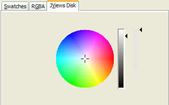 The JViews Disk color chooser
 -
Click Apply.
Adding shapes to a symbol
In the dashboard definition, the progress
bar advances on a white background. To create this effect, you
need to make a background object with the same width and length
as the fully extended progress bar.
-
Open the basicprogressbar symbol from the bampalette.For more information, see Closing and opening symbols and palettes.
-
Click Add Shape in the toolbar.The Choose Shape dialog box opens.
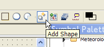 The Add Shape button
 -
Select the Rectangle shape and click OK.The Rectangle object is added to your symbol, it is the current selected object.
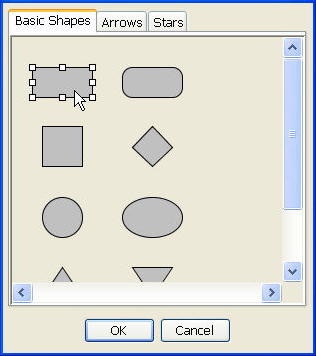 The Choose Shape dialog box
 -
In the General tab, change the Attachment Point and Anchor Point to match the following figure.
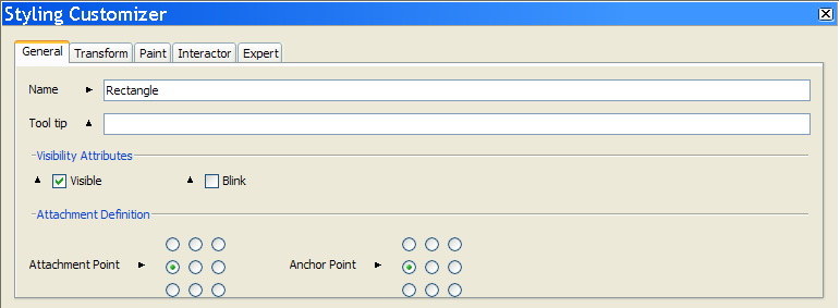 Change the attachment and anchor pointsThe Rectangle shape is now aligned with the left of the basicprogressbar.NoteThe direction in which a transformation occurs is controlled by an object’s attachment point. For example, if the object is attached to the base object from the left as in figure Change the attachment and anchor points, changes in width are reflected by the object expanding to the right of the attachment point.
 -
In the Transform tab, type
30in the Height field. -
Type 120 in the Width field.
-
In the Paint tab, change the Fill paint color to white using the Paint Editor.For more information, see Changing the fill style.
-
Set the Stroke paint to gray.For more information, see Changing the stroke.
The basicprogressbar symbol now contains
all the objects necessary to match the dashboard definition.
Changing symbol layers
The arrangement of the objects in a symbol is calculated in
reference to the base object, in terms of position and layer. As
shown in Adding shapes to a symbol, you can change
the relative position of an object. Symbols are made up of
objects stored in layers. The base object is the bottom layer,
on which all other objects in the Symbol are stacked. Using the
Symbol Editor, you can change the level of an object in the
layer stack.
In the basicprogressbar symbol, the
background image is currently in a layer higher than the
progress bar. If you test the symbol, you will see that, as the
value of the progress parameter increases, the background
rectangle moves to the right.
To rectify this behavior, make the
background rectangle the base symbol:
-
Right-click the Rectangle object in the Symbol Outline pane.
-
In the pop-up menu, click Order > Send to Back.
-
In the Confirm New Base dialog box, click Yes.
-
Save the symbol.
The basicprogressbar symbol is now complete. Test the symbol
using the procedure described in Testing your symbol.