DbTreeGadget Inspector Panel
The IliDbTreeGadget inspector has six notebook pages:
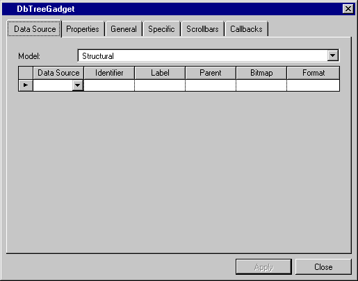
Data Source Page

Label | Description |
|---|---|
Model | Menu: Structural, Recursive. Default: Structural. Explanation: Model of the tree gadget. |
Data Source column | Menu: Names of current data sources. Default: No default. Explanation: Name of the data source to which the tree gadget is to be connected. |
Identifier column | Menu: Column names of the data source selected in the DataSource field. Default: No default. Explanation: Column in the data source containing the child identifier. |
Label column | Menu: Column names of the data source selected in the DataSource field. Default: No default. Explanation: Column in the data source containing the child label. |
Parent column | Menu: Column names of the data source selected in the Data Source field. Default: No default. Explanation: Column in the data source containing the value for parents. |
Bitmap column | Menu: Column names of the data source selected in the Data Source field. Default: No default. Explanation: Column containing the file name of the picture. |
Format column | Menu: List of predefined system and user formats. Default: No default. Explanation: Format to be applied to the label in the tree gadget, if a label exists, or to the value if no label exists. |
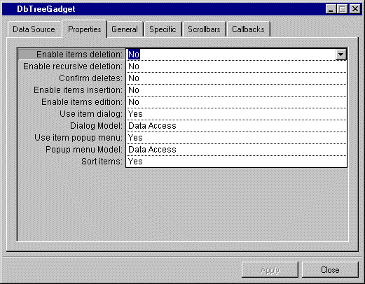
Properties Page

Label | Description |
|---|---|
Enable items deletion | Menu: Yes, No. Default: No. Explanation: Enable or disable items deletion. |
Enable recursive deletion | Menu: Yes, No. Default: No. Explanation: Enable or disable recursive deletion. Yes: When a parent is deleted, its child is also deleted. No: A parent will not be deleted if it has one or more children. |
Confirm deletes | Menu: Yes, No. Default: No. Explanation: Enable or disable message to ask confirmation of a deletion. |
Enable items insertion | Menu: Yes, No. Default: No. Explanation: Enable or disable items insertion. |
Enable items edition | Menu: Yes, No. Default: No. Explanation: Enable or disable items edition. |
Use item dialog | Menu: Yes, No. Default: Yes Explanation: Enable or disable item dialog box. |
Dialog Model | Menu: Data Access. Default: Data Access. Explanation: Model of the dialog box. |
Use item popup menu | Menu: Yes, No. Default: No. Explanation: Enable or disable item popup menu which appears when clicking the desired item and then the mouse right button. |
Popup menu Model | Menu: Data Access. Default: Data Access. Explanation: Model of the popup menu. |
Sort items | Menu: Yes, No. Default: Yes. Explanation: Enable or disable items sorting. |
General Page
For a description of this notebook page, refer to the section General Notebook Page.
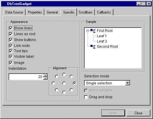
Specific Page

Label | Description |
|---|---|
Show lines | Check box. Default: Checked. Explanation: Checked = Lines connecting elements in the tree are shown. Not checked = Lines are not shown. |
Lines as root | Check box. Default: Checked. Explanation: Checked = Lines connect roots. Not checked = Lines do not connect roots. |
Show button | Check box. Default: Checked. Explanation: Checked = Shows the buttons that indicate whether the tree is expanded. Not checked = The button is not shown. |
Link roots | Check box. Default: Checked. Explanation: Checked = A line links the roots. Not checked = The roots are not visibly linked. |
Tool tips | Check box. Default: Checked. Explanation: Checked = Displays tooltips if the item length is larger than the gadget width. Not checked = There are no tooltips. |
Visible label | Check box. Default: Checked. Explanation: Checked = The labels are visible. Not checked = The labels are not visible. |
Image | Check box. Default: Checked. Explanation: Checked = The images showing roots and nodes are visible. Not checked = The images are not visible. |
Indentation | Menu: None. Default: 20. Explanation: Distance of roots and nodes from the left of the tree. |
Alignment | Menu: None. Available positions are indicated by graphic. Default: Right. Explanation: Gives the position of the label relative to the image. |
Sample | Shows how the tree looks as you change the options in the Appearance column. |
Selection mode | Menu: Single selection, Extended selection. Default: Single selection. Explanation: Single = Only one item in the tree can be selected. Extended = More than one item can be selected. |
Items editable | Not available. |
Drag and drop | Check box. Default: Checked. Explanation: Determines whether items can be dragged and dropped. |
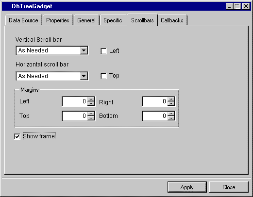
Scrollbars Page

Label | Description |
|---|---|
Vertical scroll bar | Menu: Show, Hide, As Needed. Default: As Needed. Explanation: Show = The field has a vertical scroll bar. Hide = The field does not have a vertical scroll bar. As Needed = Vertical scroll bar if needed. |
Left | Check box. Default: Not checked. Explanation: Checked = The vertical scroll bar is on the left side of the gadget. Not checked = The vertical scroll bar is on the right side of the gadget. |
Horizontal scroll bar | Menu: Show, Hide, As Needed. Default: As Needed. Explanation: Show = The field has a horizontal scroll bar. Hide = The field does not have a horizontal scroll bar. As Needed = Horizontal scroll bar if needed. |
Top | Check box. Default: Not checked. Explanation: Checked = The horizontal scroll bar is above the gadget. Not checked = The horizontal scroll bar is below the gadget. |
Margins | Menu: None. Default: 0. Explanation: Allows you to type the value of the left, right, top, and bottom margins. |
Show Frame | Check box. Default: Checked. Explanation: Determines whether frames are visible. |
Callbacks Page
In addition to the Generic and Secondary callbacks described in the section Callbacks Notebook Page, this inspector uses the callbacks listed below. The callbacks IncoherentTreeData, DeleteItem, InsertChildItem, InsertSiblingItem and EditItem are described in the Views Data Access Reference Manual IliTreeGadget section.
Published date: 05/24/2022
Last modified date: 02/24/2022


