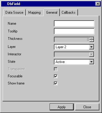
Notebook Pages Common to Data Access Gadgets Inspectors
Most Data Access gadgets inspectors have a General and a Callbacks notebook page.
General Notebook Page
The General page text fields and check boxes are the same for all the inspectors, however, the availability of each selection depends on the inspector.

Label | Description |
|---|---|
Name | Menu: None. Default: No default. Explanation: Name of the gadget. |
Tooltip | Menu: None. Default: No default. Explanation: Text to appear in the tooltip. |
Thickness | Menu: Grayed if this option is not available. Default: 2. Explanation: Increases the width of the border surrounding the gadget. |
Layer | Menu: Layer 1, Layer 2. Default: Layer 2 Explanation: Manager layer in which the gadget will be placed. |
Interactor | Menu: Names of the available interactors. Default: None. Explanation: Allows you to select the kind of interactor you want for this gadget. |
State | Menu: Active, Inactive, Grayed out. Default: Active. Explanation: Specifies the gadget activity status. |
Transparent | Check box. Default: Not checked. Explanation: When this box is checked, the gadget appears transparent. |
Focusable | Check box. Default: Checked. Explanation: When this box is checked, the gadget can receive the mouse pointer or keyboard focus. |
Show Frame | Check box. Default: Checked. Explanation: When this box is checked, the gadget frame is displayed. |
Published date: 05/24/2022
Last modified date: 02/24/2022


