DbStringList Inspector Panel
The IliDbStringList inspector has six notebook pages:
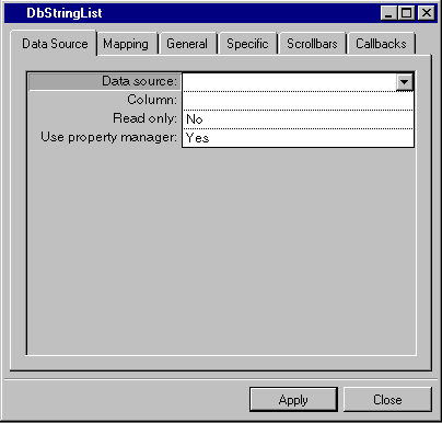
Data Source Page

Label | Description |
|---|---|
Data source | Menu: Names of current data sources. Default: No default. Explanation: Name of the data source to which the string list gadget is to be connected. |
Column | Menu: Column names of the data source selected in the Data source field. Default: No default. Explanation: Column of the data source table to which the gadget is to be connected. |
Read only | Menu: Yes, No. Default: No. Explanation: Yes = The field cannot be edited. No = The field can be edited. |
Use property manager | Menu: Yes, No. Default: No. Explanation: Yes = The DbStringList uses a property manager. No = The DbStringList does not use a property manager. |
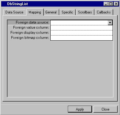
Mapping Page

Label | Description |
|---|---|
Foreign data source | Menu: Name of current data sources. Default: No default. Explanation: Data source containing the columns to which the values for the current column are to be mapped so as to convert the value to another value and display it. |
Foreign value column | Menu: Column names of the data source selected in the Foreign data source field. Default: No default. Explanation: The column in the foreign data source containing the value to which the current column is to be mapped. |
Foreign display column | Menu: Column names of the data source selected in the Foreign data source field. Default: No default. Explanation: Column in the foreign data source containing the value to be displayed when the column specified in the Foreign value column row is referred to. |
Foreign bitmap column | Menu: Column names of the data source selected in the Foreign data source field. Default: No default. Explanation: Column in the Foreign data source containing the bitmap to be displayed. |
General Page
For a description of this notebook page, refer to the section General Notebook Page.
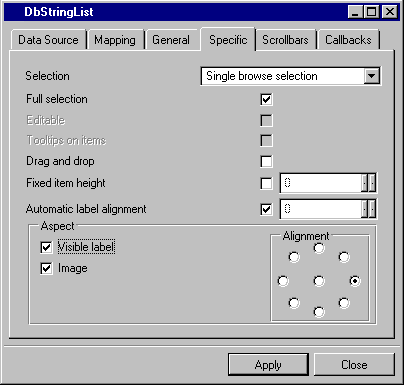
Specific Page

Label | Description |
|---|---|
Selection | Menu: Single selection, Single browse selection, Multiple selection, Extended selection, Browse selection. Default: Single browse selection. Explanation: Type of selection to be used by the gadget. |
Full selection | Check box. Default: Checked. Explanation: Checked = Selects the entire line. Not checked = Selects only the item length. |
Editable | Not available. |
Tooltips on items | Not available. |
Drag and drop | Check box. Default: Not checked. Explanation: Determines whether items can be dragged and dropped. |
Fixed item height | Check box. Default: Not checked. Explanation: When checked, 20 appears as the default. |
Automatic label alignment | Check box. Default: Checked. Explanation: When not checked, 28 appears as the default if a foreign data source is used. 0 appears as the default if a foreign data source is not used. |
Visible label | Check box. Default: Checked. Explanation: Determines whether labels are visible in the gadget. |
Image | Check box. Default: Checked. Explanation: Determines whether images are visible in the gadget. |
Alignment | Menu: None. Available positions are indicated by graphic. Default: Right center. Explanation: When Image and Visible label are selected, gives the position of the label relative to the image. |
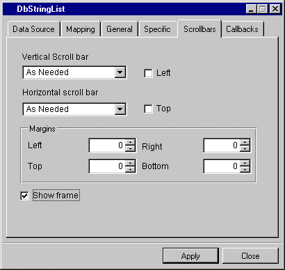
Scrollbars Page

Label | Description |
|---|---|
Vertical scroll bar | Menu: Show, Hide, As Needed. Default: As Needed. Explanation: Show = The field has a vertical scroll bar. Hide = The field does not have a vertical scroll bar. As Needed = Vertical scroll bar if needed. |
Left | Check box. Default: Not checked. Explanation: Checked = The vertical scroll bar is on the left side of the gadget. Not checked = The vertical scroll bar is on the right side of the gadget. |
Horizontal scrollbar | Menu: Show, Hide, As Needed. Default: As Needed. Explanation: Show = The field has a horizontal scroll bar. Hide = The field does not have a horizontal scroll bar. As Needed = Horizontal scroll bar if needed. |
Top | Check box. Default: Not checked. Explanation: Checked = The horizontal scroll bar is above the gadget. Not checked = The horizontal scroll bar is below the gadget. |
Margins | Menu: None. Default: 0. Explanation: Allows you to type the value of the left, right, top, and bottom margins. |
Show Frame | Check box. Default: Checked. Explanation: Determines whether frames are visible. |
Callbacks Page
In addition to the callbacks described in the section Callbacks Notebook Page, this inspector uses the callbacks listed below.
Published date: 05/24/2022
Last modified date: 02/24/2022


