Table Gadget Inspector Panel
The IliTableGadget inspector has four notebook pages:
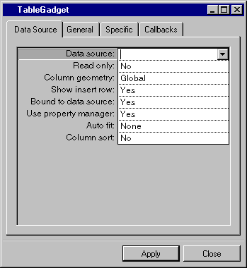
Data Source Page

Label | Description |
|---|---|
Data source | Menu: Names of current data sources. Default: No default. Explanation: Name of the source to which the table gadget is to be connected. |
Read only | Menu: Yes, No. Default: No. Explanation: Yes = The gadget cannot be edited. No = The gadget can be edited. |
Column geometry | Menu: Local, Global. Default: Global. Explanation: Local = The table gadget manages column widths, visibility and ordering independently of the underlying data source table. Global = The table gadget manages column widths, visibility, and ordering in conjunction with the underlying data source table. If there are many table gadgets using the same underlying data source, Local is recommended. |
Show insert row | Menu: Yes, No. Default: Yes. Explanation: Yes = Shows insert row. No = Hides insert row. |
Bound to data source | Menu: Yes, No. Default: Yes. Explanation: Yes = Current row of the table gadget is synchronized with the current row of the data source. No = Current row of the table gadget is independent of the current row of the data source. |
Use property manager | Menu: Yes, No. Default: Yes. Explanation: Yes = The table gadget uses a property manager. No = The table gadget does not use a property manager. |
Auto fit | Menu: None, Proportional, Last. Default: None. Explanation: Sets how visible column widths change as table gadget is resized. None = Column widths do not change. Proportional = Column widths change proportionally, leaving no empty space. Last = Only width of last column changes to fill all empty space. |
Column sort | Menu: Yes, No. Default: No. Explanation: Yes = Sorts columns of the table gadget columns by alphabetical or numeric order. No = Does not sort columns of the table gadget |
General Page
For a description of this notebook page, refer to the section General Notebook Page.
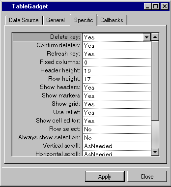
Specific Page

Label | Description |
|---|---|
Delete key | Menu: Yes, No. Default: Yes. Explanation: Yes = The Delete key can be used to delete the current row. No = The Delete key cannot be used to delete the current row. |
Confirm deletes | Menu: Yes, No. Default: Yes. Explanation: Yes = The user is prompted to confirm the deletion of a row. No = The user is not prompted to confirm the deletion of a row. |
Refresh key | Menu: Yes, No. Default: Yes. Explanation: Yes = User can use the Refresh key (F9 by default) to refresh the data source table. No = Refresh key is disabled. |
Fixed columns | Menu: None. Default: 0. Explanation: The number of columns on the left side of the table that do not scroll. |
Header height | Menu: None. Default: Height of the font used for drawing headers. Explanation: Height of the header row in pixels. |
Row height | Menu: None. Default: Height of the font used for drawing cells. Explanation: Height of the rows, other than the header, in pixels. |
Show headers | Menu: Yes, No. Default: Yes. Explanation: Yes = Header row is displayed. No = Header row is not displayed. |
Show markers | Menu: Yes, No. Default: Yes. Explanation: Yes = Row markers are displayed. No = Row markers are not displayed. |
Show grid | Menu: Yes, No. Default: Yes. Explanation: Yes = Grid is displayed in the table gadget. No = Grid is not displayed in the table gadget. |
Use relief | Menu: Yes, No. Default: Yes. Explanation: Yes = Table gadget has a relief border. No = Table gadget does not have a relief border. |
Show cell editor | Menu: Yes, No. Default: Yes. Explanation: Yes = Cell editor is shown in cells when table gadget is read only. No = Cell editor is not shown when table gadget is read only. |
Row select | Menu: Yes, No. Default: No. Explanation: Yes = When an attempt is made to select a cell, the entire row containing the cell is selected instead. No = A cell can be selected independently of its row. |
Always show selection | Menu: Yes, No. Default: No. Explanation: Yes = Selection in the table gadget is always highlighted. No = Selection in the table gadget is highlighted only when table gadget has the focus. |
Vertical scroll | Menu: Never, AsNeeded, Always. Default: AsNeeded. Explanation: Never = Vertical scroll bar is never displayed. AsNeeded = Vertical scroll bar is displayed when needed. Always = Vertical scroll bar is always displayed. |
Horizontal scroll | Menu: Never, AsNeeded, Always. Default: AsNeeded. Explanation: Never = Horizontal scroll bar is never displayed. AsNeeded = Horizontal scroll bar is displayed when needed. Always = Horizontal scroll bar is always displayed. |
Header font | Menu: None. Click the button to open the Default: Font of table gadget palette. Explanation: Sets the font used in the header row of the table gadget. |
Cell font | Menu: None. Default: Font of table gadget palette. Explanation: Sets the font used for cells in the table gadget. |
Cell background | Menu: None. Default: Background color of table gadget palette. Explanation: Sets background color for cells in the table gadget. |
Cell foreground | Menu: None. Default: Foreground color of the table gadget palette. Explanation: Sets foreground color for cells in the table gadget. |
Multi selection | Menu: Yes, No. Default: Yes. Explanation: Yes = More than one table gadget row can be selected at the same time. No = Table gadget rows cannot be selected at the same time. |
Callbacks Page
In addition to the callbacks described in the section Callbacks Notebook Page, this inspector uses the callbacks listed below, which are described in the IliTableGadget section of the Views Data Access Reference Manual.
Published date: 05/24/2022
Last modified date: 02/24/2022


