 Data Source Page
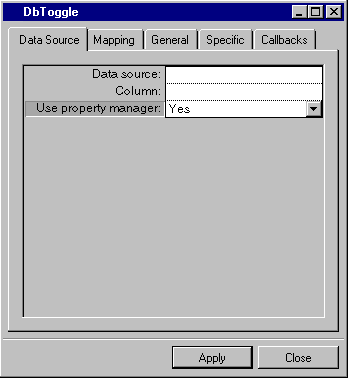
Label | Description |
Data source | Menu: Names of current data sources. Default: No default. Explanation: Name of the data source to which the DbToggle is to be connected. |
Column | Menu: Column names of the data source selected in the Data source field. Default: No default. Explanation: Column of the data source table to which the gadget is to be connected. |
Use property manager | Menu: Yes, No. Default: Yes. Explanation: Yes = The DbToggle gadget uses a property manager. No = The DbToggle gadget does not use a property manager. |
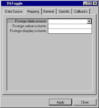
Label | Description |
Foreign data source | Menu: Names of foreign data sources. Default: No default. Explanation: Data source containing the columns to which the values for the current column are to be mapped so as to convert the value to another value and display it. |
Foreign value column | Menu: Column names of the data source selected in the Foreign data source field. Default: No default. Explanation: Column in the foreign data source containing the value to which the current column is to be mapped. |
Foreign display column | Menu: Column names of the data source selected in the Foreign data source field. Default: No default. Explanation: Column in the foreign data source containing the value to be displayed when the column specified in the Foreign value column row is referred to. |
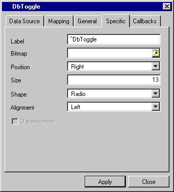
Label | Description |
Label | Menu: None. Default: DbToggle. Explanation: The text for the label placed next to the toggle gadget. |
Bitmap | Menu: None. Button: Click to open the Open dialog box. Default: No default. Explanation: The bitmap image to be placed as the label next to the toggle gadget. |
Position | Menu: Left, Right. Default: Right. Explanation: Position of the label relative to the toggle gadget. |
Size | Menu: None. Default: 13. Explanation: The width or height of the state marker. |
Shape | Menu: Radio, CheckBox. Default: Radio. Explanation: The type of toggle gadget to be used. |
Alignment | Menu: Left, Center, Right. Default: Left. Explanation: Alignment of the label within the bounding box of the toggle gadget. |
3 States Mode | Check box: Available if Shape = CheckBox (see Shape above). Default: Unchecked. Explanation: The toggle can have three states (True, False, Null) when the toggle is a check box and if this field is true. |