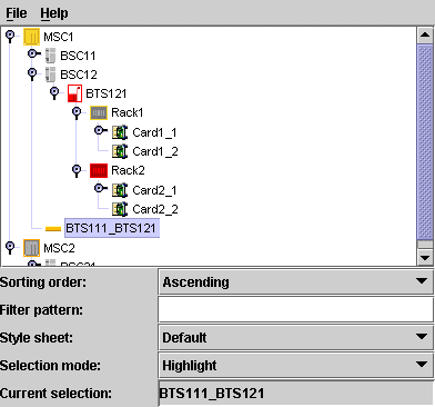
Graphical representation of tree nodes
Tree nodes are graphically represented
with a graphic object or icon and a label, as illustrated in the
following example.
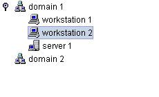
The default representation for business
objects is a representation that combines a label with an
optional icon, overlapping icon, and tool tip as illustrated in
the following example.
Properties for customizing tree nodes
The following table lists the properties
that are common to both predefined and user-defined business
objects represented in a tree component.
Common CSS properties for tree node
rendering
Property
Name |
Type
of Value |
Default
|
Description
|
|---|---|---|---|
expansion
|
IlpObject.ExpansionType
|
IN_PLACE
|
Determines
whether an object should be expandable in the tree, so that
its children can be displayed. Possible values are:
IN_PLACE
IN_PLACE_MINIMAL_LOADING
NO_EXPANSION
For details, refer to Customizing the expansion of business
objects.
|
focusBorderColor
|
Color
|
null
|
Color to be used for the focus border of the node. The focus
border shows which cell has the focus. If the value is
null
, the color of the active look-and-feel is used.
|
focusBorderWidth
|
Integer
|
1
|
Width
of the focus border, in pixels. |
icon
|
Image
|
null
|
Icon to be displayed. If the value is
null
, no icon is displayed.
|
iconVisible
|
Boolean
|
true
|
Controls whether the icon is displayed or not. If this value
is
true
and
icon
is
null
, a default icon will be displayed.
|
label
|
String
|
null
|
Text to be displayed for the label. If the value is
null
, the identifier of the business object is displayed.
|
labelBackground
|
Color
|
null
|
Color to be used for the label background. If the value is
null
, the color of the active look-and-feel is used.
|
labelFont
|
Font
|
null
|
Font to be used for the label. If the value is
null
, the font of the active look-and-feel is used.
|
labelForeground
|
Color
|
null
|
Color to be used for the label foreground. If the value is
null
, the color of the active look-and-feel is used.
|
labelPosition
|
IlvDirection
|
Right
|
Position
of the label relative to the icon. Possible values are:
Left
Right
Top
Bottom
Center
|
labelSpacing
|
Float
|
2f
|
Spacing
between the label and the icon in pixels. |
labelVisible
|
Boolean
|
true
|
Controls
whether the label string is displayed or not. |
overlapIcon
|
Image
|
null
|
Defines
the image used for the overlap icon. |
overlapIconVisible
|
Boolean
|
true
|
Determines
whether the overlap icon is to be visible or not. |
selectionFocusMode
|
IlpSelectionFocusMode
|
CELL_SELECTION_FOCUS_MODE
|
Determines
the rendering of the selection and focus. Possible values
are:
CELL_SELECTION_FOCUS_MODE
: select both icon and label.
LABEL_SELECTION_FOCUS_MODE
: select only the label.
The third possible value for this property,
BASE_SELECTION_FOCUS_MODE
, is not recommended for use in the tree.
|
toolTipGraphic
|
IlvGraphic
or
JComponent
|
null
|
This property accepts IlvGraphic and
JComponent
objects that are created in CSS using @+, @=, or @#
constructors.
|
toolTipText
|
String
|
null
|
Tooltip text for the cell, used only if toolTipGraphic is
null
. If the value of this property and the toolTipGraphic
property are both
null
, no tooltip is displayed.
|
Predefined business objects for tree nodes
By default, the predefined business objects for managed objects
are displayed in the tiny representation. The tiny representation
can be customized using the same CSS properties as for the
symbolic representation (for example,
foreground
,
background
,
label
,
labelPosition
)..
For a list of the properties that you can
customize of each type of predefined business object, refer to
the following sections:
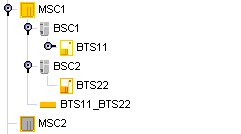
Objects of the IltNetworkElement and IltLink classes are represented as follows
in a tree:
User-defined business objects
The default representation for
user-defined business objects is a simple representation which
combines a label with an optional icon, overlapping icon, and
tool tip.
How to customize tree nodes
The following example shows you how you
can customize the tree nodes. It is based on a CSS file.
The following CSS file is provided as part of the JViews TGO demonstration
software at installdir/samples/tree/customClasses/data/tree.css.
The CSS selectors used to customize the nodes of the tree
component are formed by the CSS type
object
and the CSS class
<business class name>
, as illustrated below:
object."NetworkElement" {
  label : @name;
  labelForeground : black;
  iconVisible : true;
  toolTipText : @name;
}

object."NetworkElement":selected {
  labelForeground: red;
}
The example above illustrates a tree node configuration using
pseudoclasses: the graphic representation of the nodes is based
on the pseudoclass "
selected
", so that the label foreground color changes whether the object
is selected or not in the tree component.
Besides the selection state, you can also
customize tree nodes according to the focus state or to custom
pseudoclasses. The following example shows tree nodes whose label
foreground color changes according to the focus and selection
state:
object:selected {
  labelForeground: red;
}

object:focus {
  labelForeground: blue;
}

object {
  labelForeground: black;
}
How to customize an overlapping icon
You can define an overlapping icon to be
displayed over the default tree node icon.
To set an overlapping icon for all
instances of a given business class, use the following style
sheet extract:
object."Domain" {
    overlapIcon: '@|image("overlap.png")';
    overlapIconVisible: true;
}