In most cases, secondary states are
displayed as small icons in the top left corner of the base or
plinth of the telecom object graphic.
When an object holds several such secondary
states, they are represented as follows:
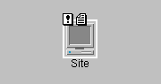
- Two secondary state icons can be displayed simultaneously as in the figure below:
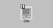
- When three or more secondary states are to be displayed, an Information icon replaces the secondary state icons as shown in the figure below:
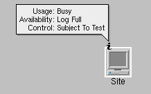
- This icon provides an interactor, used to expand an information box that provides a list of existing secondary states when you click with the left mouse button (see the following figure):NoteThis interactor is an object interactor. As such it is active only if the view interactor set to the view delegates events to object interactors. To have a view interactor delegate event processing to an object interactor, use the method setUsingObjectInteractor of the class IlpViewInteractor.
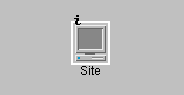
- Once the Information window is displayed, the rectangle that encompasses the Information icon becomes transparent and remains so until any new secondary state change is notified to the telecom object. After the Information window has been closed (by clicking on the Information icon with the left mouse button), the Information icon looks like this:
The display of a collection of secondary states is replaced with
the display of an information icon when there are more than a
threshold number of icons; the default is two icons. The
information window representation as well as the threshold number
of icons can be customized through CSS. For details on using CSS to
customize information windows, refer to the Styling
documentation.