Customizing network element types
Describes how the representation of a network element is customized graphically to indicate the network element type.

Describes how the network element type affects the rendering of the object.
Describes in detail the CSS properties that you can use to customize all network element types and various subsets of network element types.
Describes how to define new network element types with new representations without extending an existing base renderer class.
Describes how to find the best values for the parameters of the factory used to create a base renderer for a network element from an image.
Describes how to define new network element types with new representations without extending an existing base renderer class, by using SVG graphics.
Explains with an example how to create a new type of network element by extending the base class for the renderer.
Describes how to localize then name of the network element type in labels and tooltips in the resource bundle.
Representing a network element type
In Rogue Wave® JViews TGO, the type of the network element defines how the object base will be represented. Each network element type is associated with a specific base renderer that is in charge of drawing the object according to its type and state information.
In
JViews TGO, you can customize the behavior of the base renderer by using CSS. In addition, you can extend the base representation of graphic objects in two different ways, either by using a predefined base renderer factory class (
IltNEImageBaseRendererFactory or
IltNESVGBaseRendererFactory), or by implementing your own subclass of
IltNEBaseRenderer for each new type of network element that you want to create.
Customizing existing network element types
For details about the network element types and their graphic representation, refer to
Network elementsProperties for customizing all network element types
The following properties are common to all network element types:
CSS properties common to all network element types
Property Name | Type | Default Value | Description |
collapsed | boolean | false | Defines whether the object is displayed in its normal size or its reduced size. When the network element is shown in its reduced size, fewer decorations are displayed. In particular, there is no space for an alarm count on the base and an alarm balloon would hide secondary state icons. |
sizeRatio | IlvTransformer | null | A magnification of the node. |
tiny | boolean | false in network and equipment components true in tree and table components | Sets the network element base to its tiny representation. The tiny representation is used mainly in the Tree and Table components. |
logical | boolean | false | Sets the network element base to its logical representation. In the logical representation, all network element types are displayed in the same way using a rectangular shape. |
Mapped properties
The following properties are mapped, that is, their value is computed automatically by JViews TGO according to the states and alarms currently set in the object (column Set). You can however override the mapped values or customize their graphic representation even when the object does not carry states and alarms.
Mapped CSS properties
Property Name | Type | Set | Default Value | Description |
detailLevel | enum | Yes | MaximumDetails | Defines the level of detail to be used to draw the base. |
borderColor | Color | Yes | 10% gray | Denotes the primary color of the base border. |
borderColor2 | Color | Yes | 60% gray | Denotes the secondary color of the base border. |
borderWidth | float | Yes | 1 pixel | Denotes the width of the base border. |
reliefBorders | boolean | Yes | true | Denotes whether the base border is drawn in relief or not. |
borderLineStyle | float[] | Yes | null (Solid) | Denotes the line style used to draw the base border. |
borderPattern | Pattern | Yes | null | Denotes the pattern used to draw the base border. |
foreground | Color | Yes | 28% gray in the IltObject class style | Denotes the foreground color of the base. |
background | Color | Yes | Transparent ( null ) | Denotes the background color of the base. |
fillStyle | ilog.util.IlFillStyle | Network node except BTSEquipment | IlFillStyle.SOLID_COLOR for user-defined business objects IlFillStyle.PATTERN for predefined business objects | Denotes the style used to fill the base of an object. Possible values are: IlFillStyle.NO_FILL IlFillStyle.SOLID_COLOR IlFillStyle.LINEAR_GRADIENT IlFillStyle.RADIAL_GRADIENT IlFillStyle.TEXTURE IlFillStyle.PATTERN |
fillAngle | float | Network node except BTSEquipment | 0 | Denotes the angle (in degrees) of the gradient used to fill the base of an object. This property is only used if fillStyle is set to IlFillStyle.RADIAL_GRADIENT or IlFillStyle.LINEAR_GRADIENT |
fillEnd | float | Network node except BTSEquipment | 1f | Denotes the position where the gradient of an object ends, that is, where the color is the one defined by property background. This property is only used if fillStyle is set to IlFillStyle.RADIA_GRADIENT or IlFillStyle.LINEAR_GRADIENT |
fillStart | float | Network node except BTSEquipment | 0f | Denotes the position where the gradient of an object starts, that is, where the color is the one defined by property foreground. This property is only used if fillStyle is set to IlFillStyle.RADIA_GRADIENT or IlFillStyle.LINEAR_GRADIENT. |
fillTexture | Image | Network node except BTSEquipment | null | Denotes the texture used to fill the base of an object. This property is only used if fillStyle is set to IlFillStyle.TEXTURE. |
fillPattern | Pattern | Yes | null (Solid) | Denotes the pattern used to fill the base of an object. This property is only used if fillStyle is set to IlFillStyle.PATTERN. |
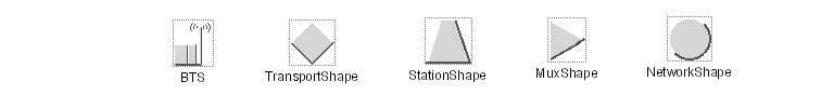
Properties for types with dotted borders
The following types ( IltNetworkElement.Type.xxx ) have dotted borders: BTS, TransportShape, StationShape, MuxShape, NetworkShape.
These types have a dotted border displayed around the main shape by default. The dotted border is configured through the properties listed in the following table.
CSS properties for dotted borders
Property Name | Type | Set | Default Value | Description |
dottedBorderForeground | Color | No | 53% gray in the IltObject class style | Denotes the foreground color used to display the extra border around the base. |
dottedBorderBackground | Color | No | Transparent (null) | Denotes the background color used to display the extra border around the base. |
dottedBorderLineStyle | float[] | No | "1,1" | Denotes the line style used to display the extra border around the base. |
Properties for mediation devices
The type IltNetworkElement.Type.MD determines the graphic representation of a mediation device in the form of a stylized shelf with five slots. It can be customized through the properties listed in the following table.
CSS properties for mediation devices
Property Name | Type | Set | Default Value | Description |
mdRedButtonColor | Color | No | 100% red 0% green 20% blue | When the network element is carrying traffic, two cards are drawn with colored buttons. This property denotes the color of the first buttons (which are red by default). |
mdGreenButtonColor | Color | No | 0% red 60% green 60% blue | When the network element is carrying traffic, two cards are drawn with colored buttons. This property denotes the color of the last buttons (which are green by default). |
mdShadowColor | Color | No | 53% gray | Denotes the color of the shadowed lines that are used to draw the slots that do not contain any card. |
Properties for servers
The type IltNetworkElement.Type.Server determines the graphic representation of a server in the form of a stylized equipment unit with a colored button and a vent grid. It can be customized through the properties listed in the following table.
CSS properties for servers
Property Name | Type | Set | Default Value | Description |
serverButtonColor | Color | No | 100% blue | Defines the color of the server button. |
serverGridColor | Color | No | 10% gray | Defines the color of the server grid. |
Properties for network management workstations
The type IltNetworkElement.Type.NMW determines the graphical representation of a network management workstation in the form of a stylized workstation. It can be customized through the properties listed in the following table.
CSS properties for network management workstations
Property Name | Type | Set | Default Value | Description |
nmwScreenColor | Color | Yes | 67% gray | When the network element is carrying traffic, the screen of the workstation is colored with a different shade of gray, which is determined by the value of this property. If the network element holds new alarms, this property is set by JViews TGO. |
nmwButtonColor | Color | No | 0% red 60% green 60% blue | Denotes the color of the button that is drawn on the central unit of the workstation. |
Property for Base Station Controllers
The type IltNetworkElement.Type.BSC determines the graphical representation of a wireless Base Station Controller (BSC). It can be customized through the property in the following table.
CSS property for BSC equipment
Property Name | Type | Set | Default Value | Description |
bscActiveBorderWidth | int | No | 1 pixel | Denotes the border width that is used when the element is carrying traffic. This type uses a different border width than the value specified by activeBorderWidth, as activeBorderWidth is designed for “large” representations, such as the generic square chicklet or geometric shapes, whereas the BSC representation uses thinner lines. |
Property for Mobile Switching Center
The type IltNetworkElement.Type.MSC determines the graphic representation of a Mobile Switching Center (MSC). It can be customized through the following property.
CSS property for MSC equipment
Property Name | Type | Set | Default Value | Description |
mscActiveBorderWidth | int | No | 1 pixel | Denotes the border width that is used when the element is carrying traffic. This type uses a different border width than the value specified by activeBorderWidth, as activeBorderWidth is designed for “large” representations, such as the generic square chicklet or geometric shapes, whereas the MSC representation uses thinner lines. |
Property for Base Transceiver Stations
The type IltNetworkElement.Type.BTS determines the graphical representation of a Base Transceiver Station (BTS). It can be customized through the property listed in the following table.
CSS property for a BTS object
Property Name | Type | Set | Default Value | Description |
btsActiveBorderWidth | int | No | 1 pixel | Denotes the border width that is used when the element is carrying traffic. This type uses a different border width than the value specified by activeBorderWidth, as activeBorderWidth is designed for “large” representations, such as the generic square chicklet or geometric shapes, whereas the BTS representation uses thinner lines. |
Properties for Base Transceiver Station equipment
The type IltNetworkElement.Type.BTSEquipment determines the graphical representation of the BTS equipment that is part of a BTS object. It can be customized through the following properties.
CSS properties for a BTS equipment
Property Name | Type | Default Value | Description |
antialiasing | boolean | true | Defines whether the object is displayed with sharp and neat lines. |
btsEquipmentRadius | int | 10 | Defines the radius of the BTS equipment. |
Creating network element types from images and customizing them
JViews TGO provides a base renderer factory class,
IltNEImageBaseRendererFactory, that simply requires an image from which it will automatically compute all the representations that a network element can have according to the state it is in (out of service, in service carrying traffic, in service carrying no traffic, or not installed) or the alarms it raises. See
States.
How to create a new type of network element from an image (using the API)
To create a new type of network element using an image:
Create a new type of network element with the following code:
IltNetworkElement.Type myNewType =
new IltNetworkElement.Type(YOUR_NEW_TYPE_NAME);
Create the image corresponding to the base style Carrying Traffic without any alarm and instantiate an
IltNEImageBaseRendererFactory using this image:
IltNEImageBaseRendererFactory factory = new
IltNEImageBaseRendererFactory(image, YOUR_IMAGE_PARAMETERS);
Map the factory with the new type using
SetValue:
IltSettings.SetValue("NetworkElement.Type.YOUR_NEW_TYPE_NAME.Renderer",facto
ry);
How to create a new type of network element from an image (using CSS)
You can create new network element types using global CSS settings as shown in the following example.
setting."ilog.tgo.model.IltNetworkElement"{
types[0]: @+neType0;
}
Subobject#neType0 {
class: 'ilog.tgo.model.IltNetworkElement.Type';
name: "YOUR_NEW_TYPE_NAME";
}
See
Using global settings for more information.
How to customize a network element renderer (using CSS)
You can customize the renderer for the network element type using global CSS settings. To do so, you need to specify the full path to the object to be customized, as well as the value of its name attribute in order to match the right type of object in the system. The CSS property to customize is renderer as shown in the following example.
setting."ilog.tgo.model.IltNetworkElement.Type"[name=YOUR_NEW_TYPE_NAME] {
renderer: @+neRendererFactory0;
}
Subobject#neRendererFactory0 {
class: 'MyNERendererFactory';
}
In this example, the name of the renderer factory class that is included in the search path is MyNERendererFactory.
Starting from an original image of type java.awt.Image corresponding to the Carrying Traffic base style without any alarm, JViews TGO automatically processes the range of representations corresponding to other states and alarms.
Suppose that you want to define a new network element with the following representation for the base style Carrying Traffic with no alarms.
Sample new network element
To define this new network element representation, all you have to do is instantiate an
IltNEImageBaseRendererFactory and provide the bitmap image as an argument to its constructor.
JViews TGO automatically computes the various representations that this network element can have according to its associated state and alarms.
The first constructor has four arguments and enables you to customize the way the different representations are computed.
The first parameter is of type java.awt.Image. It is the original image used to compute all other representations.
The first and the second int are thresholds indicating which part of the original image should be considered as details and drawn in the dark color. The third int is the gray level that should be mapped to the normal alarm color.
The second constructor has the same parameters as the first one and an additional boolean parameter that indicates whether an additional dotted border should be drawn around the base.
The third constructor has only one argument, which is the
java.awt.Image that should be used to compute the different representations of the new type. It calls the constructor with four arguments, with the image and 200 as the threshold for bright colors, 50 as the threshold for dark colors, and 128 as the gray level to be mapped to the normal alarm color.
The following figure presents the four base styles (rows) with their various representations corresponding to alarms of different severity and loss of connectivity (columns).
Sample Instantiations of New Network Elements
How to create a new type of network element using one image per base style
Another way to represent a type with an image is to specify a source image and an alarm color level parameter for every required base style, directly in CSS. No other base style property or renderer parameter is needed, as a complete image is provided for every required base style.
To create a new type of network element using an image per base style:
Create a new type of network element
Using the API:
IltNetworkElement.Type myNewType = new
IltNetworkElement.Type(YOUR_NEW_TYPE_NAME);
or, using global CSS settings:
setting."ilog.tgo.model.IltNetworkElement" {
types[0]: @+neType0;
}
Subobject#neType0 {
class: 'ilog.tgo.model.IltNetworkElement.Type';
name: YOUR_NEW_TYPE_NAME;
}
IltSettings.SetValue("NetworkElement.Type.YOUR_NEW_TYPE_NAME.Renderer", new
IltNEDirectImageBaseRendererFactory());
or, using global CSS settings:
setting."ilog.tgo.model.IltNetworkElement.Type"[name=YOUR_NEW_TYPE_NAME] {
renderer: @+neRendererFactory;
}
Subobject#neRendererFactory {
class: 'ilog.tgo.graphic.renderer.IltNEDirectImageBaseRendererFactory';
}
Define an image and an alarm color or gray-level parameter in CSS for each required base style
object."ilog.tgo.model.IltNetworkElement"["type"=YOUR_NEW_TYPE_NAME]["object
State.Bellcore.State"=EnabledActive] {
sourceImage: '@|image("newType_enabledActive.png")';
alarmColorLevel: 128;
}
object."ilog.tgo.model.IltNetworkElement"["type"=YOUR_NEW_TYPE_NAME]["object
State.Bellcore.State"=DisabledActive] {
sourceImage: '@|image("newType_disabledActive.png")';
alarmColorLevel: 140;
}
How to define a network element type from an image
If the base style is Carrying Traffic no alarms, the representation is the original image.
Sample original image
In all other cases, the representation is automatically computed by JViews TGO, as follows:
Carrying Traffic with alarms: A color scale corresponding to the alarm color is applied to the original image. This color scale uses three colors: a bright alarm color, a normal alarm color, and a dark alarm color.
For example, for a major alarm JViews TGO uses the colors bright red, red, and dark red. The color scale is applied to the original image by first converting it to a normalized gray-scale image (that is, gray levels in the range 0 - 255). Then, the normalized gray-scale image is colored by mapping each gray level to a color level. The brighter gray is mapped to the bright alarm color, the darker gray is mapped to the dark alarm color, and the gray level corresponding to the third integer in the factory constructor is mapped to the normal alarm color (if this integer is not explicitly given, the default value used is 128). Any other gray level different from the brighter one, the darker one, or the one given in the factory constructor is mapped to the appropriate color in a continuous manner.
Sample with Color
No Traffic (with or without alarms): The original image, which is supposed to be a relief image (according to the
JViews TGO look-and-feel), is transformed to a flat image. The flat image is composed of only two colors: in the absence of alarms, one gray and one darker gray, otherwise one alarm color and one dark alarm color. Using only two colors ensures a flat visual aspect. To follow the
JViews TGO look-and-feel, the whole object should be represented in the normal color with its border in the dark color, plus possibly some details of the inside of the object also in the dark color. For example, the figure shows that the border is in the dark color as well as the outline of the small screen and the receiver of the telephone. To indicate which details of the original image you want in the dark color and which you do not, you must use the first two integers of the factory constructor. The first integer indicates a threshold above which the bright colors of the original image should be considered as details and drawn in the dark color; if this integer is not explicitly given, the default value used will be 200. For example,
Sample Dark and Light Colors shows examples where the threshold assumed is 200 (in the range 0 - 255). In this way, the left border of the receiver and the lower right border of the screen are drawn in the dark color. The second integer is a threshold indicating which of the dark colors of the original image should be considered as details and also drawn in the dark color; if this integer is not explicitly provided, the default value will be 50. For example, in
Sample Dark and Light Colors we indicate that this threshold is 11 (in the range 0 - 255). This causes the lower right border of the receiver and the upper left border of the screen to be drawn in the dark color.
Sample Dark and Light Colors
Out of Service and Not Installed (with or without alarms): According to the Rogue Wave®
JViews TGO look-and-feel, the object should be represented with only two colors, a dashed border and a pattern inside, but no other details.
JViews TGO uses the transparency, if any, to determine the border of the image. When there is no transparency, the rectangle of the image is considered to be the border. Then, the interior is filled with the appropriate pattern and the border is drawn as a dashed line.
JViews TGO does not need any extra parameters (threshold or gray level as mentioned above) to compute these representations correctly.
Sample Representations
Note that
JViews TGO provides the
imagecolortuner application to help you find the best values for the thresholds and the gray level. For details, see
Using the imagecolortuner application to configure the renderer factory.
For the
IltNEImageBaseRendererFactory class to process the supported image types (GIF, PNG and JPG) correctly, the only constraint on the image itself is that the number of colors,
C, be as follows:
2 <= C <= 256
The
IltNEImageBaseRendererFactory class preserves transparency, so transparency is not considered a color. Consequently,
IltNEImageBaseRendererFactory does not color the transparent pixels of the image. For example, an image that contains the color black as the foreground color, and transparency as the background, will not have the regular coloring scheme applied as it fails to meet the constraint on the number of colors.
Using the imagecolortuner application to configure the renderer factory
The
imagecolortuner application can be found in
<installdir>/samples/framework/imagecolortuner where
<installdir> is the directory where you have installed
JViews TGO. This utility enables you to find the best values for the parameters of
IltNEImageBaseRendererFactory quickly and easily.
To set the parameters:
1. Click File>Load Image to load your image.
2. Customize the
Carrying Traffic with alarm representations. You have to choose the gray level that will be mapped to the normal alarm color. For details see
Creating network element types from images and customizing them. To do so, you can either display the tab called
Row 1 and use the slider or click in the zoomed view on a pixel that has the color you want to be mapped to the normal alarm color.
3. Customize the
No Traffic representation. You have to indicate which details of your original image should have the dark color. For details see
Creating network element types from images and customizing them. To do so, display the tab called
Row 2 and adjust the two sliders. The first slider adjusts the threshold for bright colors: colors of the original image brighter than this threshold will be displayed in the appropriate dark color depending on the state and alarms. The second slider adjusts the threshold for dark colors: colors of the original image darker than this threshold will also be displayed in the appropriate dark color depending on the state and alarms.
4. Click File>View Source to display the sample source code. The source code needed to create your new type as it is currently represented on screen is displayed. The factory constructor contains the appropriate values.
You can create your new type by noting or copying the parameter values or the entire code and pasting it into your JViews TGO application.
Customizing network element types from SVG graphics
How to create a new type of network element from an SVG file (using the API)
JViews TGO provides a base renderer factory class,
IltNESVGBaseRendererFactory, that simply requires an SVG input file. When using SVG input files, all the possible representations of a network element (according to the state) are mapped to the same SVG graphic.
To create a new type of network element using SVG:
Create a new type of network element with the following code:
IltNetworkElement.Type myNewType = new
IltNetworkElement.Type(YOUR_NEW_TYPE_NAME);
Create the SVG file corresponding to the network element representation and instantiate an
IltNESVGBaseRendererFactory using this file:
URL url = new URL("file","",YOUR_SVG_FILE_NAME);
IltNESVGBaseRendererFactory factory = new IltNESVGBaseRendererFactory(url);
Map the factory with the new type using
SetValue:
IltSettings.SetValue("NetworkElement.Type.YOUR_NEW_TYPE_NAME.Renderer",
factory );
How to create a new type of network element from an SVG file (using CSS)
You can create new network element types by using global CSS settings.
setting."ilog.tgo.model.IltNetworkElement"{
types[0]: @+neType0;
}
Subobject#neType0 {
class: 'ilog.tgo.model.IltNetworkElement.Type';
name: "YOUR_NEW_TYPE_NAME";
}
For more information, see
Using global settings.
How to customize a renderer for a network element type (using CSS)
You can customize the renderer for the network element type using global CSS settings. To do so, you need to specify the full path to the object to be customized, as well as the value of its name attribute in order to match the right type of object in the system. The CSS property to customize here is renderer. In the example below, the name of the renderer factory class that is included in the search path is MyNESVGRendererFactory.
setting."ilog.tgo.model.IltNetworkElement.Type"[name=YOUR_NEW_TYPE_NAME] {
renderer: @+neSVGRendererFactory0;
}
Subobject#neSVGRendererFactory0 {
class: 'MyNESVGRendererFactory';
}
Extending the class IltNEBaseRenderer
Drawing principles
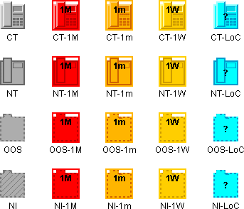
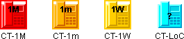
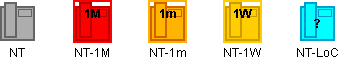
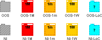
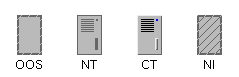
The base of a network element has four different visual aspects, each corresponding to one of the following fundamental states:
Out Of Service (OOS)
The base has a hatched outline. Inside the base, drawings are not displayed.
In service, carrying No Traffic (NT)
The base and its inside drawings are in full outline.
In service, Carrying Traffic (CT)
The base and its inside drawings are in relief.
Not Installed (NI)
The base is striped and has a hatched outline. Inside the base, drawings are not displayed. This is a special case where the base drawing changes when a secondary state is represented.
These fundamental states are enumerated in the class
IltBaseStyle.
The drawings representing the network element base are specified in a single class that inherits from
IltNEBaseRenderer. The four visual aspects of the base are drawn using the
drawMain method to draw the base and additional methods to access the resources used to draw the base.To create new vector drawings for network elements, you have to extend the
IltNEBaseRenderer class and override the methods
drawMain and
getPreferredSize.
Once the class is created, you must tell
JViews TGO how to use it to draw a network element of a particular type. To do so, you must create a new
IltNetworkElement.Type., add it to the existing types, and associate it with the drawing class using the mapping function
SetValue or global CSS settings.
How to extend a network element
This example illustrates how to define a new type of network element called Server. You add myServer to the existing types ( NE, MD, NMW, BTS, and so on).
The four graphic states that the new network element type can have are illustrated in
The Server graphic states.
The Server graphic states
When you extend the class
IltNEBaseRenderer, you must create the drawing class and define its basic methods and the
drawMain method.
The following code shows how to write a class
ServerBaseRenderer that extends
IltNEBaseRenderer and redefine its method
getPreferredSize. This class will be enhanced later on to draw the
Server element base.
static class ServerBaseRenderer extends IltNEBaseRenderer {
private static Dimension NormalSize = new Dimension(25,40);
private static Dimension SmallSize = new Dimension(13,21);
public Dimension getPreferredSize (boolean collapsed) {
if (collapsed)
return SmallSize;
else
return NormalSize;
}
}
The two fields NormalSize and SmallSize define the normal dimension of the base and its dimension when it is collapsed. Calling getPreferredSize returns the current size of the base.
The following fields are added to initialize numbers that are used to draw the base. Since there is only one method to draw both collapsed and expanded bases, these numbers ease the readability of the code.
// Some factors for drawing:
private static final float _XGrid = 4.0f / 25.0f;
private static final float _YGrid = 4.0f / 40.0f;
private static final float _WGrid = 13.0f / 25.0f;
private static final float _HGrid = 1.0f / 40.0f;
private static final float _VStepGrid = 2.0f / 40.0f;
private static final float _XButton = 19.0f / 25.0f;
private static final float _YButton = 4.0f / 40.0f;
private static final float _WButton = 2.0f / 25.0f;
private static final float _HButton = 2.0f / 40.0f;
private static final float _XDisk = 18.0f / 25.0f;
private static final float _YDisk = 23.0f / 40.0f;
private static final float _WDisk = 3.0f / 25.0f;
private static final float _HDisk = 12.0f / 40.0f;
Standard palettes
The class
IltNEBaseRenderer provides three standard drawing palettes that you can access easily with the methods
getPalette,
getBrightPalette, and
getDarkPalette.
getPalette returns the ordinary palette, commonly used to draw the face part.
getBrightPalette returns the palette used to draw the bright parts of a 3D border.
getDarkPalette returns the palette used to draw the ordinary border, and the dark parts of a 3D border.
These palettes automatically take into account the semantic state of the associated
IltNetworkElement when changing colors. For example, when a new alarm is set to an object the ordinary palette may become red instead of grey.
How to initialize and use new palettes
It is necessary to define new palettes when the base drawings include elements that are not represented in the standard palettes. These palettes are initialized in the
initResources method and used in the
drawMain method.
In the following code, the new palettes are declared as fields and initialized in
initResources.
private static Color GridColor =
IltrColor.NewColor("server grid color", IltrColor._90PctGrey);
private static Color ButtonColor =
IltrColor.NewColor("server button color", Color.blue);
private Ilt2DPalette GridPalette;
private Ilt2DPalette ButtonPalette;
protected void initResources () {
super.initResources();
GridPalette = Ilt2DPalette.NewSimple2DPalette(GridColor);
ButtonPalette = Ilt2DPalette.NewSimple2DPalette(ButtonColor);
}
How to define the main drawing method
The programming principle for the
drawMain method is similar to the
draw method of an
IlvGraphic object. The method receives a graphic to draw with, a transformer linked to the associated view, and an
IlvRect object that gives the size and position of the base.
The following code shows the beginning of the
drawMain function.
public void drawMain (Graphics g, IlvTransformer t, IlvRect rect) {
// Get the corners of the base rectangle.
int x1 = (int)rect.x;
int y1 = (int)rect.y;
int x2 = x1 + (int)rect.width-1;
int y2 = y1 + (int)rect.height-1;
// Get the state dependent parameters.
IltDetailLevel detailLevel = getDetailLevel();
Ilt2DPalette palette = getPalette();
Ilt2DPalette brightPalette = getBrightPalette();
Ilt2DPalette darkPalette = getDarkPalette();
int borderThickness = getBorderThickness();
In this code, there are the position of the base, its style (OOS, NT, CT or NI—see
The Server graphic states), and the standard palettes.
How to draw the base of a new type of network element
You can start drawing with
IltGraphicUtil, a collection of graphic functions that simplify the drawing of common shapes.
The following code starts drawing the base.
if (x1<=x2 && y1<=y2) {
IltGraphicUtil.FillRect(g,t,x1,y1,x2,y2,palette);
// Paint the border
if (detailLevel.equals(IltDetailLevel.MaximumDetails)) {
if (rect.width < 20 && borderThickness > 1)
IltGraphicUtil.DrawReliefRect (g,t,x1,y1,x2,y2,
brightPalette, darkPalette,
borderThickness);
else {
IltGraphicUtil.DrawRect(g,t,x1,y1,x2,y2,
darkPalette,
borderThickness);
}
The code has to manage the four different styles of the base, so the border thickness is taken into account to get drawings that look nice. The rest of the
drawMain method must also manage the different styles and the two different dimensions of the base.
// Paint the grid, button and disk.
if (detailLevel.equals(IltDetailLevel.MaximumDetails)
|| detailLevel.equals(IltDetailLevel.FewDetails)){
// Grid, button and disk dimensions.
final int gridWidth = Math.round(rect.width * _WGrid);
final int gridHeight = Math.round(rect.height * _HGrid);
final int buttonWidth = Math.round(rect.width * _WButton);
final int buttonHeight = Math.round(rect.height * _HButton);
final int diskWidth = Math.round(rect.width * _WDisk);
final int diskHeight = Math.round(rect.height * _HDisk);
// Grid rectangle corners.
final int gx1 = x1 + Math.round(rect.width * _XGrid);
int gy1 = y1 + Math.round(rect.height * _YGrid);
final int gx2 = gx1 + gridWidth-1;
int gy2 = gy1 + gridHeight-1;
final int gvstep = Math.round(rect.height * _VStepGrid);
// Button rectangle corners.
final int bx1 = x1 + Math.round(rect.width * _XButton);
final int by1 = y1 + Math.round(rect.height * _YButton);
final int bx2 = bx1 + buttonWidth-1;
final int by2 = by1 + buttonHeight-1;
// Disk rectangle corners.
final int dx1 = x1 + Math.round(rect.width * _XDisk);
final int dy1 = y1 + Math.round(rect.height * _YDisk);
final int dx2 = dx1 + diskWidth-1;
final int dy2 = dy1 + diskHeight-1;
// Grid and button colors.
final Ilt2DPalette gridPalette =
(detailLevel.equals(IltDetailLevel.FewDetails) ? darkPalette
: GridPalette);
final Ilt2DPalette buttonPalette =
(detailLevel.equals(IltDetailLevel.FewDetails) ? darkPalette
: ButtonPalette);
// Paint the grid.
if (gvstep > 1) {
for (int i = 0; i < 7; i++) {
IltGraphicUtil._FillRect(g,t, gx1,gy1,gx2,gy2, gridPalette);
gy1 += gvstep; gy2 += gvstep;
}
} else if (gvstep == 1) {
// Paint a grey rectangle instead of the grid.
Color rectColor = palette.getForeground();
Color gridColor = gridPalette.getForeground();
Color greyColor =
new Color((rectColor.getRed()+gridColor.getRed())/2,
(rectColor.getGreen()+gridColor.getGreen())/2,
(rectColor.getBlue()+gridColor.getBlue())/2);
Ilt2DPalette greyPalette =
Ilt2DPalette.NewSimple2DPalette(greyColor);
IltGraphicUtil._FillRect(g,t, gx1,gy1,gx2,gy2+6*gvstep,
greyPalette);
}
// Paint the button.
IltGraphicUtil._FillRect(g,t, bx1,by1,bx2,by2, buttonPalette);
// Paint the disk.
if (detailLevel.equals(IltDetailLevel.FewDetails)) {
IltGraphicUtil._FillRect(g,t, dx1,dy1,dx2,dy2, darkPalette);
} else {
IltGraphicUtil._FillRect(g,t, dx1,dy1,dx2,dy2, palette);
IltGraphicUtil.DrawReliefRect(g,t, dx1,dy1,dx2,dy2,
brightPalette,darkPalette,
1);
}
The method
drawExtraBorders is the standard method used in this example.
How to implement a method for drawing a rectangular base
If the object that you want to draw is not a rectangle, but a telephone for example, you must override this method to get a selection border that is tightly drawn around the base.
The following code shows the default implementation used for a rectangular base.
protected void drawExtraBorders (Graphics g, IlvTransformer t, IlvRect rect) {
{ // Draw the alarm border, if needed according to the state.
Color c = getAlarmBorderColor();
if (c != null)
drawExtraBorder(g,t,rect,c,0,IltrThickness.AlarmBorderThickness);
}
{ // Draw the selection border, if the object is currently selected.
Color c = getSelectionBorderForeground();
if (c != null)
drawExtraBorder(g,t,rect,c,IltrThickness.AlarmBorderThickness,
IltrThickness.SelectionBorderThickness);
}
}
How to create and register a network element type (using the API)
If you run the sample program, the main file creates and registers a network element of type server.
static IltNetworkElement.Type Server = new IltNetworkElement.Type("Server");
static {
IltSettings.SetValue("NetworkElement.Type.Server.Renderer",
new IltBaseRendererFactory() {
public IltBaseRenderer createValue() {
return new ServerBaseRenderer();
}
}
);
}
IltDefaultDataSource dataSource = new IltDefaultDataSource();
IltNetworkElement ne = new IltNetworkElement
("NE", Server, new IltOSIObjectState());
ne.setAttributeValue(IltObject.PositionAttribute, new IlpPoint(100,100));
dataSource.addObject(ne);
IlpNetwork network = new IlpNetwork();
network.setDataSource(dataSource);
How to create and register a network element type (using CSS)
You can create the new network element type using global CSS settings instead of the API, as follows.
setting."ilog.tgo.model.IltNetworkElement"{
types[0]: @+neType0;
}
Subobject#neType0 {
class: 'ilog.tgo.model.IltNetworkElement.Type';
name: "Server";
}
To customize the renderer using global CSS settings, you need first to create a renderer factory class and make sure it is included in the search path.
public class MyNERendererFactory implements IltBaseRendererFactory {
public IltBaseRenderer createValue() {
return new ServerBaseRenderer();
}
}
Then you can customize the renderer in CSS as follows:
setting."ilog.tgo.model.IltNetworkElement.Type"[name="Server"] {
renderer: @+neRendererFactory0;
}
Subobject#neRendererFactory0 {
class: 'MyNERendererFactory';
}
As illustrated in this example, you can create a network element with a specific type or set a type for it afterwards with either one of two methods.
ne.setType (Server);
or
ne.setAttributeValue (IltNetworkElement.TypeAttribute, Server);
Localizing network element types
In JViews TGO, the network element type defines how the object base will be represented. You may also be interested in displaying the name of the network element type in your application, for example, as a label in a table cell or as a tooltip.
All the predefined network element types have labels and tooltips specified in the
JViews TGO resource bundle. See
About globalization.
The resources that apply to network element types are identified as:
ilog.tgo.NetworkElement_Type_<TYPE NAME> : network element type labels
ilog.tgo.NetworkElement_Type_<TYPE NAME>_ToolTip : network element type tooltips
You can edit the values directly in the JViews TGO resource bundle file.
When you create new network element types, the label and tooltip information will also be retrieved from this resource bundle to be displayed, for example, in a table cell. As you create new network element types, register the corresponding entries into the resource bundle file, as follows.
Suppose that you have created the following new network element type:
IltNetworkElement.Type myNewType = new IltNetworkElement.Type("MyType");
You should declare the following properties in the JTGOMessages.properties file:
ilog.tgo.NetworkElement_Type_MyType=My Type ilog.tgo.NetworkElement_Type_MyType_ToolTip=My New Network Element Type
Copyright © 2018, Rogue Wave Software, Inc. All Rights Reserved.