The JViews Maps JSF component set
Presents some examples to illustrate how to use JViews Maps JSF components.

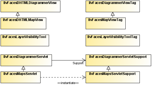
Shows the class relationships of the JSF component set.
Explains how to create various types of simple views.
Explains how to use the
JViews Maps JSF Google™ View component to display a Google™ Map in a page.
Describes using Google Maps JavaScript API V3.
Explains how to control the visible area of a view and how to reset or change it.
Explains zoom factors and the constraints on zooming and panning.
Explains fixed and dynamic zoom layers.
Explains how to enable progressive zooming by assigning values to the
progressiveZoom attribute.
Explains how to set a tile size and other attributes in order to use tiling in a view.
Describes how to use the
visibleLayers property to specify the manager layers displayed by a view.
Explains how to add an image map to an image on the client side.
Explains how to add a pop-up menu.
Explains how to use CSS classes to set pop-up menu properties for styling purposes.
Explains how to add a legend.
Shows how to connect a message box to your diagram.
Shows how to add an overview to display the global area and a rectangle that corresponds to the visible area in the main view.
Shows how to add a pan tool or zoom tool to the view to allow panning and zooming.
Describes the use of interactors for multiple purposes.
Describes how to use server-side caching with a tiled view.
Explains how to implement and configure server action listeners.
Explains how to implement and configure intercept interactors.
Describes the implications of session expiration and how to keep a user session alive when it is about to expire.
Presents the map view as a JViews Diagrammer view.
Shows how to configure the content of a map view.
Shows how to configure the style and data source of a diagram component by setting a Designer project.
Shows how to connect a data source component to the diagram.
Shows how to customize the way the data source is displayed using Cascading Style Sheets (CSS).
Shows how to install an interactor on the view to interact with it.
Describes the select interactor, used to select one or more objects and move them without performing a full screen refresh.
Describes tooltip and highlight interactors.
Shows how to create nodes and links on the view.
Shows how to delete selected nodes and links on the view.
Describes the resize interactor used to resize a selected node.
Describes the link interactor used to edit a selected link.
Shows how to add a dashboard component to the view.
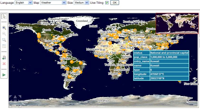
Overview
The following figure shows the class relationships of the JViews Maps JSF component set.
JViews Maps JSF component set
Creating simple views
The view component is the central component of a JViews JSF application. All the other components depend on or interact with this view. The first and simplest page that can be made with a JViews JSF component is an empty view.
Creating a map view
The map view extends the diagram view, so the common overview, zoom tool, pan tool, and interactor components are compatible.
Creating an empty view
To specify an empty view:
<jvmf:mapView style="width:500px; height:300px;" />
This produces a 500 by 300 pixel view.
Declaring the namespace
The namespace jvmf (for JViews Maps JSF) must be declared in the page.
<%@ taglib
uri="http://www.ilog.com/jviews/tlds/jviews-maps-faces.tld
prefix="jvmf" %>
Using the width and height attributes
Using the style to specify the size of the component is preferable, but an alternative is to use the width and height attributes.
<jvmf:mapView width="500" height="500" />
Creating a diagram view
The diagram view extends the common view so the common overview, zoom tool, pan tool, and interactor components are compatible.
Creating an empty view
To specify an empty view:
<jvdf:diagrammerView style="width:500px; height:300px;" />
This produces a 500 by 300 pixel view.
Declaring the namespace
The namespace jvdf (for JViews DiagrammerJSF) must be declared in the page as follows:
<%@ taglib
uri="http://www.ilog.com/jviews/tlds/jviews-diagrammer-faces.tld"
prefix="jvdf" %>
Using the width and height attributes
Using the style to specify the size of the component is preferable, but an alternative is to use the width and height attributes.
<jvdf:diagrammerView width="500" height="500" />
Creating a view with JViews Framework
This view can be extended to make more specific components.
Creating an empty view
Specify an empty view.
<jvf:view style="width:500px; height:300px;" />
This produces a 500 by 300 pixel view.
Declaring the namespace
The namespace jvf (for JViews Framework JSF) must be declared in the page as follows:
<%@ taglib
uri="http://www.ilog.com/jviews/tlds/jviews-framework-faces.tld"
prefix="jvf" %>
Using the width and height attributes
Using the style to specify the size of the component is preferable, but an alternative is to use the width and height attributes.
<jvf:view width="500" height="500" />
Creating a Google Maps view
A simple page that can be made with the JViews Maps Faces Google™ View component is to display a Google™ Map in the page.
Creating a simple Google Maps view
<jvmf:googleView style="width:500 px; height:300 px;" level="6" lon="-100" lat="40"
key="myGoogleMapKey"/>
This produces a 500 by 300 pixel view, centered on 40°N 100°W, at a zoom level of 7.
Declaring the namespace
The namespace jvmf (for JViews Maps Faces) must be declared in the page:
<%@ taglib
uri="http://www.ilog.com/jviews/tlds/jviews-maps-faces.tld
prefix="jvmf" %>
The Google View component makes use of the Google Maps API (client side). The Google key provided in the component should contain a valid application key in order to allow the component to display on any server (apart from the localhost). To retrieve that key, you need to access
http://code.google.com/apis/maps/signup.html, ““Sign Up for the Google Maps API”” and register your key before using the JViews Google Maps component.
An alternative to specifying the size of the component is to use the width and height attributes, but using the style is preferable.
Using the Width and Height attributes
<jvmf:googleView width="500" height="300" level="6" lon="-100" lat="40"
key="myGoogleMapKey"/>
NOTE In some environments, for example those that use PPR (Partial Page Refresh), you may have to register the key in a separate statement, and not use it in the component tag itself.
Pre-declaring the Google Maps key in Trinidad
For example, in Trinidad:
<trh:script source="http://maps.google.com/maps?file=api&v=2&2=mykey" />
...
<tr:showDetailItem text="Background map">
<jvmf:googleView id="mapID" level="7" style="width:500px;height:300px" data="/data/world.ivl" />
</tr:showDetailItem>
The overview, zoom tool, pan tool, and interactors common component are not compatible with this view, but are provided through the use of Google Maps Controls. You can select the controls to display with the
controls attribute (see
http://code.google.com/apis/maps/documentation/controls.html).
The main use of this JSF component is to overlay JViews map layers, symbols and links on a Google Maps background. This can be done through the data attribute. In this case, the lat and lon attributes are not longer necessary - The Google map component is, by default, centered on the JViews data.
You can also indicate that you allow the user to move the overlaid symbols with the nodeMovable attribute. If this flag is set, each interaction of the user affects the server side location of symbols, effectively modifying their location.
Using JViews map layers and Google Maps controls
<jvmf:googleView id="gmapID"
key="some Google Maps Key"
style="width:500px;height:500px" data="/data/usa.idpr"
controls="GLargeMapControl,GOverviewMapControl" nodeMovable="true"
level="7" />
The only other JViews component that can be used in relation with the Google Maps view is the legend tool. This allows the user to select which overlaid layers are visible. All the other JViews interactors and dependent views have no effect.
Using JViews map layers tool with a Google Maps view
<jvmf:layerTool id="layerTool" title="Google View Layers" viewId="gmapID"
enabled="true" />
Google Maps JavaScript API V3 support
In earlier versions of JViews
jvmf:googleView only worked with Google™ Maps JavaScript API V2. (For more information about JavaScript API V2, see
http://code.google.com/intl/fr-FR/apis/maps/documentation/javascript/v2/). In JViews V8.8 or later
jvmf:googleView works with both Google Maps JavaScript API V2 and V3. (For more information about JavaScript API V3, see
http://code.google.com/intl/fr-FR/apis/maps/documentation/javascript/).
To choose the version of Google Maps JavaScript API, jvmf:googleView has a property called apiVersion. The default value of this property is v2 to maintain compatibility with earlier versions. To use V3 of the API, you can specify v3 in the apiVersion property as shown in the following example:
<jvmf:googleView apiVersion="v3" .... />
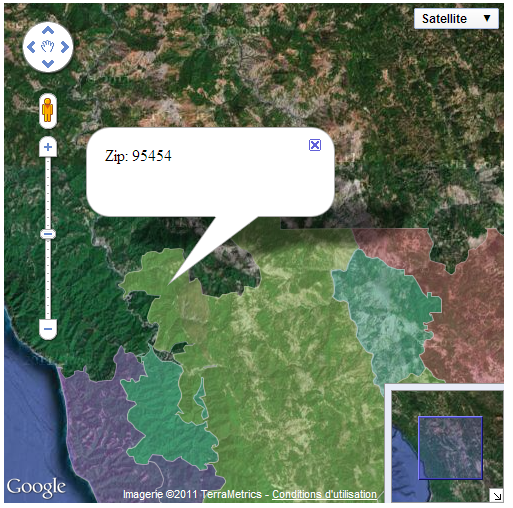
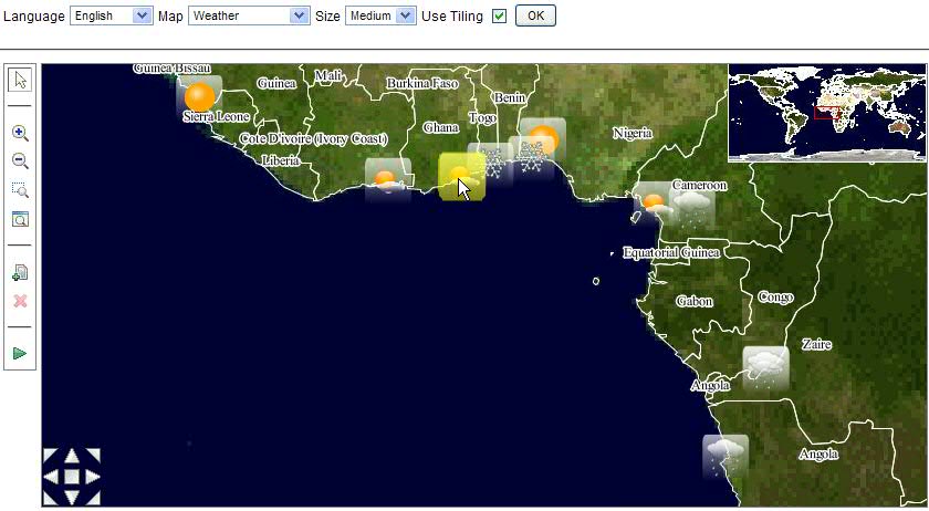
When you choose to use Google Maps JavaScript API V3, you have the ability to show tooltips when you hover over JViews static map layers as shown in the following figure.
Google Map with tooltip displayed
With Google Maps JavaScript API V2, you must specify a key in jvmf:googleView. With V3 (JViews 8.8 or later) this key is no longer necessary.
Note that the controls property has a different syntax depending on the Google Maps JavaScript API version that you have chosen.
Controlling the display of the view
The boundingBox property specifies the area in manager coordinates represented by the view. This property can be used to set the initial visible area.
The changeBoundingBox property can be used during a JSF action to reset or modify the visible area.
JViews Maps
This section shows the use of the boundingBox and changeBoundingBox properties.
Setting the initial visible area of the view
The following code example shows how to control the initial display of the view.
<jvmf:mapView [...] boundingBox="0,0,100,200"/>
Resetting or changing the visible area of the view
The following code example shows how to reset or change the visible area of the view.
This code will only work in the JSF_CONTEXT (and not in the IMAGE_SERVLET_CONTEXT ), since it requires the JSF cycle to refresh the whole page.
public class MapBean {
[...]
public void changeBoundingBox() {
IlvFacesMapsView jsfView = getJSFViewComponent();
jsfView.setBoundingBox(new IlvRect(0,0,100,100));
}
}
JViews Diagrammer
This section shows the use of the boundingBox and changeBoundingBox properties.
Setting the initial visible area of the view
The following code example shows how to control the initial display of the view.
<jvdf:diagrammerView [...] boundingBox="0,0,100,200"/>
Resetting or changing the visible area of the view
The following code example shows how to reset or change the visible area of the view.
This code will only work in the JSF_CONTEXT (and not in the IMAGE_SERVLET_CONTEXT ), since it requires the JSF cycle to refresh the whole page.
public class DiagrammerBean {
[...]
public void changeBoundingBox() {
IlvFacesDHTMLDiagrammerView jsfView = getJSFViewComponent();
jsfView.setBoundingBox(new IlvRect(0,0,100,100));
}
}
At the JViews Framework level
This section shows the use of the boundingBox and changeBoundingBox properties.
Setting the initial visible area of the view
The following code example shows how to control the initial display of the view.
<jvf:view [...] boundingBox="0,0,100,200"/>
Resetting or changing the visible area of the view
The following code example shows how to reset or change the visible area of the view.
This code will only work in the JSF_CONTEXT (and not in the IMAGE_SERVLET_CONTEXT ), since it requires the JSF cycle to refresh the whole page.
public class FrameworkBean {
[...]
public void changeBoundingBox() {
IlvFacesDHTMLView jsfView = getJSFViewComponent();
jsfView.setBoundingBox(new IlvRect(0,0,100,100));
}
}
NOTE When you change the bounding box using backing bean Java code, the changes take effect only in a JSF lifecycle, and can be seen only after the JSF page is fully or partially refreshed.
Zoom constraints
When the zoom level is equal to 1, the manager content is adjusted to the bounds of the JSF view so as to be displayed entirely. Consequently, a zoom level of n means that the content is scaled by a factor of n. For example, a zoom factor of 2 means that the manager content is displayed double its size.
By default, the view is constrained by the manager content bounds. The direct consequences are that:
Pan actions or zoom interactions cannot go out of the manager content bounds.
The view zoom level cannot be lower than 1.
This constraint can be removed by setting the constrainedOnContents property to false.
The zoom level applied to the view by using the JavaScript™ zoom interactor can be free or constrained to specified zoom levels. In the free zoom mode, the only constraints are the minimum and maximum zoom levels. The default value of the minimum zoom level is set to 1 and the default value of the maximum zoom level is set to 10. These constraints can be customized with the minZoomLevel and the maxZoomLevel properties respectively.
NOTE By default, the minimum zoom level cannot be lower than 1.
To specify fixed zoom levels, use the zoomLevels property.
When this property is set:
The
minZoomLevel and
maxZoomLevel properties are ignored.
The
minZoomLevel becomes the first zoom level and the
maxZoomLevel the last zoom level in the list.
The zoom interactor fits to the nearest zoom level.
The built-in zoom actions on the JavaScript view proxy use these fixed zoom levels.
Fixed zoom levels must be used in order for a tiled view to be cached on the client-side.
JViews Diagrammer
This section shows how to use these properties in JViews Diagrammer JSF.
Removing the constraint on the manager content
<jvdf:diagrammerView constrainedOnContents="false" [...] />
Customizing the minimum and maximum zoom levels in free zoom mode
<jvdf:diagrammerView minZoomLevel="2" maxZoomLevel="20" [...] />
Specifying fixed zoom levels
<jvdf:diagrammerView zoomLevels="1.0, 2.0, 5.0, 10.0" [...] />
JViews Framework
This section shows how to use these properties with JViews Framework.
Removing the constraint on the manager content
<jvf:view constrainedOnContents="false" [...] />
Customizing the minimum and maximum zoom levels in free zoom mode
<jvf:view minZoomLevel="2" maxZoomLevel="20" [...] />
Specifying fixed zoom levels
<jvf:view zoomLevels="1.0, 2.0, 5.0, 10.0" [...] />
Zoom levels and dynamic layers
Fixed zoom levels, which should be used if the view is tiled, must be set so that the client can cache the tiles. This can be achieved in two different ways:
Specify the Web application property scales in the Map Builder.
Specify the zoom levels in the JSP™ tag using the
zoomLevels property, for example:
<jvmf:mapView zoomLevels="1.0, 2.0, 5.0, 10.0" [...] />
Dynamic layers can also be specified in the Map Builder by setting the THIN_CLIENT_BACKGROUND property to false. Layers that have their THIN_CLIENT_BACKGROUND property set to true are then taken as static layers.
NOTE The JSP tag attribute overrides the scales and layer properties set in the Map Builder. Be careful when setting the zoomLevels property and the staticLayers property, if your map already contains scales and static layers specified in the Map Builder.
Progressive zoom
Use the progressiveZoom attribute to enable the zoom interactor to perform progressive zooming in a map view. The default value for this attribute is false.
The following code example shows how to enable progressive zooming:
<jvf:zoomInteractor id="zoomInteractor" />
<f:verbatim>
<input type="button" value="zoom"
onclick="mapID.setInteractor(zoomInteractor)" />
</f:verbatim>
<jvmf:mapView id="mapID" style="width:500px;height:300px"
data="/data/usa.ivl" progressiveZoom="true" />
Use the progressiveZoom attribute to enable the zoom interactor to perform progressive zooming in a diagram view. The default value for this attribute is false.
The following code example shows how to enable progressive zooming:
<jvf:zoomInteractor id="zoomInteractor" />
<jvdf:diagrammerView id="diagrammer"
style="width:600px;height:350px"
interactorId="zoomInteractor"
data="/data/diagrammer.idpr"
imageFormat="PNG"
maxZoomLevel="3" minZoomLevel="0.5"
constrainedOnContents="false"
resizable="true"
progressiveZoom="true"/>
Tiling the view
To implement tiling in the view you must specify the tile size. Other attributes, that is, the zoom levels and the dynamic or static layers, must be set to make tiling fully operational.
1. Specifying the tile size
To make tiling available in the view, you must specify a tile size. The tile size must be carefully chosen because it can have a considerable and potentially critical impact on performance. The larger the number of tiles needed because of their size, relative to the size of the view to be covered, the more simultaneous requests to be addressed to the image servlet. There will also be more graphic objects to manage on the client side.
If a server-side caching mechanism is implemented, such as pregenerated tiles, the size must be consistent with the configuration of the server-side caching mechanism. See
IlvTileManager for more details about server-side caching mechanisms.
Setting the tile size parameter in JViews Maps
<jvmf:mapView [...] tileSize="256"/>
Setting the tile size parameter in JViews Diagrammer
<jvdf:diagrammerView [...] tileSize="256"/>
Setting the tile size parameter at the JViews Framework level
<jvf:view [...] tileSize="256"/>
2. Specifying the zoom levels
Specify the zoomLevels attribute to allow the client to cache the tiles for predefined levels.
3. Specify the dynamic and static layers
Specify which layers are subject to changes (dynamic layers) and which layers are not supposed to change (static layers). Static layers can be tiled and cached.
The staticLayersCount attribute allows you to specify how many layers at the bottom of the JViews JSF view component are static.
Specifying static layers in JViews Maps
The static and dynamic layer list is determined automatically by
IlvFacesMapsServletSupport according to the value of the layer style property
ThinClientBackground.
Specifying static layers in JViews Diagrammer
<jvdf:diagrammerView [...] staticLayersCount="3"/>
Specifying static layers at the JViews Framework level
<jvf:view [...] staticLayersCount="3"/>
For more information on the use of tiling for building Web applications, see
Tiling.
Visible layers
The visibleLayers property contains the list of the names of the visible manager layers displayed by the view.
At first, all the layers are visible by default. To specify the visible layers at initialization, use the visibleLayers JSP™ tag attribute.
Then, if a JSF action adds or removes some layers, the values specified by this property can be updated.
Visible layers in the map view
To specify the initial visible layers:
<jvmf:mapView [...] visibleLayers="layer1,layer2,layer3" />
To update the list of visible layers:
public class MapBean {
[...]
public void addLayer() {
IlvFacesMapsView jsfView = getJSFViewComponent();
//Adds a new visible layer.
ArrayList list = jsfView.getVisibleLayers();
list.add(newLayer.getName());
jsfView.setVisibleLayers(list);
}
}
Visible layers in the diagram view
To specify the initial visible layers:
<jvdf:diagrammerView [...] visibleLayers="layer1,layer2,layer3" />
To update the list of visible layers:
public class DiagrammerBean {
[...]
public void addLayer() {
IlvFacesDHTMLDiagrammerView jsfView = getJSFViewComponent();
//Adds a new visible layer.
ArrayList list = jsfView.getVisibleLayers();
list.add(newLayer.getName());
jsfView.setVisibleLayers(list);
}
}
Visible layers at the JViews Framework level
To specify the initial visible layers:
<jvf:view [...] visibleLayers="layer1,layer2,layer3" />
To update the list of visible layers:
public class FrameworkBean {
[...]
public void addLayer() {
IlvFacesDHTMLView jsfView = getJSFViewComponent();
//Adds a new visible layer.
ArrayList list = jsfView.getVisibleLayers();
list.add(newLayer.getName());
jsfView.setVisibleLayers(list);
}
}
Image maps
The
image map allows you to have images on the client-side with an attached map that points out certain hot spots or clickable areas. A typical use case for image maps is for displaying tooltips.
The role of the image map generator is to configure the attributes and JavaScript™ handlers for each zone of the image map.
See
IlvSDMImageMapAreaGenerator and the associated sample
Diagram Gallery for details of how to implement an image map object in
JViews Diagrammer.
See
IlvImageMapAreaGenerator and the associated sample
Using a Manager View for details of how to implement an image map object at the
JViews Framework level.
JViews Diagrammer
Adding and displaying an image map
To add an image map and to display it, use the following code.
<jvdf:diagrammerView [..] generateImageMap="true"
imageMapGenerator="#{diagrammerBean.imapGenerator}"
imageMapVisible="true"/>
Showing or hiding an image map
You can use the JavaScript representation of the view to show or hide the image map.
<jvdf:diagrammerView [..] id="view"/>
<jv:imageButton id="bImgMap"
[...]
onclick="view.setImageMapVisible(bImgMap.isSelected())"
toggle="true"
message="Show/Hide Tooltips" />
At the JViews Framework level
Adding and displaying an image map
To add an image map and to display it, use the following code.
<jvf:view [..] generateImageMap="true"
imageMapGenerator="#{frameworkBean.imapGenerator}"
imageMapVisible="true"/>
Showing or hiding an image map
You can use the JavaScript representation of the view to show or hide the image map.
<jvf:view [..] id="view" />
<jv:imageButton id="bImgMap"
[...]
onclick="view.setImageMapVisible(bImgMap.isSelected())"
toggle="true"
message="Show/Hide Tooltips" />
Hiding an image map for use with interactors
The image map must be hidden to use interactors. The following code sample shows how to hide the image map when another button in the same button group is clicked.
<jv:imageButton id="bZoom"
[...]
onclick="view.setInteractor(zoomInteractor)"
buttonGroupId="interactors"
message="Zoom" />
<jv:imageButton id="bImgMap"
[...]
onclick="view.setImageMapVisible(bImgMap.isSelected())"
buttonGroupId="interactors"
doActionOnBGDeselect="true"
message="Show/Hide Tooltips" />
NOTE >> When the image map is displayed, the current interactor is disabled. To use interactors, the image map must be hidden.
See
JavaScript objects for more details on the client-side representation of JSF-compatible components.
Adding a pop-up menu
The pop-up menu component allows you to display a static or contextual menu when the application user right-clicks in the view.
For use of menus in Facelets environments, see also
Supporting Facelets and Trinidad.
Pop-up menu tag in the view tag
Since the pop-up menu is attached to a view, its JSP™ tag must be enclosed in the JSP tag of the view.
The pop-up menu can be contextual or static. The following examples show contextual pop-up menu tags used in the view tag.
The following code is for JViews Diagrammer.
<jvdf:diagrammerView [...] >
<jvf:contextualMenu [...]/>
</jvdf:diagrammerView>
The following code is for JViews Framework.
<jvf:view [...] >
<jvf:contextualMenu [...]>
</jvf:view>
Static pop-up menu
The pop-up menu is static and fully on the client side.
To define a menu and menu items in
JViews Diagrammer use the
menu,
menuItem, and
menuSeparator tags as shown in the following example.
<jvf:contextualMenu
<jv:menu label="root">
<jv:menuItem label="Zoom ..."
onclick="zoomButton.doClick()"
image="images/zoomrect.gif" />
<jv:menuItem label="Pan ..."
onclick="panButton.doClick()"
image="images/pan.gif"/>
<jv:menuSeparator/>
<jv:menuItem label="Zoom In"
onclick="viewID.zoomIn()"
image="images/zoom.gif" />
<jv:menuItem label="Zoom Out"
onclick="viewID.zoomOut()"
image="images/unzoom.gif"/>
<jv:menuItem label="Zoom to Fit"
onclick="viewID.showAll()"
image="images/zoomfit.gif"/>
<jv:menuSeparator/>
<jv:menuItem label="Select"
actionListener="#{diagrammerBean.action}"
actionListener="#{ganttBean.action}"
image="images/arrow.gif"
invocationContext="IMAGE_SERVLET_CONTEXT" />
</jv:menu>
</jvf:contextualMenu>
To define a menu and menu items at the
JViews Framework level use the
menu,
menuItem, and
menuSeparator tags as in the following example.
<jvf:contextualMenu
<jv:menu label="root">
<jv:menuItem label="Zoom ..."
onclick="zoomButton.doClick()"
image="images/zoomrect.gif" />
<jv:menuItem label="Pan ..."
onclick="panButton.doClick()"
image="images/pan.gif"/>
<jv:menuSeparator/>
<jv:menuItem label="Zoom In"
onclick="viewID.zoomIn()"
image="images/zoom.gif" />
<jv:menuItem label="Zoom Out"
onclick="viewID.zoomOut()"
image="images/unzoom.gif"/>
<jv:menuItem label="Zoom to Fit"
onclick="viewID.showAll()"
image="images/zoomfit.gif"/>
<jv:menuSeparator/>
<jv:menuItem label="Select"
actionListener="#{frameworkBean.action}"
actionListener="#{ganttBean.action}"
image="images/arrow.gif"
invocationContext="IMAGE_SERVLET_CONTEXT" />
</jv:menu>
</jvf:contextualMenu>
Contextual pop-up menu
The pop-up menu is dynamically generated on the server side by a menu factory depending on:
The
menuModelId property of the current interactor set on the view.
The object selected when the application user triggers the pop-up menu.
JViews Diagrammer
To specify the factory use the
factory or the
factoryClass attribute of the contextual pop-up menu tag.
<jvf:contextualMenu factory="#{bean.factory}"/>
<jvf:contextualMenu factoryClass="com.xyz.demo.DemoFactory"/>
At the JViews Framework level
To specify the factory use the
factory or the
factoryClass attribute of the contextual pop-up menu tag.
<jvf:contextualMenu factory="#{bean.factory}"/>
<jvf:contextualMenu factoryClass="com.xyz.demo.DemoFactory"/>
The factory must implement the
IlvMenuFactory interface.
Styling the pop-up menu
The pop-up menu is stylable by setting the following pop-up menu properties to a CSS class name:
ItemStyleClass: the base CSS class name applied to a menu item.
itemHighlightedStyleClass: the style applied over the base style when the cursor is over the item.
itemDisabledStyleClass: the style applied over the base style when the cursor is disabled.
The following set of code examples shows CSS styling in a pop-up menu.
<html>
[...]
<style>
.menuItem {
background: #21bdbd;
color: black;
font-family: sans-serif;
font-size: 12px;
}
.menuItemHighlighted {
background: #057879;
color: white;
}
.menuItemDisabled {
background: #EEEEEE;
font-style: italic;
color: black;
}
</style>
[...]
Then continue with the code for a specific JViews JSF component.
For JViews Diagrammer
[...]
<jvf:contextualMenu itemStyleClass="menuItem"
itemHighlightedStyleClass="menuItemHighlighted"
itemDisabledStyleClass="menuItemDisabled" />
At the JViews Framework level
[...]
<jvf:contextualMenu itemStyleClass="menuItem"
itemHighlightedStyleClass="menuItemHighlighted"
itemDisabledStyleClass="menuItemDisabled" />
Adding a legend
A legend displays and controls the visibility of the layers that compose the map. The legend is connected with the view in the usual way by using an identifier.
Connecting a legend to a view
<jvmf:mapView id="map" [...] />
<jvmf:layerTool viewId="map" [...] enabled="true" />
You can use the legend tool in read only mode (to display which layers are visible) by setting its enabled property to false.
NOTE For performance related reasons tiles are often cached on the client and/or server side. Therefore, if you are using a view in tiled mode, you cannot control the background layer visibility because the layer images would be inconsistent with the cached tiles.
The legend tool is based on an HTML TABLE element. You can style the various elements of the legend using CSS styling mechanisms. For example, if you declare your legend as follows:
<jvmf:layerTool styleClass="legendStyle" viewId="map"/>
Then you can create the following style rules to choose the appearance of the table header, background, cells, and so on.
. legendStyle {background: #d0d0d0; }
table.legendStyle {border-collapse: collapse; border: thin solid gray}
td.legendStyle {background: #d0d0d0; font-weight: normal ;}
thead.legendStyle {background: #d00000; font-weight: bold ;}
Adding a Message Box
To connect a message box to a view, use the following code:
<jvdf:diagrammerView [...] messageBoxId="messageBox"/>
<jv:messageBox id="messageBox" [...] />
The messages issued are now displayed in the message box.
Adding an overview
An overview displays the global area and a rectangle corresponding to the area visible in the main view. You can move this rectangle to change the area visible in the main view. This overview is connected with the view in the usual way with the identifier.
<jvdf:diagrammerView id="diagrammer" [...] />
<jvf:overview viewId="diagrammer" [...] />
You can set whether the Overview aspect ratio is enforced by the View aspect ratio size.
<jvf:overview id="overview" viewId="diagrammer" ignoreContentAspectRatio="true"[...] />
The default setting for the ignoreContentAspectRatio attribute is false (disabled). When you set this flag to true (enabled) you keep the aspect ratio of the Overview the same as the View aspect ratio.
When you disable this flag, the initial aspect ratio of the Overview is defined to be the smallest area around all visible objects.
The most common reason for you to enable this attribute is because you want to keep the size of the Overview constant, when the View content is being modified.
See
<installdir>/jviews-diagrammer/samples/diagrammer/jsf-diagrammer-gallery/index.html<installdir>/jviews-diagrammer/samples/diagrammer/jsf-diagrammer-gallery/index.html for more information.
Adding a Pan Tool and a Zoom Tool
The zoomTool component shows a set of buttons. Each button corresponds to a zoom level; clicking the button zooms the view to this zoom level. The button corresponding to the current zoom level is visually different from others so that you can tell what the current zoom level is. The component can be vertical or horizontal.
The panTool component is a component that allows you to pan the view in all directions.
The connection to the view is done by setting the identifier of the view to the viewId property of the tools.
<jvdf:diagrammerView id="diagrammer" [...] />
<jvf:panTool viewId="diagrammer" [...] />
<jvf:zoomTool viewId="diagrammer" [...] />
Multipurpose interactors
As only one interactor can be installed in the view component, you can use an interactor group to combine multiple interactors to make them work simultaneously for the view. Not all the interactors, however, can work together. Some of them can work together based on the Hitmap technology. Some of them conflict with each other because they use the same mouse event to perform the operation. The following table shows interactors which conflict which other and therefore cannot be used simultaneously.
Interactors that cannot be used simultaneously |
jvcf:chartPanInteractor | jvcf:chartZoomInteractor | | |
jvf:objectSelectRectInteractor | jvf:panInteractor | jvf:zoomInteractor | jvdf:nodeOrLinkSelectRectInteractor |
You must add code, as shown in the following example, to the JSP page to use interactors for multiple purposes.
<jvf:panInteractor id="panInteractor" />
<jvdf:selectInteractor id="selectInteractor" />
<jvf:highlightInteractor id="hightlight" color="yellow"/>
<jv:interactorGroup id="selectHighlight" interactors="selectInteractor panInteractor highlight"/>
<jvmf:mapView id="mapID"interactorId="selectHighlight"hitmapLayer"Symbols" ... />
Server-side caching
When the view is tiled, a server-side caching mechanism for tiles of static layers can be installed by using the tileManager property. No server-side caching mechanism is installed by default.
The following code example shows server-side caching of tiles.
In JViews Maps
<jvmf:mapView tileManager="#{mapBean.tileManager}" [...] />
In JViews Diagrammer
<jvdf:diagrammerView tileManager="#{diagrammerBean.tileManager}" [...] />
At the JViews Framework level
<jvf:view tileManager="#{frameworkBean.tileManager}" [...] />
Managing server action listeners
Install listeners to send notifications for actions executed on, the server side, such as when a graphic object is clicked, selected, or deleted.
To implement and configure a server action listener:
1. Create a servlet that extends a subclass of
IlvManagerServlet or
IlvSDMServlet, or that uses these classes themselves. The
actionName attribute is the action type (such as clicked or delete), and the
actionListener attribute is the class of the server action listener.
2. Configure the server-side action listeners either by editing the web.xml file or by using annotations.
Customized servlet example in a web.xml file:
<servlet>
<servlet-name>DiagrammerEditingServlet</servlet-name>
<servlet-class>demo.editing.DiagrammerEditingServlet</servlet-class>
<!-- content between init-param tags equivalent to annotations shown in next substep. -->
<init-param>
<param-name>serverActions</param-name>
<param-value>
[createObject]
[deleteObject, ilog.views.diagrammer.servlet.IlvDiagrammerDeleteActionListener]
</param-value>
</init-param>
</servlet>
<servlet-mapping>
<servlet-name>DiagrammerEditingServlet</servlet-name>
<url-pattern>/DiagrammerEditingServlet</url-pattern>
</servlet-mapping>
To use the customized servlet in a JViews Diagrammer view, use the following assignment statement:
<jvdf:diagrammerView id="diagrammer" servlet="DiagrammerEditingServlet " ... />
Java annotation example configuring server action listeners:
@IlvServerActions(parameters={
@IlvServerActionParam(actionName="deleteObject", actionListener=DiagrammerDeleteActionListener.class),
@IlvServerActionParam(actionName="createObject"),
@IlvServerActionParam(actionName="myServerAction", actionListener=MyServerAction.class), })
public class DiagrammerEditingServlet extends IlvDiagrammerServlet { ......}
Intercept interactors
Install listeners to send notifications for client-side actions, such as when a graphic object is clicked, selected, dragged-and-dropped, zoomed, or deleted.
To implement and configure an intercept interactor:
1. Import the jviews-faces tag library by adding the following line to the JSP page:
<%@ taglib uri="http://www.ilog.com/jviews/tlds/jviews-faces.tld" prefix="jv"%>
2. Script the interceptinteractor. For example, to capture a zooming action, enter these lines in the JSP page:
<jvcf:chartZoomInteractor id="zoom" message="#{bundle.zoomMessage}" menuModelId="zoom" />
<jv:interceptInteractor beforeHandler="beforeZoom" interactor="zoom" eventType="mouseUp" id="zoomIntercept"/>
This adds beforeZoom as a JavaScript function, and calls it before the mouseUp event type of the zoom interactor.
Managing the session expiration
The user session expires after a certain period of inactivity, usually defined in the Web deployment descriptor.
JViews components are stored in the HTTP user session. For example, after the user session expires, queries to update the image fail.
The beforeSessionExpirationHandler property allows you to add a JavaScript™ handler that is invoked when the user session is about to expire.
For example, to keep the session alive as long as the browser page is open, use the following code:
In JViews Maps
<jvmf:mapView [...] beforeSessionExpirationHandler="view.updateImage();" />
In JViews Diagrammer
<jvdf:diagrammerView [...] beforeSessionExpirationHandler="view.updateImage();"
/>
At the JViews Framework level
<jvf:view [...] beforeSessionExpirationHandler="view.updateImage();" />
This example shows how to query an image and keep the user session alive.
Note the use of view, the implicit object that represents the view JavaScript proxy. The internal timer is reset only by requests issued by Rogue Wave® JViews objects. If the application implements other requests that do not refresh the image, this timer could be inaccurate. To reset the timer manually, use the following JavaScript code:
viewID.getObject().resetSessionExpirationTimer();
where viewID is the value of the id property of your view component.
NOTE The beforeSessionExpirationHandler is called two minutes before the actual session expiration time.
The map view as a JViews Diagrammer view
The map view component is a specialized subclass of the JViews Diagrammer view component. For more information, refer to
Creating a diagram view.
JViews Maps project
The easiest way to configure the content of a map view is to set a Map Builder IVL file or a JViews Diagrammer project to the map view component. This is done with the map attribute of the tag that points to a .ivl file or a .idpr file, as shown in the following example.
Building a Map Builder project
<jvmf:mapView id="map"
map="data/usa.ivl"
style="width:800;height:400" />
For more information about the Map Builder, see Using the Map Builder.
JViews Diagrammer Designer Project
The easiest way to configure the style and the data source of a diagram component is to set a JViews Diagrammer Designer project to the diagram view component. This is done with the data attribute of the tag that points to an idpr file.
<jvdf:diagrammerView id="diagrammer"
data="data/diagrammer.idpr"
style="width:800;height:400" />
You can set the CSS style sheet and data source separately.
Data Source Binding
If a project is not already set and you want to set a data source to a diagram, a data source component should be connected to the diagram.
Using an XML File
An easy way to connect to a data source is to use an XML file in diagram format.
<jvdf:diagrammerView id="diagrammer" data="data/molecule.xml"/>
NOTE If your XML file is not in diagram format, you can use the XMLDataSource component to specify an XSLT file.
Using a Value Binding
Another way to specify a data source is to use a value binding. In this case, the data model is provided by a bean property:
<jvdf:diagrammerView [...] data="#{diagrammerBean.dataSource}" />
The bean should then provide the data model through its getDataSource method:
public IlvDiagrammerDataSource getDataSource() {
if (dataSource == null)
dataSource = createDataSource();
return dataSource;
}
NOTE The JViews Diagrammer JSF component properties are all bindable.
To use the value binding attribute, the bean must be declared in the faces-config.xml file or the managed-beans.xml:
<faces-config>
<managed-bean>
<description>A diagram component demo bean</description>
<managed-bean-name>diagrammerBean</managed-bean-name>
<managed-bean-class>diagrammerBean</managed-bean-class>
<managed-bean-scope>session</managed-bean-scope>
</managed-bean>
</faces-config>
For further information about these configuration files, see the
http://java.sun.com/j2ee/javaserverfaces/reference/index.htmlJavaServer Faces specifications.
DataSource and XMLDataSource Components
Another way of setting a data source to a diagram view is to use the dataSource and XMLDataSource components. These components allow you to create and configure a data source. The data source is stored in memory and is ready to be set on a diagram component.
Setting a data source on a diagram component
<jvdf:XMLDataSource filename="data/molecule.xml" id="xmlDataSource" />
<jvdf:dataSource value="#{diagrammerBean.datasource}" />
<jvdf:diagrammerView id="diagrammer" data="xmlDataSource" [...] />
<h:commandButton type="button" value="Set XML Data Source"
onclick="diagrammer.setDataSourceId(‘xmlDataSource’)" />
<h:commandButton type="button" value="Set Bound Data Source"
onclick="diagrammer.setDataSourceId(‘dataSource’)" />
This example creates two data sources: one filled from an XML file and another one from a bound diagram data source.
The two data sources are present in memory. It is then possible to query the server for switching the data source and updating the image without a complete page refresh by clicking one of the command buttons. To perform this task, use the client-side JavaScript proxy of the diagram view.
The initial data source of the diagram view is configured through the data tag attribute that must match the id attribute of the desired data source component.
To learn how to use these proxies, see
JavaScript objects.
The
diagrammer property allows you to bind an existing
IlvDiagrammer instance to be reused by the
diagrammerView component.
<jvdf:diagrammerView [...] diagrammer="#{diagrammerBean.diagrammer}" />
Styling with CSS
After you set the data source, you can customize the way it is displayed. You can use Cascading Style Sheets (CSS) to style your data. CSS can be applied with a styleSheets attribute:
<jvdf:diagrammerView id="diagrammer" [...] styleSheets="data/diagrammer.css" />
The CSS file must be present in the data directory of the Web application. The style sheet file specification can also be a value binding, that is, a value provided by a bean.
Installing Interactors
You can now install interactors on the view to interact with it:
<jvf:zoomInteractor id="zoom" />
<jvdf:diagrammerView interactorId="zoom" [...] />
The link between the view and its interactor is done through the identifier of the interactor. It is now possible to zoom on a view area by dragging a rectangle on the view.
Select Interactor
The select interactor allows you to select one or more objects and move them without performing a full refresh of the page.
To define one object, use the following tag:
<jvdf:selectInteractor id="select"/>
To set the object on the view, use the following tag:
<jvdf:diagrammerView id="thediagrammer" interactorId="select"/>
NOTE If you just want to trigger a server-side action when an object is clicked, use the nodeOrLinkSelectInteractor instead.
Move Selection
The select interactor allows you to move the selection if the following conditions are met:
The
moveAllowed property of the interactor is set to
true (default value).
The server-side object is movable.
The node layout is disabled.
Basic Selection Management Configuration
You can customize the way the selection is performed and displayed by using a facet on the diagrammerView tag, as follows:
<jvdf:diagrammerView id="thediagrammer" interactorId="select">
<f:facet name="selectionManager">
<jvdf:selectionManager imageMode="false" […] />
</f:facet>
</jvdf:diagramerView>
The selection manager has two display modes:
image mode
The image is refreshed after each selection. A new image is requested to the server at each selection which allows the client to get nice selection graphics.
regular mode
Rectangles representing the selection are displayed on top of the view. The round-trip to the server is minimal: the generation of a new image is not required and the response time is faster but the selection feedback is limited to a selection rectangle.
The default mode is the image mode.
Other parameters can be configured on the selection manager, like for example the line width or the color of the selection rectangle used in regular selection mode:
<jvdf:selectionManager lineWidth="2" lineColor="red"/>
Information on Selection
You can register a listener that is called when the selection changes:
<jvdf:selectionManager onSelectionChanged="displayProperties(selection)"/>
The
onSelectionChanged attribute value is JavaScript™ code that is executed when the selection has changed. The execution context defines the variable
selection, which stores the current selection as an array of
IlvSelectionRectangle instances.
The JavaScript code can be a function as follows:
// Alert the ID and bounds of all the selected objects
function displayProperties(selection) {
for (var i = 0; i < selection.length; i++)
alert(selection[i].getID()+" "+selection[i].getBounds());
}
Besides ID and bounds properties of the selected object, you might want to get also the properties of the selected node or link in the JViews Diagrammer model.
This can be done by configuring a property accessor on the selection manager:
<jvdf:selectionManager propertyAccessor="#{serverBean.propertyAccessor}" [...] />
With:
public class ServerBean {
private IlvFacesDiagrammerPropertyAccessor accessor =
new IlvFacesDiagrammerPropertyAccessor();
public IlvFacesDiagrammerPropertyAccessor getPropertyAccessor() {
return accessor;
}
}
The
IlvFacesDiagrammerPropertyAccessor contains several methods that can be either called or redefined to configure or specialize the way it gives access to model properties.
Once done, in the JavaScript you can access all the methods of the IlvSelectionRectangle and code as follows:
// Alert all the properties of all the selected objects
function displayProperties(selection) {
for (var i = 0; i < selection.length; i++) {
var propertiesNames = selection[i].getObjectPropertyNames();
for (var j = 0; j < propertiesNames.length; j++)
alert(selection[i].getObjectProperty(propertiesNames[j]));
}
}
In addition, if the diagrammerView has been set as editable:
<jvdf:diagrammerView editable="true" [...] />
you can also set properties on the client such that they can be committed back to the model on the server. You can do this by using the following code:
// Modify a property on the first selected object
thediagrammer.getSelectionManager().getSelection()[0].
setObjectProperty("propertyName","propertyValue");
// [other modifications]
thediagrammer.getSelectionManager().
commitSelectionProperties(true, oncompleted, onfailed);
where:
oncompleted is a JavaScript function that is called when the server has completed the changes, to handle errors that may have occurred while setting the new values. The parameter of the
oncompleted method is an array of
IlvSelectionPropertiesError objects.
onfailed is a JavaScript function that is called when the commit could not occur due to network problems.
To obtain selected object properties information on the client side while you are running the selection in image mode, you need to force an additional request by setting the property forceUpdateProperties to true. In regular mode this feature is available without any overhead.
Select an Object by Its Identifier
Objects can be selected on the client side by their identifier by means of the following JavaScript method:
IlvAbstractSelectionManager.selectById.
The identifier of an object is retrieved through the SDM model (see
Implementing the behavior of data model objects). You can also retrieve the identifier by using directly the JViews Diagrammer method
getID.
You can select one object by means of the following JavaScript method call:
thediagrammer.getSelectionManager().selectById("nodeId");
This method call deselects the objects currently selected and selects the object with the identifier nodeId. You can extend or reduce the selection by selecting or deselecting a node as follows:
thediagrammer.getSelectionManager().selectById("nodeId", true);
This method call keeps the existing selection and selects the object with the identifier nodeId if it is not already selected, otherwise it deselects it.
Clear the Selection
To clear the selection use the following JavaScript method call:
IlvAbstractSelectionManager.deselectAllFor example:
thediagrammer.getSelectionManager().deselectAll();
Select all the Objects
To select all the selectable objects use the following JavaScript method:
IlvAbstractSelectionManager.selectAllFor example:
thediagrammer.getSelectionManager().selectAll();
NOTE If the select interactor is set on the view and if the view has the focus, you can use CTRL+A to select all the objects.
Image Mode or Rectangle Mode
Using one mode rather than the other depends on your criteria: performance or graphic feedback.
Image mode provides a better graphic feedback but is slower because of the image generation and the need for an extra request to get additional information about the selection on the client.
Rectangle mode offers basic graphic feedback but better performance.
Move Selection
The select interactor also allows you to move the selection if:
The
moveAllowed property of the interactor is set to
true (default value).
The server-side object is movable.
The node layout is disabled.
Using Hitmap technology
Describes tooltip and highlight interactors.
Presents an overview of the Hitmap technology.
Describes how to use the tooltip interactor to show customized tooltips when moving the mouse over graphic objects.
Describes how to use the highlight interactor to highlight graphic objects when moving the mouse over them.
Explains how to use multiple interactors at the same time.
Describes the customization of Hitmap information to generate specific requests.
The Hitmap Technology
Rogue Wave® JViews introduces a new interaction technology named Hitmap that considerably improves the responsiveness and the interactivity of JViews web applications. Hitmap technology enables you to provide pure client-side interaction capabilities in JViews web applications without requiring round-trips to the servers.
Highlighting and tooltips are typical interactions that you can perform using Hitmap technology. This section provides an overview of Hitmap technology.
For detailed instructions on how to perform highlighting and tooltips using Hitmap technology, see
Highlight interactor and
Tooltip interactor.
Background
The web was originally designed as a text-oriented distributed hypertext environment. Providing rich interactive graphics on this platform is much in demand. However, this demand has not yet been met with a satisfying, simple, and unified solution.
Three approaches compete to provide rich interactive graphics on the web:
Proprietary plug-ins and extensions to the web protocols, such as Flash®, Java™ applets, and Silverlight™.
Newer standards for web graphics, such as the Canvas HTML tag.
Thin-client technologies, where the web server generates the graphics and sends them as images. This is the approach on which JViews web technologies are based.
The main drawback of the thin-client approach is the limited interactivity it provides. Each time the user clicks or performs a graphical interaction, a round trip to the web server has to be made to provide an updated representation of the display. JViews introduces the Hitmap technology to improve this situation.
In the context of graphical thin-client web applications, Hitmap technology performs fast hit testing on arbitrary graphic objects, thereby enabling the application to associate application-related information to a point or an area designated on the screen.
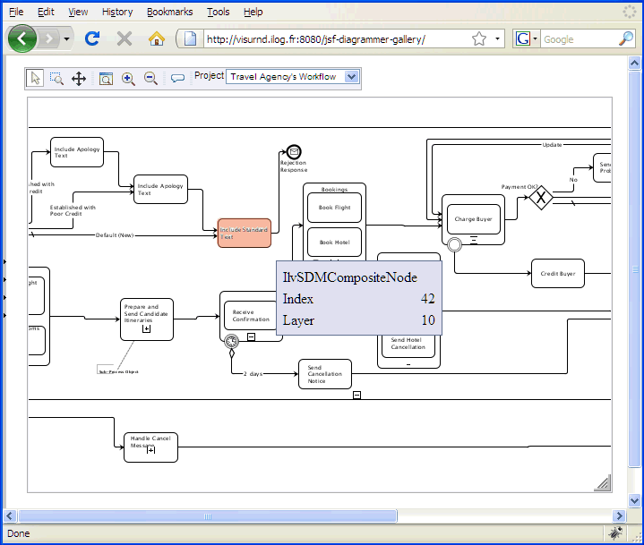
For example, the following thin-client web application screen displays a user-editable workflow network:
The image in the center is a bitmap generated by the server and displaying some network data. Without the Hitmap technology, clicking or hovering over a node to highlight this node and display related information requires sending to the server the coordinate of the point clicked, having the server compute the object that corresponds to this point, and returning a newly computed image representing the highlighted object (in orange), as well as the application data associated to this object (here, the phrase IlvSDMCompositeNode ). This greatly reduces the interactivity and the responsiveness of the thin-client solution.
What would be preferable instead is a means to retrieve, inside the client web browser, the semantic data associated to the object and the boundaries of the object to highlight, and then to execute local scripts to perform the highlighting and tooltip display, or any appropriate feedback, locally.
The natural (trivial) approach to implementing such graphics-to-application domain mapping in graphical applications is to maintain a data structure of graphic objects (polygons, text areas, rectangles, icons, and so on) and to associate to each of those objects a pointer to application domain objects. Hence, when the mouse is pointed at a region of the application display, traversing this data structure allows the application to retrieve the intersecting objects and from them to retrieve the semantic data associated with them. While this approach is easy to implement and is used in regular graphical user interfaces, it suffers some drawbacks in thin-client applications, which Hitmap technology resolves.
With Hitmap technology, the application defines a buffered and raster data structure that allows the application to reduce the computation cost when doing hit tests. The “color indices” in the associated bitmap do not represent real colors to display, but instead indices in an array of application data objects sent separately. Hence, this raster map embeds both the geometry of the graphic representations and the mapping to the related application objects. Because there are a limited number of objects that are useful to represent on the screen, the total number of “colors” used is very low and these images are highly compressible and very fast to generate. Thus, you can minimize the client-server bandwidth and extra server-side computation, while providing precise geometric description and application object mappings.
With Hitmap technology, the hit test and also the highlighting can be performed offline and do not cost a round-trip to the server. This gives JViews web applications excellent responsiveness and has a number of useful applications.
Data structure of the Hitmap
The Hitmap uses a raster data structure. Compared to the bitmap data structure that gives the color information of each pixel, the Hitmap data structure gives the hit test information of each pixel.
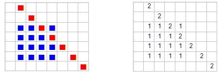
The set of pixels that have the same ““color index”” in the hitmap is called a
region. A region consists of those pixels of a graphic object that are not hidden by other graphic objects.
For example, the following image shows two regions, coming from two graphic objects: a red line and a blue square.
The structure in the image on the left shows how the color information is represented. The structure in the image on the right shows the hit test information of the same bitmap, where the number 1 means that the pixel belongs to the first region (the blue square pixels that are not hidden by the red line) and the number 2 means that the pixel belongs to the second region (the red line).
You can consider a Hitmap as an indexed bitmap. Given the x and y coordinates of the mouse position, you can immediately tell to which graphic object the pixel belongs. This is why the hit test can be done extremely fast. Given the index of a region, you can easily find all pixels that belong to that region. This provides a fast way to highlight graphic objects.
How to generate the Hitmap
The Hitmap can be generated using the Java 2D™ drawing pipeline with a customized raster composite. Compared to a normal raster composite that writes pixel color information to the buffer when rasterizing graphic objects, the Hitmap composite writes the index of the graphic object being rendered to the raster buffer. Other 2D drawing pipelines can also be used to render Hitmaps.
For example, when rendering the red line shown in the preceding image, a normal raster composite marks the corresponding pixels as red. However, the Hitmap composite assigns the index of the red line, in this example 2, to the corresponding pixels.
The Hitmap generation is similar to normal painting but costs less in CPU time. Tests show that generating and compressing a Hitmap requires only 20% of the time consumed by the normal rendering and compressing of the same image.
How to associate application data to Hitmaps
When the server generates the Hitmap, it uses a corresponding table of application data objects. This table is kept and transmitted to the client software in addition to the bitmap and the Hitmap. JavaScript methods are provided (embedded in the client's HTML page) to retrieve the ““pixel color”” of a given point in response to a user mouse event, and from this ““color”” information, turn it into an integer (the region index) that is used to retrieve the application data associated with the area of the display on which the user clicked.
The following are examples of Hitmap use cases and applications:
Tooltips: the client software uses the Hitmap and the associated application data to locally construct and display tooltips. See
Tooltip interactor.
Highlighting: the client software superimposes a semi-transparent bitmap on top of the original image sent by the server to create a highlight effect and provides feedback that the user has, for example, selected a node in a graph display. See
Highlight interactor.
Keyboard navigation: The client software retrieves for each region some information containing references to four graphic objects. This information determines which graphic object the focus will be moved on to when the user presses a particular arrow key.
Cursor: The client software changes the cursor shape according to information that has been specified for each region.
Tooltip interactor
The tooltip interactor allows you to show customized tooltips when moving the mouse over graphic objects. Using Hitmap technology, the tooltip can be constructed and displayed on the client side without a round-trip to the server.
JViews provides a JavaServer™ Faces (JSF) component for this interactor. To use the tooltip interactor you must first insert the tooltip interactor tag into your JSF page.
To define one object, use the following tag:
<jvf:tooltipInteractor id="tooltipInteractor"/>
You can use the interactor in a <jvf:view> view as follows:
<jvf:view id="viewID" interactorId="tooltipInteractor" />
You can use the interactor in a <jvdf:mapView> view as follows:
<jvmf:mapView id="mapId" interactorId="tooltipInteractor" />
The tooltips are visible when you move your mouse over the graphic objects.
The tooltip interactor works with both a <jvf:view> and a <jvmf:mapView>.
Example map showing tooltip
The method described in the previous section shows you how to use the tooltip interactor with a <jvf:view> and a <jvmf:mapView>. However, you might want to have both the pan interactor and the tooltip interactor working at the same time. The interactor group is designed for this purpose.
You can make two interactors work together as follows:
<jvf:tooltipInteractor id="tooltipInteractor"/>
<jvf:panInteractor id="panInteractor" />
<jv:interactorGroup id="panAndTooltip" interactors="panInteractor tooltipInteractor"/>
<jvmf:mapView id="mapID" interactorId="panAndTooltip" hitmapLayers="Symbols" ... />
As shown in the previous example, for JViews Maps you must use the attribute hitmapLayers to determine which layers will generate the hitmap data and the hitmap information.
Using the tooltip template
The tooltip template allows easier tooltip styling with enhanced performance. To use the tooltip template, you must specify the value of the template attribute for the tooltip interactor, as shown in the following example.
<jvf:tooltipInteractor id="tooltipInteractor" template="tooltip_callback"/>
In order to work with the tooltip template feature, the tooltip data for the Hitmap information that you generated on the server must be in a valid JSON format. For example:
jviews_hitInfos={
tooltip:[,
{'properties':'values','name':'node1'},
{'properties':'values','implementation':'workflow','name':'Graphics Framework','type':'workflow'},
{'properties':'values','name':'node2'},
{'properties':'values','name':'node4'}
]}
For more information about Hitmap information customization, see
Customizing Hitmap information.
There are two types of tooltip template: the HTML template and the JavaScript callback.
Using the HTML template
To use the HTML template, you can create the template as shown in the following example.
<jvf:tooltipInteractor id="tooltipInteractor"
template="<div style='background:#333399;font-size:70%;font-weight:bold;color:white;'>properties=<%properties%></div>" />
In the preceding code example, <%properties%> corresponds to the key of your JSON object generated from the server. This will be replaced by the value of the key of your JSON object when the tooltip is displayed.
Using the JavaScript callback
To use the JavaScript callback, you need to write the JavaScript callback to show the tooltip which will be invoked when the tooltip is displayed.
When writing your own JavaScript callback, there are two parameters for you to use in your callback function:
Name | Description |
view | The view object. |
index | The index of the current graphic element. |
The following code is a JavaScript callback sample which generates a dynamic tooltip.
<script type="text/javascript">
function tooltip_callback(view, index) {
var message = view.getHitInfos().tooltip[index]; //retrieve the tooltip message of current index
var msg = '<table class=\'jviews_tooltip\'>';
for(key in message){
msg += '<tr class=\'jviews_tooltip_title\'><td>';
msg += key;
msg += '</td><td>' + message[key] + '</td></tr>';
}
msg += '</table>';
return msg;
}
</script>
After creating the JavaScript callback, you can write the following code to invoke it with the tooltip interactor:
<jvf:tooltipInteractor id="tooltipInteractor" template="tooltip_callback" />
Highlight interactor
The highlight interactor allows you to highlight graphic objects when moving the mouse over them. Using Hitmap technology, the highlighting effect can be constructed and displayed on the client side without a round-trip to the server.
JViews provides a JavaServer™ Faces (JSF) component for this interactor. To use the highlight interactor you must first insert the highlight interactor tag into your JSF page.
To define one object, use the following tag:
<jvf:highlightInteractor id="highlightInteractor"/>
You can use the interactor in a <jvf:view> view as follows:
<jvf:view id="viewID" interactorId="highlightInteractor" />
You can use the interactor in a <jvmf:mapView> view as follows:
<jvmf:mapView id="mapId" interactorId="highlightInteractor" />
The highlight effects are visible when you move your mouse over the graphic objects.
The highlight interactor works with both a <jvf:view> and a <jvmf:mapView>.
Example map with highlighting displayed.
The method described in the previous section shows you how to use the highlight interactor with a <jvf:view> and a <jvmf:mapView>. However, you might want to have both the pan interactor and the highlight interactor working at the same time. The interactor group is designed for this purpose.
You can make several interactors work together as follows:
<jvf:panInteractor id="panInteractor" />
<jvdf:selectInteractor id="selectInteractor" />
<jvf:highlightInteractor id="highlight" color="yellow"/>
<jv:interactorGroup id="selectHighlight" interactors="selectInteractor panInteractor highlight"/>
<jvmf:mapView id="mapID" interactorId="selectHighlight" hitmapLayers="Symbols" ... />
The attribute hitmapLayers is used to select which layer will generate the hitmap data from the hitmap request. This attribute is only available in JViews Maps.
Tips for using multiple interactors
You can make some interactors work together at the same time.
The following example shows how to make a pan interactor, a select interactor, and a highlight interactor work together:
<jvf:panInteractor id="panInteractor" />
<jvdf:selectInteractor id="selectInteractor" />
<jvf:highlightInteractor id="highlight" color="yellow"/>
<jv:interactorGroup id="selectHighlight" interactors="selectInteractor panInteractor highlight"/>
<jvmf:mapView id="mapID" interactorId="selectHighlight" hitmapLayers="Symbols" ... />
NOTE You cannot combine certain interactors in this way, because some interactors expect and consume the same event. You can try to change the order of the interactors in the group in order to avoid conflicts. However, this technique has its limitations. You might arrive at a situation where you cannot place some sets of interactors in the same group because of conflicts.
Customizing Hitmap information
You can customize Hitmap information to generate specific information from the server side. For example, to highlight a group element or change the cursor when you move the mouse over a certain type of element.
The server side code will generate Hitmap information in JSON format for the Hitmap request.
On the server side you must do the following:
Your servlet must be a subclass of
IlvDiagrammerServlet or of one of its existing subclasses, for example
IlvFacesMapsServlet.
For JSF, configure the servlet using the servlet attribute in the JSF view component.
//Configure the servlet in the web.xml file.
<servlet>
<servlet-name>MapsEditingServlet</servlet-name>
<servlet-class>demo.editing.MapsEditingServlet</servlet-class>
</servlet>
<servlet-mapping>
<servlet-name>MapsEditingServlet</servlet-name>
<url-pattern>/MapsEditingServlet</url-pattern>
</servlet-mapping>
Set the servlet attribute of JSF view component. For example:
<jvmf:mapView id="maps" servlet="MapsEditingServlet" ... />
You must extend
IlvHitmapDefinition. For example:
package yourpackage;
public class MyHitmapDefinition extends IlvHitmapDefinition {
}
Then add, for example, the following code in the web.xml file and add the hitmap init-param for your servlet.
<servlet-name>MapsEditingServlet</servlet-name>
<servlet-class>demo.editing.MapsEditingServlet</servlet-class>
<init-param>
<param-name>hitmap</param-name>
<param-value>yourpackage.MyHitmapDefinition</param-value>
</init-param>
</servlet>
Creating nodes and links
If you want to create nodes and/or links on the view, you have to set the editable mode on the view component as follows:
<jvdf:diagramerView id="thediagrammer" editable="true" [...] />
For example, by calling the following extract of JavaScript™ in response to a user action, an interactor is set on the view. This interactor allows you to create a link with the thetag tag in the JViews Diagrammer model attached to the view.
thediagrammer.setCreateLinkInteractor("thetag", true);
When the second parameter is set to true, the create action is available only once. If you want to have the interactor available permanently, you can ignore that parameter.
Similarly, you can set a node creation interactor:
thediagrammer.setCreateNodeInteractor("anothertag", true);
In addition to the tag name, the interactor can be configured to set some initial properties on the selected object at creation time:
var properties = {propertyName1: "propertyValue1", propertyName2: "propertyValue2"};
thediagrammer.setCreateNodeInteractor("anothertag", true, properties);
In order to work correctly, a property accessor must be set and configured on the facet (see
Information on Selection).
Deleting selected nodes and links
If you want to be able to delete selected nodes and links on the view, you have to set the editable mode on the view component as follows:
<jvdf:diagrammerView id="thediagrammer" editable="true" [...] />
This allows you to ask for deletion of the selected objects on the client side by using the following JavaScript™ code:
thediagrammer.getSelectionManager().deleteSelection();
Resize interactor
The resize interactor allows you to resize a selected node. Because this interactor works together with the select interactor, an interactor group consisting of both these interactors must be defined. If the selected node is resizable, the rectangle representing the selection is displayed on top of the view with 8 handles attached.
The following code example shows the tag needed to define one object:
<jvdf:resizeInteractor id="resize" selectionResizableClass="faces.dhtml.DiagrammerSelectionResizable"/>
The attribute
selectionResizableClass is used to specify the class that implements the
IlvSelectionResizable interface. This class determines whether the selected node is resizable or not.
The attribute
selectionResizableClass is used to specify the class that implements the
IlvSelectionResizable interface. This class determines whether the selected node is resizable or not.
The following code example shows how you can set the object on the view:
<jvdf:selectInteractor id="select"/>
<jvdf:resizeInteractor id="resize" actionName="resizeNode"/>
<jv:interactorGroup id="interactorGroup" interactors="select resize"/>
<jvdf:mapView id="themap" interactorId="interactorGroup"/>
Set the attribute actionName to resizeNode.
In the interactorGroup definition the values of the attribute interactors must be listed in order with select preceding resize. This order is necessary because the resize interactor depends on the select interactor.
Link interactor
The link interactor allows you to move and reshape a selected link (polyline). It allows you to add points, remove points and move points in the selected link. Removing end points of a link deletes the link. Because this interactor works together with the select interactor, an interactor group consisting of both these interactors must be defined.
The following code example shows the tag needed to define one object:
<jvdf:linkInteractor id="resize" modifier="alt"/>
Set the attribute modifier to one of the following values [ alt, shift, ctrl ]. The user can then hold down this modifier and use the mouse to reshape the selected link.
The following code example shows how to set the object on the view:
<jvdf:selectInteractor id="select"/>
<jvdf:linkInteractor id="linkInteractor" modifier="alt"/>
<jv:interactorGroup id="interactorGroup" interactors="select linkInteractor"/>
<jvdf:diagrammerView id="thediagrammer" interactorId="interactorGroup"/>
In the interactorGroup definition the values of the attribute interactors must be listed in order with select preceding linkInteractor. This order is necessary because the link interactor depends on the select interactor.
Dashboard diagram
The
jvdf:dashboardView component allows you to display a dashboard diagram. This JSF component manages an
IlvDashboardDiagram instance to display the image. This class is an
IlvDiagrammer subclass, therefore the
diagrammerView and the
dashboardView share a lot of properties. This component can be used in the same way as the
diagrammerView, except that the only way to set data is to use the
data attribute (no project, style sheets properties). This attribute only accepts
idbd files.
<jvdf:dashboardView [...] data="/data/dashboard.idbd" />
The dashboardDiagram property allows you to bind an existing IlvDashboardDiagram instance to be reused by the dashboardView component.
<jvdf:dashboardView [...] dashboardDiagram="#{dashboardBean.dashboard}" />
NOTE Palettes files (JARs) must be in the application classpath (usually in the WEB-INF/lib of the WAR file) for the dashboardView component to load the dashboard.
Copyright © 2018, Rogue Wave Software, Inc. All Rights Reserved.