Predefined renderers
Describes the predefined renderers provided in Rogue Wave® JViews Diagrammer. The following predefined SDM renderers are described, with their global properties and their rendering properties if any

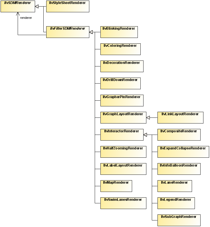
Presents an overview of the predefined renderers and their class relationships.
Describes the
Coloring renderer.
Describes the
Decoration renderer.
Describes the
Blinking renderer.
Describes the
GrapherPin renderer.
Describes the
DrillDown renderer.
Describes the
HalfZooming renderer.
Describes the
InfoBalloon renderer.
Describes the
Composite renderer.
Describes the
Interactor renderer.
Describes the
LabelLayout renderer.
Describes the
Legend renderer.
Describes the
Map renderer.
Describes the
StyleSheet renderer.
Describes the Map StyleSheet renderer.
Describes the
SubGraph renderer.
Describes the
SwimLanes renderer.
Class summary
This section describes the following predefined SDM renderers with their global properties and their rendering properties if any.
Predefined renderers class relationships
The Coloring renderer
The Coloring renderer allocates colors automatically to nodes or links or both, depending on one of their properties. This is useful when you want to represent objects with different colors depending on a given property, but you do not know in advance how many different values the property will take. There are two ways to set colors.
With the first way, you use the custom function called
coloring of the
Coloring renderer which returns the color mapped to the model property value. The following code example shows a style rule that sets the foreground color according to the level of the
node.
Using a custom function to set coloring in the style sheet
node[level] {
foreground : @|coloring(level);
}
This rule states that all nodes that define the level property will be visualized with the foreground property set to a color computed according to the level value. Objects with the same level value will have the same color.
With the second way, you use the two properties colorProperty and indexProperty of the Coloring renderer. These properties can be set to achieve a similar, although more global, behavior, as shown in the following code example.
Using the Coloring renderer to set global coloring
Coloring {
colorProperty : foreground;
indexProperty : level;
}
This rule sets the foreground property for all nodes that have the level property.
The first way is preferred since the object selectors can be more specific than the coloring renderer global setting.
The following table lists the properties of the Coloring renderer:
Global properties of the Coloring renderer
Property | Type | Default | Description |
alpha | float | 1.0 | The alpha value (that is, the transparency) of the allocated colors. |
brightness | float | 1.0 | The brightness of the allocated colors. |
colorProperty | String | “foreground” | The color property to set on the graphic objects. |
hue | float | 0.0 | The hue with which the color allocation algorithm will start. |
indexProperty | String | null | The object property used as an index to allocate colors. |
saturation | float | 1.0 | The saturation of the allocated colors. |
The Coloring renderer does not have any per-object rendering properties.
See the class
IlvColoringRenderer for more details.
The Decoration renderer
The Decoration renderer lets you add graphic objects in addition to the objects that represent the nodes and links, and change the background color or texture. You can use the Decoration renderer to display additional information such as titles or annotation labels. The objects you add are static: they cannot change in response to model object states.
You can load decoration objects from a .ivl file or define them in the style sheet, as follows:
1. Give a name to each decoration.
2. Attach the decorationNames property of the Decoration renderer to all the names collected at step 1.
3. Add a
style rule for each decoration, where the selector is an ID with the decoration name, and the declarations are what are needed to create and customize the decoration.
The following code example shows style rules that add a title and an image to the diagram.
Adding a title and image to the diagram with the Decoration renderer
SDM {
Decoration : true ;
}
Decoration {
decorationNames : 'title,logo' ;
}
#title {
class : "ilog.views.sdm.graphic.IlvGraphicFactories$ShadowLabel";
IlvRect : '5,5,100,20';
font : "dialog-18-bold";
foreground : black;
background : white ;
label : 'The main window.';
}
#logo {
class : "ilog.views.sdm.graphic.IlvGraphicFactories$Icon";
IlvRect : '5,35,20,20';
imageLocation : url(images/company.gif);
}
The following table lists the properties of the Decoration renderer.
Global properties of the Decoration renderer
Property | Type | Default | Description |
background | Color | white | The view background color, as defined in IlvManagerView. |
backgroundFile | URL | | Sets a URL that points to a .ivl, .svg, .svgz, or .dxf file. The file contains graphic objects that are added to the diagram. |
backgroundPatternLocation | URL | | The view background pattern, as defined in IlvManagerView. |
decorationNames | String[] | null | The names of the style rules that define the decoration objects. |
The Decoration renderer does not define any per-object rendering properties.
See the class
IlvDecorationRenderer for more details.
The Blinking renderer
The Blinking renderer offers a convenient API to obtain color or visibility blinking on graphic objects. It allows you to specify a uniform timing for all graphic objects with visibility blinking:
SDM {
Blinking : "true";
}
Blinking {
onPeriod : 1000; // Every second
offPeriod : 1000; // Every second
}
The blinking can be defined in CSS in different ways:
Toggling between colors
The following example illustrates how to specify a blinking color in CSS:
@|blinkinColor(color1,color2)
@|blinkinColor(color1,color2,color1Timing,color2Timing)
Bcolor1Timing/color2Timimg[color1/color2]
Btiming[color1/color2/color3/...]
The first two lines work only when the Blinking renderer is installed. The first line creates a blinking color with the timings for the color taken from the Blinking renderer. The second and third lines are essentially equivalent. The fourth line creates a blinking color with multiple subcolors. Note that the Blinking renderer only enables the appropriate syntax, but it is not necessary for the blinking effect. The third and the fourth lines work even when no Blinking renderer is installed.
Here is a concrete example:
Example 1 – Color blinking
node {
class: "ilog.views.sdm.graphic.IlvGeneralNode";
label: "@name";
// toggles from red to black (2 states)
fillColor1: "B1000/1000[red/black]";
// toggles from red to yellow (2 states)
fillColor2: "@|blinkingColor(red,yellow)";
// toggles from black to transparent red to yellow (3 states)
labelColor: "B500[black/#aaff0000/yellow]";
}
Toggling between paints
The classes
IlvBlinkingPaint and
IlvBlinkingMultiPaint represent blinking paints. They can be used as Paint for various properties of graphic objects that support blinking. Blinking paints work even when no
Blinking renderer is installed.
The following example illustrates how to specify a blinking paint in CSS:
Example 2 – Paint blinking
node {
class: "ilog.views.graphic.IlvGeneralPath";
fillPaint: "@=fillPaint";
fillOn: "true";
}
Subobject#fillPaint {
class: "ilog.views.util.java2d.IlvBlinkingPaint(onPaint,offPaint,onPeriod,offPeriod)";
onPaint: "@#onPaint";
offPaint: "@#offPaint";
onPeriod: "1000";
offPeriod: "1000";
}
Subobject#onPaint {
class: "java.awt.GradientPaint(point1,color1,point2,color2)";
point1: "0.0,0.0";
color1: "white";
point2: "72.0,72.0";
color2: "255,0,51";
}
Subobject#offPaint {
class: "java.awt.GradientPaint(point1,color1,point2,color2)";
point1: "0.0,0.0";
color1: "255,0,51";
point2: "72.0,72.0";
color2: "white";
}
Toggling the visibility
The renderer property ToggleVisibility switches the visibility of the whole object periodically. The blinking timings are taken from the Blinking renderer, therefore this specification works only when the Blinking renderer is installed and enabled.
Example 3 – Visibility blinking
node {
class: "ilog.views.sdm.graphic.IlvGeneralNode";
ToggleVisibility: "true";
}
When you use this specification, the visibility is toggled with the same timings for all the objects. You can also specify individual timings per node; this does not require the Blinking renderer to be installed. It is illustrated in the following example:
node {
class: "ilog.views.sdm.graphic.IlvGeneralNode";
blinkingOnPeriod: 1000;
blinkingOffPeriod: 1000;
}
The following table lists the global properties of the Blinking renderer.
Global properties of the Blinking renderer
Property | Type | Default | Description |
onPeriod | int | 1000 | The duration, in milliseconds, of the first color specified in the blinkingColor function, or of the visible period when ToggleVisibility is set to true. |
offPeriod | int | 1000 | The duration, in milliseconds, of the second color specified in the blinkingColor function, or of the invisible period when ToggleVisibility is set to true. |
The following table lists the per-object properties of the Blinking renderer.
Per-object properties of the Blinking renderer
Property | Type | Default | Description |
ToggleVisibility | boolean | false | If the value of this property is true, the graphic representation will toggle the visibility. |
See the class
IlvBlinkingRenderer for more details.
The GrapherPin renderer
The
GrapherPin renderer defines the exact positions where links will be connected to the nodes of the
graph. For example, the following code example shows a rule which declares that a node of tag
split has three connection points: one at the top of the node’s bounding rectangle, one on the left, and another one on the right.
Specifying link connection points in the style sheet
node.split {
GrapherPin[0] : "Top";
GrapherPin[1] : "Left";
GrapherPin[2] : "Right";
}
Other rules can then make use of the connection points defined to specify where different types of links are to be connected. For example, the following code example shows a rule that connects all links of tag transition whose condition property is true from the right of the source node to the top of the destination node.
Specifying how the ends of a transition link are connected
link.transition[condition="true"] {
FromPin : "2"; // pin #2 = Right (see node.split rule)
ToPin : "0"; // pin #0 = Top (see node.split rule)
}
The grapher pins are taken into account during editing when you create a new
link or when you reconnect an existing link. They are displayed as small circles during the interaction.
The GrapherPin renderer does not have any global properties.
The following table lists the per-object rendering properties of the GrapherPin renderer.
Per-object properties of the GrapherPin renderer
Property | Type | Default | Description |
FromPin | int | | The grapher pin to which the link will be connected on the source node. The value of the property is the index n of the GrapherPin[ n ] property of the node, and the GrapherPin[ n ] entry specifies the connection point. |
GrapherPin[n] | position, or x,y | | The grapher pin of index n for this node. The value of the property can be either a position relative to the node’s bounding box (for example: Top, BottomLeft ) or an x, ycouple, indicating the relative X and Y offsets of the grapher pin (0 = left or top, 1 = bottom or right, 0.5 = center). |
ToPin | int | | The grapher pin to which the link will be connected on the destination node. The value of the property is the index n of the GrapherPin[ n ] property of the node. |
For more details, see the class
IlvGrapherPinRenderer.
The DrillDown renderer
The DrillDown renderer allows you to display more and more objects as you zoom in the view. The objects are dispatched to different manager layers with visibility filters, which are configured according to the object property DrillDownZoom. All the objects with the same drill-down zoom are placed in a manager layer that is visible only when the view’s zoom level is greater than the drill-down zoom.
The following code extract illustrates how to enable the DrillDown renderer:
SDM {
DrillDown: "true";
}
The following table lists the global properties of the DrillDown renderer.
Global properties of the DrillDown renderer
Property | Type | Default | Description |
showingIndicator | boolean | false | Specifies whether an icon should be displayed in the top-left corner of the view to alert the user that some objects are not visible at the current zoom level. The indicator disappears when the user zooms in enough to make all objects visible. |
The following code extract shows how to configure the DrillDown renderer global property:
DrillDown {
showingIndicator: "true";
}
The following table lists the per-object properties of the DrillDown renderer.
Per-object properties of the DrillDown renderer
Property | Type | Default | Description |
DrillDownZoom | double | | Specifies the zoom level above which the objects become visible. |
The following code extract illustrates how to specify the drill down zoom level for objects based on data model properties. In this scenario, links become visible according to the data model property distance:
Specifying drill down zoom levels
link[distance>="1000"] {
DrillDownZoom : "0";
}
link[distance<"1000"] {
DrillDownZoom : "2";
}
link[distance<"100"] {
DrillDownZoom : "4";
}
link[distance<"10"] {
DrillDownZoom : "8";
}
See the class
IlvDrillDownRenderer for more details.
The HalfZooming renderer
The HalfZooming renderer lets you control the way your graphic objects will grow or shrink when you zoom in or out. You can specify the following parameters:
Maximum zoom level above which the objects will stop growing; their size will stay fixed past this zoom level.
Minimum zoom level below which the objects will not be drawn any more; they will be replaced by gray boxes, or will keep a fixed size.
You can also specify an initial zoom factor by which the minimum and maximum zoom levels will be multiplied.
The following table lists the properties of the HalfZooming renderer.
Global properties of the HalfZooming renderer
Property | Type | Default | Description |
alpha | double | 1.0 | Specifies the alpha globally for all objects. |
grayedWhenUnzoomed | boolean | true | If true, the nodes are drawn as gray boxes when the zoom level is below the minimum zoom, and the gray boxes zoom out normally. If false, the nodes simply stop zooming out and keep the same size. |
initialZoom | double | 1.0 | Specifies the initial zoom globally for all objects. |
maxZoom | double | 1.0 | Specifies the maximum zoom globally for all objects. |
minZoom | double | 1.0 | Specifies the minimum zoom globally for all objects. |
unzoomedBackground | Color | grey | The background (the fill color) of the boxes displayed instead of zoomed out objects. |
unzoomedForeground | Color | black | The foreground (the border color) of the boxes displayed instead of zoomed out objects. |
The following table lists the per-object rendering properties of the HalfZooming renderer.
Per-object properties of the HalfZooming renderer
Property | Type | Default | Description |
Alpha | double | | Overrides alpha for a given object. |
InitialZoom | double | | Overrides initialZoom for a given object. |
MaxZoom | double | | Overrides maxZoom for a given object. |
MinZoom | double | | Overrides minZoom for a given object. |
UnzoomedBackground | Color | | Overrides unzoomedBackground for a given object. |
UnzoomedForeground | Color | | Overrides unzoomedForeground for a given object. |
See the class
IlvHalfZoomingRenderer for more details.
The InfoBalloon renderer
The InfoBalloon renderer displays information about a node or a link when the user clicks in it. The information is displayed in a customizable pop-up window called a balloon.
The contents of the balloon are specified through strings that have the following format:
"line1,First Title: ,prop1;line2,Second Title: ,prop2;..."
where prop1, prop2, and so on are the names of the object’s properties for which values are to be displayed.
The following table lists the properties of the InfoBalloon renderer.
Global properties of the InfoBalloon renderer
Property | Type | Default | Description |
linkBalloonLines | String | | Specifies the contents of the balloon globally for all the links. |
nodeBalloonLines | String | | Specifies the contents of the balloon globally for all the nodes. |
prototype | String | | Sets the prototype(s) that represents the balloon. |
The following table lists the per-object rendering properties of the InfoBalloon renderer.
Per-object properties of the InfoBalloon renderer
Property | Type | Default | Description |
InfoBalloonLines | String | | Specifies the contents of the balloon for a particular object. Overrides nodeBalloonLines or linkBalloonLines. |
See the class
IlvInfoBalloonRenderer for more details.
The Composite renderer
The Composite renderer provides support for symbols and composite graphics to represent nodes and links. In particular, it allows you to:
Perform Swing actions on predefined gestures defined for any child of a composite graphic.
Define which child the links connect to.
The following code extract illustrates how to enable the Composite renderer:
SDM {
Composite: "true";
}
The following table lists the per-object properties of the Composite renderer.
Per-object properties of the Composite renderer
Property | Type | Default | Description |
LinkConnectionRectangle | int | -1 | Specifies the index used with the indexed property children of composite graphics. The links connect to the nearest edge of the bounding box of the child at the position defined by this property. This property is defined on the objects of type node. |
FromCompositePin | String | null | Specifies the name of a decoration in a composite graphic, which is used to connect the origin of a link. This property is defined on the objects of type link. |
FromCompositePinPosition | String | Center | Connects the origin to this position of the decoration. This property is defined on the objects of type link. |
ToCompositePin | String | null | Specifies the name of a decoration in a composite graphic, which is used to connect the destination of a link. This property is defined on the objects of type link. |
ToCompositePinPosition | String | Center | Connects the destination to this position of the decoration. This property is defined on the objects of type link. |
The following code extract illustrates how to configure the link connection rectangle:
node {
LinkConnectionRectangle: 0;
}
The following code extract illustrates how to specify the decoration to be used to connect links:
link {
FromCompositePin:"decoration"; // use the name defined above
FromCompositePinPosition:"Center";
ToCompositePin:"decoration"; // use the name defined above
ToCompositePinPosition:"Center";
}
See the class
IlvCompositeRenderer for more details.
The Interactor renderer
The Interactor renderer is a base class for all renderers that attach object interactors to graphic objects. This renderer can also be used directly to install an object interactor specified in the style sheet.
The following table lists the properties of the Interactor renderer.
Global properties of the Interactor renderer
Property | Type | Default | Description |
interactor | String | null | Specifies the class name of the object interactor to attach to all the graphic objects. |
The following table lists the per-object rendering properties of the Interactor renderer.
Per-object properties of the Interactor renderer
Property | Type | Default | Description |
Interactor | String | null | Specifies the class name of the object interactor to attach to a particular graphic object. Overrides the interactor property. |
processMouseMoveEvent | boolean | false | Specifies whether mouse motion events are dispatched in addition to mouse click events. |
See the class
IlvInteractorRenderer for more details.
The LabelLayout renderer
The LabelLayout renderer performs a label layout algorithm. It is useful when the graphic objects that represent the data model have labels and you want to minimize the overlap of these labels with other labels or other graphic objects. The algorithm will try to move the labels around their original position (for node labels) or along their link (for link labels) to minimize the overlaps.
The
LabelLayout renderer uses the classes of the package
ilog.views.graphlayout.labellayout, available since Rogue Wave JViews 5.0. The label layout algorithm applied is the "simulated annealing" algorithm.
The following table lists the properties of the LabelLayout renderer.
Global properties of the LabelLayout renderer
Property | Type | Default | Description |
enabled | boolean | true | Enables/disables the label layout algorithm. |
layoutOfGeneralLinkLabelsEnabled | boolean | true | If true, the labels of IlvGeneralLink objects will be laid out. If false, general link labels are left unchanged. |
layoutOfGeneralNodeLabelsEnabled | boolean | true | If true, the labels of IlvGeneralNode objects will be laid out. If false, general node labels are left unchanged. |
The LabelLayout renderer does not have any per-object rendering properties.
You can set any property of the
IlvAnnealingLabelLayout object used by this renderer.
See the class
IlvLabelLayoutRenderer for more details.
The Legend renderer
The Legend renderer displays a legend box explaining the look of the graphic objects. The legend is generated using an index property. For each object, the value of the index property is queried. If no object with the same value is already shown in the legend, a new entry is added.
Each entry consists of a copy of the graphic object and a label displaying the value of the property for this graphic object.
The legend can be contained in the same view as the generated graph, or it can be in a separate frame.
The legend can contain several columns, each corresponding to a different index property.
The graphic objects in the legend can be customized separately, using the pseudoclass legend.
For example, the following code example shows how to set the same color for all the links in the legend.
link:legend {
foreground : "green";
}
The following table lists the properties of the Legend renderer.
Global properties of the Legend renderer
Property | Type | Default | Description |
background | Color | white | The background color of the legend box. |
checkBoxesVisible | boolean | true | If true, each entry has a check box that lets the user show or hide the corresponding graphic objects. |
foreground | Color | black | The border color of the legend box. |
indexProperty | String | null | Specifies the object property to use as an index. You can specify several properties, separated by commas. Each index property will be displayed in a separate column of the legend. |
inlaid | boolean | true | If true, the legend box is contained in the diagram. Otherwise, it is displayed in a separate frame. |
insideMargin | int | 5 | The margin around the legend elements. |
labelFont | Font | | The font used for the labels of the entries. |
labelsZoomable | boolean | false | Specifies whether the labels must be zoomable. |
layer | int | 30 | The manager layer in which the legend box will be added. |
legendVisible | boolean | true | Hides or shows the legend. |
legendZooming | boolean | true if inlaid, false if not inlaid | If true, the legend items zoom together with the view. If false, the legend items do not zoom; they always keep the same size when the diagram is zoomed in or out. |
linksLength | float[] | 50 | The length of links in each column of the legend. |
linksWidth | float[] | | The width of links in each column of the legend. Zero means the same width as in the diagram. |
maxEntries | int | 10 | The maximum number of entries for each column. |
outsideMargin | int | 5 | The margin around the legend. |
position | int | BottomLeft | The position where the legend will be placed in the diagram. |
scrollDelay | int | 200 | The delay (in milliseconds) before showing the legend after scrolling the diagram. |
sortingEntries | boolean | true | If true, the legend entries are sorted alphabetically. If false, the entries appear in the same order as in the data model. |
spacing | int | 5 | The spacing between the elements of the legend. |
title | String | null | Specifies the title(s) of the column(s). You can pass several values, separated by commas. |
titleFont | Font | | The font used for the titles of the columns. |
updateOnPropertyChange | boolean | false | If true, the legend is dynamically updated when a property of an object changes in the data model. |
xOffset | float | | The horizontal offset of the legend relative to the border of the diagram. |
yOffset | float | | The vertical offset of the legend relative to the border of the diagram. |
The Legend renderer does not define any per-object rendering properties.
See the class
IlvLegendRenderer for more details.
The Map renderer
The Map renderer displays a background map behind the graph and automatically places geo-referenced objects on top of this map. You need to have the product JViews Maps installed with a valid license to be able to use this renderer.
The map is specified as the URL of an IVL file that will be loaded into the diagram. This IVL file can contain any cartographic information supported by Rogue Wave JViews Maps, such as vectorial or raster maps read from various cartographic formats, load-on-demand readers, and so on. The IVL file should also contain the definition of a projection. This projection information will be used to place the objects on the map according to their latitude and longitude.
The following table lists the properties of the Map renderer.
Global properties of the Map renderer
Property | Type | Default | Description |
hideInvalidNodesAndLinks | boolean | true | If true, the nodes that are not within the limits tolerated by the map projection will be hidden. The links that go to or come from these nodes will also be hidden. |
autoRegionOfInterest | boolean | false | If true, the region of interest is computed automatically from the positions of the nodes contained in the data model. |
map | String | null | The URL of the IVL file containing the map and the projection. |
regionOfInterest | IlvRect | null | The “region of interest” on the map. This is useful to center on or zoom to a particular region of a larger map. The rectangle is in latitude and longitude coordinates (radians). |
regionOfInterestMargin | float | 5 | The margin remaining around the objects when the region of interest is computed automatically. The margin is expressed as a percentage of the width of the bounding box of the objects. |
The following table lists the per-object rendering properties of the Map renderer.
Per-object properties of the Map renderer
Property | Type | Default | Description |
latitude | double | | The latitude of the object. |
longitude | double | | The longitude of the object. |
fitToContentsAllowed | boolean | true | Performs a fit-to-contents each time the diagram is reloaded. |
The latitude and longitude can be specified in several formats:
As a floating-point value, in which case the value is the latitude or longitude expressed in
radians.
In degrees/minutes/seconds, as a string of the form
xx D xx ’ xx " L, where
L is one of
N (north),
S (south),
W (west) or
E (east). The string will be converted to radians.
As a string matching one of the formats registered in the Maps package.
NOTE >> The latitude and longitude of the objects are usually stored in the data model. If the style sheet does not specify any values for the latitude and longitude properties, these properties will be read directly from the data model. Most of the time, the style sheet will be used only to translate the names of the data object properties holding the latitude and longitude, if needed. For example, if your data model has properties named LAT and LONG, you will write a rule like this in the style sheet:
node {
latitude : "@LAT";
longitude : "@LONG";
}
See the class
IlvMapRenderer for more details.
The StyleSheet renderer
The StyleSheet renderer is the default renderer. The StyleSheet renderer is always enabled.
The StyleSheet renderer implements the basic creation of graphic objects. For each object in the data model, the StyleSheet renderer looks up all the style rules that match the object and creates the graphic object specified by the declarations of these rules.
The following table lists the properties of the StyleSheet renderer.
Global properties of the StyleSheet renderer
Property | Type | Default | Description |
debugMask | int | | Prints selected debug information. |
styleSheets | String[] | null | Sets cascading style sheets. This property is usually set on the SDM engine rather than directly on the StyleSheet renderer. |
linkConnectorEnabled | boolean | true | Specifies if a link connector should be installed on the nodes to connect the links to the sides of the nodes, rather than to their centers. |
addingLinkConnectors | boolean | true | If false, no link connector is installed by the style sheet renderer. |
nodesLayer | int | 10 | Specifies the default layer in which the nodes will be added. |
linksLayer | int | 9 | Specifies the default layer in which the links will be added. |
The following table lists the per-object rendering properties of the StyleSheet renderer.
Per-object properties of the StyleSheet renderer
Property | Type | Default | Description |
| | | |
Anchor | int | Center | The position of the object’s location relative to its bounding box (for example, TopLeft will place the object so that its upper-left corner is located at the x, y position). |
Layer | int | | Overrides nodesLayer or linksLayer for a specific object. |
LinkConnector | IlvLinkConnector | | Defines the link connector set on the nodes of the graph. By default, an IlvSDMLinkConnector object is used. |
ToolTipText | String | null | Deprecated, replaced by the IlvGraphic property toolTipText. |
x | float | | The horizontal coordinate of the object. |
y | float | | The vertical coordinate of the object. |
width | int | | The width of the object. If the width is not specified in the style sheet file, and if it is specified in the data model XML file, the value contained in the XML file will be used. See IlvSDMRenderer.getGraphicProperty for details. |
height | int | | The height of the object. If the height is not specified in the style sheet file, and if it is specified in the data model XML file, the value contained in the XML file will be used. See IlvSDMRenderer.getGraphicProperty for details. |
See the class
IlvStyleSheetRenderer for more details.
The StyleSheet renderer is always present, but you must explicitly declare changes in the style sheet if some properties are to be modified. shows a style rule which instructs the StyleSheet renderer to print debug information about all the declarations being processed.
Debugging the style sheet
StyleSheet {
debugMask : "DECL_MASK|DECL_VALUE_MASK" ;
}
The Map StyleSheet renderer
The Map StyleSheet renderer is a specific version of
The StyleSheet renderer. You must have Rogue Wave® JViews Maps installed with a valid license to be able to use this renderer.
The Map StyleSheet renderer wraps the node and link layers into an IlvMapLayer object so that they are managed by the maps layer tree. For example, it allows:
Interactive raising and lowering of layers
Indication that the layers are always on top of the map background.
In a JViews Maps application you have to enable the Map StyleSheet renderer using Java™ code before you make any use of a style sheet. The following code example shows how to replace the StyleSheet renderer:
// replace the stylesheet renderer with map rendererclass.
IlvRendererUtil.addRendererAlias(
IlvRendererUtil.getRendererAlias(IlvStyleSheetRenderer.class.getName()),
IlvMapStyleSheetRenderer.class.getName());
The Map StyleSheet renderer provides exactly the same properties as the StyleSheet Renderer. However, any use of the nodesLayer, linksLayer or Layer properties will be overridden by the Map Layer tree order. The following table lists the Map StyleSheet renderer properties.
The Map StyleSheet renderer global properties
Property | Type | Default | Description |
debugMask | int | 0 | Prints selected debug information. |
styleSheets | String[] | null | Sets cascading style sheets. This property is usually set on the SDM engine rather than directly on the StyleSheet renderer. |
linkConnectorEnabled | boolean | true | Specifies if a link connector should be installed to connect the links to the sides of the nodes, rather than to their centers. |
addingLinkConnectors | boolean | true | If false, no link connector is installed by the style sheet renderer. |
The following table lists the Map StyleSheet renderer per-object rendering properties.
The Map StyleSheet renderer per-object proprieties
Property | Type | Default | Description |
Anchor | int | Center | The position of the object's location relative to its bounding box (for example, Top Left? will place the object so that its upper-left corner is located at the x, y position). |
LinkConnector | IlvLinkConnector | | Defines the link connector set on the nodes of the graph. By default, an IlvSDMLinkConnector object is used. |
ToolTipText | String | null | Deprecated, replaced by the IlvGraphic property, toolTipText. |
x | float | | The horizontal coordinate of the object. |
y | float | | The vertical coordinate of the object. |
width | int | | The width of the object. If the width is not specified in the style sheet file, and if it is specified in the data model XML file, the value contained in the XML file will be used. See IlvSDMRenderer for details. |
height | int | | The height of the object. If the height is not specified in the style sheet file, and if it is specified in the data model XML file, the value contained in the XML file will be used. See getGraphicProperty for details. |
The SubGraph renderer
The SubGraph renderer displays subgraphs of the data model as expandable and collapsible nodes. This renderer is useful if the data model is hierarchical, that is, if it contains nodes that have subnodes and sublinks.
An expandable node can be in one of two states: expanded or collapsed. When it is expanded, its subobjects are visible, and a frame is displayed around them. When the expandable node is collapsed, its subobjects are hidden, and the collapsed node looks like a simple node. You can customize the look of the frame and of the collapsed node in the style sheet.
An expandable node can be collapsed and re-expanded interactively by clicking in the icon displayed in its upper-left corner.
The following table lists the properties of the SubGraph renderer.
Global properties of the SubGraph renderer
Property | Type | Default | Description |
loadOnDemand | boolean | false | When set to true, the graphic objects inside a collapsed subgraph are created only the first time the subgraph is expanded. This can be used to reduce the startup time of an application. |
savingExpandedState | boolean | false | If true, the state of subgraphs (expanded or collapsed) can be saved to the data model. |
subObjectsSelectionAllowed | boolean | true | Allows/forbids the selection of subnodes and sublinks in an expanded node. |
The following table lists the per-object rendering properties of the SubGraph renderer.
Per-object properties of the SubGraph renderer
Property | Type | Default | Description |
Expandable | boolean | true | This property determines whether a node becomes a subgraph. If the value is true, the node is represented as a subgraph that can have children. If the value is false, the node is represented as a standard node and its potential children are displayed at the root level. |
FrameGraphic | IlvGraphic | | Specifies a custom graphic object for the frame. You can set this property to the special value “ default” to use a default manager frame (displayed as a rectangle with a title bar). |
FrameMargin | float, or float,float,float,float | 10 | Sets the margins between the frame and the subobjects. If a single value is specified, it is used for the four sides. If four values are specified, they represent the left, top, right, and bottom margins. |
InitiallyExpanded | boolean | true | Sets the initial state of the expandable node. |
MinusGraphic | IlvGraphic | | Specifies a custom graphic object for the “collapse” icon. |
MinusGraphicPosition | int | TopLeft | Specifies the position of the “collapse” icon in the node’s bounding box.The possible values are defined by the class IlvDirection. |
PlusGraphic | IlvGraphic | | Specifies a custom graphic object for the “expand” icon. |
PlusGraphicPosition | int | TopLeft | Specifies the position of the “expand” icon in the node’s bounding box.The possible values are defined by the class IlvDirection. |
NOTE For compatibility with previous versions of Rogue Wave® JViews, the name ExpandCollapse may be used in the style sheet instead of the name SubGraph. The two names are equivalent.
See the class
IlvSubGraphRenderer for more details.
The SwimLanes renderer
The SwimLanes renderer displays vertical or horizontal stripes in the background of the diagram. Swimlanes are used to represent logical groups of nodes. For example, in a workflow process, each swimlane could represent a department of a company, and the activities executed within each department would be placed in the corresponding swimlane.
Swimlanes are represented graphically by vertical or horizontal rectangles that cover the whole view. Each swimlane rectangle contains (geometrically) all the nodes that belong to the swimlane. Each swimlane has a different color which can be automatically generated or customized through the style sheet. Each swimlane also has a title.
The SwimLanes renderer can be used alone, but it is most often used in conjunction with a GraphLayout renderer configured to use a hierarchical layout algorithm, because the hierarchical layout has the ability to automatically arrange the nodes of the hierarchy according to the swimlanes to which they belong.
The hierarchical layout ensures that the swimlanes do not overlap, but if no hierarchical layout is applied, or if the nodes are moved after the layout is applied, the swimlanes may overlap.
There are two versions of the SwimLanes renderer, corresponding to two different implementations. The first one, IlvSwimLaneRenderer, is a basic implementation of swimlanes, internally managed by the renderer. The second one, IlvLaneRenderer, differs from the first one in several ways:
Each lane is the graphical representation of a dedicated object in the data model. The advantage of this new implementation is that the properties of the lanes (position, size, label...) can be stored in the data model.
IlvLaneRenderer supports hierarchical swimlanes, that is, lanes containing sub-lanes. Lane containers are sometimes called “pools”.
To select one version of the renderer or the other, specify the following in the SDM rule:
SDM {
SwimLanes : true;
}
or
SDM {
Lanes : true;
}
IlvLaneRenderer is used in the BPMN modeler.
IlvSwimLanesRenderer
Swimlanes are computed according to the value of the SwimLaneConstraints property in the style sheet. The value of this property is examined for each node, and a swimlane is created for each different value. Note that this is the same property as the one used by the GraphLayout renderer, which makes sure that the GraphLayout and SwimLanes renderers group nodes into swimlanes in the same way.
For example, the following code example defines two swimlanes: one representing the R&D department of a company, and another one representing the Sales department.
node.activity[department=”R&D”] {
SwimLaneConstraint : “R&D Department”;
}
node.activity[department=”Sales”] {
SwimLaneConstraint : “Sales Department”;
}
With these rules, the diagram will be divided into two swimlanes with different colors, and these will have the titles “R&D Department” and “Sales Department”.
The following table lists the properties of the SwimLanes renderer.
Global properties of the SwimLanes renderer
Property | Type | Default | Description |
alpha | float | 0.5 | The alpha value (that is to say the transparency) of the allocated colors. |
brightness | float | 0.8 | The brightness of the allocated colors. |
defaultSwimLanes | String | null | Can be used to create default swimlanes in an empty diagram. The string is a comma-separated list containing the titles of the default swimlanes. |
draggingEnabled | boolean | true | Allows you to drag a node from one swimlane to another. |
hue | float | 0.2 | The hue with which the color allocation algorithm will start. |
layer | int | | The index of the manager layer in which the swimlane graphics will be added. |
margin | int | 5 | The margin between two adjacent swimlanes. |
saturation | float | 0.5 | The saturation of the allocated colors. |
The following table lists the per-object rendering properties of the SwimLanes renderer.
Per-object properties of the SwimLanes renderer
Property | Type | Default | Description |
SwimLaneConstraint | Object | null | Defines the swimlane to which the node belongs. |
SwimLaneGraphic | IlvGraphic | null | Lets you customize the graphic object used to represent the swimlane. By default, an IlvGeneralNode is used. |
SwimLaneLabel | String | null | Lets you customize the title of the swimlane. By default, the title is the value of the SwimLaneConstraint property. |
SwimLaneColor | Color | null | Lets you customize the color of the swimlane. By default, the colors are allocated automatically, based on the hue, saturation, brightness, and alpha properties of the renderer. |
You should set the SwimLaneGraphic, SwimLaneColor, and SwimLaneLabel properties on all nodes. Although the SwimLane Renderer makes use of only the first node in a swimlane to set these properties, you may not find it easy to keep track of which node is the first node.
See the class
IlvSwimLanesRenderer for more details.
IlvLaneRenderer
The Lane Renderer defines properties to customize the created lanes.
The following table lists the properties of a lane.
Lane properties
Property | Type | Default | Description |
defaultLength | float | 500 | Default length of the lanes, that is, the width if the lanes are horizontal, or the height if they are vertical. |
defaultSize | float | 100 | Default size of the lanes, that is, the height if the lanes are horizontal, or the width if they are vertical. |
horizontal | boolean | true | Lane orientation. |
margin | float | 5 | Margin between the objects inside the lane and the edges of the lane. |
spacing | float | 10 | Minimum spacing between adjacent lanes. |
sublaneOffset | float | | If the lanes are horizontal, this property changes the offset between the left side of a sublane and the left side of the parent lane. This offset is used to leave room for a label. |
To create a lane, the style sheet rule that matches the lane object must contain the declaration LaneName:<name>, where <name> is the name of the lane. If this rule also creates an IlvGraphic that implements ilog.views.IlvLabelInterface, then this graphic will be the label of the lane and will appear in front of the lane. In general, the class of the lane graphic representation is ilog.views.sdm.graphic.IlvDefaultLaneGraphic, which displays vertical labels for horizontal lanes. In addition to LaneName, two more properties are then interpreted:
Lane additional properties
Property | Type | Default | Description |
LaneName | string | "" | Sets the matching node as a lane (or a pool) and defines its name. |
LaneLength | float | defaultLength | Overrides the lane default length. |
LaneSize | float | defaultSize | Overrides the lane default size. |
Following is an example of a lane specification in the style sheet:
node.Pool, node.Lane {
// These properties define the look of pools and lanes.
// The IlvDefaultLaneGraphic is a subclass of IlvGeneralNode
// that can display its label vertically (when the lane is horizontal).
//
class : "ilog.views.sdm.graphic.IlvDefaultLaneGraphic";
shapeType : "Rectangle";
fillStyle : "SOLID_COLOR";
strokeWidth : "1";
horizontal : "true";
label : "@Name";
toolTipText : "@Name";
labelPosition : "Center";
labelSpacing : "5";
minLabelZoom : "0";
// This property identifies the object as a Pool or a Lane,
// and tells the Lane renderer that it must handle it.
//
LaneName : "@Name";
Anchor : "TopLeft";
// Tell the link layout to preserve pools/lanes.
LayoutFixed : "true";
}
The following property can be set on any node to state that it belongs to a lane.
Property | Type | Default | Description |
Lane | string | "" | Sets the matching object in the named lane. |
Example:
node[lane] {
Lane : "@lane";
}
This rule states that all nodes that define an attribute "lane" are assigned to the lane with the "lane" attribute value.
Lane Behavior
When editing is allowed, a lane has the following behaviors:
Nodes inside the lane can be moved anywhere. The pools and lanes resize automatically to adjust to the new node positions. Note that, to remove an object from a lane, all you need to do is remove the Lane property from the node.
The lane can be manually resized: When the mouse is close to a lane edge, a resize cursor appears, which indicates that the lane can be resized if the mouse is pressed down.
See the class
IlvLaneRenderer for more details.
Copyright © 2018, Rogue Wave Software, Inc. All Rights Reserved.