Customizing general nodes in the style sheet
Shows how to customize general nodes in the style sheet.

Provides some preliminary information for customizing the display of nodes.
Describes the basic shapes available for general nodes.
Describes the properties that control the node's skin.
Describes the properties used to control the node's border.
Lists the features used to control the node's label.
Describes the properties used to control a node's icon.
Describes the properties used to control automatic resizing of a node.
Describes the properties used to add decoration to a node.
Overview
To customize the display of nodes, start by setting default properties at the highest level, which is the node level.
Example of default properties for nodes
node {
class : ilog.views.sdm.graphic.IlvGeneralNode ;
shapeType : RoundRectangle ;
shapeWidth : 15 ;
borderWidth : 2 ;
foreground : 153,0,153 ; // dark magenta - border color
fillColor1 : 198,226,255; // slate grey - inner color
}
In the customizer for a node, you can customize the node’s shape, skin, border, icon, label, and decorations.
Controlling the node’s shape
The basic shape of the general node is controlled by the shapeType property. The possible values are as listed in the following table.
Available shape types for a node
shapeType : “Rectangle”; | |
shapeType : “RoundRectangle”; | |
shapeType : “Ellipse”; | |
shapeType : “Diamond”; | |
shapeType : “TriangleUp”; | |
shapeType : “TriangleDown”; | |
shapeType : “TriangleLeft”; | |
shapeType : “TriangleRight”; | |
shapeType : “Marker”; | |
If needed, you can set the shape of the node directly through the setShape method. This lets you use any custom shape. You can specify a custom shapes in any of the following ways:
By referring to an SVG file in the style sheet:
node {
shape : "url(myCustomShape.svg)";
}
In Java code:
IlvGeneralPath myShape = new IlvGeneralPath(...);
generalNode.setShape(myShape);
The horizontal and vertical sizes of the shape are controlled through the properties shapeWidth, shapeHeight, and shapeAspectRatio.
There are basically two policies to set the width and height of the shape:
You can set the properties
shapeWidth and
shapeHeight. In this case the aspect ratio of the shape will not be preserved. For example:
node {
class : "ilog.views.sdm.graphic.IlvGeneralNode";
shapeType : "RoundRectangle";
shapeWidth : "100";
shapeHeight : "50";
}
You can set the property
shapeWidth to the desired width and the property
shapeAspectRatio to the desired width/height ratio. For example:
node {
class : "ilog.views.sdm.graphic.IlvGeneralNode";
shapeType : "RoundRectangle";
shapeWidth : "100";
shapeAspectRatio : "2";
}
If you change the shape width in another rule, the aspect ratio will be preserved.
Controlling the node’s skin
The following properties control the way colors are used in the shape: fillStyle, fillColor1, fillColor2, fillStart, fillEnd, fillAngle, and fillTexture.
The fillStyle property specifies the type of Paint object used to fill the shape. The possible values are as listed:
fillStyle : “SOLID_COLOR”; | |
fillStyle : “LINEAR_GRADIENT”; | |
fillStyle : “RADIAL_GRADIENT”; | |
fillStyle : “TEXTURE”; | |
The fillColor1 and fillColor2 properties specify the colors used:
In
SOLID_COLOR mode, the shape is filled with
fillColor1.
In
LINEAR_GRADIENT and
RADIAL_GRADIENT modes, the gradient starts with
fillColor1 and ends with
fillColor2 :
fillStyle : “LINEAR_GRADIENT”; fillColor1 : “blue”; fillColor2 : “red”; | |
fillStyle : “RADIAL_GRADIENT”; fillColor1 : “blue”; fillColor2 : “red”; | |
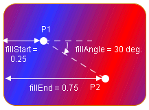
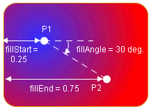
In LINEAR_GRADIENT and RADIAL_GRADIENT modes, the fillStart, fillEnd, and fillAngle properties define the geometry of the gradient. A gradient is defined by two points called P1 and P2. The following figures explain the meaning of the properties.
The following figure shows the geometry for a linear gradient.
Linear gradient
Note that the linear gradient is always in “reflect” mode, so the colors go back and forth from fillColor1 to fillColor2 outside the (P1, P2) segment.
The following figure shows the geometry for a radial gradient.
Radial gradient
The fillTexture property specifies the URL of an image file to use as a texture in TEXTURE mode.
Controlling the node’s border
The stroke (that is, the border) of the shape is controlled by the properties strokeColor, strokeWidth, strokeDashArray, strokeEndCaps, strokeLineJoins, strokeMiterLimit, and strokeDashPhase.
The strokeColor property sets the color used to paint the stroke.
The other properties are used to create an instance of java.awt.BasicStroke :
strokeWidth specifies the width of the stroke.
strokeDashArray is used to create dashed or dotted strokes. It is an array of floating-point values that specify the lengths of the alternate painted and transparent segments.
strokeEndCaps specifies the shape of the ends of the dash segments.
strokeLineJoins and
strokeMiterLimit specify how the stroke looks at the angles between two segments.
The following code example shows how to create a blue dashed stroke, with rounded segment ends, visible segments that have a length of 4, and transparent segments that have a length of 2, in the style sheet.
Styling rule for the border (stroke) of a node
node {
strokeColor : "blue";
strokeDashArray : "4,2";
strokeEndCaps : "CAP_ROUNDS";
}
For more details of the stroke-related properties, see the documentation of the BasicStroke class in the Java™ documentation.
Controlling the node’s label
You can make use of the following features for a label on a node:
Label string
The label property controls the string displayed by the node’s label.
You can set the label to the empty string ( "" ) if you do not want to display any label on the node.
Multiline label
A label can have several lines. To define a multiline label, simply put new line (‘ \n ’) characters in the value of the label property to separate the lines.
The alignment of multiline labels is controlled by the property labelAlignment, which can take the values Left (left-aligned), Center (centered), or Right (right-aligned).
The spacing between the lines of multiline labels is controlled by the property lineSpacing.
Label position
The
labelPosition property controls the placement of the label relative to the shape. This property can take the values defined by the interface
IlvDirection. For example, setting
labelPosition to
Top places the label above the shape.
Center places the label inside the shape. The default position is
Bottom.
The spacing between the shape and the label is controlled by the property labelSpacing.
Autowrap
If the labelMode property is set to WORD_WRAP, the label is automatically cut into several lines to fit into the width of the shape.
You can choose the characters where a break due to word wrapping is allowed by setting wordWrapChars. In autowrap mode, the new line characters contained in the label are ignored.
The property labelMargin controls the margin to leave between the border of the shape and the label when word wrapping is active:
If the label is inside the shape, the label is kept narrower than the shape by two times the margin.
If the label is outside the shape, the label is allowed to be wider than the shape by two times the margin.
Truncation
If the labelMode property is set to TRUNCATE, the label is automatically truncated to fit into the width of the shape. This is different from autowrap mode: the label is not cut into several lines, but simply truncated, and the truncated label always has a single line.
The property labelMargin controls the margin to leave between the border of the shape and the (truncated) label, as in WORD_WRAP mode.
The end of the label is replaced by the string " ... " (You can change this suffix using the method setTruncatedLabelSuffix.
Zoom
If the labelZoomable property is set to "true", the label grows when the view is zoomed in and shrinks when the view is zoomed out. If the labelZoomable property is set to "false", the label size stays constant.
You can choose to make the label invisible when the view is zoomed in or out past a certain zoom level. The property minLabelZoom specifies the minimum zoom level past which the label will no longer be visible when zooming out. The property maxLabelZoom specifies the maximum zoom level past which the label will no longer be visible when zooming in.
The labelScaleFactor lets you apply a scale factor to the label.
Label font, color, and antialiasing
The properties labelFont and labelColor control the font and color of the label.
The property labelAntialiasing determines whether the label should be drawn using antialiasing or not.
Controlling the node’s icon
To display an icon inside the shape, set the property icon to the URL of the icon to display.
You can define the icon URL in the style sheet as:
An image file in any format supported by the Java™ VM:
node {
icon : "url(myIcon.jpg)";
}
An SVG file:
node {
icon : "url(myIcon.svg)";
}
A Rogue Wave JViews prototype:
node {
shape : "url(myPrototypeLibrary.ivl#myPrototype)";
}
Set the icon property to the empty string if you do not want an icon.
The icon is always displayed inside the shape (or centered on top of the marker if the shape type is Marker ).
If the label is inside the shape (
labelPosition : "Center" ), the position of the icon relative to the label is controlled by the property
iconPosition, which can be set to any direction defined by the interface
IlvDirection. For example,
iconPosition : "Left" places the icon to the left of the label.
Automatic resizing
The general node can automatically compute the size of its shape according to the size of the labels and the icon.
You can control autoresizing in the vertical and horizontal directions independently through the properties horizontalAutoResizeMode and verticalAutoResizeMode. These properties accept the following values:
NO_AUTO_RESIZE | Autoresize is disabled. |
EXPAND_ONLY | The node is allowed to grow in the specified direction, but not to shrink. |
SHRINK_ONLY | The node is allowed to shrink in the specified direction, but not to grow. |
EXPAND_OR_SHRINK | The node is allowed to expand or to shrink as needed. |
If horizontal autoresizing and word wrapping are used at the same time, the general node cannot use the size of the label to compute the shape’s width because word wrapping uses the shape’s width to cut lines. In this case, the label will be word wrapped such that its bounding box is approximately square.
You can control how much space will be left between the border of the shape and its contents (label and icon) using the properties horizontalAutoResizeMargin and verticalAutoResizeMargin.
Decorations
The general node can display “decoration” graphics in its top-left corner. Decorations are small graphic objects used to represent the state of an object. For example, you could use an icon to show that an error has occurred during the processing of a workflow activity.
To add a decoration to a node, set the
decorations property. The value of the property is an array of
IlvGraphic objects.
The following code example shows a style sheet extract that adds a decoration which is an
IlvShadowLabel object.
Adding a decoration to a node in the style sheet
node[status="error"] {
decorations[0] : "@Subobject#errorDecoration";
}
Subobject#errorDecoration {
class : "ilog.views.sdm.graphic.IlvGraphicFactories$ShadowLabel";
IlvRect : "0,00,20,20";
label : "E";
foreground : "red" ;
background : "white" ;
}
The decorations are always displayed in the upper-left corner of the node. The upper-left corner of the first decoration is aligned with the upper-left corner of the node. If several decorations are used, the subsequent decorations are shifted to the right.
Copyright © 2018, Rogue Wave Software, Inc. All Rights Reserved.