Case 2: Setting a Starting Angle and a Range
Case 2 assumes that you have already completed all the steps described in
Case 1. From now on, you are going to work on a copy of the chart you obtained at the end of Case 1 so that you can compare the two charts at the end of the exercise. The two charts will appear as shown in
Figure 3.2.
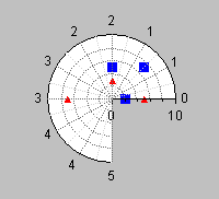
Figure 3.2 Abscissa Scale in Degrees vs. Abscissa Scale in Radians
Before beginning the tasks in this section, copy the chart you created in Case 1 and paste it either to the same buffer or to another buffer. (Click in the buffer before you choose Paste.)
To continue with this part of the example, you first need to remove the transformation previously set on the abscissa scale.
Disabling the Transformation
1. Double-click the polar chart to open its inspector.
2. Select the Scales page.
3. Make sure Abscissa is selected in the Scales list.
4. Select the Transformation page.
5. Choose None from the “Elementary transformation” drop-down list to disable the transformation.
6. Click Apply to validate the change.
All you have to do now is specify a starting angle and a range to tell the projector how to map the radians values along the abscissa scale.
Mapping Radians Values Along the Abscissa Scale
1. Select the Projection page of the Chart inspector.
2. Make sure the option “Projected values expressed in degrees” is deselected.
3. Make sure the Starting angle is set to 0.
This means that you want the minimum value considered for the data values of the abscissa to be drawn at 0 degree.
4. Enter 270 in the Range field.
This means that you want the maximum value considered for the data values of the abscissa to be drawn at a 270‑degree angle (= starting angle + range). You previously set
0 and
4.71 radians as the minimum and maximum data values considered for the abscissa scale. These values are equivalent to 0 and 270 degrees, respectively. (See step
4 of
Specifying the Transformation on the Abscissa.)
5. Click Apply to validate the changes.
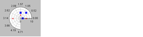
You should now have the same chart as in Case 1, except that the abscissa scale is graduated in radians.
Notice, however, that the scale labels are formatted as integers. To format them as floating values, do the following:
1. Select the Scales page of the Chart inspector.
2. Make sure Abscissa is selected in the Scales list.
3. Click the Steps tab of the Scales page.
4. Change the label format to “%.2f”.
5. Click Apply to validate the change.
The resulting chart should now look like this. You can compare it with the chart you created in Case 1.
Summary
You have now completed the first example that shows how to use a polar chart to represent data whose abscissa values are not expressed in degrees. Although you changed the abscissa scale unit from degrees to radians, this example still displays data whose abscissa expresses angle values.
You can also use a polar chart to represent any data you want on a circular scale, even if the abscissa values are not directly related to angles. For example, a pie chart is based on a polar chart. For this reason, we are now going to show you another simple example that shows how to use a polar chart to represent time values in a circular way.
Version 6.0
Copyright © 2015, Rogue Wave Software, Inc. All Rights Reserved.