Creating a Stacked or a Side-by-Side Representation
This section explains how to create a stacked representation. The same procedure can be used to create a side-by-side representation.
We will continue to use our example chart, which shows the temperatures and pressures (see
Table 2.1). To better highlight the day of the week with the highest mean temperature, you are going to stack the morning and afternoon temperatures.
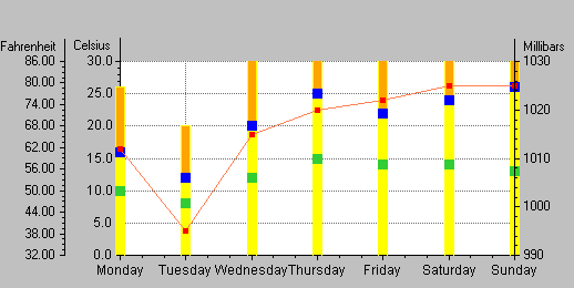
Figure 2.3 shows how your chart will appear.
Figure 2.3 Final Stacked-Bar Chart
To create the stacked-bar representation, you will perform the following tasks:
Creating the Stacked-Bar Displayer
Starting from the chart you obtain once you have created and customized the third ordinate scale (see the previous section
Defining a Related Ordinate Scale), follow the steps below to create a stacked-bar displayer.
1. Select the Displayers page of the Chart inspector.
2. Make sure Displayer 1 is selected.
3. Click the “Insert a displayer before” icon

below the Displayers list.
A new displayer called “Displayer 1” is inserted before the others. (Displayers are displayed in the order in which they are listed.) The new displayer is automatically highlighted.
4. Select Stacked bar from the Displayer type list.
In the Displayers list, an indented tree item also named Displayer 1 is added under Displayer 1.
Notice that at this stage, the stacked-bar displayer Displayer 1 only represents the Morning temperatures data set, as indicated by the state of the toggle button in the Data sets box. You want Displayer 1 to display the Afternoon temperatures data set as well.
5. In the Data sets list, check the toggle box in front of the Afternoon temperatures data set.
Now the stacked-bar displayer Displayer 1 will display both the Morning temperatures and Afternoon temperatures data sets.
This creates the Displayer 2 subitem.
6. Click Apply to validate the changes.
The chart now looks like this.
Seemingly, at this stage, only one bar is visible. However, if you look at the Displayers list on the Displayers page, you can see that the root Displayer 1 is composed of two child displayers that are associated with the morning temperatures and the afternoon temperatures, respectively. These two displayers have the same foreground and background colors. This is why their graphical representations seem to merge into one single bar. To differentiate the morning from the afternoon temperatures within the stacked bars, you must change the colors.
Changing the Color of the Bars
1. In the Displayers list, select the subitem Displayer 1 under the main Displayer 1.
The General page in the right lower corner of the Displayers page shows information on the selected displayer.
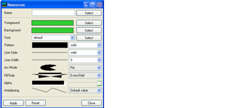
2. At the right end of the Palette field, click the small icon.
The Resources panel showing the settings of the palette associated with the displayer opens.
You will keep the default foreground color used to draw the borders of the bars, but you are going to change the background color used to fill the bars.
3. In the Resources panel, click the Select button next to the Background box.
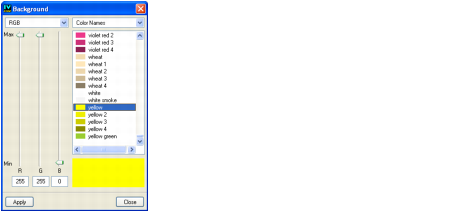
The Background panel that opens lists the available colors.
4. Scroll down the color list to select Yellow. Click Apply in the Background panel to validate this change. Then click Close to close this window.
5. Click Apply in the Resources panel and then Close to close the Resources panel.
6. In the Chart inspector, click Apply to validate this change.
7. To change the color of the second displayer, select the subitem Displayer 2 of the main Displayer 1 in the Displayers list. Repeat steps
2 to
6 to set the background color to Orange.
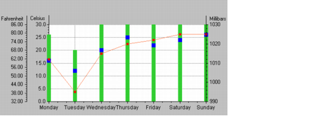
At this stage, you can see that the stacked bars appear in two different colors. However, some of the bars are truncated. This is because the sum of the morning and afternoon temperatures is sometimes greater than 30, the upper limit set to the scale Ordinate 1. In order to see all of the bars that are truncated, you will need to change this upper value.
Changing the Maximum Value of the Ordinate Scales
1. In the Chart inspector, select the Scales page.
2. Select Ordinate 1 in the Scales list.
3. On the General subpage, change the value in the Max field from 30 to 40, which is the maximum sum of the morning and afternoon temperatures in our example.
4. Click Apply to validate the change.
Now that you have changed the maximum value of Ordinate 1, you must also change the maximum value represented on Ordinate 3, which converts degrees Celsius to degrees Fahrenheit. Otherwise, the two scales will no longer match.
5. To change the maximum value of Ordinate 3, select Ordinate 3 in the Scales list. Repeat steps
3 and
4.
Your chart should now look like this:
You have now completed the Cartesian chart example representing temperatures (cumulated or not) both on a Celsius scale and on a Fahrenheit scale, as well as pressures on a millibars scale. In working through this example, you have learned how to do the following:

Define data sets and their displayers.
Create and customize scales.
Create and customize a grid associated with a scale.
Define a transformation to be applied to the data values represented by a scale.
Create a stacked representation.
You can now go on to the second example. In the second example, you are going to represent analytic functions in a chart. In addition to learning more about how to define data sets and displayers and customize scales, you will also learn how to use logarithmic scales and how to connect a legend to a chart.
Version 6.0
Copyright © 2015, Rogue Wave Software, Inc. All Rights Reserved.