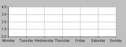
Example 1: Charting Temperatures and Pressures of the Week
The data you are going to represent in your chart are the mean morning and afternoon temperatures, as well as the mean pressure recorded for each day of a week. The temperatures are expressed in degrees Celsius and the pressures in millibars. These data are listed in the following table:
Temperature and Pressure Values
Day | Morning Temperature (° C) | Afternoon Temperature (° C) | Mean Pressure (millibars) |
0 | 10 | 16 | 1012 |
1 | 8 | 12 | 995 |
2 | 12 | 20 | 1015 |
3 | 15 | 25 | 1020 |
4 | 14 | 22 | 1022 |
5 | 14 | 24 | 1025 |
6 | 13 | 26 | 1025 |
Defining Several Independent Ordinate Scales
Let’s assume that you want to represent all the data in
Table 2.1 on the same chart. Since the data are expressed in two different units (degrees Celsius and millibars), you need to define two independent ordinate scales, one representing degrees Celsius and the other representing millibars.
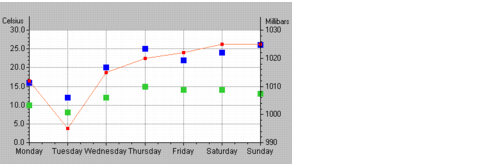
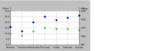
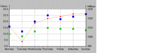
Figure 2.1 shows the chart you will be creating. The morning and afternoon temperatures are represented by markers of different colors while the pressures are represented by a marked polyline.
Figure 2.1 Cartesian Chart with Two Ordinate Scales
You will find the step-by-step instructions to show you how to build this chart. The procedure is broken down into several tasks, which are themselves divided into several steps.
In this part of the example, you will see how to do the following tasks:
Creating a Cartesian Chart
Because our example chart is based on a Cartesian chart, the first thing you must do is create the chart.
Note: It is recommended that you load both Charts and the GUI application plug-ins in order to be able to use the Test mode with Charts. |
2. Drag a Cartesian chart object to your working buffer window.
Your working buffer window can be the buffer window that is created by default or any other window you have created in the work space. You can create a new buffer window by selecting File > New in the menu bar at the top of the Main window and then the buffer type you want (2D Graphics, and so on).
3. Double-click the Cartesian chart object in the buffer window.
The corresponding inspector appears with the General page in front by default.
See
Using the Chart Inspector for an overview of the Chart inspector. This section contains an explanation of each notebook page you may need to use when working with charts.
4. At this stage, it is a good idea to save the buffer containing your chart.
Make sure you select a directory for which you have write access. Also remember to save periodically as you work.
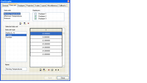
Defining the Data Sets
Because you want to represent morning temperatures, afternoon temperatures, and pressures, you must define three data sets.
Defining the Morning Temperatures Data Set
1. Click the Data sets tab in the Chart inspector to bring this page to the front.
The top of this page shows the list of data sets and the list of displayers created for the current chart. At this stage, you can either use a data set that is already defined for the current chart or create another data set by simply clicking the Insert icon

below the Data sets list.
Just remember to delete the data sets that you will not use since you only need three data sets for our example. To delete a data set, select the data set and click the Remove icon

below the Data sets list.
2. Make sure the first data set is selected in the Data sets list.
You are going to use this data set to represent the morning temperatures. The days of the week will be displayed along the abscissa scale and the mean temperatures along the ordinate scale. Since the days are referenced by indexes ranging from 0 to 6, you can use a data set of type “Y values” to represent the morning temperatures. By doing this, you only need to enter the temperature values. By default, the values represented on the abscissa scale will be the indexes of the specified Y values.
3. Make sure the selected data set is of type “Y values” in the Data set type list. If not, select “Y values” in the Data set type list.
4. Make sure the Y list in the scrolling list next to the Data set type list is empty. If not, click the Clean icon

below the list to empty it.
You are now going to fill it in with the morning temperatures from
Table 2.1.
5. Click the Add icon

below the empty Y list as many times as necessary to create the required number of empty cells.
6. Select the first cell and enter the first temperature value.
7. Repeat step 6 for each cell.
8. In the Name field, change the default name of the data set to Morning temperatures.
The Data sets list is updated accordingly.
9. Click Apply to validate the change.
Defining the Afternoon Temperatures Data Set
Following the same procedure, you are now going to enter the values for the second data set, the afternoon temperatures. You can either use a data set that is already defined for the current chart or create another data set by simply clicking the Add icon

below the Data sets list once the first data set is selected.
1. Select the second data set in the Data sets list.
2. Make sure this data set is already of type “Y values.” If not, select “Y values” in the Data set type list.
3. Repeat
steps 4 to 7 in the previous section to enter the afternoon temperatures.
4. In the Name field, change the default name of the data set to Afternoon temperatures.
The Data sets list is updated accordingly.
5. Click Apply to validate the change.
Defining the Pressure Data Set
Finally, you are going to enter the values for the third data set that represents the pressures. You can either use a data set that is already defined for the current chart or create another data set by simply clicking the Add icon
below the Data sets list, once the second data set is selected.
1. Select the third data set in the Data sets list.
2. Make sure “Y values” is selected in the Data set type list. If not, select “Y values” in the Data set type list.
3. Enter the pressure values by repeating
steps 4 to 7 of the morning temperatures data set section.
4. In the Name field, change the default name of the data set to Pressures.
The Data sets list is updated accordingly.
5. Click Apply to validate the change.
You have now defined all the data sets for the chart.
Defining the Displayers
You are now going to define the corresponding displayers to display the data sets you defined in the previous section.
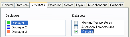
1. Click the Displayers tab in the Chart inspector to bring this page to the front.
The top of this page shows the list of displayers and the list of data sets created for the current chart. At this stage, you can either use a displayer that is already defined for the current chart or create another displayer by simply clicking the Insert icon
below the Displayers list.
Just remember to delete the displayers that you will not use since you only need three displayers for our example. To delete a displayer, select the displayer and click the Remove icon
below the Displayers list.
2. Make sure the first displayer is selected in the Displayers list.
This displayer will be used to display the Morning temperatures data set.
3. For the displayer to display the Morning temperatures data set, the toggle in front of the Morning Temperatures data set must be checked. If it is not checked, click the toggle.
Next, you must specify the type of displayer for the data set. Because you want to represent the morning temperatures with markers, you must specify a scatter displayer.
4. Make sure “Scatter” is selected in the Displayer type list. If it is not selected, select “Scatter.”
5. Click Apply to validate the changes.
Following the same procedure, you are now going to define the displayer for the
Afternoon Temperatures data set. You can either use a displayer that is already defined for the current chart or create another displayer by simply clicking the Add icon
below the Displayers list once the first displayer is selected.
1. Select the second displayer from the Displayers list.
2. For the displayer to display the Afternoon temperatures data set, the toggle in front of the Afternoon Temperatures data set must be checked. If it is not checked, click the toggle.
Next, you must specify the type of displayer for the data set. Because you want to represent the afternoon temperatures with markers, you must specify a scatter displayer.
3. Make sure “Scatter” is selected in the Displayer type list. If it is not selected, select “Scatter.”
4. Click Apply to validate the changes.
Following the same procedure, you are also going to define the displayer displaying the
Pressures data set. You can either use a displayer that is already defined for the current chart or create another displayer by simply clicking the Add icon
below the Displayers list once the second displayer is selected.
1. Select the third displayer from the Displayers list.
2. For the displayer to display the Pressures data set, the toggle in front of the Pressures data set must be checked. If not, check this toggle by clicking it.
Next, you must specify the type of displayer for the data set. Because you want to represent the pressures with a marked polyline, you must specify a marked polyline displayer.
3. Make sure “Marked polyline” is selected in the Displayer type list. If not, select “Marked polyline” in the Displayer type list.
4. Click Apply to validate the changes.
You have now defined the displayers for the three data sets to be displayed in your chart.
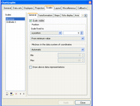
Customizing the Abscissa Scale
For this example, you want to define labels that will be displayed next to the steps of the scale instead of the indexes of the days. To customize the abscissa scale in this way, do the following:
1. Click the Scales tab in the Chart inspector to bring this page to the front.
2. Make sure Abscissa is selected in the Scales list.
The right side of the Scales page is divided into several subpages that describe the properties of the selected scale.
3. Display the General page of the Chart Inspector and make sure that the minimum and maximum data values represented on the current scale are automatically computed. If not, select “Automatic” in the Min/Max drop-down list.
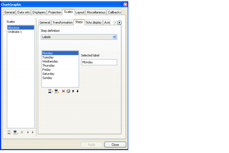
4. Click the Steps tab to bring this page to the front.
By default, the steps are labeled with floating values that correspond to the data. In this example, they are labeled with the indexes of the days (from 0 to 6). However, for better understanding, we prefer to display the names of the days.
5. Choose Labels in the Step definition list.
A rectangular area and the “Selected label” text field appear below this drop-down list. The rectangular area is empty because you have not created any labels yet.
6. To create a label, click the “Add a label” icon
below the empty rectangular area.
A selected X appears at the top of the rectangular area and the string &DefaultStepLabel appears in the “Selected label” field.
7. Select &DefaultStepLabel and type the name of the first day of the week, Monday.
The label you are currently editing is selected in the rectangular area.
8. Repeat steps 6 and 7 to create a label for each day of the week. Make sure the last label you created is selected before you click the “Add a label” icon.
9. Click Apply to validate the new labels.
In the buffer window, the labels on the abscissa scale may overlap. To see each label completely, you may need to resize the chart:
Customizing the First Ordinate Scale
The first ordinate scale of the chart will be graduated in degrees Celsius. To customize the scale in this way, you need to perform the following tasks:
The Scales page should already be selected in the Charts inspector, so you can continue with these tasks.
Setting the Minimum and Maximum Values
1. Select Ordinate 1 in the Scales list.
The notebook pages on the right side of the page describe the properties of the selected scale.
2. Make sure the General tab is displayed in front.
The scale must be attached to a position that is defined with respect to the minimum data value. If not, select “a position” from the “Scale fixed to” drop-down list, set 0 in the position box, and select “From minimum value” in the drop-down list that appears below. These settings are used to attach Ordinate 1 to the position of the minimum data value represented on the abscissa scale.
The scale Ordinate 1 will be used to represent the temperatures in degrees Celsius. The minimum and maximum data values of the scale must therefore include at least all the temperatures listed in
Table 2.1. Otherwise, some temperatures will not be displayed.
3. On the Scales/General notebook page, make sure “User-defined” is selected from the Min/max drop-down list. Then enter 0 in the Min field and 30 in the Max field.
4. Click Apply to validate the changes.
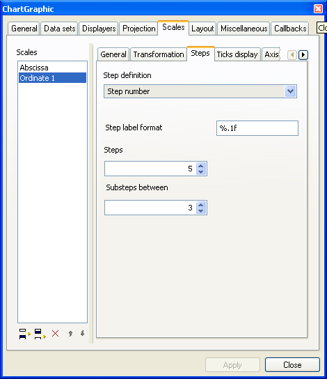
Setting the Scale Graduations
1. Click the Steps tab to bring this page to the front.
For scale Ordinate 1, you want to define the steps by specifying a step unit.
2. Make sure “Step unit” is selected in the Steps definition list.
3. Enter 5 in the “Step unit” field.
This means that the scale will display one major tick for every five degrees Celsius. (You can either type the value or use the down and up arrows to select the value).
4. Enter 4 as the number of substeps between two steps.
5. Click Apply to validate.
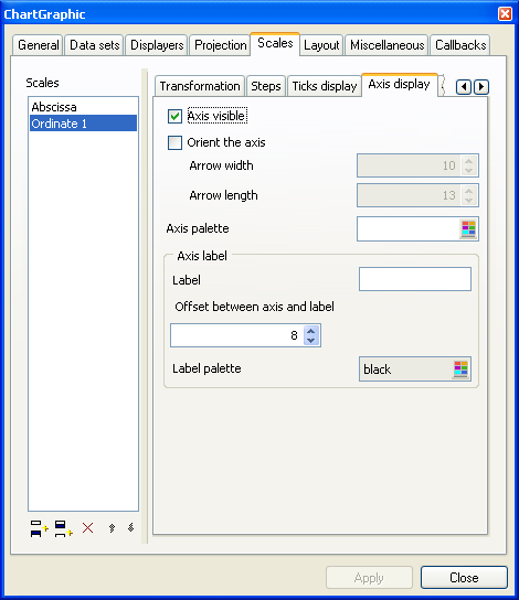
Labeling the Axis
1. Click the Axis display tab to bring this page to the front.
2. In the Axis label box, type Celsius in the Label text field.
3. Click Apply to validate the change.
Creating and Customizing the Second Ordinate Scale
Because it will be used to display the pressure values, the second ordinate scale must be graduated in millibars. Unlike the first ordinate scale, which already existed by default, the second one needs to be created before you can customize it.
The Scales page should already be selected in the Charts inspector, so you can continue with these tasks.
Creating Ordinate 2 Scale
1. Select the last created scale (Ordinate 1 at this stage) in the Scales list and click the “Add an ordinate scale” icon
below the Scales list.
A new scale, named Ordinate 2, is added to the list and highlighted. The notebook pages on the right describe the properties of the selected scale.
2. Click the General tab to bring this page to the front.
Customizing Ordinate 2 Scale
To customize the Ordinate 2 scale, you need to perform the following tasks:
Setting the Position and Min/Max Values of the Scale
The General page should be displayed on the Scales page. On the General page, you will specify the position on the abscissa scale to which Ordinate 2 is attached, as well as the minimum and maximum values that will be represented by the scale Ordinate 2. The new scale is attached by default to the position of the minimum data value represented on the abscissa scale (as is Ordinate 1). The minimum and maximum values are computed automatically by default. Therefore, your first task is to change the scale positioning and the way the minimum and maximum values are defined.
1. In the Position box, select 0 as the position.
2. Select “From maximum value” in the drop-down list below.
This specifies that the position of the second ordinate scale is relative to the position of the maximum data value represented on the abscissa scale.
3. Select “User-defined” in the Min/max drop-down list so that you can specify the minimum and maximum values that will be represented by the scale.
Ordinate 2 will represent pressures in millibars. Therefore, the minimum and maximum data values used for the scale must include at least all the pressures given in
Table 2.1. Otherwise, some pressures will not be displayed.
4. Type 990 in the Min field and 1030 in the Max field.
5. Click Apply to validate the changes.
Setting the Scale Graduations
1. Click the Steps tab to bring this page to the front.
2. Make sure the “Step unit” option is selected.
3. Enter 10 as the step unit.
This means that there will be one major tick displayed for every ten millibars.
4. Enter 4 as the number of substeps between two steps.
5. Click Apply to validate.
Indicating that Labels Must Be Drawn at the Axes Crossings
1. Click the Ticks display tab to bring this page to the front.
2. Click the “Draw labels on axes crossings” toggle button.
3. Click Apply to validate.
Labeling the Axis
1. Click the Axis display tab to bring this page to the front.
2. In the Axis label box, type Millibars in the Label text field.
3. Click Apply to validate.
You have now defined the second ordinate scale. At this stage, your chart should look like this:
Specifying the Ordinate Scale Used by the Displayers
You must specify the ordinate scale that is used by each displayer to display the data. This is done on the General page of each displayer.
Currently, the default setting (Ordinate 1) is true for the Morning temperatures and Afternoon temperatures data sets, but false for the Pressures data set. The Pressures data set must be represented on Ordinate 2 since this scale was created for this purpose.
1. Click the Displayers tab of the Chart inspector to bring this page to the front.
2. Select Displayer 3 in the Displayers list.
This displayer is associated with the Pressures data set, as shown by the checked toggle button in the Data sets box.
3. On the General subpage, select Ordinate 2 from the “Ordinate scale” drop-down list.
4. Click Apply to validate.
The chart you obtain at this stage should be similar to
Figure 2.1.
Version 6.0
Copyright © 2015, Rogue Wave Software, Inc. All Rights Reserved.