Area chart widget using CLI
Area chart widgets display area charts for a Library, IP, IPV, or Saved query.
Area chart widget configuration
To display an area chart on an object, set an attribute on that object with a specific value. You can set the title of the chart with the widgetHeader option. See Widgets for more information.
The attribute value is a JSON string with the following fields:
-
display: area
-
config: (optional) See the Basic configuration and Axis configuration sections.
-
data: Array of y-coordinates along a y-axis of type “number”. This is an array of objects containing the following fields:
-
name: Name of the y-coordinate that will appear in the tooltip
-
data: Array of y-coordinates (numbers) to plot. The chart will be adjusted automatically based on the range
-
color: (optional) Specify the color of the plot
-
-
xKeyData: (optional) Array of primitives, either category names (strings) to display on each tick of an axis of type “category” or x-coordinates along an x-axis of type “number” or “time” (numbers or timestamps)
Basic configuration
This table lists the basic configuration options for area charts. Specify these options in the JSON, as child properties of the “config” object (see examples in code below):
| Property Name | Description |
|---|---|
| theme |
If specified, identifies a theme to use to customize the appearance of the chart. Can be one of:
When a theme is used, the "color" value on the "data" field will be ignored (see above). |
| title | If specified, displays a title for the chart. |
| subtitle | If specified, displays a subtitle for the chart. |
| legendPosition | Legend positions: “top”, “bottom”, “left”, “right” Default: No legend is displayed if “config” object is specified and “legendPosition” is not specified. |
| showMarkers | Boolean which indicates if markers should be displayed on all data points. Default is false. |
| stacked | Boolean which indicates if the chart data will be stacked on top of each other. Default is false. |
| normalizedTo | Number to which the totals in a stacked area chart should be normalized. This option only applies when “stacked” is true. Default is 0, or disabled. |
Axis configuration
Specify these options in the JSON, as child properties of the “config” object (see examples in code below):
| Property name | Description |
|---|---|
|
axes: [{ type: <value> }] |
Axis types: “category”, “number”, “log”, “time” |
|
axes: [{ position: <value> }] |
Axis positions: “top”, “bottom”, “left”, “right” |
|
axes: [{ title: <value> }] |
If specified, displays a title for the axis on the chart. |
|
axes: [{ label: { format: <value> } }] |
Format string used when rendering labels for number or time axes. See the descriptions for these strings in the “Number Label Format String” and "Time Label Format String" sections at https://www.ag-grid.com/vue-charts/axes/. |
|
axes: [{ label: { rotation: <value> } }] |
Number of degrees to rotate the axis tick labels. Use to eliminate label over-crowding. Default is 0. |
|
axes: [{ tickCount: <value> }] |
For a “number" or "time" axis, indicates the desired number of ticks for the axis to use (this is only a hint, and not guaranteed). Default is 10. For a “log” axis, can be used to alleviate the problem of tick over-crowding. Not intended to be used for “category” axes. |
|
axes: [{ tickCount: { interval: <value> } }] |
For a “time” axis, indicates the time interval at which ticks should appear. This string value is one of:
If the "dates" that are specified in the JSON are in local time, then you’ll specify a non-“utc” interval to render the ticks relative to the same. Otherwise, with a “utc” interval, the ticks will be displayed relative to Coordinated Universal Time (UTC). If the “dates” are specified in GMT time, then always use a non-“utc” interval, otherwise the ticks will be improperly adjusted earlier in time than GMT. See Dates configuration for an example. The value that you choose for this property should be appropriate for the data being charted. For example, if the data is year-based, specify an interval of “month” to prevent an enormous amount of ticks.
|
|
axes: [{ tickCount: { every: <value> } }] |
For a “time” axis, a number which indicates how often a tick will appear at the specified interval. For example, if the interval is “month” and every is 2, ticks will be displayed every two months. |
|
axes: [{ hideTickLabels: <value> }] |
Boolean which indicates whether to show or hide tick labels. Default is false (show tick labels). |
|
axes: [{ base: <value> }] |
For a “log” axis, indicates which logarithm base to use. Default is 10 (i.e. base 10, or the common logarithm). |
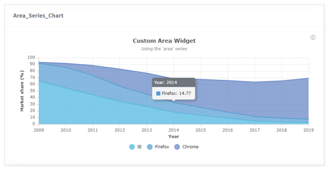
Area chart widget example - Command line
pi ip attribute set drinks.cosmo@2.TRUNK Area_Series_Chart '{ "display": "area", "config": { "title": "Custom Area Widget", "subtitle": "Using the ‘area’ series", "legendPosition": "right" }, "data": [{ "name": "IE", "data": [64.97, 54.39, 44.03, 34.27, 26.55, 17.75, 13.3, 8.94, 4.77, 3.2, 2.7] }, { "name": "Firefox", "data": [26.85, 31.15, 29.36, 22.69, 18.55, 14.77, 11.82, 8.97, 6.75, 5.66, 4.66] }], "xKeyData": [2009, 2010, 2011, 2012, 2013, 2014, 2015, 2016, 2017, 2018, 2019] }'
Area chart widget example - Formatted JSON
{
    "display": "area",
    "widgetHeader": "#### Area\\_Series\\_Chart",
    "config": {
         "title": "Custom Area Widget",
	 "subtitle": "Using the 'area' series",
	 "legendPosition": "right",
	 "axes": [
	     {
	          "type": "number",
		  "position": "bottom",
		  "title": "Year"
	     },
	     {
                "type": "number",
                "position": "left",
                "title": "Market share (%)"
	     }
        ]
    },
    "data": [
        {
            "name": "IE",
            "data": [64.97, 54.39, 44.03, 34.27, 26.55, 17.75, 13.3, 8.94, 4.77, 3.2, 2.7]
        },
	{
            "name": "Firefox",
            "data": [26.85, 31.15, 29.36, 22.69, 18.55, 14.77, 11.82, 8.97, 6.75, 5.66, 4.66]
	},
        {
            "name": "Chrome",
            "data": [1.37, 5.94, 15.01, 25.99, 31.71, 35.85, 42.27, 47.79, 51.76, 56.31, 61.72]
        }
    ],
    "xKeyData": [2009, 2010, 2011, 2012, 2013, 2014, 2015, 2016, 2017, 2018, 2019]
}
IPLM Web output
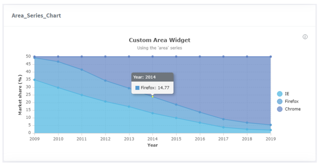
This is the result of specifying the showMarkers property with a true value:
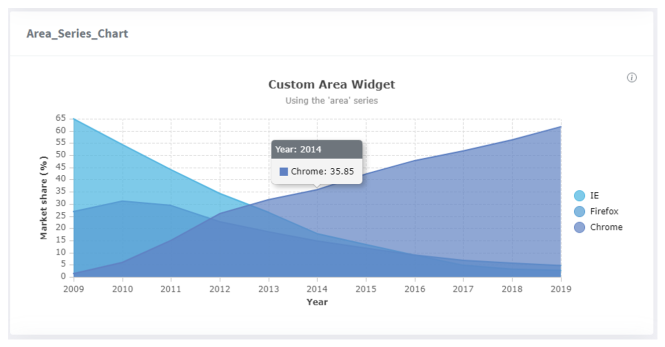
This is the result of specifying the stacked property with a true value:
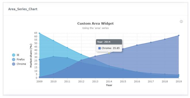
This is the result of specifying the normalizedTo property as 50 (and stacked true):