Line chart widget using CLI
Line chart widgets display line charts for a Library, IP, IPV, or Saved query.
You can use the Widget Editor for a simpler way to create line charts, including making code changes in the Code editor. For more information, see Widget Editor.
Line chart widget configuration
To display a line chart on an object, set an attribute on that object with a specific value. The attribute name is used as the name of the displayed chart.
The attribute value is a JSON string with the following fields:
- display: graph
- widgetHeader (optional): If provided, the markdown enabled text is displayed in the widget header. If omitted, the widget header will not be displayed.
- config: (optional) See the Basic configuration and Axis configuration sections.
- data: Array of dictionaries. Each dictionary is plotted as a line (use only one dictionary if only one line is to be plotted). Dictionary fields:
- name: Name of the line chart
- data: Array of integers to plot. The graph will be adjusted automatically based on the range.
- color: (optional) Specify the color of the plot
-
xKeyData: (optional) Array of category names (strings) to display on each tick of an axis of type “category” or an array of x-coordinates (numbers) along an x-axis of type “number” or “time”.
-
xaxis (deprecated): String to display as the X-axis label
-
yaxis (deprecated): String to display as the Y-axis label
Basic configuration
This table lists the basic configuration options for line charts. Specify these options in the JSON, as child properties of the “config” object (see examples in code below):
| Property Name | Description |
|---|---|
| theme |
If specified, identifies a theme to use to customize the appearance of the chart. Can be one of:
When a theme is used, the "color" value on the "data" field will be ignored (see above). |
| title | If specified, displays a title for the chart. |
| subtitle | If specified, displays a subtitle for the chart. |
| legendPosition | Legend positions: “top”, “bottom”, “left”, “right” Default: No legend is displayed if “config” object is specified and “legendPosition” is not specified. |
Axis configuration
Specify these options in the JSON, as child properties of the “config” object (see examples in code below):
| Property name | Description |
|---|---|
|
axes: [{ type: <value> }] |
Axis types: “category”, “number”, “log”, “time” |
|
axes: [{ position: <value> }] |
Axis positions: “top”, “bottom”, “left”, “right” |
|
axes: [{ title: <value> }] |
If specified, displays a title for the axis on the chart. |
|
axes: [{ label: { format: <value> } }] |
Format string used when rendering labels for number or time axes. See the descriptions for these strings in the “Number Label Format String” and "Time Label Format String" sections at https://www.ag-grid.com/vue-charts/axes/. |
|
axes: [{ label: { rotation: <value> } }] |
Number of degrees to rotate the axis tick labels. Use to eliminate label over-crowding. Default is 0. |
|
axes: [{ tickCount: <value> }] |
For a “number" or "time" axis, indicates the desired number of ticks for the axis to use (this is only a hint, and not guaranteed). Default is 10. For a “log” axis, can be used to alleviate the problem of tick over-crowding. Not intended to be used for “category” axes. |
|
axes: [{ tickCount: { interval: <value> } }] |
For a “time” axis, indicates the time interval at which ticks should appear. This string value is one of:
If the "dates" that are specified in the JSON are in local time, then you’ll specify a non-“utc” interval to render the ticks relative to the same. Otherwise, with a “utc” interval, the ticks will be displayed relative to Coordinated Universal Time (UTC). If the “dates” are specified in GMT time, then always use a non-“utc” interval, otherwise the ticks will be improperly adjusted earlier in time than GMT. See Dates configuration below for an example. The value that you choose for this property should be appropriate for the data being charted. For example, if the data is year-based, specify an interval of “month” to prevent an enormous amount of ticks.
|
|
axes: [{ tickCount: { every: <value> } }] |
For a “time” axis, a number which indicates how often a tick will appear at the specified interval. For example, if the interval is “month” and every is 2, ticks will be displayed every two months. |
|
axes: [{ hideTickLabels: <value> }] |
Boolean which indicates whether to show or hide tick labels. Default is false (show tick labels). |
|
axes: [{ base: <value> }] |
For a “log” axis, indicates which logarithm base to use. Default is 10 (i.e. base 10, or the common logarithm). |
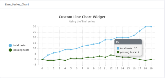
Line chart widget example - Command line
pi ip attribute set drinks.cosmo@2.TRUNK Line_Series_Chart '{ "display": "graph", "config": { "title": "Custom Line Chart Widget", "subtitle": "Using the ‘line’ series", "legendPosition": "left" }, "data": [{ "name": "total tests", "data": [0, 4, 6, 7, 9, 9, 10, 12, 13, 14, 15, 18, 18, 20, 20, 20, 22, 26, 30, 30]}, { "name": "passing tests", "data": [0, -1, -1, 0, -1, 1, 1, 1, 2, 2, 3, 2, 4, 3, 2, 2, 1, 0, -1, 0],"color": "darkgreen" }]}'
Line chart widget example - Formatted JSON
{
    "display": "graph",
    "config": {
        "title": "Custom Line Chart Widget",
        "subtitle": "Using the ‘line’ series",
        "legendPosition": "left"
    },
    "data": [
        {
            "name": "total tests",
            "data": [0, 4, 6, 7, 9, 9, 10, 12, 13, 14, 15, 18, 18, 20, 20, 20, 22, 26, 30, 30]
        },
        {
            "name": "passing tests",
            "data": [0, -1, -1, 0, -1, 1, 1, 1, 2, 2, 3, 2, 4, 3, 2, 2, 1, 0, -1, 0],
            "color": "darkgreen"
        }
    ]
}
IPLM Web output
Dates configuration
You can define an axis (typically the x-axis) of type "time" for the line chart. You must specify the root “xKeyData” property in the widget’s JSON. The values in this array must be either an empty string (which represents the current date), a Unix timestamp number (which is Epoch time in milliseconds, 13 digits), or a timestamp string (see: https://developer.mozilla.org/en-US/docs/Web/JavaScript/Reference/Global_Objects/Date/parse#date_time_string_format).
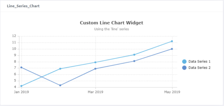
Line chart widget example with dates - Formatted JSON
{ "display": "graph",
"widgetHeader": "##### Line chart widget example with dates header",
"config": {
"title": "Custom Line Chart Widget",
"subtitle": "Using the 'line' series",
"legendPosition": "right",
"axes" : [
{
"type": "time",
"position": "bottom",
"labelFormat": "%b %Y",
"tickCount": {
"interval": "month",
"every": 2
}
},
{
"type": "number",
"position": "left" }
]
},
"data": [
{
"name": "Data Series 1",
"data": [4.2, 6.9, 7.9, 9.1, 11.2]
},
{
"name": "Data Series 2",
"data": [7.1, 4.3, 6.9, 8.1, 10.0]
}
],
"xKeyData": [
"01 Jan 2019 00:00:00 GMT",
"01 Feb 2019 00:00:00 GMT",
"01 Mar 2019 00:00:00 GMT",
1554076800000,
1556668800000
]
}
IPLM Web output