Additional Ways to Customize a Chart
The example charts in
The Temperatures Chart with a Legend and
Example Polar Chart are quite basic. At this point, we can customize the charts in several other ways to improve their appearance. The same improvements can be made to both of our charts. For example, we can do the following:
The complete source code of the examples can be found in the cartesian_custom.cpp file for the Cartesian chart and in the polar_custom.cpp file for the polar chart. These files are located in the $ILVHOME/samples/charts/userman/src directory.
Replacing the Values Displayed along the Abscissa Scale
By default, the labels displayed at the major tick marks of the scales are floating values corresponding to the data values represented by the scales. The labels displayed along the abscissa scale are the indexes from 0 to 6 referencing the days of the week. To make these values more understandable, we can display the names of the days instead of the indexes. To do this, use the following code:
const char* labels[7] = {"Monday", "Tuesday", "Wednesday", "Thursday", "Friday", "Saturday", "Sunday"}; IlUInt labelsCount = 7; abscissaScale->setStepLabels(labelsCount, labels); |
Adding a Label at the End of the Ordinate Scale Axis
The ordinate scale represents the temperatures expressed in degrees Celsius. To indicate the unit of the values represented by this scale, we can add the label “Celsius” at the end of the axis. To do this, use the following code:
ordinateScale->setAxisLabel("Celsius"); |
Adding an Arrow at the End of the Scale Axes
To add an arrow at the end of each scale axis, use the following code:
abscissaScale->setAxisOriented(IlTrue); ordinateScale->setAxisOriented(IlTrue); |
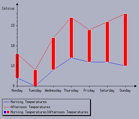
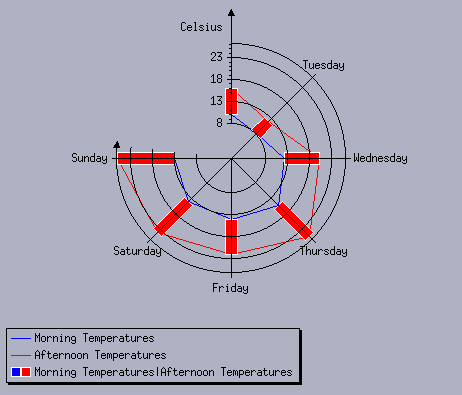
The Temperatures Cartesian Chart with Additional Customization and
The Temperatures Polar Charts with Additional Customization now show the new charts that we obtain. The names of the days of the week appear at the major tick marks along the abscissa. The label “Celsius” appears at the end of the ordinate scale and arrows appear at the end of each axis.
The Temperatures Cartesian Chart with Additional Customization
The Temperatures Polar Charts with Additional Customization
Note: In step 3 of the section Customizing the Abscissa Scale, we added an instruction for the polar chart to display the step label of the abscissa scale at the intersection point with the ordinate scale. This instruction has been removed to obtain the chart in The Temperatures Chart Displayed as a Polar Chart. If you keep this instruction, the “Monday” label will be drawn and it will be partially covered by the ordinate axis. |
The Charts package of Rogue Wave Views provides many ways for you to customize your charts. For example, you can also add grids, cursors, and so on. For more details about all the possible ways to customize a chart, take a look at the remaining chapters of this user’s manual.
Version 6.2.1
Copyright © 2018, Rogue Wave Software, Inc. All Rights Reserved.

