Creating a Substate: the Edit State
You do not want the text field in Panel2 to be editable when this panel is in the Show state. You do, however, want to be able to edit the text in the Edit state.
To make the text field in Panel2 noneditable when the Show state is active, do the following:
1. Select the Show state in the State Tree panel.
2. If required, click the New requirement icon in the State Inspector to create a new row.
3. In the Panel column of the new row, select Panel2 from the list of panels in the combo box.
4. In the Object column, select Text from the list of objects in the combo box.
5. Click in the Attribute column and choose editable from the list.
You will notice that the list of related requirements is not the same as the one you chose for a button, as the requirements depend on the object type.
6. Click in the Value column and choose false.
7. Test the application and verify that the Text field is not editable in the Show state.
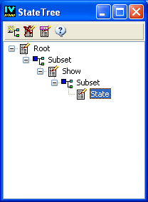
You are now going to define a substate of Show that will inherit from its visibility requirement: the Edit substate. To do so:
1. Select the Show state in the State Tree panel.
2. Click the New Subset icon in the State Tree toolbar.
A new tree item is created and selected. Notice that the toolbar has slightly changed—the New Subset icon is now replaced with the New State icon.
3. Click the New State icon in the toolbar.
A new state item is created in the tree.
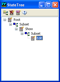
4. Click Rename to rename the state to Edit.
5. Leave the Edit state selected in the State Tree or select it if needed.
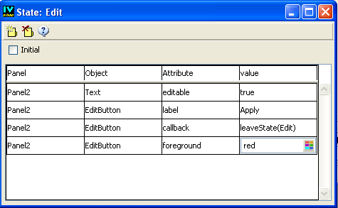
6. If required, click the New requirement icon in the State Inspector to create a new row.
7. In the Panel column of the empty row, choose Panel2 from the combo box.
8. In the Object column, choose Text from the list of objects.
9. Choose editable in the Attribute column.
10. Choose true in the Value column.
11. Click New Requirement in the State Inspector toolbar to create a new row in the State Inspector panel.
12. Choose Panel2 in the Panel column and EditButton from the Object column.
13. Choose label in the Attribute column.
14. Type Apply in the Value column and press Enter (or click New Requirement in the toolbar).
15. In the empty row just below, click in the Attribute column and select callback.
16. Choose leaveState(Edit) in the Value column.
17. Create another state requirement for this button and choose foreground as its attribute.
18. Click the Value item and select a color from the color selector (for example, red).
Notice that when you click the Value column in the State Inspector panel, the behavior of the inspector depends on the chosen attribute. It may activate a string list of predefined values or a specialized selector.
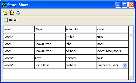
Now, go back to the Show state to attach the Edit state to the Edit button in Panel2:
1. Select the Show state in the State Tree panel.
2. In the State inspector, create an empty row.
3. Choose Panel2 from the combo box of the Panel column and EditButton from the combo box of the Object column.
4. Choose callback in the Attribute column.
5. Choose setState(Edit) in the Value column.
6. Now, test the application. Once you are in the Show state, go to the Edit state by clicking the Edit button in Panel2.
You can also enhance your application states by modifying and adding the state requirements so they look like this:
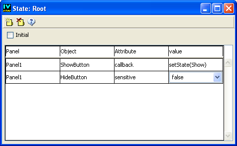
Figure A.3 The Root Sheet of the State Inspector
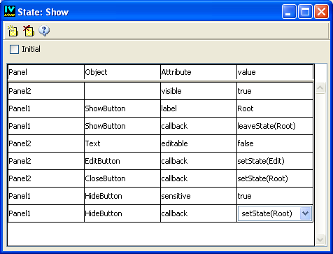
Figure A.4 The Show Sheet of the State Inspector
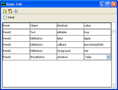
Figure A.5 The Edit Sheet of the State Inspector
Version 5.8
Copyright © 2014, Rogue Wave Software, Inc. All Rights Reserved.