Label | Description |
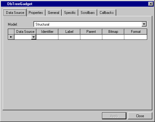
Model | Menu: Structural, Recursive. Default: Structural. Explanation: Model of the tree gadget. |
Data Source column | Menu: Names of current data sources. Default: No default. Explanation: Name of the data source to which the tree gadget is to be connected. |
Identifier column | Menu: Column names of the data source selected in the DataSource field. Default: No default. Explanation: Column in the data source containing the child identifier. |
Label column | Menu: Column names of the data source selected in the DataSource field. Default: No default. Explanation: Column in the data source containing the child label. |
Parent column | Menu: Column names of the data source selected in the Data Source field. Default: No default. Explanation: Column in the data source containing the value for parents. |
Bitmap column | Menu: Column names of the data source selected in the Data Source field. Default: No default. Explanation: Column containing the file name of the picture. |
Format column | Menu: List of predefined system and user formats. Default: No default. Explanation: Format to be applied to the label in the tree gadget, if a label exists, or to the value if no label exists. |

Label | Description |
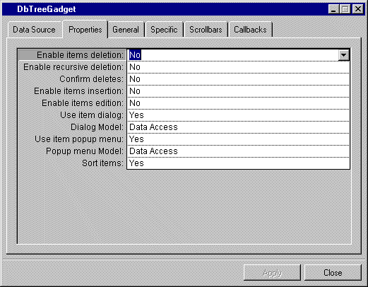
Enable items deletion | Menu: Yes, No. Default: No. Explanation: Enable or disable items deletion. |
Enable recursive deletion | Menu: Yes, No. Default: No. Explanation: Enable or disable recursive deletion. Yes: When a parent is deleted, its child is also deleted. No: A parent will not be deleted if it has one or more children. |
Confirm deletes | Menu: Yes, No. Default: No. Explanation: Enable or disable message to ask confirmation of a deletion. |
Enable items insertion | Menu: Yes, No. Default: No. Explanation: Enable or disable items insertion. |
Enable items edition | Menu: Yes, No. Default: No. Explanation: Enable or disable items edition. |
Use item dialog | Menu: Yes, No. Default: Yes Explanation: Enable or disable item dialog box. |
Dialog Model | Menu: Data Access. Default: Data Access. Explanation: Model of the dialog box. |
Use item popup menu | Menu: Yes, No. Default: No. Explanation: Enable or disable item popup menu which appears when clicking the desired item and then the mouse right button. |
Popup menu Model | Menu: Data Access. Default: Data Access. Explanation: Model of the popup menu. |
Sort items | Menu: Yes, No. Default: Yes. Explanation: Enable or disable items sorting. |

Label | Description |
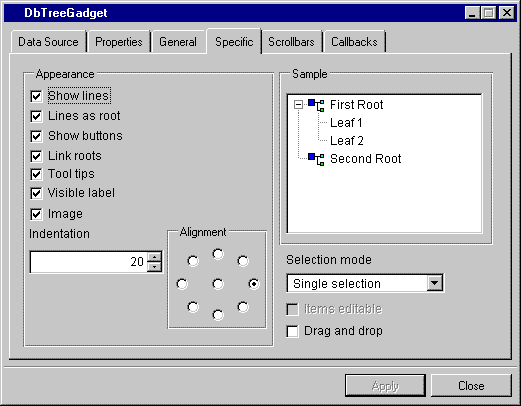
Show lines | Check box. Default: Checked. Explanation: Checked = Lines connecting elements in the tree are shown. Not checked = Lines are not shown. |
Lines as root | Check box. Default: Checked. Explanation: Checked = Lines connect roots. Not checked = Lines do not connect roots. |
Show button | Check box. Default: Checked. Explanation: Checked = Shows the buttons that indicate whether the tree is expanded. Not checked = The button is not shown. |
Link roots | Check box. Default: Checked. Explanation: Checked = A line links the roots. Not checked = The roots are not visibly linked. |
Tool tips | Check box. Default: Checked. Explanation: Checked = Displays tooltips if the item length is larger than the gadget width. Not checked = There are no tooltips. |
Visible label | Check box. Default: Checked. Explanation: Checked = The labels are visible. Not checked = The labels are not visible. |
Image | Check box. Default: Checked. Explanation: Checked = The images showing roots and nodes are visible. Not checked = The images are not visible. |
Indentation | Menu: None. Default: 20. Explanation: Distance of roots and nodes from the left of the tree. |
Alignment | Menu: None. Available positions are indicated by graphic. Default: Right. Explanation: Gives the position of the label relative to the image. |
Sample | Shows how the tree looks as you change the options in the Appearance column. |
Selection mode | Menu: Single selection, Extended selection. Default: Single selection. Explanation: Single = Only one item in the tree can be selected. Extended = More than one item can be selected. |
Items editable | Not available. |
Drag and drop | Check box. Default: Checked. Explanation: Determines whether items can be dragged and dropped. |

Label | Description |
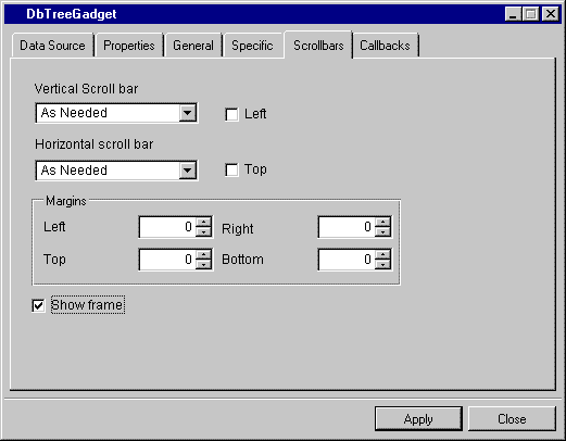
Vertical scroll bar | Menu: Show, Hide, As Needed. Default: As Needed. Explanation: Show = The field has a vertical scroll bar. Hide = The field does not have a vertical scroll bar. As Needed = Vertical scroll bar if needed. |
Left | Check box. Default: Not checked. Explanation: Checked = The vertical scroll bar is on the left side of the gadget. Not checked = The vertical scroll bar is on the right side of the gadget. |
Horizontal scroll bar | Menu: Show, Hide, As Needed. Default: As Needed. Explanation: Show = The field has a horizontal scroll bar. Hide = The field does not have a horizontal scroll bar. As Needed = Horizontal scroll bar if needed. |
Top | Check box. Default: Not checked. Explanation: Checked = The horizontal scroll bar is above the gadget. Not checked = The horizontal scroll bar is below the gadget. |
Margins | Menu: None. Default: 0. Explanation: Allows you to type the value of the left, right, top, and bottom margins. |
Show Frame | Check box. Default: Checked. Explanation: Determines whether frames are visible. |