Label | Description |
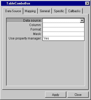
Data source | Menu: Names of current data sources. Default: No default. Explanation: Name of the source to which the table combo box gadget is to be connected. |
Column | Menu: Column names of the data source selected in the Data source field. Default: No default. Explanation: Column of the data source table to which the gadget is to be connected. |
Format | Menu: List of predefined system and user formats. Default: No default. Explanation: Format to be applied to the values in the table combo box gadget. |
Mask | Menu: List of predefined system and user input formats. Default: No default. Explanation: Input format to be applied to the values in the table combo box gadget. |
Use property manager | Menu: Yes, No. Default: Yes. Explanation: Yes = The table combo box uses a property manager. No = The table combo box does not use a property manager. |

Label | Description |
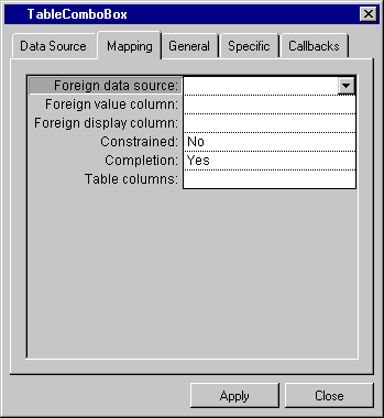
Foreign data source | Menu: Names of foreign data sources. Default: No default. Explanation: A data source containing the columns to which the values for the current column are to be mapped so that the value can be converted to another value and displayed. Creates a combo box pull-down menu in the table combo box field showing the values in the foreign data source. |
Foreign value column | Menu: Column names of the data source selected in the Foreign data source field. Default: No default. Explanation: Column in the foreign data source containing the value to which the current column is to be mapped. |
Foreign display column | Menu: Column names of the data source selected in the Foreign data source field. Default: No default. Explanation: The column in the foreign data source containing the value to be displayed when the column specified in the Foreign value column row is referred to. |
Constrained | Menu: Yes, No. Default: No. Explanation: Applies only when the value entered in the Foreign value column and Foreign display column rows is the same. Yes = Can only enter a value that belongs to foreign data source. No = Can enter any value. |
Completion | Menu: Yes, No. Default: Yes. Explanation: Is only in effect when constrained = Yes. Yes = Can enter a combo box list item by typing enough of its initial characters to make it unique, then validating it or leaving the cell. No = Cannot enter a combo box list item by typing its initial characters. |
Table columns | Menu: None. Button: Click to have the Table Columns Dialog Box appear. Default: No default. Explanation: The column(s) in the foreign data source to be displayed in the pull-down menu. |

Label | Description |
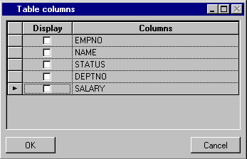
Display | Check box. Default: Not checked. Explanation: If checked, the column name appears in the pull-down menu. |
Columns | Column names. |

Label | Description |
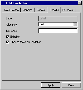
Label | Not available. |
Alignment | Menu: Left, Center, Right. Default: Left. Explanation: Alignment of the values in the table combo box gadget. |
No. Chars | Menu: None. Default: -1. Explanation: The maximum number of characters that can be entered in the Table Combo Box gadget. |
Editable | Check box. Default: Checked. Explanation: Checked = The field in the gadget can be edited. Not checked = The field in the gadget cannot be edited. |
Change focus on validation | Check box. Default: Checked. Explanation: Checked = Focus moves to the next gadget. Not checked = Focus remains on this gadget. |