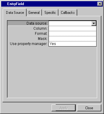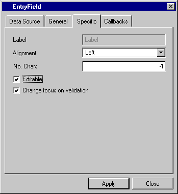
Label | Description |
Data source | Menu: Names of current data sources. Default: No default. Explanation: Name of the source to which the entry field gadget is to be connected. |
Column | Menu: Column names of the data source selected in the Data source field. Default: No default. Explanation: Column of the data source table to which the gadget is to be connected. |
Format | Menu: List of predefined system and user formats. Default: No default. Explanation: Format to be applied to the value in the entry field gadget. |
Mask | Menu: List of predefined system and user input formats. Default: No default. Explanation: Input format to be applied to the value in the entry field gadget. |
Use property manager | Menu: Yes, No. Default: Yes. Explanation: Yes = The entry field gadget uses a property manager. No = The entry field gadget does not use a property manager. |

Label | Description |
Label | Not available. |
Alignment | Menu: Left, Center, Right. Default: Left. Explanation: The alignment of the value in the Entry Field gadget. |
No. Chars | Menu: None. Default: -1. Explanation: The maximum number of characters that can be entered in the Entry Field gadget. |
Editable | Check box. Default: Checked. Explanation: Checked = The field in the gadget can be edited. Not checked = The field in the gadget cannot be edited. |
Change focus on validation | Check box. Default: Checked. Explanation: Checked = Focus moves to the next gadget after validation. Not checked = Focus remains on this gadget. |