Configuring the network component
You can configure the background, behavior, and other aspects of the network component in a cascading style sheet file. See
Configuring a network component through a CSS file in the
Graphic Components documentation for detailed information on the content of this type of file. This section shows you how to read in one or more network configuration files.
Three network configuration files are loaded:
This file specifies the configuration of the default interactors. See
Interacting with the network view in the
Graphic Components documentation for details of the default network interactors.
This file specifies the name and type of a background map to load. See
Background support in the
Graphic Components documentation for details concerning background maps.
This file specifies the configuration of the objects displayed in this network component.
This part of the code is referred to as Step 4:
void step4() {
Read in the network configuration.
String[] css = new String[] { "network.css",
"networkConfiguration.css", "networkBackground.css" };
try {
networkComponent.setStyleSheets(css);
} catch (Exception e) {
e.printStackTrace();
}
The names of the network configuration files are passed as string arguments of the
setStyleSheets method of the network component class. This method reads a configuration into an existing network, replacing the previous configuration. See
Configuring a network component through a CSS file in the
Graphic Components documentation for a detailed description of the properties used in this type of file.
This example shows you how to configure the toolbar of the network component and how to modify the behavior of the interactors that it invokes. In the configuration file, the toolbar is defined by a number of buttons. The complete list of supported buttons can be found in the
ilog.cpl.network.action.toolbar package; the names found in the CSS file correspond to the class name of the button, without the
IlpNetwork prefix and with the
Button suffix. When invoked, each button sets its associated interactor to the network component.
You can customize the behavior of each interactor through the CSS selectors that correspond to the toolbar buttons. Many Bean properties of the interactor class can be set in this way. For a complete list, see the reference documentation of the toolbar button classes in the
ilog.cpl.network.action.toolbar package.
The
networkConfiguration.css file is nearly the same as the default configuration of the network component toolbar, except that it disables the moving of nodes. Moving nodes is disabled by setting the
moveAllowed property of the
Select interactor to
false. In real life, this feature could be useful for preventing accidental changes to the network layout. See
Selection interactor in the
Graphic Components documentation for more details.
The corresponding CSS file looks like this:
// Sample network configuration file
// This file copies the default toolbar configuration, with one
// modification: the moving of objects is disabled.
// See ilog.cpl.network.renderer package for additional options.
Network {
toolbar: true;
interactor: true;
}
ToolBar {
enabled: true;
button[0]: @+SelectButton;
button[1]: @+PanButton;
button[2]: @+ZoomInButton;
button[3]: @+ZoomOutButton;
button[4]: @+ZoomBackButton;
button[5]: @+ZoomResetButton;
button[6]: @+FitToContentsButton;
button[7]: @+ZoomViewButton;
}
Subobject#SelectButton {
actionType: "Select";
usingObjectInteractor: true;
opaqueMove: true;
moveAllowed: false;
}
Subobject#PanButton {
actionType: "Pan";
usingObjectInteractor: false;
}
Subobject#ZoomInButton {
actionType: "ZoomIn";
}
Subobject#ZoomOutButton {
actionType: "ZoomOut";
}
Subobject#ZoomBackButton {
actionType: "ZoomBack";
}
Subobject#ZoomResetButton {
actionType: "ZoomReset";
}
Subobject#FitToContentsButton {
actionType: "FitToContents";
margins: "5";
}
Subobject#ZoomViewButton {
actionType: "ZoomView";
usingObjectInteractor: false;
}
Interactor {
name: "Select";
}
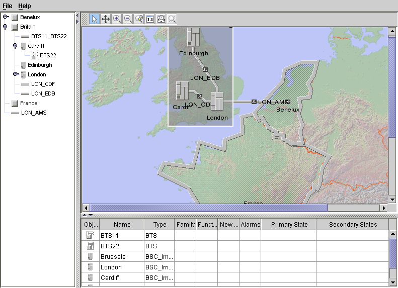
The sample with a configured network component should look as shown in the following figure.
Copyright © 2018, Rogue Wave Software, Inc. All Rights Reserved.
