Style rules
Explains how style rules are used to style your chart and data rules to style application data.

Describes the options available in the Style Rules pane and how style rules are saved.
Explains how you use the Options section to style a chart and its individual subcomponents.
Explains what data rules are and where to find them in the Designer.
Explains what the Styling Customizer is and the editing options available for the different properties.
Explains how properties are displayed in the Styling Properties list.
Explains how rule priority is calculated.
Explains how to investigate the effect of rule priority over style change.
Describes the effect of inherited default values on a renderer.
Overview
The Style Rules pane displays the Options for styling your chart as a whole and data rules for styling the application data. When you save a chart as a project, the style rules (options and data rules) are saved in a style sheet (
.css file) with the
CSS for Java syntax. For details of the syntax, see
Using CSS syntax in the style sheet in
Developing with the SDK.
Options
The Options section of the Style Rules pane allows you to style the chart at the level of the chart as a whole and of its individual subcomponents. Each chart you work on has its own style sheet and therefore its own options.
There are Options for the chart component and its subcomponents. Options are controlled through properties in the Styling Customizer for the chart component or each of its subcomponents. The Styling Customizer appears in the lower pane of the Designer when you select the option in the Style Rules pane.
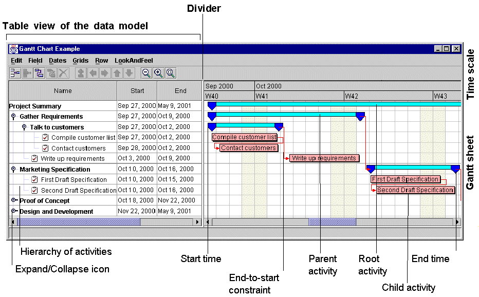
The following figure shows the different parts of a Gantt chart.
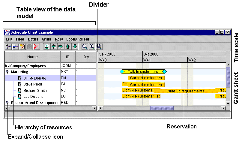
The following figure shows the different parts of a Schedule chart.
You can customize the styling of the Gantt chart through options that apply to:
The chart itself
You can customize the appearance of the chart through properties that control:
Border
Inside border
Row height
Visibility of the table and the sheet
You can customize the appearance of the divider through properties that control:
Location
Size
Move mode
You can customize the appearance of the scroll bars through properties that control:
Horizontal scrollbar visibility
Vertical scrollbar policy
You can customize time and duration through properties that control:
Beginning of the visible time interval
Animation steps of the visible time interval
Unbounded time interval scrolling mode
Bounded time interval scrolling mode
You can customize the colors and fonts of the chart, Gantt sheet, table, table header, and time scale through properties that control:
Background color
Foreground color
Font
The table
You can customize the appearance of the table and table header through properties that control:
Background color
Foreground color
Font
You can customize the appearance of the grid through a property that controls:
Color
You can customize the columns of the table through properties that control their appearance:
Margin
Selection allowed
You can customize the columns of the table through a property that uses the column names to control:
Column order
The sheet
You can customize the appearance of the Gantt sheet through properties that control:
Background color
Background pattern location
Constraint layer visible
Displaying constraints
The Control group of properties of the Gantt sheet let you control whether:
Tooltips are enabled
Activity graphics are drawn over multiple rows
and whether parent activities are:
Editable
Movable
Refreshed when changing from leaf to parent or vice versa
and whether milestones are:
Refreshed when the activity time interval changes from null to non-null or vice versa
The Advanced group of properties of the Gantt sheet let you control:
Autofit to contents
Anti-aliasing
Double buffering
Optimized translation
The time scale
You can customize the time scale through properties that control:
Background color
Foreground color
Font
The horizontal grid
You can customize the lines of the horizontal grid through a property that controls:
Color
You can customize the rows of the horizontal grid through properties that control:
Fill
Even row color
Odd row color
The vertical grid
You can customize the colors of the vertical grid through a property that controls:
Foreground color
You can customize the weekend grid through properties that control:
Display of weekends
Color of weekends
Printing of weekends as opaque
You can use all the properties listed for Options in this section directly in the Designer. To control styling through other properties, you must use the SDK. See
Styling Gantt and Schedule chart components in
Developing with the SDK.
The following table shows the components and their corresponding CSS element type and ID together with their properties available in the Designer and the property type. See also
Styling properties.
Option | CSS Element Type and ID | Designer Property Fields | Type |
The Gantt or Schedule chart component | chart | Border Inside border Row height Table visible Gantt sheet visible Divider location Divider size Divider opaque move mode Horizontal scrollbar visible Vertical scrollbar policy Beginning of the visible time interval Animation steps of the visible time interval Unbounded time interval scrolling mode ( minVisibleTime is null and maxVisibleTime is null) Bounded time interval scrolling mode ( minVisibleTime is not null and maxVisibleTime is not null) Background color Foreground color Font | Border Border int boolean boolean int int boolean boolean int Date int Date Date Color Color Font |
The Gantt table | table | Background color Foreground color Font Grid color Column margin Selection allowed Column order | Color Color Font Color int boolean String |
The Gantt sheet | sheet | Background color Background pattern location Constraint layer visible Displaying constraints Tooltips enabled Activity graphics drawn over multiple rows Parent activity editable Parent activity movable Refresh parent activity when changing from leaf to parent or vice versa Refresh milestone when activity time interval changes from null to non-null or vice versa Autofit to contents Anti-aliasing Double buffering Optimized translation | Color URL boolean boolean boolean boolean boolean boolean boolean boolean boolean boolean boolean boolean |
The time scale | timeScale | Background color Foreground color Font | Color Color Font |
The horizontal grid of the Gantt sheet | horizontalGrid | Line color Rows filled Even row background color Odd row background color | Color boolean Color Color |
The vertical grid of the Gantt sheet | verticalGrid | Foreground color Display weekends Color of weekends Print weekends as opaque | Color boolean Color boolean |
Data rules
A data rule is a style rule that applies to the data in the chart. It consists of an object type and attribute conditions followed by
declarations.
A data rule is defined on a group of
data model objects belonging to the same class, or having a common ascendant class, or belonging to the same user-defined type. It is applied to the renderers used to visualize the data in the chart.
In the Designer, you see the data rules in the upper left pane, titled Style Rules, following the Options. This pane shows a hierarchical view of the rules depending on how specific they are.
In the Designer, you see the declarations in terms of property values in the Styling Customizer or the optional list of Styling Properties.
Styling customizers
The Styling Customizer is a user-friendly way to see properties and their values, subdivided into categories by different tabs and with explanatory names. You use a Styling Customizer to customize an option or a renderer by setting property values. The Styling Customizer for the current rule selection is displayed in the lower pane of the Designer.
For each property, the Styling Customizer displays one of the following according to the type of value concerned:
A check box to select or clear
A list of the valid values or items for you to choose from
A step scale for numerical values
A text field for you to enter text
Buttons for you to add or remove values or lines of text
An Ellipsis button to browse in order to select a file name or font
A calendar system in which to select date and time
A choice of the following systems for color settings:
JViews color disk
RGB (Red, Green, Blue)
HSB (Hue, Saturation, Brilliance)
Swatches
Styling properties
The Styling Properties list gives a view of properties that is closer to the API; it comprises a single exhaustive list and shows the API (short) names. To open the Styling Properties pane, choose View > Styling Properties.
The list shows the locally set properties (those set in the selected rule), in alphabetical order, followed by the inherited properties (those set in previous rules), in alphabetical order. The status icons next to each property show which property values are local and which inherited:
Arrow up: value set in a previous rule
Arrow right: value set in the selected rule
Click the arrow icon to toggle the status.
Important If you change the status to Inherited from a previous rule, you will lose the value set by the selected rule.
Priority
The principles of inheritance and overriding apply to style rules. This allows you to write default rules for all model objects of a certain type and then to refine the customization with more specific rules that apply to subsets of these model objects.
The priority of a style rule depends on how specific it is and on the order with respect to other style rules of the same specificity. In general, a rule with more components in its
selector has a higher priority because it is more specific. Note that a more specific rule sets property values for some model objects but not for others. When the specificity of two rules is the same, the lowest rule in the tree has priority.
Different rules apply to different groups of objects, but several rules can apply to the same object. If the same property is set on one object in several rules, only the setting in the rule with the highest priority is retained; this rule overrides all the previous ones.
To style a model object, the Designer sorts all rules that match it in priority order and then applies the settings they contain to the graphic object representing the model object.
Debugging the style sheet
If you change a property in a Styling Customizer, and you do not immediately see the effect of the change, this is probably because the selected rule has been overridden by a later rule. You can look at the other rules at the same level in the tree to see if the same property is set in one of these rules.
Resetting default property values
A renderer can have default values for its properties, which can be set at creation time.
In a style sheet, some property values may be inherited at all levels and therefore come from the default values of the renderer. If you change such a property value in a style rule to reflect a temporary state (such as selection), when the temporary state no longer applies (the object is deselected), the property value does not automatically revert to the default value. This situation arises because there is no style rule to set the default value. You therefore need to include this setting explicitly in the general rule for the renderer.
If you do not change such a property value according to a temporary state in a style rule, you can leave the implicit default value and not worry about it.
Copyright © 2018, Rogue Wave Software, Inc. All Rights Reserved.