Developing an activity-oriented Gantt chart
Explains what an activity-oriented Gantt chart is and how to use the New Gantt Chart Wizard.

Explains what an activity-oriented Gantt chart is, how it works, and the classes used to create it.
Explains how to use the New Gantt Chart Wizard to make an activity-oriented Gantt chart and how to create your own project file (extension
.igpr) to contain the data and styling of your chart.
Explains the stages needed to change the appearance of a chart.
Describes how to save a Designer project.
Explains how to customize data styling using CSS style rules.
Describes how to create, rename, and set renderers for style rules applied to activities and constraints.
Overview
An activity-oriented
Gantt chart shows activities and subactivities along the y axis against time on the x axis. Each
activity lasts for a projected amount of time, its
duration. A dependency between activities, for example, where an
activity cannot be started before another activity is completed, is shown by a
constraint. A
milestone in the Schedule represented by this type of Gantt chart is represented by a special kind of activity that has no duration:
zero-duration activity.
This type of Gantt chart is implemented by an instance of the class
IlvGanttChart. For more information on how to use this class, see
The Gantt beans.
Creating an activity-oriented Gantt chart
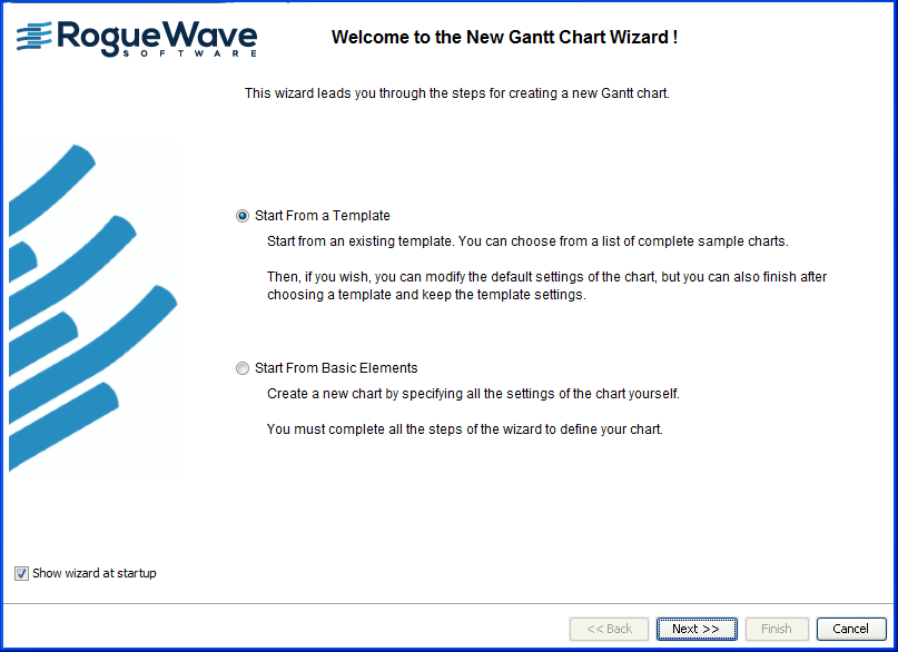
The easiest way to create a new Gantt chart is through the New Gantt Chart Wizard. The first time that you start the Designer, the New Gantt Chart Wizard is displayed.
If you do not want this wizard to be displayed automatically at startup, clear the option. You can access the New Gantt Chart Wizard from the menu bar (File>New from Wizard) or by typing Ctrl-W.
The following figure shows the New Gantt Chart Wizard.
In this section you will:
Create a new Gantt chart
project with the basic elements of a Gantt chart.
Choose an XML-type data source for importing your data into the chart.
Choose the XML file that contains the data for the basic Gantt chart.
Select the activity-oriented Gantt chart, a basic time-and-activity bar chart; there is no indication of the resources that will be applied to the tasks represented in this chart.
Choose a theme to determine a ready made look and feel for the chart.
The objective is to set up your chart quickly and easily, so that you can start customizing the rendering of the chart and its data through the styling facilities of JViews Gantt.
The Gantt chart you create will show completion of the activities and whether the completion is in advance of or behind the scheduled completion dates of each activity.
Starting from the basic elements
In this example, you are going to create your own project file (extension .igpr) to contain the data and styling of your chart. The project file holds the basic settings of a chart, which are the chart itself, the table, the sheet, the time scale, the horizontal grid and the vertical grid.
1. Select Start from Basic Elements.
2. Click Next.
3. 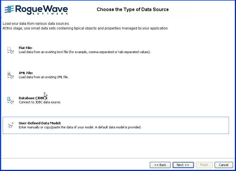
Choosing a type of data source
You are going to use existing XML data in the new Gantt chart.
1. Select XML file.
2. Click Next.
Loading data from an Existing Gantt XML file
The data that the file contains is compliant with the Gantt data model. Important points to note for the particular features that this file allows you to implement are:
The property
completion, which allows you to show which activities are completed.
The user-defined type (
"tags" ) named
critical, which allows you to show which activities are on a critical path towards completion and may not be completed on time.
You can later customize the styling of completed and critical activities to give them a different appearance.
See
Content and structure of an XML data file for an explanation of the data content and structure of
monitorGantt.xml. In particular, see
Activities and
Constraints.
1. Click Load to browse for the XML file that contains the data for this example.
2. Select the file monitorGantt.xml from the examples directory and click Open.
The XML file is validated and loaded. You have a preview of a read-only JTable view of the data (Data Preview), open by default on the Activities tab. This view shows the XML data corresponding to the activity objects in the data model.
The following figure shows the Activities view of XML data.
3. 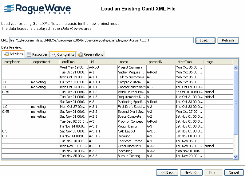
4. Click the Resources, Constraints, and Reservations tabs to view the data corresponding to these data model objects.
5. Click Next.
Previewing the mapping
Data from an XML data source must comply with the DTD used in the Schedule Data eXchange Language (SDXL). See
XML structure for more information. The mapping of data in an SDXL-compliant file takes place automatically. You can view the mapping in this step of the New Gantt Chart Wizard, but you cannot change it.
The mandatory properties of activities are shown in blue. They are mapped to the corresponding tables in the data source. These tables are shown as columns in the lower part of the Activities Table pane. (Activities are shown in the activity-oriented Gantt chart.)
User-defined properties are shown in black. They are also mapped to the corresponding tables in the data source. User-defined properties are properties that are not defined in the default Gantt data model. See
User-defined properties for how to define these properties in an XML file.
1. Click the Resources tab to see the mapping of the properties defined for resources in monitorGantt.xml. Resources are shown in the resource-oriented Gantt chart (or Schedule chart).
2. Click the Constraints tab to see the mapping of the properties defined for constraints in monitorGantt.xml. Constraints are shown in the activity-oriented Gantt chart.
3. Click the Reservations tab to see the mapping of the properties defined for reservations in monitorGantt.xml. Reservations are shown in the resource-oriented Gantt chart (or Schedule chart).
The following figure shows data mapping for XML.
4. 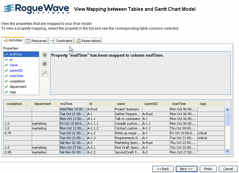
5. Click Next.
Selecting the type of chart
You need to select the appropriate type of chart for displaying the data. The emphasis is on the tasks to perform, their
duration, milestones in their performance, and any constraints that might affect completing the tasks on time.
1. Select the activity-oriented Gantt chart.
This Gantt chart displays the data from the XML file representing activities, milestones, and constraints.
2. Click Next.
Choosing a theme
You can select an appropriate theme for your
project from the list of available themes.
Themes provide a particular look and feel by specifying, for example, the fonts, vertical and horizontal grids, main bar, and background to use. A
theme is a
style sheet that is available as a starter style sheet. It is a convenient way of applying a common look that you want to reuse in different projects.
The themes provided apply styles to the chart itself and to the mandatory properties of the data it contains. The mandatory properties for the start time, end time, ID, and name can be styled in a theme.
1. Select A green theme.
This theme colors important subcomponents of the chart and elements of its data representation in different shades of green and uses large font sizes.
2. Click Finish.
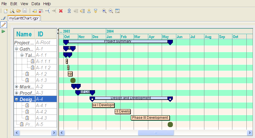
Congratulations! You have completed the setup of your new chart.
You have a complete chart containing the data specified by the XML file. You can customize the styling of this chart and its data in the Designer.
The chart as it stands now should be the same as a chart derived from the basicGantt template with A green theme applied.
Customizing Gantt chart options
In the Designer you make these modifications in Style Editing mode.
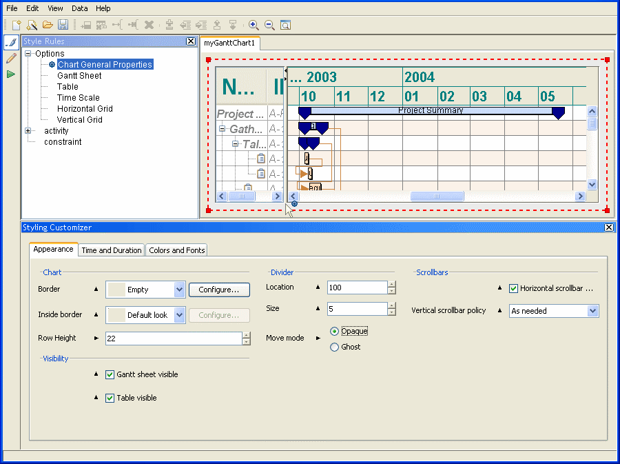
Changing the chart appearance
This section shows you how to change the row height and the move mode of the divider.
1. Expand Options under Style Rules.
2. Select Chart General Properties to modify the chart component.
3. Make sure the Appearance tab is active in the Styling Customizer.
4. Decrease the Row Height to 22.
The rows in the Gantt chart get narrower.
5. Select Opaque as the Move mode.
The move mode controls the visual effect of moving the divider between the table and the Gantt Sheet. Making the move mode opaque means that the table and the Gantt Sheet are resized continuously as you move the mouse.
Your Gantt chart should look like the following figure, which shows the settings in the Styling Customizer.
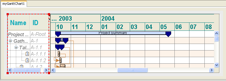
Changing features of the Gantt table
This section shows you how to change the font and the font size used in the table header and change the header background color.
1. Select the Table subcomponent.
2. Make sure the Appearance tab is active in the Styling Customizer.
3. In the Table Header section, click the ellipsis (...) in the Font field.
4. In the Font Editor window, select the font Arial Narrow and the font size 24.
The effect of the changes is shown in the Preview area.
5. Click Apply.
6. Click the ellipsis (...) in the Foreground color field.
7. In the Color Editor window, select the RGBA tab.
8. Change the Red setting to 14, the Green setting to 170, and the Blue setting to 186.
The effect of the new color setting is shown in the Preview area. You have set the header foreground to a shade of turquoise.
9. Click Apply.
The following figure shows how your Gantt chart should look at this stage. It displays the table with modified header font and foreground color.
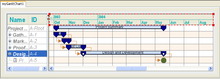
Changing the time scale
This section shows you how to change the font and the font size used in the time scale and change the foreground color.
1. Select the Time Scale subcomponent.
2. Click the ellipsis (...) in the Font field.
3. In the Font Editor window, select the font Arial Narrow and the font size 14.
The effect of the changes is shown in the Preview area.
4. Click Apply.
5. Click the ellipsis (...) in the Foreground color field.
6. In the Color Editor window, select the HSBA tab.
7. Change the Hue setting to 0.5, the Saturation setting to 0.82, and the Brightness setting to 0.69.
The color defined by the new HSBA settings is shown in the Preview area and should be similar to the turquoise color selected for the foreground of the table header with the RGB coordinates.
8. Click Apply.
The following figure shows how your Gantt chart should look at this stage. It shows the time scale with modified font and foreground color.
Changing the horizontal grid
1. Select the Horizontal Grid subcomponent.
2. In the Styling Customizer, click the ellipsis (...) in the Odd Rows Color field.
3. In the Color Editor window, select the Swatches tab.
4. Select the pale peppermint swatch that corresponds to the setting (153,255,204).
5. Click Apply.
The following figure shows what your Gantt chart should look like at this stage. It displays a horizontal grid with modified fill color for odd rows.
Saving a project
It is important to save your work periodically to avoid losing it.
To save the chart initially, choose
File > Save As and enter a file name in the file name box. When you save your work, the Designer saves three files: a project file, a
style sheet, and a data file.
The project file specifies the name of the style sheet file, the type and URL of the data source, and the name of the data file.
The File > Save As and File > Savecommands save the project file with the extension .igpr. The other two files are saved implicitly.
You can find examples of project files in the directory:
<installdir>/jviews-gantt/bin/designer/data/examples
Styling the data
The chart you created in the New Chart Wizard had the styling of the basic Gantt chart. You can customize the styling of the data in the chart by adding to the
style sheet. The style sheet is a
.css file that contains style rules that define the styling of the data. You can create or change a
style rule in the Create Style Rule Wizard or the Change Style Rule Wizard.
The currently defined style rules can apply to instances of activity or constraint. You can view them in the hierarchy listed under Style Rules. There are rules that control the styling of activities in general, parent activities lower in the hierarchy, leaf activities, and milestones. There is also a style rule for constraints. The names of these rules are:
activity activity:parent activity:leaf activity:milestone constraint Applying general and specific rules
There is one rule defined for all activities in the Gantt chart. This rule sets the default properties of all activities for the top and bottom margins, the ToolTip, and the shape and label properties.
An
activity is a task that must be completed. Activities are hierarchical in nature. The hierarchy consists of parent activities and child activities, which can themselves be parent activities, right down to leaf activities. A
leaf activity is an activity that has no
child activity.
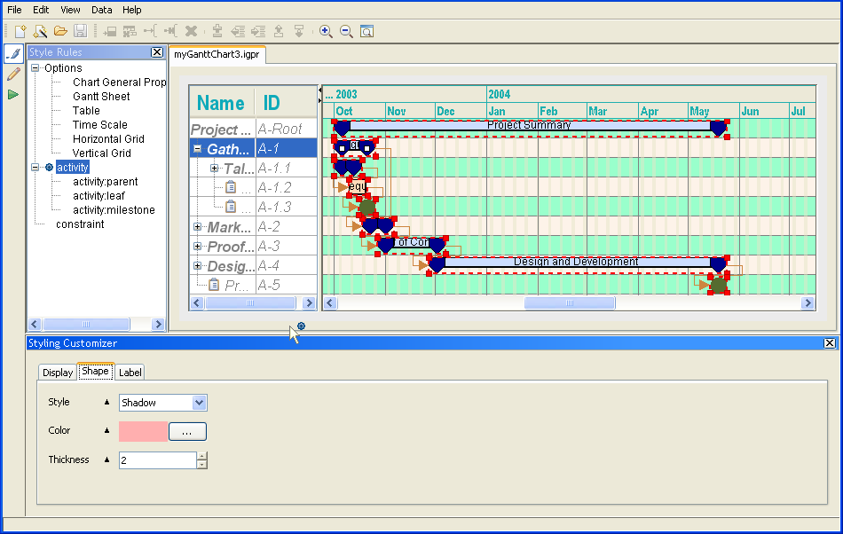
When you select the activity entry in the Style Rules, all activities to which this general rule applies are selected in the Gantt chart. You can see the default properties set by this rule in the Styling Customizer.
There can be only one general rule at the top level of the hierarchy of style rules that control the styling of activities. If you try to create another activity rule, you are prompted to delete the existing one.
The blue icon beside the style rule indicates that this rule applies to the currently selected objects. It is the only currently applicable rule, since none of the other style rules have a blue icon beside them. It is a general rule that can be overridden by more specific rules that appear later and therefore lower in the hierarchy. This is why the parent activities in the Gantt chart look different and do not seem to display the same properties as defined by the selected activity rule.
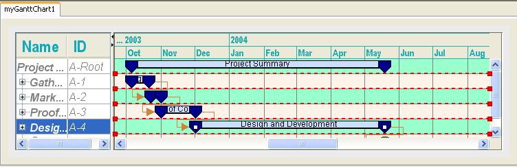
The following figure shows the default properties of the style rule for all activities.
Select the rule
activity:leaf and examine its properties in the Styling Customizer. It has the same properties as the
activity rule, but the values are different and the leaf activities therefore look different from the expected result of the
activity rule.
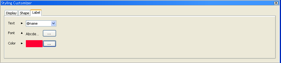
The following figure shows the label properties set for the leaf activities by the style rule activity:leaf. Select the activity style rule and click the Label tab in the Styling Customizer. You can see that the default label properties of activities do not all include the @name property.
When you select the rule activity:leaf, another blue icon appears beside this rule. The blue icons indicate that the rules activity and activity:leaf are currently applicable.
The last style rule created overrides other applicable rules. The more recent a style rule, the lower in the hierarchy it appears. You can move rules in the hierarchy. If you move a rule up in the hierarchy, it has a lower priority and can be overridden by style rules lower in the hierarchy in contexts in which all these rules apply.
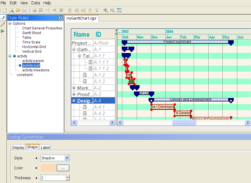
The following figure shows that a different color is set for the shape of leaf activities. (Click View > Mode > Edit to switch to Gantt Editing Mode to expand the activities in the Gantt chart and view the leaf activities themselves.)
The following figure shows the expanded leaf activities in Gantt chart editing mode.
Styling with a summary renderer
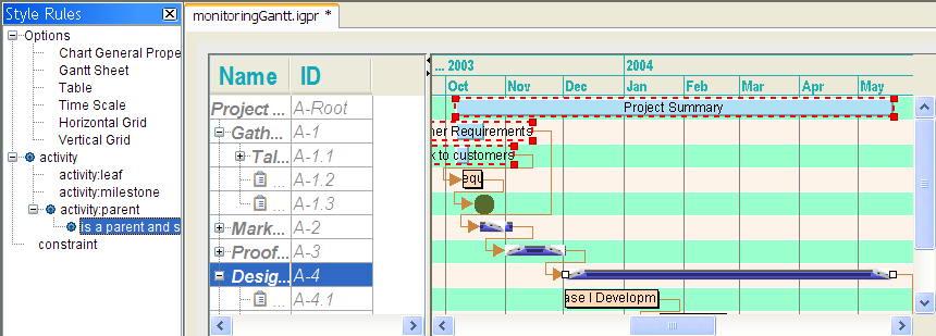
Select the style rule activity:parent. This rule controls the styling of the parent activities in the Gantt chart. When you select the rule activity:parent, a blue icon appears beside this rule. The blue icons indicate that the rules activity and activity:parent are currently applicable to the selected objects in the Gantt chart.
A
parent activity is represented in the Gantt chart by a collection of basic renderers, known as a summary renderer. The summary renderer contains an activity bar renderer and a symbol renderer used for the start and end times of the activity.
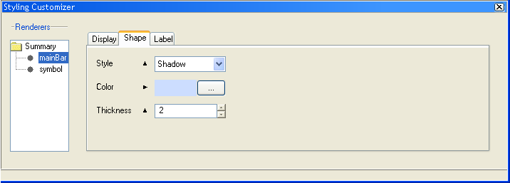
1. In the Styling Customizer, select the mainBar renderer in the summary tree. Click the Shape tab. The following figure shows the properties used to render the shape of the activity bar of parent activities.
1. 
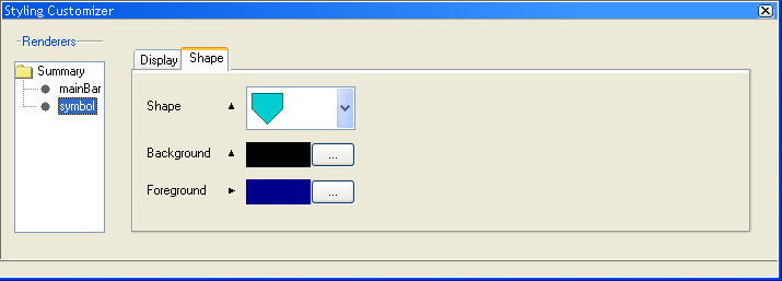
2. Select the symbol renderer to see the properties used to render the shape of the start and end time symbols of parent activities.
3. 
See
Changing the style rule for how to change the rendering applied by this style rule.
See
Creating a style rule condition for specific parent activities for how to write a more specific new style rule for controlling the representation of parent activities.
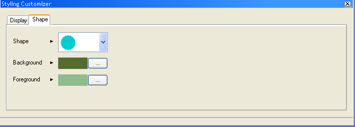
Styling milestones
Select the rule
activity:milestone. You can see in the Styling Customizer that this rule controls the Display properties and the Shape properties for representing milestones. A
milestone is a
zero-duration activity, that is, it has the same start and end time.
When you select the rule activity:milestone, a blue icon appears beside this rule. The blue icons indicate that the rules activity and activity:milestone are currently applicable to the selected object in the Gantt chart.
The following figure shows the Shape properties of milestones.
Changing the style rule
You can change the representation of activities in the Gantt chart by changing the renderer in the style rule activity:parent. You can do this in the Change Style Rule Wizard.
1. Select the style rule activity:parent.
2. Choose Edit > Change Style Rule or right-click and choose Change Style Rule.
3. 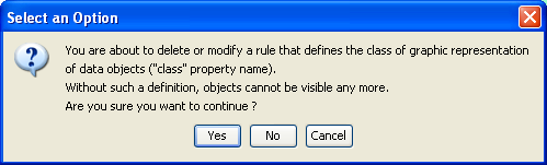
4. Click Yes to confirm that you want to modify the style rule governing the graphic representation of the selected class of object.
5. Click Next on the Welcome page of the Change Style Rule Wizard.
If you do not want this page to be displayed when you open the wizard, clear the option.
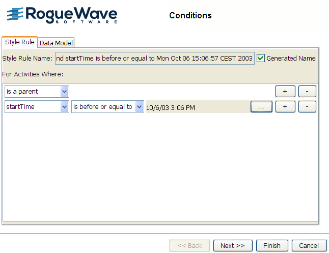
The following figure shows how the condition (left part) of the style rule activity:parent is displayed. The condition determines the context in which the styling will be applied. You can read it as "If the object is of type activity and it has no user-defined type property and it is a parent activity and it has no specific attribute".
6. 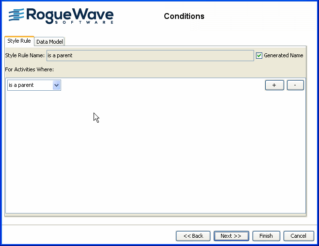
A generated name is applied to the style rule that is to be modified. In this case, the name is "is a parent". This name will appear in the Style Rules tree when you have finished restyling the graphic representation applied by the style rule. If you want, you can change the name to one of your own choice.
Since you will change only the representation of objects to which the rule applies and you will leave the condition unchanged, it is better to retain the original name.
7. Clear the option Generated Name and enter the original name of the style rule activity:parent.
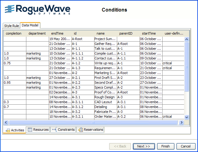
8. Click the Data Model tab to have a read-only view of the data model.
It is useful to remind yourself of the specific properties of objects when you want to change the condition of a style rule or write a new style rule. The following figure shows you the Activities table view of the Gantt Data Model. The columns represent the properties defined for activity objects. You can see that the only user-defined type is critical.
This example is not concerned with changing the condition part of the style rule, but only with changing the styling applied through the rule.
9. 
10. Click Next to opt to define a new renderer.
11. Select New Renderer and click Next.
12. Select a renderer.
The Designer offers ready-made base elements for composite graphics, complex, and basic renderers. The summary renderer used to represent activities with an activity bar and start and end time symbols falls into the category of basic renderers. You are going to change it for one of the complex renderers shown in the following figure.
Select the Complex tab.
13. 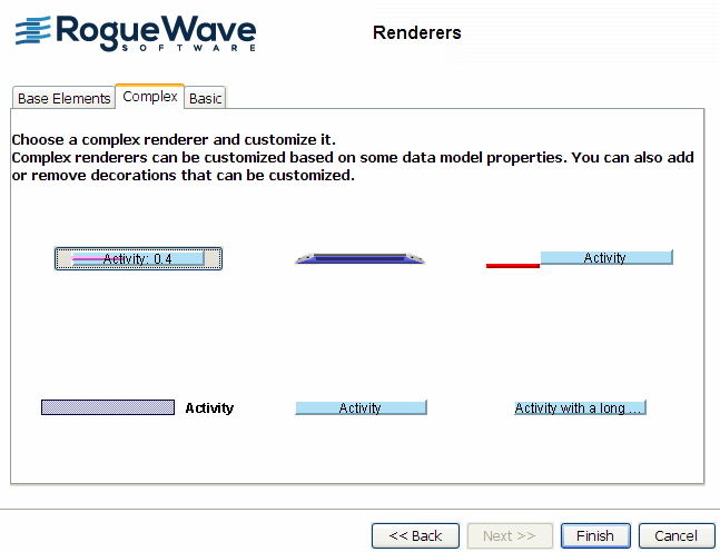
Select Activity bar with icons. Move your mouse pointer over the renderers to see their names.
14. Click Finish.
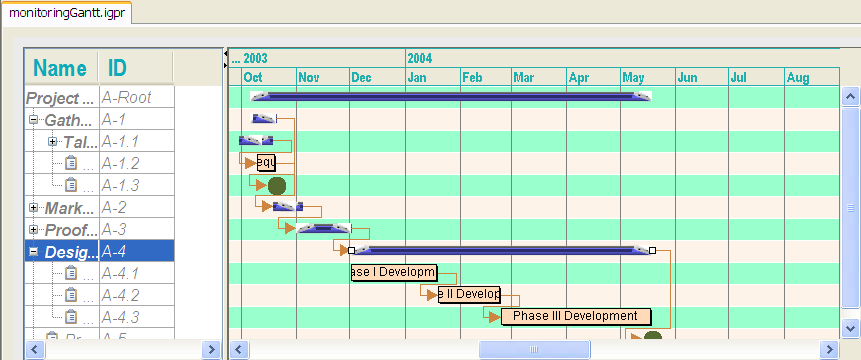
The following figure shows how the change in styling of parent activities is reflected immediately in the Gantt chart.
15. 
Creating style rules
In this section you will complete the following tasks:
Create new style rule conditions that apply to specific activities.
Set the renderer for each style rule.
Rename a style rule.
Create a style rule for a constraint.
Creating a style rule condition for specific parent activities
This style rule will have a more restricted application than the style rule activity:parent. The objective is to render parent activities started on or before October 6 2003 differently from other parent activities.
1. Select the style rule activity:parent.
2. Choose Edit > Create Style Rule or right-click and choose Create Style Rule.
3. Clear the option for displaying the Welcome page.
4. Click Next and select the Data Model tab.
You can see that there are two parent activities that start on October 6, 2003: A-1 Gather Requirements and A-1.1 Talk to customers.
5. Select the Style Rule tab to write the condition of the new style rule.
You are going to write the new style rule by adapting the content of the style rule
activity:parent. The objects affected by the rule are parent activities and they do not have any special properties of
user-defined type.
User-defined type is shown in the pink column in the data model view. The only activities shown to have this kind of property are leaf activities. (See
User-defined properties for more information on user-defined types.)
You must specify the attribute that distinguishes the affected objects and causes the style rule to be applied selectively.
6. Click the plus sign and select startTime.
7. Select is before or equal to.
8. Click the ellipsis (...)to display the calendar that allows you to enter the date in the correct format.
9. Select October 2003 and the date of the 6th; click Apply.
The following figure shows the completed condition.
10. 
Setting the renderer for specific parent activities
You must set the way the parent activities that satisfy the condition of the style rule will be rendered.
1. Click Next to set the renderer for the activities specified by the rule condition.
2. Select New renderer and click Next to define a different renderer for the specified activities.
3. Select the complex renderer Activity bar with text: where the text is given by a property of the model and click Finish.
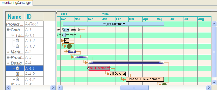
The following figure shows that the effect of the new style rule on activities A-1 and A-1.1 is shown in the chart immediately.
You can see that three style rules, as indicated by the blue icons, apply to the objects selected in the chart:
activity activity:parent is a parent and startTime is before or equal to Monday Oct 06 15:06:04 CEST 2003 The style rule lowest in the hierarchy is the rule with the most specific application.
Renaming a style rule
The default name of a new rule may not be useful to you. You can rename a style rule:
1. Select the style rule and right-click.
2. Choose Rename.
3. Type the new name of the rule and click OK.
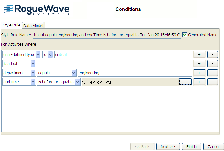
Creating a style rule condition for an activity with a user-defined type
This style rule is based on the style rule
activity:leaf. The objective is to render activities that have the
user-defined type critical, are the responsibility of the Engineering Department, and that are completed before January 20 2004. You might want to check the data model view to determine the likely scope of the rule. See
User-defined properties for more information about user-defined types.
There are four activities marked as critical in the data model view. User-defined types are shown in the pink column of this view. Only one of these belongs to the Engineering Department. This activity, A-4.1 Phase 1 Development, has an end time of December 2, 2003.
1. Select the style rule activity:leaf.
2. Choose Edit > Create Style Rule
You are going to write the new style rule by adapting the content of the style rule activity:leaf. The objects affected by the rule are leaf activities with a user-defined type.
You need to specify the user-defined type and the attributes that distinguish the affected objects and cause the style rule to be applied selectively.
3. Selectuser-defined type and type critical.
4. Click the plus sign and select is a leaf.
5. Click the plus sign and select department.
6. Select equals.
7. Type engineering.
8. Click the plus sign to specify the next attribute.
9. Select endTime.
10. Select is before or equal to.
11. Click the ellipsis (...)to display the calendar that allows you to enter the date in the correct format.
12. Select January 2004 and the date of the 20th; click Apply.
The following figure shows the completed condition.
13. 
Setting the renderer for the specified activity
Set the way the activity that satisfies the condition of the style rule will be rendered.
1. Click Next to set the renderer for the activity specified by the rule condition.
2. Select New renderer and click Next to define a different renderer for the specified activity.
3. Click the Basic tab to select a basic renderer for customization.
4. Choose the Activity bar:simple activity bar and click Finish.
5. Select the new style rule in the tree to customize the Activity bar.
6. In the Styling Customizer, click the Label tab and set Color to bright red (255,0,51).
7. Click Apply.
8. Click the Shape tab and set Color to mid-gray (153,153,153).
9. Click Apply.
The following figure shows the effects of this style rule.
The new style rule is added to the tree after the rule activity:parent. Even though this rule applies to a leaf activity, it is too specific to be added to a part of the hierarchy that would branch directly under leaf activities. This is because the rule relates to objects with a user-defined type, which increases the specificity of the rule. This rule is so specific that you cannot move it up in the rule tree. Remember that the more specific a rule, the further down the hierarchy it appears.
When you select the new style rule, the yellow icons clearly show that the style rules for activity and activity:leaf can also apply, but are overridden by the new rule.
Rename the rule to activity.critical:leaf.engineering.completion.
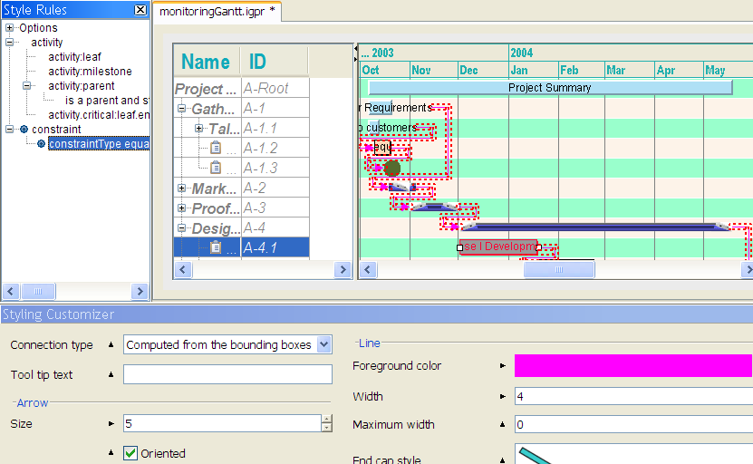
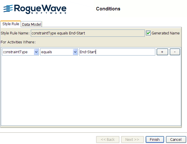
Creating a style rule condition for a constraint
This style rule is based on the style rule constraint. The objective is to render constraints of type End-Start.
1. Select the style rule constraint.
2. Choose Edit > Create Style Rule
You are going to write the new style rule by adapting the content of the style rule constraint.
You can specify the constraint type.
3. Select equals.
4. Type End-Start.
The following figure shows the resulting style rule condition.
5. 
6. Click Finish.
Setting the renderer for the specified constraints
Set the way the constraints that satisfy the condition of the style rule will be rendered.
1. Select the new constraint.
2. In the Styling Customizer, change the Foreground color of the line to magenta by selecting and applying the color identified as (255,0,255).
Select this color from the Swatches; its tooltip identifies the desired value.
3. Increase the Line Width to 4.
4. Reduce the Arrow Size to 5.
The following figure shows the changed styling, which is restricted to constraints on activities of type End-Start. Note that the black triangles beside the changed rendering properties that are specific to this rule point to the right to show that these settings are local to the current rule. The black triangles beside the other properties point upwards to indicate that those properties are inherited from the generic constraint rule.
Copyright © 2018, Rogue Wave Software, Inc. All Rights Reserved.