Charts for planning and scheduling
Time and activity charts most commonly take the form of a bar chart. The main purpose of such a chart is to represent the relationship of events, activities, or actions to time by using combinations of words, numbers, and graphics to represent activities and events. Time is displayed on the horizontal axis.
Activities or resources are displayed on the vertical axis. Resources might be people, places, or things related to performing the activities.
Blocks of time are delimited by using horizontal bars, colors, symbols, and so forth.
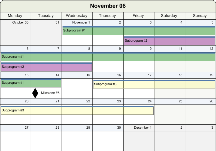
The relationship between activities and time can also be displayed in the form of a calendar view. The main purpose of such a view is to represent the relationship of activities to the days of a month or to the working hours in a day. Blocks of time are delimited by overlaying horizontal bars and symbols on top of a calendar or hourly grid.
Typical uses of time and activity charts are for:

Scheduling
Loading
Project planning
Managing activities
Time and activity charts are used to communicate information in these domains in a way that is easy to assimilate because of its graphic representation.
The size and complexity of these charts range from small scheduling charts used to plan office-based tasks to very complicated charts used for major projects that require updating by computer.
There are specific types of time and activity chart, but these types of chart are often customized to fit user requirements.
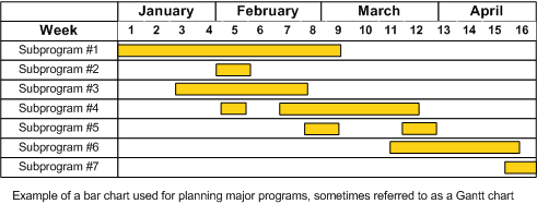
Time and activity bar charts are frequently used to plan activities, such as projects, that have a distinct start and end. This type of chart is often called a Gantt chart.
A Gantt chart is a time and activity bar chart that is used for planning, and controlling projects or programs that have a distinct beginning or end. In a Gantt chart, each main activity that is involved in the completion of the overall project or program is represented by a horizontal bar.
The ends of the bar represent the start and end of the activity. The start and end times may be estimated times if the chart is used for planning purposes only. When a chart is used for planning and tracking, the start and end times of future activities are estimated. The historical parts of the chart show the real start and end times of completed activities.
Significant information can be indicated by the bars in addition to marking the real or projected time intervals. For example, the bars can show the difference between elapsed time and worked time, the major steps or phases of an activity, or the internal or external assignment of resources to an activity.
When an activity is estimated to take a considerable amount of time, it can be broken down into smaller chunks. The completion of each chunk is recorded as a
milestone. A specific visual representation is associated with milestones. The chunking of an activity and the use of milestones provide closer control and earlier detection of slippages or other difficulties. This type of Gantt chart is sometimes called a milestone chart.
The following figure shows a Gantt chart.
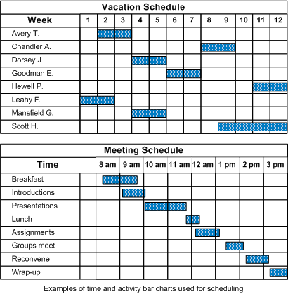
Scheduling charts are used to indicate when things will happen, to make sure that there is no overlapping, or to coordinate multiple activities or resources. You could have activities or resources along the vertical axis.
The following figure shows charts for scheduling.
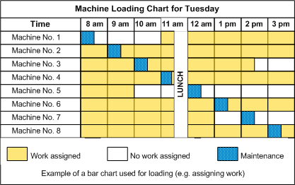
Charts for showing the work assigned to a resource, such as a person or a machine, represent the loading of that resource. A blank cell indicates that nothing is assigned to a resource in the given period. A filled cell shows that work has been assigned to the resource. The objective is often to achieve maximum utilization of resources, with every cell filled.
The following figure shows a Load chart.
The dependency of an activity upon another can be indicated, usually by an arrowed line pointing from one task to another. For example, if an arrow leads from one bar to another, you can interpret it to mean that the task represented by the bar ending at the base of the arrow must be completed before the task represented by the bar starting at the arrow tip can start.
If bars run without interconnecting arrows, the tasks they represent can be considered to be independent.
A type of chart that displays all interdependencies is called a PERT chart.
Activity bar charts can display the relationship of activities to absolute or relative horizontal time scales. In contrast, activity calendar views display the relationship of activities to absolute dates and times arranged in a monthly or hourly grid. This type of chart is useful for showing how activities relate to weekends, holidays, and other milestones that are external to the project schedule.
The following figure shows a monthly calendar view chart.
Copyright © 2018, Rogue Wave Software, Inc. All Rights Reserved.