Managing data style rules
Explains how to use the Style Rule Wizard to specify rendering attributes for data series and single data points.

Explains how to customize the global appearance of your chart by creating or changing the styles rules that define the styling of the data.
Explains how to create rules on point or series.
Explains how to create rules on data points.
Explains how to create rules on data points.
The Create Style Rule wizard
You can customize the global appearance of your chart by creating or changing the styles rules that define the styling of the data.
To open the Create Style Rule Wizard, choose
Edit>Create Style Ruleor right-click a rule and choose Create Style Rule in the pop-up menu.
The Create Style Rule Wizard simplifies the definition of data rules which can include attribute conditions.
Creating rules on data
Through the Create Style Rule Wizard you can create rules on the following object types: point or series. If you have defined your own classes in the
data model, you may also have user-defined types. The plus and minus signs allow you to add or remove attribute conditions to which the rule applies.
Attribute conditions
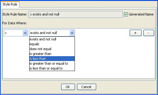
An attribute condition tests one or more attributes against a value. If you select an attribute, you must then set a condition on its value by selecting an operator from the operator menu and entering a value. You can set several attribute conditions.
The operator menu reflects the type of the attribute: x, y, index, label, seriesIndex and seriesName.
For label and seriesName attributes, the operator menu offers:
exists and not null
equals
does not equal
contains
For x, y, index and seriesIndex attributes, the operator menu offers:
exists and not null
equals
does not equal
is greater than
is less than
is greater than or equal to
is less than or equal to
Data points
On data points, you can define the following attributes:
x: The x-value of the data point.
y: The y-value of the data point.
index: The index of the data point in the data set.
label: The label of the data point.
seriesIndex
seriesName
Creating a style rule
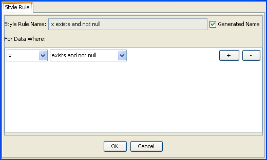
To add a new style rule on a data point, proceed as follows:
1. Select the option point from the Style Rules tree pane.
2. From the menu bar choose Edit>Create Style Rule. The Create Style Rule wizard opens.
3. Select x from the attributes list.
4. Select “is less than” from the operator menu.
5. An editable drop-down list appears. Enter the value 3.0 and click OK.
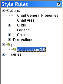
The new rule appears in the Style Rules tree pane under point.
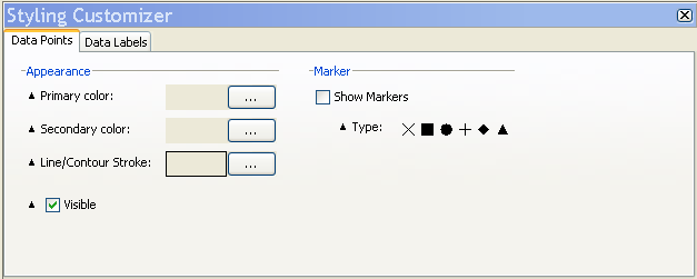
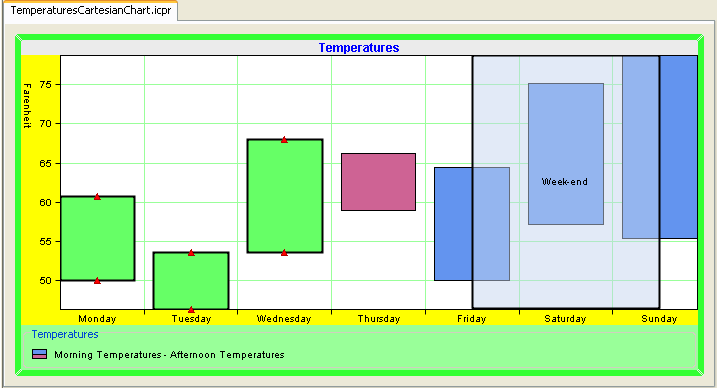
You can customize the new rule by using the Styling Customizer.
6. Choose green as Primary Color.
7. Modify the Line/Contour Stroke attributes by entering 2 in the Line Width field and click Apply.
Your chart should now appear as follows:
Modifying an existing style rule
You are going to modify the style rule you have just created.
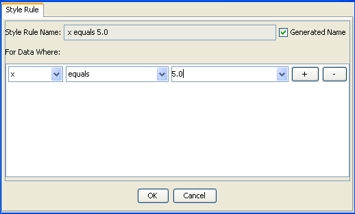
1. From the Style Rules tree pane select the rule: point[x is less than 3.0].
2. From the menu bar choose Edit>Change Style Rule.
3. Modify the attribute as follows: x equals 5.0.
4. Click OK to continue.
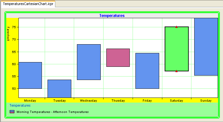
You chart appears now as follows:
Checking an existing rule
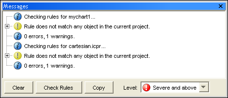
You are going to check the style rule you have just modified.
1. From the Style Rules tree pane select the rule point[x equals 5.0].
2. From the menu bar choose Edit>Check Rules. The Messages window opens.
The messages help you debug your style rules. For more information, see
Undoing actions.
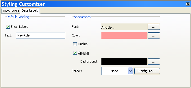
Adding data labels
1. With the new rule selected, activate the Data Labels tab in the Styling Customizer.
2. Check the option Show Labels.
3. In the Text field type “NewRule”.
4. From the Font editor, change the font properties as indicated below and click Apply:
Font type: Arial
Font size: 12
Bold
5. From the Color editor, choose the light red color.
6. Check the option Opaque.
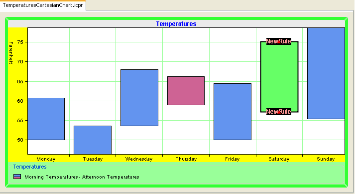
You chart appears now as follows:
Data series
On data series, you can define the following attributes:
name: The name of the data set.
index: The index of the data set in its data source.
Creating a new Cartesian chart
1. Start the New Chart Wizard.
2. Click Start From Basic Elements and Next.
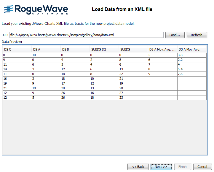
3. From the list of data sources, choose XML File and click Next.
4. Browse to the directory containing the file data.xml and select that file.
This file contains a set of series, some being marked with a CSS class. You can look at the file in a text editor to see how the CSS class has been specified.
Click Next to continue.
5. Leave the default mapping and click Next.
6. Click Cartesian Chart and Next.
7. From the Representation Family list select Area and then click Superimposed and Next.
8. Leave the default theme and click Finish to exit the Wizard.
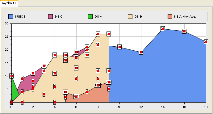
You are now ready to style your data series. The final goal is to display the x and y values as a label annotation for every point of the series marked with the 'labelled' CSS class. You will learn how to create a style rule and add data labels.
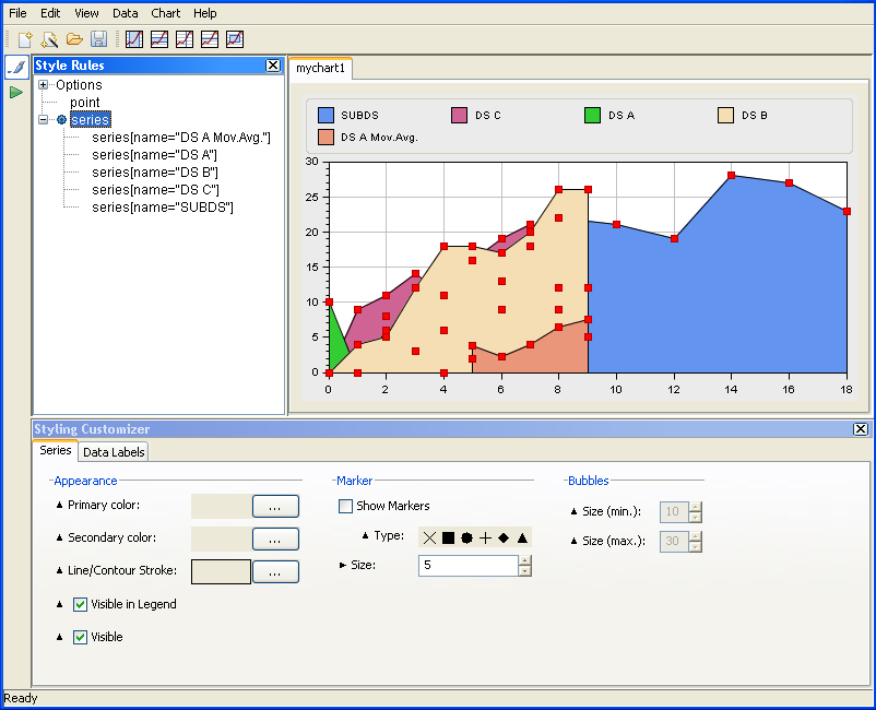
Creating a style rule on data series
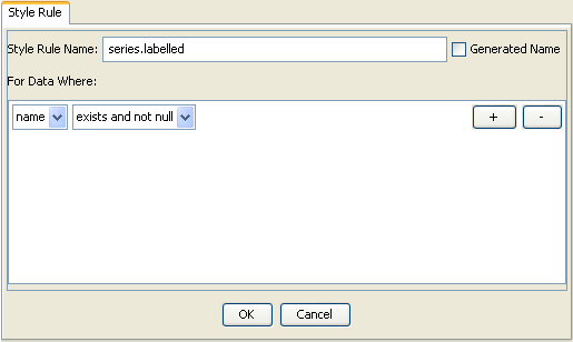
1. Select the option series from the Style Rules tree pane.
2. From the menu bar choose Edit>Create Style Rule. The Create Style Rule wizard opens.
3. From the attributes list select “name”. From the operator menu select “exists and not null”.
4. Clear the option Generated Name and type series.labelled in the field Style Rule Name. Click OK to confirm.
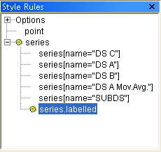
The new rule series.labelled appears in the Style Rules tree pane under Series.
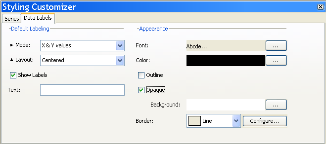
Adding data labels
1. Make sure the Data Labels tab is active in the Style Customizer.
2. Set Mode to X & Y values.
3. Check the option Show Labels.
4. Change the Background color to White.
5. Check the option Opaque.
6. From the Border drop-down list, choose Line.
All the series that have the labelled property are annotated with data labels, as illustrated below:
Copyright © 2018, Rogue Wave Software, Inc. All Rights Reserved.