Customizing your chart
Describes how to customize an existing chart.

Describes how to configure the chart area.
Describes how to configure the general properties of the chart.
Describes the different graphical representation available for the series.
Describes how to configure the legend of the chart.
Explains how to configure the grids.
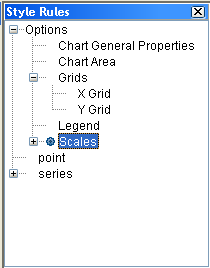
Explains how to configure scales.
Explians how to set a 3-D display on your chart.
Describes the various decorations and you can add them to your chart.
Configuring the chart area
All the examples use the basic Cartesian chart you created in
Getting started.
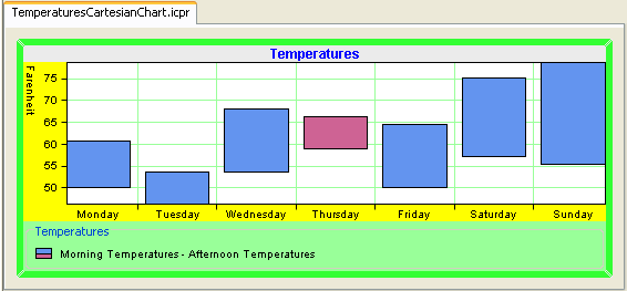
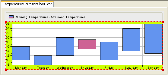
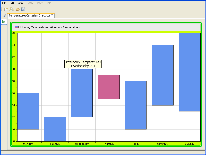
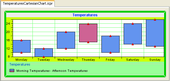
1. Open the project TemperaturesCartesianChart.icpr you saved in the Getting Started. This is how the basic Cartesian chart appears in the Designer:
2. Select the Chart Area option in the Style Rules tree pane.
3. Make sure the Styling Customizer pane is active.
4. Change the background color to yellow and select Opaque.
5. Leave the default settings for the plotting area and margins.
The resulting chart should appear as follows:
Configuring chart general properties
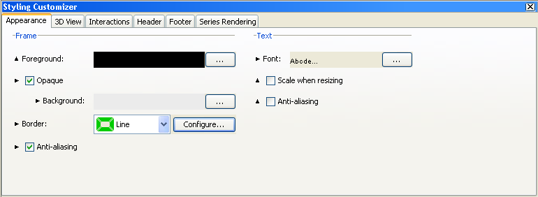
1. Select the Chart General Properties option from the Style Rules tree pane.
2. Make sure the Styling Customizer pane is active.
From the Appearance tab, apply the following configurations:
3. Leave the default foreground and background colors.
4. Change the border.
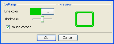
From the border list, choose Line and click the Configure button. Change the line color to green, increase the thickness and check the Round corner option.
From the 3D View tab, you can apply to your chart a three-dimensional display. The type of chart we are treating in this example does not support the 3-D view. To see how to configure the 3-D view, refer to
Configuring 3-D rendering.
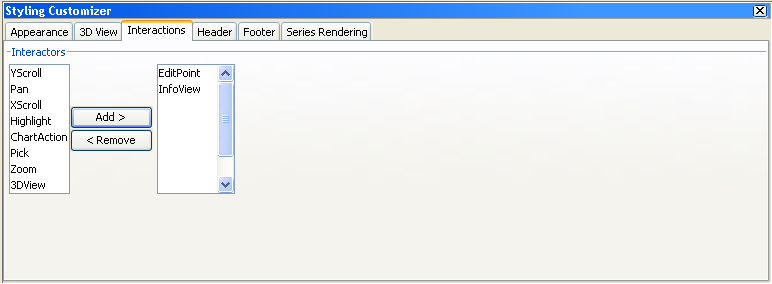
5. From the Interactions tab, apply the following configurations:
The list on the left displays the available interactors. The list on the right displays the interactors you want to add to your chart.
Add the EditPoint and InfoView interactors to your chart. Select them in the Interactors list and click Add.
NOTE Items on the Interactions tab are not available for thin-client applications. For information on using interactors with thin clients, see
The JViews Charts JSF component set.
For the following interactors the JViews Charts Designer allows you to specify additional settings:
EditPoint Interactor
InfoView Interactor
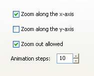
Zoom Interactor
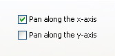
Pan Interactor
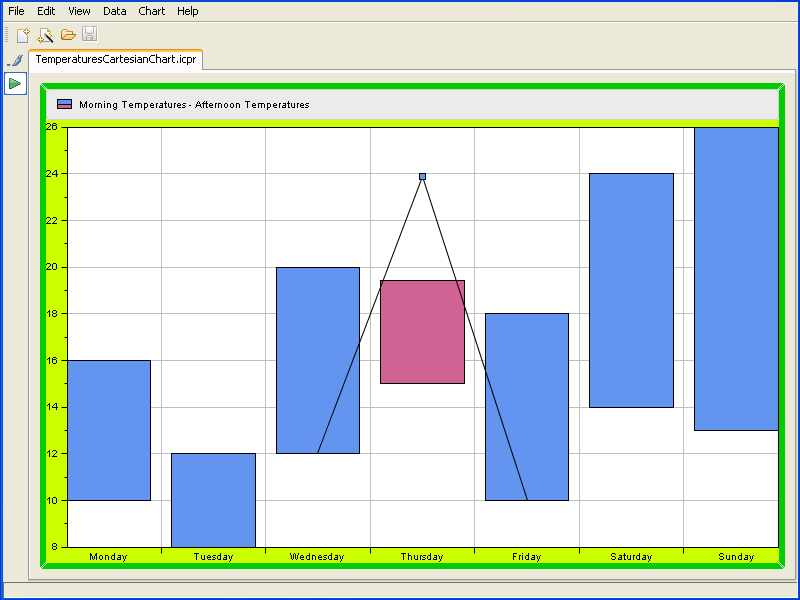
6. Switch to the Preview mode to make the interactors active.
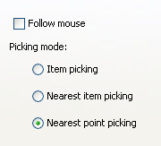
The InfoView interactor allows you to display information about a data point whenever you move the mouse over the data point in the data display area.
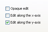
The EditPoint interactor allows you to modify a data point by dragging its graphical representation within the display area.
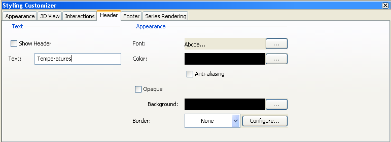
7. Go back to Style Editing mode, select Chart General Properties and click the Header tab to add a title at the top of your chart.
8. Check the option Show Header to make the title visible.
9. In the Text field type the title “ Temperatures ” and press Enter to validate.
10. From the Font editor, change the font properties as indicated below and click Apply:
Font type: Arial
Font size: 12
Bold
11. From the Color editor, choose the blue color.
12. Leave the default values for the remaining properties.
NOTE If you want to add a title at the bottom of your chart, activate the Footer tab and apply the same configurations.
13. On the Series Rendering tab, you can leave the default settings.
This tab allows you to select a type of chart different from the one you have currently chosen for you chart, or select a different type of representation.
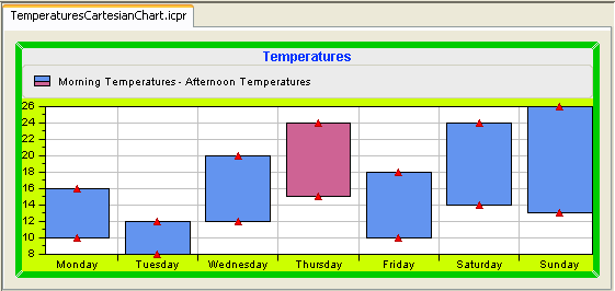
The resulting chart should appear as follows:
Series graphical representation
The Representation drop-down box on the Series Rendering tab lets you choose the type of the graphical representation of the series.
Each representation comes then in different modes. These modes are specific to the selected representation.
Polyline representation
This representation displays the series as polylines. It supports three representation modes:
Superimposed mode
Polylines are drawn on top of each other.
Stacked mode
Polylines are stacked, so that each one displays the contribution of a y-value in a set of several y-values.
Stacked (Percent) mode
The contribution of a y-value is computed as a percentage of all the y-values for a given x-value.
Bar representation
This representation displays the series as vertical or horizontal bars (orientation is determined from the chart projector configuration). It supports four representation modes:
Clustered mode
Bars are laid out in clusters, each cluster representing the set of y-values corresponding to a given x-value.
Superimposed mode
Bars are drawn on top of each other.
Stacked mode
Bars are stacked, so that each one displays the contribution of a y-value in a set of several y-values.
Stacked (Percent) mode
The contribution of a y-value is computed as a percentage of all the y-values for a given x-value.
Stacked (Diverging) mode
Bars are stacked. Positive and negative values are displayed separately: positive values in bars with an upward direction, negative values in bars in the opposite direction.
Area representation
This representation displays the series as areas. It supports three representation modes:
Superimposed mode
Areas are drawn on top of each other.
Stacked mode
Areas are stacked, so that each one displays the contribution of a y-value in a set of several y-values.
Stacked (Percent) mode
The contribution of a y-value is computed as a percentage of all the y-values for a given x-value.
Bubble representation
This representation displays a two-dimensional data model as bubbles of variable size. The data model should be described by two data sets, the first data set determining the location of the bubbles, and the second data set determining the size of the bubbles. There is one representation mode.
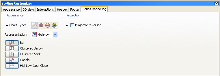
High-low representation
This representation displays two data sets with High/Low items. It supports five representation modes.
Bar mode
This mode creates a renderer for every pair of data sets contained in the data source and displays them as bars.
Clustered Arrow mode
This mode creates a renderer for every pair of data sets contained in the data source and displays them as arrows.
Clustered Stick mode
This mode creates a renderer for every pair of data sets contained in the data source and displays them as sticks.
Candle mode
This mode handles two pairs of data sets: the first pair for the low/high values, the second pair for the open/close values. The low/high values are displayed as a stick, while the open/close values are displayed as a bar.
HighLow-OpenClose mode
This mode handles two pairs of data sets as for the OpenClose mode. The mode differs from the previous mode by its representation. The low/high values are rendered with horizontal marks, the Open/Close values as a bar.
Scatter representation
This representation displays a data set with scattered graphical markers. It supports one mode.
Stair representation
This representation represents a transition between two values as a stair.
Superimposed mode
Stairs are drawn on top of each other.
Stacked mode
Stairs are stacked, so that each one displays the contribution of a y-value in a set of several y-values.
Stacked (percent) mode
The contribution of a y-value is computed as a percentage of all the y-values for a given x-value.
Combined representation
This representation displays series with multiple representations. Contrary to the previous representations, it allows you to render each data set by a different representation, mixing a subset of the representation mode listed above. For example, it can render a data set with a scatter representation and the other data sets with a stacked bar representation.
NOTE The drawing order of the graphical representation is determined by the series order in the data source, the first series being drawn first (that is, "below").
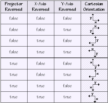
By checking the option Projector reversed you can reverse the projector.
A reversed projector swaps the meaning of the abscissa and ordinate coordinates of a point. For example, a reversed Cartesian projector projects x-data values along the y-axis of the screen.
Cartesian Orientation illustrates the different Cartesian orientations that can be specified by using this property in conjunction with the reversed property of an axis:
Cartesian Orientation
Configuring the legend
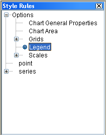
1. Select the Legend option from the Style Rules tree pane.
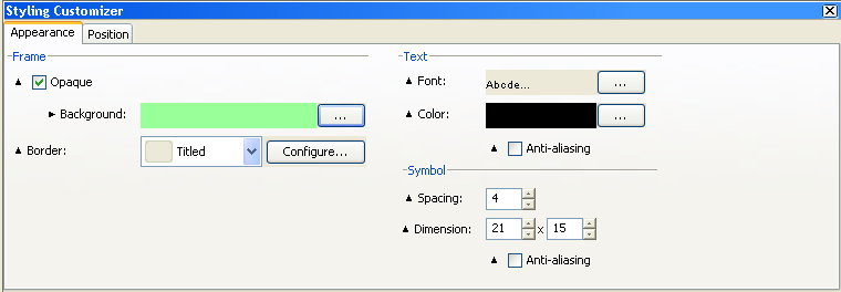
2. Make sure the Styling Customizer pane is active. From the Appearance tab, apply the following configurations:
a. Change the background color to light green.
b. Check the option Opaque.
c. Leave the default type of border, which is Titled.
If your legend has a title, this would be visible only if you select the type of border Titled.
3. Add a title to the legend.
Click the Configure button, type “ Temperatures ” in the Title field and click OK.
4. Leave the default settings for the remaining properties.
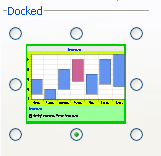
5. Change the position of the legend on the chart.
Click the Position tab and from the Docked options, select the bottom of the chart.
The resulting chart should appear as follows:
Configuring grids
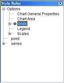
1. Expand the Grids option from the Style Rules tree pane and click Y Grid.
2. Make sure the Styling Customizer pane is active.
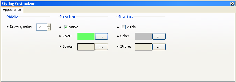
3. Set the drawing order to -1.
NOTE The drawing order lets you control the position of a decoration in the drawing queue of a chart. Decorations with a negative drawing order are drawn below the chart representations, while decorations with a zero or positive drawing order are drawn above the chart representations.
4. Set the major lines as visible.
5. Change the color to light green.
6. Leave the default settings for the minor lines.
7. Click X Grid and set the drawing order to -2.
8. Apply the same configurations you applied to the Y grid.
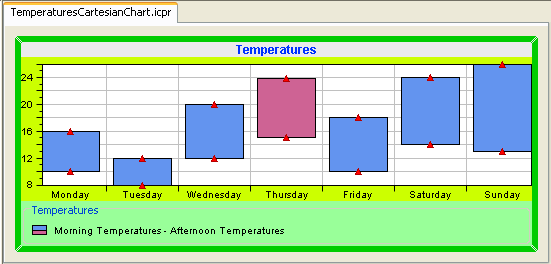
The resulting chart should appear as follows:
Configuring scales
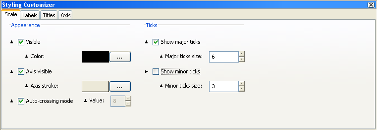
1. Select the Scales option from the Style Rules tree pane.
2. Make sure the Styling Customizer pane is active.
From the Scale tab, apply the following configurations:
3. Set the scales visible and leave the default color.
NOTE Showing or hiding a scale affects the drawing area bounds, therefore a layout is automatically performed on the chart area when you check the Visible option.
4. Set the axis visible and leave the default axis stroke.
5. Leave the default position of the scales on the chart, which is Auto-crossing.
NOTE The position of a scale is defined with respect to the scale dual axis according to a given data value. This data value is the value on the dual axis where the scale axis crosses it, and is called the scale crossing value.
6. Show major ticks and set their size to 5.
7. Do not show minor ticks.
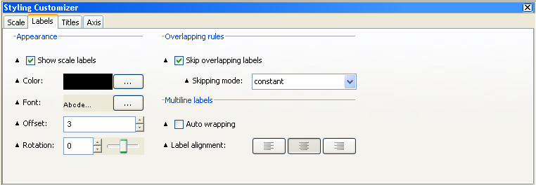
8. Activate the Labels tab and apply the following configurations:
a. Show the scale labels.
b. You can rotate the scales vertically or horizontally by either entering a value in the Rotation field or moving the slider.
In Cartesian charts, the abscissa and ordinate scales can be oriented either horizontally or vertically. In Polar charts, the circular x-axis can be oriented clockwise or counterclockwise and the radial ordinate axis can be oriented at any angle.
c. Check the option Skip overlapping labels.
Depending on the values and the way labels are formatted, it may occur that steps labels overlap each other because of the text length.
d. Leave the Skipping mode set to constant.
e. Constant mode: the scale computes a constant number of labels to skip to avoid overlapping.
f. Adaptive mode: the scale considers every label from the first to the last, and determines which one should be skipped to avoid overlapping.
g. In case of multiline labels, check Auto wrapping.
This option toggles the automatic wrapping of step labels. When the wrapping is turned on, the scale tries to wrap the labels into several lines according to the space available between two steps. The wrapping also takes into account the explicit new line characters.
NOTE The label wrapping does not check the orientation nor the type of the scale. Similarly, it does not take into account the rotation of scale labels. It should only be enabled for scales whose labels are parallel to the axis.
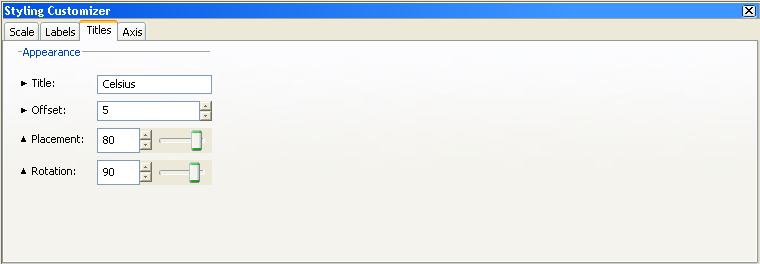
9. Select Y Scale, click the Titles tab, and apply the following configurations:
a. Add the title "Celsius".
Type “ Celsius ” in the Title text field and press Enter to validate.
b. Specify an offset value of 5.
c. Set the title at the top of the scale.
You can either set the Placement value to 80 or move the slider.
d. Place the title in the vertical direction.
You can either set the Rotation angle to 90 degrees or move the slider.
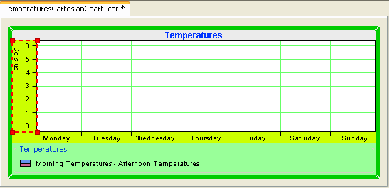
The resulting chart should appear as follows:
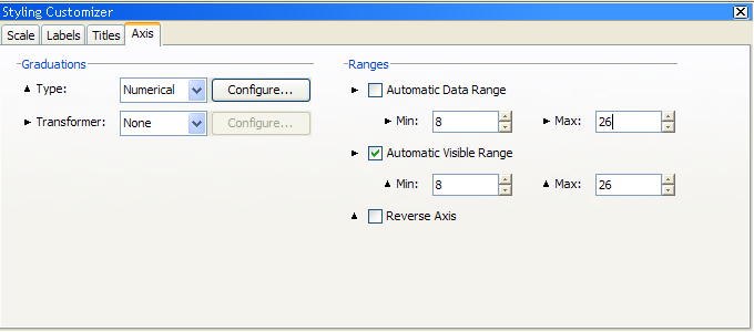
10. Activate the Axis tab and apply the following configurations:
a. Set the graduation type to numerical.
Four graduation types are available:
numerical: for scales that display standard numerical values. time: for scales that display time values. category: for scales that display categories. logarithmic: for logarithmic scales. |
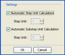
b. You can click the Configure button to configure the numerical steps graduation. In this example you are going to leave the default settings.
The step and substep unit values are automatically computed at run time. You can disable the automatic steps calculation by defining a specific step unit.
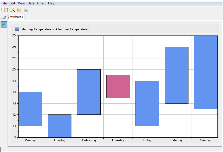
c. You are now going to use the Transformer option to express the temperatures in Fahrenheit.
NOTE >> The Transformer option allows you to apply a transformation to the coordinates along a given axis. The available types of transformer are:
Affine: the transformation is defined by scaling and constant coefficients. Logarithmic: the transformation is defined by a logarithmic base. Local Zoom: the transformation is defined by a scaling factor to data values within a given range. |
d. Select the Y axis.
e. Set the Transformer option to Affine.
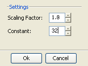
f. Click the Configure button and enter the following values:
Scaling factor: 1.8
Constant: 32
Click OK to validate your choice.
The temperatures are now expressed in Fahrenheit and you can see how their values have changed on the axis (they range from 50 to 75).
To be consistent with the new type of temperature, you need to change the title as well.
g. Go back to the Titles tab and type “ Fahrenheit ” in the Title field. Press Enter to validate.
h. Leave the default settings for Data Range and Visible Range.
Data Range: defines the limits of the data values along a specified axis.
Visible Range: defines the visible data interval along a specified axis.
If you set these options to Automatic mode, the ranges are automatically computed to fit the data actually displayed by the chart.
The resulting chart should appear as follows:
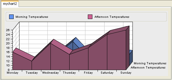
Configuring 3-D rendering
The Designer allows you to switch from a two-dimensional to a three-dimensional display. Only Cartesian and pie charts support 3-D rendering.
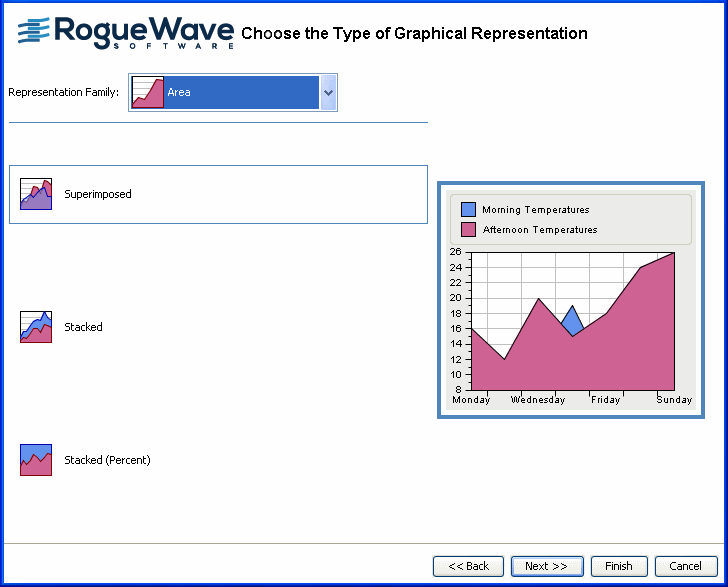
To better appreciate the 3-D rendering benefits, you are going to create a basic Cartesian chart and choose Area as graphical representation.
To create the basic Cartesian chart, see
Creating a new basic chart and follow the same steps until you reach the step Choose the Type of Graphical Representation. Once there, proceed as explained below.
1. From the Representation Family list, select Area.
2. Choose Superimposed and click the Next button.
3. Leave the default Theme and click Finish to exit the Wizard.
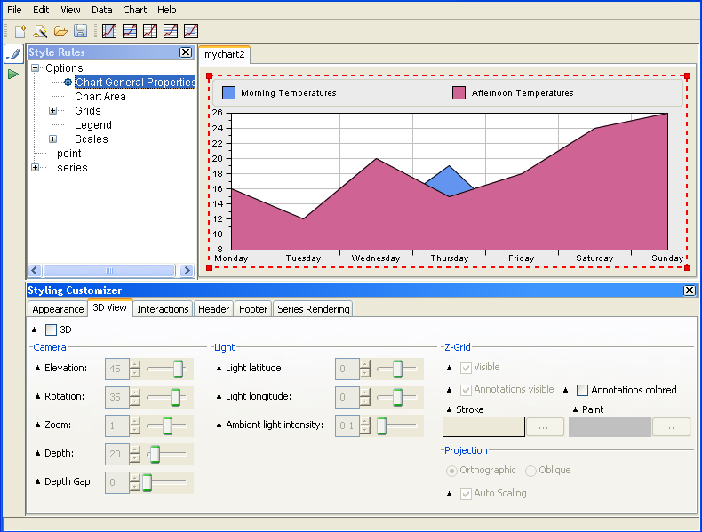
4. Select Chart General Properties from the Style Rule tree pane and make sure the 3-D View tab is active in the Styling Customizer.
5. Check the 3-D option.
Your chart will be displayed with the 3-D view.
6. Select the Oblique projection.
7. Check the option Auto-scaling.
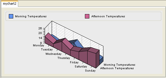
The resulting chart should appear as follows:
Managing decorations
The Designer allows you to add the following decorations to your chart:
grids
data indicators
image
Decorations are drawn according to a drawing order. The drawing order lets you control the position of a given decoration in the drawing queue of a chart. This drawing order is used to define the position of the decoration relative to:
Other chart decorations.
Graphical representations of the chart data.
A chart handles decorations as an ordered list according to the decorations drawing order: decorations with the lowest drawing order are drawn first, decorations with the highest drawing order are drawn last.
The drawing order also defines whether a decoration should be drawn above or below the graphical representations of the chart data: decorations with a negative drawing order are drawn below the chart representations, while decorations with a zero or positive drawing order are drawn above the chart representations.
To add and configure grids for your chart:
See
Configuring grids. More information on grids can also be found in the section
Grids in
Introducing JViews Charts.
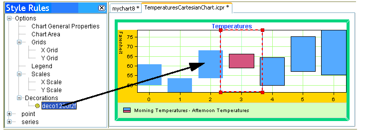
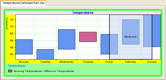
You are going to decorate your chart by highlighting the week-end period using a range indicator which represents a data interval equal to the week-end period.
To add data indicators to your chart:
1. With your TemperaturesCartesianChart.icpr project open, proceed as follows:
2. Select the X scale in the Style Rules tree pane.
3. Click the

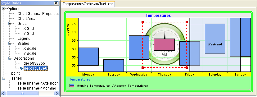
icon on the toolbar to add a range indicator along the X axis.
You will notice that a range indicator is visible on the chart area and a new decoration is added to the Style Rules pane under Options:
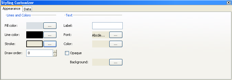
4. Select the new decoration and activate the Appearance tab on the Styling Customizer pane.
5. In the Fill Color option, choose a transparent color.
6. Change the Line color to black.
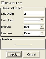
7. Modify the Stroke. From the Stroke Editor, change the Line Width to 2.
8. Set the drawing order to 0.
NOTE The drawing order lets you control the position of a decoration in the drawing queue of a chart. Decorations with a negative drawing order are drawn below the chart representations, while decorations with a zero or positive drawing order are drawn above the chart representations.
9. Add a label.
Type “Week-end” in the label text field and press Enter to validate.
10. Leave the default settings for the remaining properties.
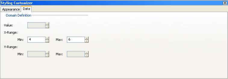
11. Activate the Data tab and apply the following configurations:
12. On the X-Range option, set the Min value to 4 and the Max value to 6.
The settings on the Data tab correspond to the type of indicator you have chosen to apply:
Value indicator: specify a value for the Value option.
Range indicator: specify a min/max value for the X-Range or Y-Range.
Window indicator: specify a min/max value for both the X-Range and Y-Range.
The resulting chart should appear as follows:
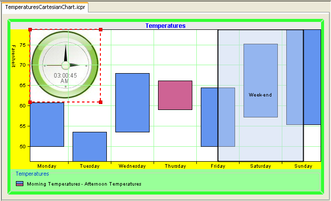
To add an image to your chart:
1. From the menu bar, choose Chart>Image Decoration.
2. Browse to the image you want to add and click the Open button.
NOTE The following formats are supported: GIF, JPEG, PNG.
You will notice that the image appears on the background of the chart area and a new decoration is added to the Style Rules pane under Options:
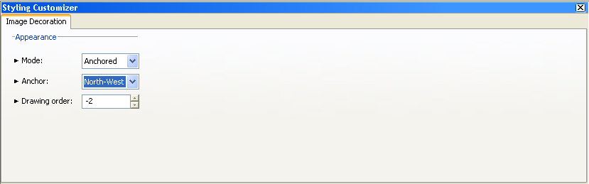
3. Activate the Styling Customizer and apply the following configurations:
a. Set Mode to Anchored to locate the image at a fixed location.
b. Set Anchor to North-West to locate the image on the upper-left corner of your chart.
c. Set Drawing order to -2.
The resulting chart should appear as follows:
Copyright © 2018, Rogue Wave Software, Inc. All Rights Reserved.
