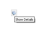
The image button faces component allows you to create a button and associate an action to be executed once it is clicked. The button can display different images for its 3 different states: normal, highlighted, and selected. Additionally you can set the tooltip for the button using its title attribute.
| Attributes |
| Name | Required | Request-time | Type | Description |
| action | false | false | java.lang.String | The method binding reference or a constant outcome executed if this button is a submit button and if the user selects it. |
| actionListener | false | false | java.lang.String | The method binding reference executed if this button is a submit button and if the user selects it. |
| binding | false | false | java.lang.String | The value binding expression linking this component to a property in a backing bean. If this attribute is set, the tag does not create the component itself but retrieves it from the bean property. This attribute must be a value binding. |
| buttonGroupId | false | false | java.lang.String | The identifier of the button group. In a button group, one button can be selected at a time. |
| cursor | false | false | java.lang.String | The cursor displayed when the mouse is on the button. |
| doActionOnBGDeselect | false | false | java.lang.String | Whether the button should execute its action when it's deselected by its button group. It's happening when another button of the button group is selected. In this case the action is called with an empty event. Default value is false. |
| enabled | false | false | java.lang.String | The enabled state of the button. Default value is true. |
| id | false | false | java.lang.String | The ID of this component. |
| image | false | false | java.lang.String | The image representing the button in its 'normal state'. |
| immediate | false | false | java.lang.String | The immediate property of a command. |
| message | false | false | java.lang.String | The message displayed on the status bar when the mouse is on the button. |
| messageBox | false | false | java.lang.String | The binding to a message box component used to display messages. |
| messageBoxId | false | false | java.lang.String | The ID of a message box component used to display messages. |
| onclick | false | false | java.lang.String | The JavaScript action executed when the button is clicked. The action can use 'thisObj' and 'thisEvent' parameters when available that respectively represent the DIV object that contains the button and the event that launches this action. |
| partialTriggers | false | false | java.lang.String | This attribute is meaningful only when the component is used inside an Apache MyFaces Trinidad application. The IDs of the components that should trigger a partial update. This component will listen on the trigger components. If one of the trigger components receives an event that will cause it to update in some way, this component will request to be updated too. Separate multiple triggers with a space. Trigger identifiers are relative to the source component for non-NamingContainer components and relative to the parent component for NamingContainer components. Identifiers must account for NamingContainers. You can use a single colon to start the search from the root, or use multiple colons to move up through the NamingContainer. For example, for a non-NamingContainer component, "::" will search from the parent naming container, ":::" will search from the grandparent naming container, etc. For a NamingContainer component, "::" will search from the parent component's parent naming container. ":::" will search from the parent component's grandparent naming container. |
| rolloverImage | false | false | java.lang.String | The image representing the button when the mouse is over the button. |
| selected | false | false | java.lang.String | The selection state of the button. Default value is false |
| selectedImage | false | false | java.lang.String | The image representing the button when the button is selected. |
| style | false | false | java.lang.String | CSS style(s) to be applied when this component is rendered. |
| styleClass | false | false | java.lang.String | Space separated list of CSS style classe(s) to be applied when this element is rendered. |
| title | false | false | java.lang.String | The tooltip message. |
| toggle | false | false | java.lang.String | The toggle state of the button. Default value is false |
| type | false | false | java.lang.String | The type of the button. Valid values are submit or button. - A
submit button will submit its enclosing form. - A
button button only executes the JavaScript onclick action. |
| baseTextDirection | false | false | java.lang.String | This attribute controls the direction of the text. supported values: LTR, RTL , Contextual |