Configuring a network view JSF component
Explains how to configure the rendering of a network JSF component.

Describes the tag attributes defined for the networkView component.
Explains the different ways to configure a data source within the network JSF component.
Describes how to customize the way the underlying IlpNetwork component is created.
Describes how to connect components from the core JViews JSF and
JViews Framework JSF libraries to the network view.
Describes how to declare predefined interactors and connect them to the networkView component.
Describes how to specify zoom levels.
Describes how to control the area displayed on the client.
Explains how to enable scroll bars by assigning values to the
scrollbar attribute.
Explains how to define pop-up menus by means of the contextualMenu tag.
Describes the tiling support provided by the Network JSF component.
Explains how to manage the user session expiration.
Configuring the client and server side of the network view component
To display a network view in the client application, you need business data and rendering information that defines how to display these data.
The configuration for the rendering is split into two distinct groups:
client-side configuration: HTML configuration stored in the JavaScript page and the JavaScript™ objects
server-side configuration: stored in the network JSF implementation or in the image servlet
Client-side configuration relates to the behavior and look of the JSF component itself. Server-side configuration relates to the network model and the way the representation objects are displayed and laid out.
There are many ways to configure the client and server sides of the
networkView component. In general, the client-side configuration is passed as tag attributes to the
networkView. It is also through tag attributes that you connect auxiliary JSF components to enhance the
networkView, like the
dataSource,
overview,
selectInteractor, and others
Server-side configuration can be set through a CSS configuration file or through the
IlpNetwork API, the easiest and preferred way being the CSS configuration. The tag attribute
styleSheets is used to pass a list of Cascading Style Sheets (CSS) files to configure the network adapter (filters, node and link factories, for example), the network view (background and zoom policies, for example) and the network objects themselves.
The following table lists all the tag attributes defined for the networkView component.
Tag attributes of the networkView JSF component
Tag Attributes | Description |
id | Defines the unique identifier for the component. Every component should have a unique identifier. Mandatory. |
context | Defines the JViews TGO context to be used by the underlying IlpNetwork component. Mandatory. |
binding | Allows the user to bind the component to a backing bean. |
width | Defines the width, in pixels, of the view component. This attribute is inherited from the view JSF component. |
height | Defines the height, in pixels, of the view component. This attribute is inherited from the view JSF component. |
style | Provides CSS customization. This attribute is inherited from the JViews Framework JSF. |
styleClass | Defines the style classes for the component. This attribute is inherited from the JViews Framework JSF. |
messageBox | Binds the text output of the networkView component to a messageBox component. (A messageBox component is defined by the core JViews JSF library and displays text messages in a JSP™ page.) This attribute is inherited from the JViews Framework JSF. |
messageBoxId | Similar to messageBox but binds the messageBox component by its unique identifier. This attribute is inherited from the JViews Framework JSF. |
interactor | Specifies the default (initial) interactor set to the networkView component. It has no correspondence with a view interactor. It should be a JSF component (like the selectInteractor component). This attribute is inherited from the JViews Framework JSF. |
interactorId | Similar to interactor but binds to the unique identifier of the interactor. This attribute is inherited from the JViews Framework JSFJSF. |
zoomFactor | Configures the zoom factor applied when zooming in or out. This attribute is inherited from the JViews Framework JSF. |
panFactor | Configures the pan factor (how much the image is moved). It is mainly used when the networkView component is connected with the panTool component. This attribute is inherited from the JViews Framework JSF. |
updateInterval | Defines the interval between automatic updates. The networkView component will then send an update request to the server on a regular basis. This attribute is inherited from the JViews Framework JSF. |
imageFormat | The image encoding format, for example "JPG" or "PNG". This attribute is inherited from the JViews Framework JSF. |
waitingImage | Defines the image to be displayed by the network JSF component while waiting for the image servlet to generate the response image. This attribute is inherited from the JViews Framework JSF. |
generateImageMap | Indicates whether an image map should be generated for the network JSF component. This attribute is inherited from the JViews Framework JSF. See Adding an Image Map in the Advanced Features of JViews Frameworkdocumentation. |
imageMapVisible | Indicates whether the image map should be made visible or not. This attribute is inherited from the JViews Framework JSF. See Adding an Image Map in the Advanced Features of JViews Frameworkdocumentation. |
imageMapGenerator | Binds to a bean that subclasses the ilog.views.servlet.IlvImageMapAreaGenerator class and is responsible for generating the image map. This attribute is inherited from the JViews Framework JSF. See Adding an Image Map in the Advanced Features of JViews Frameworkdocumentation. |
imageMapGeneratorClass | The name of a bean class that subclasses the ilog.views.servlet.IlvImageMapAreaGenerator class and is responsible for generating the image map. This attribute is inherited from the JViews Framework JSF. See Adding an Image Map in the Advanced Features of JViews Frameworkdocumentation. |
backgroundColor | Specifies the background color to be displayed by the network JSF component when there is no background image. This attribute is inherited from the JViews Framework JSF. |
onImageLoaded | Specifies the JavaScript code to be executed right after a refreshed image is loaded from the server. This attribute is inherited from the JViews Framework JSF. |
onCapabilitiesLoaded | Similar to onImageLoaded, but this is executed right after a request for capabilities has been answered by the server. This attribute is inherited from the JViews Framework JSF. |
errorMessage | The error message to be displayed in case of faulty client-server communication. This attribute is inherited from the JViews Framework JSF. |
servlet | Overrides the default image servlet used to generate images. This attribute is inherited from the JViews Framework JSF. |
project | Sets a JViews TGO project to the underlying IlpNetwork component. |
dataSource | Binds the networkView component with a dataSource component. The data source component wraps an IlpAbstractDataSource component internally. |
dataSourceId | Similar to dataSource, but binding is done through the data source’s unique identifier. |
network | Specifies a custom IlpNetwork which replaces the default automatically instantiated network component. |
styleSheets | Specifies a JViews TGO CSS configuration file for the underlying IlpNetwork component. It is different from the styles tag attribute as it provides server-side configuration, which is specific to JViews TGO. This CSS file may contain component and business data configuration. |
resizable | Enables or disables the resizing of the network JSF component. This attribute is inherited from the JViews Framework JSF. |
boundingBox | Defines the width and height of the network view component. This attribute is inherited from the JViews Framework JSF. |
data | Defines the data to be displayed, which can be a JViews TGO project, a binding to an IlpAbstractDataSource instance, or the unique identifier of a dataSource component. |
zoomLevels | Comma-separated list of fixed zoom levels used by the view. If the zoom levels are not specified, the zoom is bound only by the maxZoomLevel property. |
maxZoomLevel | The maximum zoom level. This property is used if, and only if, the zoomLevels property is not used. The default value is 10. |
tileSize | The size of a tile. If the tile size is greater than or equal to 0, the view will be set in tiled mode. The tile size must be carefully chosen for performance reasons. |
tileManager | The tile manager is responsible for retrieving and/or storing image tiles on the server side. The tile manager is used when the view is tiled, that is, if tileSize is strictly positive. |
Connecting a business data source
To be able to display network objects, the network JSF component must be connected to a data source. This can be done in different ways:
using a
JViews TGO project
using the
dataSource JSF component
directly setting an
IlpAbstractDataSourceThe easiest way to provide server-side customization and business data to a network JSF component is through the
project tag attribute. It allows you to specify a
JViews TGO project that will be set to the underlying
IlpNetwork on the server side. For more information, see
Loading a project file. Keep in mind that not all CSS view customizations are supported by the network JSF component. For details, see
Network view component services.
How to set a JViews TGO project to a networkView JSF component
The following example shows how to pass a JViews TGO project to the networkView component, and to configure the component dimensions ( width and height ) using the style tag attribute:
<jvtf:networkView id="aNetwork"
context="#{contextBean}"
style="width:740;height:550"
project="data/myProject.itpr" />
If you have started the bundled Tomcat web server, the following link will take you to the small sample illustrating this:
http://localhost:8080/jsf-network-step-by-step/faces/example2.jsp.
You will find more information about the sample web application in:
<installdir> /samples/faces/jsf-network-step-by-step/index.html where
<installdir> stands for the directory where Rogue Wave JViews TGO is installed.
The id tag attribute defines a unique identifier for the networkView component. The context tag attribute is a binding to a bean defined in the faces_config.xml file. The style tag attribute defines two CSS properties ( width and height ) for the dimensions, in pixels, of the network component. The project tag attribute is a relative path to a JViews TGO project within the web application. This file should be accessible by the web application.
The following example shows how to declare the context bean in the faces_config.xml file:
<managed-bean>
<managed-bean-name>contextBean</managed-bean-name>
<managed-bean-class>
ilog.tgo.faces.service.IltFacesDefaultContext
</managed-bean-class>
<managed-bean-scope>session</managed-bean-scope>
</managed-bean>
The context should implement the IlpContext interface and must use the synchronization strategy IlSynchronizeOnLockStrategy in order to address the particular threading issues of a web server.
How to declare a dataSource JSF component for the network view
Another way to connect business data to the network view is through the
dataSource JSF component. This component represents a wrapper for an
IlpAbstractDataSource object that can be connected to a network component. Many different data source components can be declared in a given JSP™ page, but only one can be connected to the network view at a time. It is possible to switch data sources dynamically.
The following example shows how to declare a data source in a JSP page:
<jvtf:dataSource id="myDataSource" value="#{dataSourceBean}" />
The id tag attribute defines a unique identifier for the data source component. The value tag attribute gets a value binding to a bean previously declared in the faces_config.xml file that extends IlpAbstractDataSource.
How to connect the dataSource JSF component to the networkView JSF component
Once the data source has been declared, you can connect it to the network view as follows:
<jvtf:networkView id="aNetwork"
context="#{contextBean}"
style="width:740;height:550"
dataSourceId="myDataSource" />
The dataSourceId tag attribute gets the unique identifier of the data source component that will connect it to the network view.
The following example shows how to declare the dataSource bean in the faces_config.xml file:
<managed-bean>
<managed-bean-name>dataSourceBean</managed-bean-name>
<managed-bean-class>ilog.cpl.datasource.IlpDefaultDataSource</managed-bean-class>
<managed-bean-scope>session</managed-bean-scope>
<managed-property>
<property-name>context</property-name>
<property-class>ilog.cpl.service.IlpContext</property-class>
<value>#{contextBean}</value>
</managed-property>
<managed-property>
<property-name>fileName</property-name>
<property-class>java.lang.String</property-class>
<value>data/myNetwork.xml</value>
</managed-property>
</managed-bean>
The dataSource bean is declared and two properties are set: context and fileName. The context property is set with a value binding to a context bean. It is mandatory, so that the JViews TGO context is consistent across components. The fileName property gets a relative path to an XML file compatible with the data source and accessible from the web application.
If you have started the bundled Tomcat web server, the following link will take you to the small sample illustrating this:
http://localhost:8080/jsf-network-step-by-step/faces/example3.jsp.
You will find more information about the sample web application in:
<installdir> /samples/faces/jsf-network-step-by-step/index.html where
<installdir> stands for the directory where Rogue Wave JViews TGO is installed.
How to set a data source Bean to a networkView JSF component
It is also possible to set a data source bean directly to the network view component, without requiring the data source component.
For example:
<jvtf:networkView id="aNetwork"
context="#{contextBean}"
style="width:740;height:550"
dataSource="#{dataSourceBean}" />
The
dataSource tag attribute gets a value binding to a bean that extends
IlpAbstractDataSource. It will connect the network component to this data source bean.
How to use the data tag attribute of the networkView JSF component
The network view JSF component has a multipurpose data tag attribute, which can be used to connect business data sources using:
a
JViews TGO XML project file
the unique identifier of a data source JSF component
the binding to an instance of
IlpAbstractDataSourceNOTE >> You must not use any combination of the following tag attributes, which allow you to connect the network view to any form of data source:
data dataSourceId dataSource project When used with JViews TGO projects, the data tag attribute behaves exactly like the project attribute, getting the relative path to a JViews TGO project, as in the following example:
<jvtf:networkView id="aNetwork"
context="#{myContext}"
style="width:740;height:550"
data="data/myProject.itpr" />
Here myProject.itpr is the project file within the web application.
If you have started the bundled Tomcat web server, the following link will take you to the small sample illustrating this:
http://localhost:8080/jsf-network-step-by-step/faces/example4.jsp.
When used with the unique identifier of a data source JSF component, the data tag attribute behaves exactly like the dataSourceId attribute, getting the unique identifier of a data source component, as in the following example:
<jvtf:networkView id="aNetwork"
context="#{myContext}"
style="width:740;height:550"
data="myDataSource" />
Here myDataSource uniquely identifies a data source JSF component in the current session.
If you have started the bundled Tomcat web server, the following link will take you to the small sample illustrating this:
http://localhost:8080/jsf-network-step-by-step/faces/example5.jsp.
When used with an IlpAbstractDataSource instance, the data tag attribute behaves exactly like the dataSource attribute, getting a value binding to a bean that extends IlpAbstractDataSource, as in the following example:
<jvtf:networkView id="aNetwork"
context="#{myContext}"
style="width:740;height:550"
data="#{dataSourceBean}" />
Here #{dataSourceBean} is a value binding to the corresponding bean declared in the faces_config.xml file.
If you have started the bundled Tomcat web server, the following link will take you to the small sample illustrating this:
http://localhost:8080/jsf-network-step-by-step/faces/example6.jsp.
Customizing the underlying IlpNetwork component
The network view JSF component is a facade to an
IlpNetwork component which manages the integration between business data and display data, server-side configuration and interactions. By default, an instance of
IlpNetwork is instantiated. However, you can customize the way this underlying component is created, in two different ways:
Using the binding tag attribute
The binding tag attribute allows you to replace the default network view JSF component with a customized backing bean that controls how the IlpNetwork is created through the createNetworkComponent method, as illustrated below:
protected IlpNetwork createNetworkComponent(IlpContext context,
String config) {
IlpNetwork myNetwork = new IlpNetwork(config, context);
IlpDefaultDataSource dataSource = new IlpDefaultDataSource(context);
try {
myNetwork.setStyleSheets(new String[] { "myStyles.css" });
dataSource.parse("myData.xml");
} catch(Exception x) {
System.err.println("Could not configure custom component");
}
myNetwork.setDataSource(dataSource);
return myNetwork;
}
How to use the binding tag attribute of the networkView JSF component
JSF components allow you to set a backing bean to replace the default component implementation. So, for the network view JSF component, the
binding attribute can be set with a value binding to a backing bean that extends
IltFacesDHTMLNetworkView (the JavaScript implementation of the network view JSF component). The following example illustrates this:
<jvtf:networkView id="aNetwork"
context="#{contextBean}"
style="width:740;height:550"
binding="#{myJSFNetwork}" />
Here #{myJSFNetwork} is a value binding to a backing bean declared in the faces_config.xml like this:
<managed-bean>
<description>A bean extending IltFacesDHTMLNetworkView</description>
<managed-bean-name>myJSFNetwork</managed-bean-name>
<managed-bean-class>example.MyNetworkView</managed-bean-class>
<managed-bean-scope>session</managed-bean-scope>
</managed-bean>
The backing bean provides more flexibility to the user by giving access to the component API and its instantiation.
If you have started the bundled Tomcat web server, the following link will take you to the small sample illustrating this:
http://localhost:8080/jsf-network-step-by-step/faces/example7.jsp.
You will find more information about the sample web application in:
<installdir> /samples/faces/jsf-network-step-by-step/index.html where
<installdir> stands for the directory where Rogue Wave JViews TGO is installed.
Using the network tag attribute
The
network tag attribute allows you to define the customized instance of an
IlpNetwork component through method binding. You should declare a bean with a method that returns your instance of
IlpNetwork and bind this method with the
network tag attribute, as illustrated below:
public IlpNetwork getCustomNetwork() {
if (null == network) {
// Get the default configuration file name
String config = IltFacesNetworkView.DefaultConfigurationFileName;
network = new IlpNetwork(config, context);
IlpDefaultDataSource dataSource = new IlpDefaultDataSource(context);
try {
network.setStyleSheets(new String[] { "myStyles.css" });
dataSource.parse("myData.xml");
} catch(Exception x) {
System.err.println("Could not configure custom component");
}
network.setDataSource(dataSource);
}
return network;
}
NOTE The configuration file is mandatory. The sample uses the default JSF configuration file which is accessible from the property IltFacesNetworkView.DefaultConfigurationFileName.
How to use the network tag attribute of the networkView JSF component
It is possible to replace the automatically created
IlpNetwork object with a customized network object. This is done with the
network attribute of the network view JSF component, as follows:
<jvtf:networkView id="aNetwork"
context="#{contextBean}"
width="740"
height="550"
network="#{myIlpNetwork.network}" />
Here the tag attributes width and height are used to specify the size of the network view. Other examples produce the same results using the style tag attribute with the CSS properties " width " and " height ".
In this example, the network attribute is set with a method that binds to a bean defined in the faces_config.xml. The corresponding method ( getNetwork in this case) will be invoked when the JSP™ page is parsed. It allows the user to have access to the IlpNetwork API as well as to its instantiation. Using the network attribute and keeping the IlpNetwork in a bean is a good way to provide quick access to the underlying IlpNetwork API within the web application. Note that the context is not passed to the myIlpNetwork.getNetwork method, which means that this bean must be configured with the appropriate context in the faces_config.xml file. For example:
<managed-bean>
<description>A bean with read access to the 'network' property</description>
<managed-bean-name>myIlpNetwork</managed-bean-name>
<managed-bean-class>example.MyNetwork</managed-bean-class>
<managed-bean-scope>session</managed-bean-scope>
<managed-property>
<property-name>context</property-name>
<property-class>ilog.cpl.service.IlpContext</property-class>
<value>#{contextBean}</value>
</managed-property>
</managed-bean>
If you have started the bundled Tomcat web server, the following link will take you to the small sample illustrating this:
http://localhost:8080/jsf-network-step-by-step/faces/example8.jsp.
You will find more information about the sample web application in:
<installdir> /samples/faces/jsf-network-step-by-step/index.html where
<installdir> stands for the directory where Rogue Wave JViews TGO is installed.
Combining JSF components
You can connect components from the core JViews JSF and
JViews Framework JSF libraries to the network view to combine features and improve user interaction. This is the case with the
overview,
zoomTool,
panTool and
imageButton components.
How to set up an overview for the network view
The overview component must be manually set up within the HTML page. Its dimensions and location are important criteria to be considered when designing the HTML page. The following example shows how to declare an overview and connect it to the network view:
<h:panelGrid columns="2">
<jvtf:networkView id="aNetwork"
context="#{contextBean}"
style="width:740;height:550"
project="data/myProject.itpr" />
<jvf:overview id="anOverview"
viewId="aNetwork"
style="width:123;height:91" />
</h:panelGrid>
In the example, a network view component is declared with the unique identifier " aNetwork " within a two-column panelGrid. Then, an overview component is declared so that it is layered after the network component. The viewId tag attribute is used to connect the network view to the overview, through the unique identifier of the main view component. Note that the dimensions of both components are defined in a similar way by the tag attribute style.
If you have started the bundled Tomcat web server, the following link will take you to the small sample illustrating this:
http://localhost:8080/jsf-network-step-by-step/faces/example9.jsp.
You will find more information about the sample web application in:
<installdir> /samples/faces/jsf-network-step-by-step/index.html where
<installdir> stands for the directory where Rogue Wave JViews TGO is installed.
How to connect a zoom tool and a pan tool to a network view
See section The JViews Framework JSF Component Set in the Advanced Features of JViews Framework part of the JViews Diagrammer documentation for details about the zoomTool and panTool.
The following example shows how to attach zoomTool and panTool components to a network view:
<h:panelGrid columns="2">
<jvtf:networkView id="aNetwork"
context="#{contextBean}"
style="width:740;height:550"
project="data/myProject.itpr" />
<h:panelGrid columns="1">
<jvf:panTool id="aPanTool"
viewId="aNetwork"
style="width:123;height:123" />
<jvf:zoomTool id="aZoomTool"
viewId="aNetwork"
style="width:123;height:322" />
</h:panelGrid>
</h:panelGrid>
In this example, a network view component is declared with the unique identifier " aNetwork " within a two-column panelGrid. Then, a new one-column panelGrid is declared to accommodate the panTool and zoomTool components. The viewId tag attribute is used to connect the network view to the other components. Note that the style tag attribute is used to set the dimensions for all the declared components.
If you have started the bundled Tomcat web server, the following link will take you to the small sample illustrating this:
http://localhost:8080/jsf-network-step-by-step/faces/example10.jsp.
You will find more information about the sample web application in:
<installdir> /samples/faces/jsf-network-step-by-step/index.html where
<installdir> stands for the directory where Rogue Wave JViews TGO is installed.
How to add image buttons and set client-side actions for the network view component
Although zoomTool and panTool components provide basic user interaction, you can also set client actions to image buttons to achieve similar results. The advantage is that image buttons are more customizable, as the user can define the action to be set. The following example shows how to declare image buttons and associate them with client-side actions.
<!-- Create a 2 columns grid -->
<h:panelGrid columns="2">
<!-- Declare a button for zooming in -->
<jv:imageButton onclick="aNetwork.zoomIn(true)"
image="images/zoom.gif"
rolloverImage="images/zoomh.gif"
selectedImage="images/zoomd.gif"
title="Zoom In"
message="Zoom In" />
<!-- Declare a button for zooming out -->
<jv:imageButton onclick="aNetwork.zoomOut(true)"
image="images/unzoom.gif"
rolloverImage="images/unzoomh.gif"
selectedImage="images/unzoomd.gif"
title="Zoom Out"
message="Zoom Out" />
</h:panelGrid>
<jvtf:networkView id="aNetwork"
context="#{contextBean}"
style="width:740;height:550"
project="data/myProject.itpr" />
This example declares two image buttons:
one for zooming in
one for zooming out
Each button declaration defines the following attributes:
onclick : The JavaScript™ action to be triggered when the button is pressed.
image : The main button image.
rolloverImage : The image to be displayed when the mouse pointer rolls over the button.
selectedImage : The image to be displayed when the button is pressed.
title : The tooltip message displayed when the mouse pointer stays over the button.
message : The message displayed in the
messageBox component when the mouse pointer stays over the button.
The onclick tag attribute is the most important as it defines the action associated with the button. Note that it uses the JavaScript API of the networkView component to perform the desired action:
onclick="aNetwork.zoomIn(true)" : This uses the
zoomIn JavaScript call to zoom in the network view component.
onclick="aNetwork.zoomOut(true)" : This uses the
zoomOut JavaScript call to zoom out the network view component.
The onclick attribute can be set with any valid JavaScript code, which will be executed when the button is pressed. The other tag attributes define the look and feel of the button, with corresponding images and tooltip text.
If you have started the bundled Tomcat web server, the following link will take you to the small sample illustrating this:
http://localhost:8080/jsf-network-step-by-step/faces/example11.jsp.
You will find more information about the sample web application in:
<installdir> /samples/faces/jsf-network-step-by-step/index.html where
<installdir> stands for the directory where Rogue Wave JViews TGO is installed.
Interacting with the network view component
JViews Framework JSF and core JViews JSF libraries declare predefined interactors that can be connected to the networkView component to add extra user interaction. Interactors are JSF components that execute client- or server-side actions. Most of them can be extended and configured to suit the user needs.
How to declare an interactor and connect it to the network view component
The following example shows how to declare a predefined interactor (the pan interactor) in the JSP™ page and connect it to the networkView component so that it is always available.
<!-- Declare the predefined 'pan' interactor -->
<jvf:panInteractor id="pan" />
<jvtf:networkView id="aNetwork"
context="#{contextBean}"
style="width:740;height:550"
interactorId="pan"
project="data/myProject.itpr" />
In this example, the predefined panInteractor is declared. A unique identifier is associated with it (" pan "). Then, the interactorId tag attribute of the networkView component specifies the interactor to be connected to the network view.
How to associate interactors with image buttons in the network view component
Usually many interactors are made available in a web application. The following example shows how to declare multiple predefined interactors and how to use image buttons to make them active. Note that only one interactor can be set in the network view component at a time. Whenever a new interactor is set, the previous one is removed.
<!-- Declare the predefined 'select' interactor -->
<jvtf:selectInteractor id="select" />
<!-- Declare the predefined 'pan' interactor -->
<jvf:panInteractor id="pan" />
<!-- Create a 4 columns grid -->
<h:panelGrid columns="4">
<!-- Declare a button for selection -->
<jv:imageButton onclick="aNetwork.setInteractor(select)"
buttonGroupId="interactors"
image="images/arrow.gif"
rolloverImage="images/arrowh.gif"
selectedImage="images/arrowd.gif"
title="Select Interactor"
message="Select Interactor" />
<!-- Declare a button for panning -->
<jv:imageButton onclick="aNetwork.setInteractor(pan)"
buttonGroupId="interactors"
selected="true"
image="images/pan.gif"
rolloverImage="images/panh.gif"
selectedImage="images/pand.gif"
title="Pan Interactor"
message="Pan Interactor" />
<!-- Declare a button for zooming in -->
<jv:imageButton onclick="aNetwork.zoomIn(true)"
image="images/zoom.gif"
rolloverImage="images/zoomh.gif"
selectedImage="images/zoomd.gif"
title="Zoom In"
message="Zoom In" />
<!-- Declare a button for zooming out -->
<jv:imageButton onclick="aNetwork.zoomOut(true)"
image="images/unzoom.gif"
rolloverImage="images/unzoomh.gif"
selectedImage="images/unzoomd.gif"
title="Zoom Out"
message="Zoom Out" />
</h:panelGrid>
<jvtf:networkView id="aNetwork"
context="#{contextBean}"
style="width:740;height:550"
interactorId="pan"
project="data/myProject.itpr" />
This example defines two predefined interactors:
panInteractor: This is a client-side interactor that enables panning of the image displayed by the network view component.
Two buttons are declared to connect the interactor to the network view component. The buttonGroupId tag attribute is used to group image buttons so that only one button of the group is selected at a time. The selected attribute is used to specify which button should be made selected when the page is loaded. This should correspond to the interactor initially connected to the network view with the interactorId tag attribute. In this case, the pan button is selected ( select="true" ) and the pan interactor is connected to the network view ( interactorId="pan" ).
If you have started the bundled Tomcat web server, the following link will take you to the small sample illustrating this:
http://localhost:8080/jsf-network-step-by-step/faces/example13.jsp.
You will find more information about the sample web application in:
<installdir> /samples/faces/jsf-network-step-by-step/index.html where
<installdir> stands for the directory where Rogue Wave JViews TGO is installed.
The selectInteractor JSF component
The
selectInteractor JSF component has been defined as an interactor that maps client-side mouse clicks to server-side events dispatched to the underlying view interactor. It extends the JavaServer™ Faces
UICommand component, which means that it will fire
ActionEvents to registered
ActionListeners.
This component allows you to create customized
IlvManagerViewInteractor instances that will process the mouse actions on the client side. By default, it uses the
IltSelectInteractor, which allows selecting, dragging and expanding graphic objects.
This interactor has the following limitations in terms of handling events:
Only
BUTTON1 and
BUTTON3 mouse buttons are supported (left and middle).
Pop-up menus are supported in a different way from the Swing network component. See
Adding pop-up menus.
Double-click events are not supported.
There is no visual feedback when dragging an object (the graphic representation of the object does not follow the mouse pointer).
No keyboard actions are supported except the following modifiers:
Shift key
Control key
Alt key
Meta key
Client-side interactions are converted into the following mouse events, dispatched to the appropriate interactor:
MOUSE_PRESSED MOUSE_DRAGGED MOUSE_RELEASED How to declare the selectinteractor JSF component for the network view
The selectInteractor is declared like any other JSF component defined in the JViews TGO JSF tag library:
<jvtf:selectInteractor id="select" />
Configuring the selectInteractor
The selectInteractor JSF component is configured through the following tag attributes.
Tag attributes of the selectInteractor JSF component
Tag Attributes | Description |
cursor | Defines the mouse cursor to be used when the interactor is active; it should be one of the cursors supported by the web browser. |
lineWidth | Defines the width of the interaction area drawn by the interactor. |
lineColor | Defines the color of the interaction area drawn by the interactor. |
actionName | Defines the name of the action event triggered by this interactor; it is used to identify events coming from this interactor. |
autoSubmit | Defines whether the request will be submitted by a mouse click or not; this tag is used to control when the actions are submitted. When this tag attribute is set to false, the selectInteractor will not submit any request after the user interaction, but wait until some other component does it. |
actionListener | Defines an action listener that is called when this interactor is used. Action listeners should implement the ActionListener interface (from JSF library), but JViews TGO JSF provide the IltFacesGraphInteractorActionListener abstract implementation that decodes the user interactions into events dispatched to a given view interactor. Subclasses should implement the method getViewInteractor in order to return the appropriate view interactor to process the events. The default implementation ( IltFacesSelectInteractorListener) dispatches all events to the IltSelectInteractor view interactor. Therefore, the actionListener tag attribute may be used to register any ActionListener that will be notified whenever a user interaction has been performed, or a subclass of IltFacesGraphInteractorActionListener can be registered to decode the user interaction into events dispatched to view interactions ( IlpViewInteractor). |
invocationContext | Defines whether the server-side processing is performed in the JSF lifecycle or directly by the image servlet. The possible values are: • JSF_CONTEXT: Processing is done in the JSF lifecycle (the default value) • IMAGE_SERVLET_CONTEXT: Processing is done by the image servlet, bypassing the JSF lifecycle The selectInteractor submits requests to be processed on the server side. By default, the request is addressed to the JavaServer JSF controller servlet which processes all requests according to the well-defined JSF lifecycle. This means that all component dependencies will be verified, any registered listener will be notified. The result is a full page refresh with an update of all components involved. If your interaction triggers updates of components other than the networkView, then the JSF_CONTEXT should be used. If, on the other hand, your requests are supposed to only update the image displayed by the networkView component, then you may want to benefit from the faster IMAGE_SERVLET_CONTEXT. In this case, the interactor requests will be addressed to the image servlet responsible for generating the image displayed by the networkView component. Note that the image servlet has no access to any JSF component other than networkView, which means that your request cannot rely on other JSF components, and that any registered listener for changes on the selectInteractor and networkView will not be updated. There is one exception to this rule. As the overview JSF component is largely used with the networkView JSF component, and as its displayed image is also generated by the image servlet, you can force the overview to be refreshed whenever the main view ( networkView ) is updated, at the cost of an extra client-server-client roundtrip. To do so, you must set the autoRefresh tag attribute of the overview JSF component to true. |
binding | Defines a binding expression to a backing bean. |
The cursor, lineWidth and lineColor tag attributes control the look of the interactor when it is activated, they do not affect its functionality.
You will find more information about the sample web application in:
<installdir> /samples/faces/jsf-network-step-by-step/index.html where
<installdir> stands for the directory where Rogue Wave JViews TGO is installed.
Configuring action listeners for the select interactor component
Action listeners are responsible for processing the interactions performed with the select interactor component. Their default behavior is to convert the interactions into server events dispatched to the IltSelectInteractor. It is possible to override this behavior by adding action listeners to the component.
Unlike in the regular network Swing component, it is not possible to declare view interactors through a CSS file. Instead, in the network JSF component, the view interactors are declared within customized action listeners added to the selectInteractor JSF component.
As the selectInteractor extends the JavaServer Faces UICommand, it allows one or more action listeners (implementing javax.faces.event.ActionListener ) to be registered to receive events ( javax.faces.event.ActionEvent ) whenever a user interaction is performed. For the ActionEvent API there are the following methods:
getComponent() or
getSource() : Return a reference to the interactor JSF component that is currently active (for example,
IltFacesGraphInteractor ).
A predefined abstract implementation of the
ActionListener interface named
IltFacesGraphInteractorActionListener is provided to translate client-side interactions into server-side events that are dispatched to a given view interactor. When notified, this class translates user interactions into mouse events that are automatically dispatched to the
IlpViewInteractor returned by the abstract method
getViewInteractor(actionName).
The following example illustrates how to override the default selectInteractor behavior with a customized one:
<jvtf:selectInteractor id="select"
actionListener="#{MyListenerBean}"
invocationContext="JSF_CONTEXT" />
Here the actionListener tag attribute gets a binding to a bean implementing the javax.faces.event.ActionListener interface. Note that actionListener will override the default behavior of the selectInteractor. It is possible to add more than one action listener, combining customized action listeners with the default behavior as shown in the next example:
<jvtf:selectInteractor id="select"
invocationContext="JSF_CONTEXT">
<f:actionListener
type="ilog.tgo.faces.graph.dhtml.event.IltFacesSelectInteractorListener"/>
<f:actionListener type="demo.MyInteractionListener"/>
</jvtf:selectInteractor>
Here
IltFacesSelectInteractorListener is the action listener (extends
IltFacesGraphInteractorActionListener) that implements the default behavior of the
selectInteractor JSF component, and
MyInteractionListener is a customized implementation of the
javax.faces.event.ActionListener interface. The
actionListener tag is used to add several action listeners to the
selectInteractor, which are invoked in the order in which they have been declared. Note that action listeners may conflict with each other, especially multiple implementations of
IltFacesGraphInteractorActionListener, as the first one invoked may change the business model and invalidate the next action listener.
If you have started the bundled Tomcat web server, the following link will take you to the small sample illustrating how to customize action listeners:
http://localhost:8080/jsf-network-step-by-step/faces/example14.jsp.
You will find more information about the sample web application in:
<installdir> /samples/faces/jsf-network-step-by-step/index.html where
<installdir> stands for the directory where Rogue Wave JViews TGO is installed.
The clientSelectInteractor JSF component
The clientSelectInteractor JSF component is an interactor designed to minimize the number of image requests and image updates between the graph view on the client and the image servlet on the server by dynamically rendering and managing the selection borders in the client side.
Instead of requesting a new graph view image every time the user selects an object, the clientSelectInteractor dynamically renders an HTML rectangular selection around the object. The server is notified so that the selection model is kept synchronized with the user interactions. A new graph view image is requested only when the user drags objects or interacts with specific decorations (such as information icons, and expansion icons).
The performance and responsiveness is greatly improved as lesser images are generated and dispatched by the server. However, the selection graphic feedback is impacted, as the client is limited to only displaying a rectangular border around the selected object.
The interactor can be configured to work in image mode. In this mode, it will ask the server to process the selection and get a new image on every user interaction. The dynamic selection border will only be displayed while objects are being dragged, as when objects are in their resting position the new image sent by the server already represents the selection.
It is possible to customize the interaction with object decorations, controlling when a click on a particular object decoration should trigger a new image request or not.
NOTE Unlike the selectInteractor, the clientSelectInteractor always communicates with the image servlet directly. Therefore, it does not follow the JSF lifecycle, which means that only the view JSF component and a possibly attached overview are updated and not all the other components in the page.
How to declare the clientSelectInteractor JSF component for the network view
The clientSelectInteractor is declared like any other JSF component defined in the JViews TGO JSF library:
<jvtf:clientSelectInteractor is="clientSelect" />
Configuring the clientSelectInteractor
The clientSelectInteractor JSF component is configured through the following tag attributes:
Tag attributes of the clientSelectInteractor JSF component
Tag Attributes | Description |
binding | Defines a binding expression to a backing bean, allowing the user to customize the clientSelectInteractor JSF component. |
message | Defines the message displayed by the view when the interactor is set. |
cursor | Defines the mouse cursor to be used when the interactor is active. It should be one of the cursors supported by the web browser. |
menuModeId | The identifier passed to dynamically generated popup menus. |
moveAllowed | Specifies whether this interactor allows mouse dragging. |
objectActionMethodBinding | Defines a method binding to process actions on the object or on specific decorations attached to it. |
onSelectionChanged | Specifies a JavaScript handler to be called whenever the selection changes. Deprecated in JViews TGO 8.0. See The selectionManager JSF component for an alternative. |
imageMode | Sets the interactor to image mode. A new image will be requested every time the user interacts with the view. Deprecated in JViews TGO 8.0. See The selectionManager JSF component for an alternative. |
lineWidth | The width of the selection border dynamically rendered by the interactor. Deprecated in JViews TGO 8.0. See The selectionManager JSF component for an alternative. |
lineColor | The color of the selection border dynamically rendered by the interactor. Deprecated in JViews TGO 8.0. See The selectionManager JSF component for an alternative. |
forceUpdateProperties | Forces the request of additional information when the interactor is in image mode. Used in conjunction with the infoProviderMethodBinding. Deprecated in JViews TGO 8.0. See The selectionManager JSF component for an alternative. |
infoProviderMethodBinding | Defines the information provider method binding to return additional information about the selected object. Deprecated in JViews TGO 8.0. See The selectionManager JSF component for an alternative. |
If you have started the bundled Tomcat web server, the following link will take you to a small sample illustrating this:
http://localhost:8080/jsf-network-step-by-step/faces/example19.jsp.
You will find more information about the sample web application in:
<installdir> /samples/faces/jsf-network-step-by-step/index.html where
<installdir> stands for the directory where Rogue Wave JViews TGO is installed.
Configuring an object action for the clientSelectInteractor
By default, the clientSelectInteractor supports interactions with the following object decorations:
The information icon
The system icon
The expand and collapse icons
If the user clicks on any of these decorations, the interactor triggers a default object action instead of selecting the object. These actions change the look of the objects, which means that a new image is generated.
It is possible to override or even extend this behavior through the objectActionMethodBinding tag attribute, as follows:
<jvtf:clientSelectInteractor id="clientSelect"
objectActionMethodBinding="#{interactorBean.objectAction}" />
Here, the objectActionMethodBinding tag attribute is bound to the objectAction method declared in the interactorBean. The method binding must conform to the following signature:
boolean methodName(IlpGraphView, int, int)
The IlpGraphView is a reference to the graph view containing all the objects. The two integer parameters are the x and y components of the view position where the user has clicked. Returning true indicates that a new image has to be generated, while false indicates that nothing has been processed and the clicked object will be selected.
In the example above, the
objectAction method will override the default object action behavior (which is to react on expand, collapse, information and system icons). It is possible to extend this default behavior by overriding the method
processObjectAction in class
IltFacesDefaultObjectAction.
The selectionManager JSF component
You can customize the way the selection is performed and displayed by using a selection manager.
This selection manager is defined in a facet on the networkView tag, as follows:
<jvtf:networkView id="tgoViewId" interactorId="select">
<f:facet name="selectionManager">
<jvtf:selectionManager imageMode="false" [...] />
</f:facet>
</jvtf: networkView >
The selection manager has two display modes:
image (default)
The image is refreshed after each selection. A new image is requested to the server at each selection which allows the client to get nice selection graphics.
regular
Rectangles representing the selection are displayed on top of the view. The roundtrip to the server is minimal: the generation of a new image is not required and the response time is faster but the selection feedback is limited to a selection rectangle.
TIP Image Mode versus Regular Mode
TIP Using one mode rather than the other depends on your criteria: performance or graphic feedback. Image mode provides a better graphic feedback but is slower because of the image generation and the need for an extra request to get additional information about the selection on the client. Regular mode offers basic graphic feedback but better performance.
Other parameters can be configured on the selectionManager, like for example the line width or the color of the selection rectangle used in regular selection mode:
<jvtf:selectionManager lineWidth="2" lineColor="red"/>
NOTE The selection manager currently supports integration with the following TGO JSF interactor: clientSelectInteractor.
Configuring the selectionManager
The selectionManager JSF component is configured through the following tag attributes:
Tag attributes of the selectionManager Faces component
Tag Attributes | Description |
infoProviderMethodBinding | A method binding that respects the signature List methodName(IlpGraphView, IlpRepresentationObject). The returned value of this method is a list of additional properties associated with the selected object. A valid item of this list is a String or a list itself. As of JViews TGO 8.0, the preferred way to transfer object properties to client is via the propertyAccessor tag of the selectionManager. |
binding | The value binding expression linking this component to a property in a backing bean. If this attribute is set, the tag does not create the component itself but retrieves it from the Bean property. This attribute must be a value binding. |
lineColor | The color of selection rectangles lines. |
forceUpdateProperties | Force to make additional request to query the current selection and additional properties in image mode to enable client-side selection listener. |
id | The ID of this component. |
imageMode | The image mode. In image mode, the image is refreshed on each selection. In regular mode, only the selected object(s) bounding box is queried and rectangles are dynamically displayed on top of the view. Note that the client-side listeners on selection and additional information on selected objects are available in image mode if and only if the forceUpdateProperties property is set to true. In regular mode no special configuration is needed. By default the manager is in image mode. |
lineWidth | The width of selection rectangle lines. |
onSelectionChanged | A JavaScript handler called when the selection has changed. The handler can use the predefined variable ' selection ' which is the list of current selected items. To use this handler the selectionManager must be in regular mode or the forceUpdateProperties must be set if in image mode. Refer to the user's documentation for further information. |
propertyAccessor | The reference to the value binding expression to an IltFacesPropertyAccessor instance that will be used to access model properties of the selected objects. |
fillOn | true to display filled selection rectangles. The fill color is the line color with a transparency of 50%. |
Exposing selection details
You can expose details on the current selection by taking advantage of the property accessor of the selection manager.
The
IltFacesPropertyAccessor contains several methods that can be overridden to configure or specialize the way it gives access to model properties. In particular, you can filter the properties that are exposed to clients by overriding the following method:
List getPropertyNames(IlpGraphicView view, IlpRepresentationObject object)
The following code illustrates how to provide your property accessor:
<jvtf:selectionManager propertyAccessor="{#serverBean.propertyAccessor}" [...]
/>
The following code illustrates how to implement your custom requirements in a new property accessor:
public class ServerBean {
private IltFacesPropertyAccessor accessor = new MyPropertyAccessor();
public IltFacesPropertyAccessor getPropertyAccessor() {
return accessor;
}
class MyPropertyAccessor extends IltFacesPropertyAccessor {
protected List getPropertyNames(IlpGraphicView view, IlpRepresentationObject object) {
[…]
}
}
}
Then you can register a JavaScript listener that will be called when the selection changes:
<jvtf:selectionManager onSelectionChanged="displayProperties(selection)"/>
The JavaScript function can be as follows:
// Alert the ID and bounds of all the selected objects
function displayProperties(selection) {
for (var i = 0; i < selection.length; i++)
alert(selection[i].getID()+"+selection[i].getBounds());
}
In addition to the ID and bounds properties of the selected object, you can also expose the properties of the selected object in the TGO model as follows:
// Alert all the properties of all the selected objects
function displayProperties(selection) {
for (var i = 0; i < selection.length; i++) {
var propertiesNames = selection[i].getObjectPropertyNames();
for (var j = 0; j < propertiesNames.length; j++)
alert(selection[i].getObjectProperty(propertiesNames[j]));
}
}
NOTE To obtain selected object properties information on the client side while you are running the selection in image mode, you need to force an additional request by setting the property forceUpdateProperties to true. In regular mode this feature is available without any overhead.
If you have started the bundled Tomcat Web server, the following link will take you to the small sample illustrating how to use the selection manager with the property accessor:
http://localhost:8080/jsf-network-step-by-step/faces/example20.jsp.
You can find more information about the sample Web application in:
<installdir> /samples/faces/jsf-network-step-by-step/index.html where
<installdir> is the directory in which Rogue Wave JViews TGO is installed.
Managing object selection
The selectionManager also allows for changing the selection state of objects programmatically via its client side by means of JavaScript. This can be accomplished by using the following API:
Selecting and deselecting an object
The selectById function allows you to select or deselect an object by providing the object's identifier:
networkView.getSelectionManager().selectById("tgoObjectId");
This method call will select the object with the identifier tgoObjectId and deselect the object currently selected.
You can extend/reduce the current selection by selecting/deselecting a node as follows:
networkView.getSelectionManager().selectById("tgoObjectId", true);
This method call keeps the existing selection and selects the object with the identifier tgoObjectId, if it's not already selected; or it will deselect it, if it is already selected.
Selecting all objects
The selectAll function allows you to select all objects:
networkView.getSelectionManager().selectAll();
This method call will select all visible objects.
Deselecting all objects
The deselectAll function allows you to deselect all objects:
networkView.getSelectionManager().deselectAll();
This method call will clear the selection of all visible objects.
NOTE In all cases, the object must be selectable in order to get selected.
If you have started the bundled Tomcat Web server, the following link will take you to the small sample illustrating how to use the selection manager API:
http://localhost:8080/jsf-network-step-by-step/faces/example22.jsp.
You can find more information about the sample Web application in:
<installdir> /samples/faces/jsf-network-step-by-step/index.html where
<installdir> is the directory in which Rogue Wave JViews TGO is installed.
Zoom constraints
When the zoom level is equal to 1, the manager content is adjusted to the bounds of the JSF view so as to be displayed entirely. Consequently, a zoom level of n means that the content is scaled by a factor of n. For example, a zoom factor of 2 means that the manager content is displayed double its size.
By default, the view is constrained by the manager content bounds. The direct consequences are that:
Pan actions or zoom interactions cannot go out of the manager content bounds.
The view zoom level cannot be lower than 1.
This constraint can be removed by setting the constrainedOnContents property to false, as follows:
<jvtf:networkView constrainedOnContents="false" [...] />
The zoom level applied to the view by using the zoom interactor of JavaScript™ zoom actions can be free or constrained to specified zoom levels. In the free zoom mode, the only constraints are the minimum and maximum zoom levels. The default value of the minimum zoom level is set to 1 and the default value of the maximum zoom level is set to 10. These constraints can be customized with the minZoomLevel and the maxZoomLevel properties respectively.
<jvtf:networkView minZoomLevel="2" maxZoomLevel="20" [...] />
NOTE By default, the minimum zoom level cannot be lower than 1.
To specify fixed zoom levels, use the zoomLevels property, as follows:
<jvtf:networkView zoomLevels="1.0, 2.0, 5.0, 10.0" [...] />
When this property is set:
The
minZoomLevel and
maxZoomLevel properties are ignored.
The
minZoomLevel becomes the first zoom level and the
maxZoomLevel the last zoom level in the list.
The zoom interactor will fit to the nearest zoom level.
The built-in zoom actions on the JavaScript view proxy use these fixed zoom levels.
Fixed zoom levels must be used in order for a tiled view to be cached on the client-side.
Controlling the displayed area
The Network JSF component allows developers to specify the area that will be displayed on the client. For example, this enables developers to set the initial visible area or possibly to change at runtime the clipping rectangle so that it centers or focuses on a given network element.
This can be done by means of the boundingBox property as follows:
<jvtf:networkView [...] boundingBox="0,0,100,200"/>
The value provided corresponds to the x, y, height and width of the area of interest in manager coordinates separated by commas.
Programmatically, this property can be used during a JSF action to reset or modify the visible area by providing an instance of IlvRect as illustrated below.
public class ActionProvider {
[...]
public void changeAreaDisplayed() {
IltFacesNetworkView facesNetworkView = …;
facesNetworkView.setBoundingBox(new IlvRect(0,0,100,100));
}
}
Enabling scroll bars in a network view
Scroll bars allow you to scroll a view horizontally or vertically.
You can assign the following values to the scrollbar attribute:
yes to always have scroll bars in a view
need to enable scroll bars only when needed: when part of the view is not visible
no to have no scroll bars in a view. This is the default value.
The following code example shows how to enable scroll bars in a network view using the scrollbar attribute in the networkView tag:
<jvdf:networkView id="network" scrollbars="need">
Adding pop-up menus
Unlike the network Swing component, the network JSF component does not rely on the IlpPopupMenuFactory interface to declare contextual menus. Instead, it is based on the contextualMenu tag defined in the jviews-framework-faces.tld tag library descriptor. This means that pop-up menus in network JSF cannot be declared in CSS files.
The contextualMenu tag allows you to define two distinct types of pop-up menu:
Static pop-up menus: The menu structure is hard coded in the JSP™ file, it applies to all objects and cannot be changed dynamically.
Dynamic pop-up menus: The menu structure is defined by the
IlvMenuFactory interface and can be created dynamically where the pop-up was activated
NOTE In JViews TGO JSF, the pop-up menu does not trigger any object selection, that is, the object right below the mouse pointer is not automatically included in the selection model.
How to add a static pop-up menu to a network JSF component
The static pop-up menu is fully declared within the JSP file, using the following tags:
contextualMenu (
jviews-framework-faces.tld library)
menu (
jviews-faces.tld library)
menuItem (
jviews-faces.tld library)
menuSeparator (
jviews-framework-faces.tld library)
The following example illustrates how to declare a static pop-up menu within a network JSF component:
<!-- Declare the Network JSF component -->
<jvtf:networkView id="aNetwork"
context="#{contextBean}"
style="width:740;height:550"
project="data/default_project.xml">
<!-- Declare the contextual menu -->
<jvf:contextualMenu>
<!-- Declare the root popup menu -->
<jv:menu label="root">
<jv:menuItem label="Zoom In"
image="images/zoom.png"
onclick="aNetwork.zoomIn()" />
<jv:menuItem label="Zoom Out"
image="images/unzoom.png"
onclick="aNetwork.zoomOut()" />
<jv:menuSeparator />
<jv:menuItem label="Fit To Contents"
image="images/zoomfit.png"
onclick="aNetwork.showAll()" />
<jv:menuItem label="Alert!"
image="images/alert.png"
onclick="alert('Alert menu item!')" />
</jv:menu>
</jvf:contextualMenu>
</jvtf:networkView>
In this example, the contextualMenu tag is declared within the network JSF component declaration ( networkView tag). It is structured as a root menu ( menu tag) with multiple menu items ( menuItem tags).
The
onclick attribute in the
menuItem tag is the most important. It defines the JavaScript™ code to be executed when the menu item is selected. See
index for details on the available tag attributes.
If you have started the bundled Tomcat web server, the following link will take you to the small sample illustrating how to declare a static pop-up menu:
http://localhost:8080/jsf-network-step-by-step/faces/example15.jsp.
You will find more information about the sample web application in:
<installdir> /samples/faces/jsf-network-step-by-step/index.html where
<installdir> stands for the directory where Rogue Wave JViews TGO is installed.
How to add and customize a dynamic pop-up menu for a network JSF component
Like the static pop-up menu, the dynamic pop-up menu is declared in a JSP page using the contextualMenu tag inside the network JSF declaration ( networkView tag). However, instead of declaring the menu structure, it declares a menu factory (implementing the IlvMenuFactory interface) that is invoked whenever the pop-up menu is activated. The following example illustrates how the dynamic pop-up menu is declared:
<head>
<!-- Specify a CSS file -->
<link href="data/style.css" rel="stylesheet" type="text/css"/>
</head>
<!-- Declares a select interactor, which will be attached to the view -->
<jvtf:selectInteractor id="select"
menuModelId="selectInteractor"
invocationContext="IMAGE_SERVLET_CONTEXT" />
<!-- Declare the Network JSF component -->
<jvtf:networkView id="aNetwork"
context="#{contextBean}"
interactorId="select"
backgroundColor="#F5F5F5"
style="width:740;height:550"
project="data/default_project.xml">
<!-- Declare the contextual menu with given popup menu factory -->
<jvf:contextualMenu factory="#{popupMenuFactory}"
itemStyleClass="menuItem"
itemHighlightedStyleClass="menuItemHighlighted"
itemDisabledStyleClass="menuItemDisabled" />
</jvtf:networkView>
As shown above, the contextualMenu tag is used within the networkView declaration to add a pop-up menu to the network JSF component. In addition, the following tag attributes are noteworthy:
The factory tag attribute
This attribute of the contextualMenu tag is bound to a bean implementing the IlvMenuFactory interface, which defines one single method:
public IlvMenu createMenu(Object graphicComponent, Object selectedObject,
String menuModelId);
When this method is automatically called, the
graphicComponent attribute refers to the underlying graphic view (
IlpGraphView, superclass of
IlpNetworkView ). It allows full access to the
IlpNetworkView API, including selection model, controller, and so on.
The selectedObject attribute refers to the representation object ( IlpRepresentationObject ) located immediately below the mouse pointer when the pop-up menu was activated, if any. Note that this object may or may not be selected. It is independent of the selection model.
The menuModelId corresponds to the value set in the menuModelId tag attribute of the selectInteractor tag. It allows you to create custom pop-up menus based on the active interactor.
The following IlvMenuFactory example creates a basic pop-up menu:
public IlvMenu createMenu(Object graphicComponent,
Object selectedObject,
String menuModelId) {
// Create the root menu
IlvMenu root = new IlvMenu("Root");
// Create 3 JavaScript actions
ActionListener jsAction = new
JavaScriptActionListener("aNetwork.zoomIn()");
root.addChild(new IlvMenuItem("Zoom in", jsAction,
"images/zoom.png", true));
jsAction = new JavaScriptActionListener("aNetwork.zoomOut());
root.addChild(new IlvMenuItem("Zoom out", jsAction,
"images/unzoom.png", true));
jsAction = new JavaScriptActionListener("alert('Alert menu item!')");
root.addChild(new IlvMenuItem("Alert!", jsAction,
"images/alert.png", true));
return root;
}
In this example, IlvMenu is the root menu that contains menu items ( IlvMenuItem ). Each menu item has an ActionListener associated with it. In this case, the predefined JavaScriptActionListener class is used to trigger JavaScript code executed on the client when the corresponding menu item is activated. Note that aNetwork in aNetwork.zoomOut() refers to the identifier of the networkView JSF component. zoomOut() is the JavaScript method that performs zooming out on the client side.
The itemStyleClass, itemHighlightedStyleClass and itemDisabledStyleClass tag attributes
These attributes of the contextualMenu tag are used to customize the look of the pop-up menu. They declare the CSS classes that contain styling definitions for items, highlighted items and disabled items, respectively as follows (from the style.css file):
.menuItem {
background: #E5E5E5;
font-family: sans-serif;
font-size: 14px;
font-style: normal;
color: black;
}
.menuItemHighlighted {
background: #FFE5A5;
font-style: normal;
color: black;
}
.menuItemDisabled {
font-style: italic;
color: #A5A5A5;
}
The menuModelId tag attribute
This attribute of the selectInteractor tag is used by the menu factory to identify which pop-up menu to create based on the interactor that is currently active.
If you have started the bundled Tomcat web server, the following link will take you to the small sample illustrating how to customize pop-up menus:
http://localhost:8080/jsf-network-step-by-step/faces/example16.jsp.
You will find more information about the sample web application in:
<installdir> /samples/faces/jsf-network-step-by-step/index.html where
<installdir> stands for the directory where Rogue Wave JViews TGO is installed.
How to trigger server actions from a dynamic pop-up menu of a network JSF component
The dynamic pop-up menu can trigger two types of action:
client actions: JavaScript actions executed on the client
server actions: Java™ actions executed on the server
When building the dynamic menu, the pop-up menu factory ( IlvMenuFactory ) creates a root menu ( IlvMenu ) with menu items ( IlvMenuItem ) and each menu item has an action listener ( ActionListener ) associated with it.
Client actions are defined by the predefined JavaScriptActionListener.
Server actions, like interactions, can be processed either by the JavaServer Faces lifecycle or directly by the image servlet. This is defined by an invocation context that can be either one of the following:
JSF_CONTEXT : Processing takes place in the JSF lifecycle (default value)
IMAGE_SERVLET_CONTEXT : Processing is performed by the image servlet, bypassing the JSF lifecycle.
Server actions are defined by subclassing the FacesViewActionListener abstract class. The subclass should define the desired invocation context and implement the public void actionPerformed(EventObject event) method. The event parameter is in fact an instance of the ServletActionListener class that has the following convenient methods in its API:
getGraphicComponent() : This method returns the underlying view (instance of
IlpNetworkView )
getObject() : This method returns the representation object (
IlpRepresentationObject ) located right below the mouse pointer when the pop-up menu was activated)
This allows full access to the IlpNetworkView API, including selection model, controller, and so on.
The following example shows a basic subclass of FacesViewActionListener :
public class MyActionListener extends FacesViewActionListener {
/**
* Constructor. Sets the invocation context.
*/
public AddAlarmActionListener() {
super(IlvDHTMLConstants.IMAGE_SERVLET_CONTEXT);
}
/**
* Access the network view and the active object.
*
* @param event An instance of ServletActionListener.
*/
public void actionPerformed(EventObject event) throws Exception {
ServletActionEvent saEvt = (ServletActionEvent)event;
// access the network view
IlpNetworkView view = (IlpNetworkView)saEvt.getGraphicComponent();
// access the active object
IlpObject obj = (IlpObject)saEvt.getObject();
// implement your action with 'view' and 'obj'
}
}
Once the action listener has been defined, it can be used within the pop-up menu factory ( IlvMenuFactory ) as follows:
public IlvMenu createMenu(Object graphicComponent, Object selectedObject,
String menuModelId) {
// Create the root menu
IlvMenu root = new IlvMenu("Root");
// Create one server action
ActionListener srvAction = new MyActionListener();
root.addChild(new IlvMenuItem("My action", srvAction,
"images/action.png", true));
return root;
}
If you have started the bundled Tomcat web server, the following link will take you to the small sample illustrating how to handle server actions:
http://localhost:8080/jsf-network-step-by-step/faces/example17.jsp.
You will find more information about the sample web application in:
<installdir> /samples/faces/jsf-network-step-by-step/index.html where
<installdir> stands for the directory where Rogue Wave JViews TGO is installed.
Tiling
The Network JSF component provides support for tiling. The tiling support consists of providing developers with the ability of configuring the Network JSF component to compute, cache and provide on demand only the areas of its graphical representation that are visible to the client at one given time, instead of computing and providing the entire area of the graphical representation that may not be visible to the client.
NOTE The tiling support provided by the JViews TGO Network JSF component is based on the tiling support by the underlying JViews JSF Framework. Any difference in the default behavior as defined in the JViews JSF Framework documentation is documented in this section.
Configuration
Tiled view
See Concepts in Advanced Features of JViews Framework for an introduction to the use of tiling for building Web applications.
To make tiling available in the view, you must specify a tile size. The tile size is a critical parameter and must be chosen with care. See Tile Size in Advanced Features of JViews Framework.
<jvtf:networkView [...] tileSize="256"/>
Server-side caching
When the view is tiled, a server-side caching mechanism for tiles of static layers can be installed by using the tileManager property. No server-side caching mechanism is installed by default.
<jvtf:networkView tileManager="#{tgoBean.tileManager}" [...]/>
See The Tile Manager in Advanced Features of JViews Framework for more information.
Client-side caching
In order to enable the client-side caching mechanism, the
zoomLevels attribute must be set. When this attribute is set, the client caches the tiles for the predefined zoom levels. See
Zoom constraints for details on how to set the predefined zoom levels.
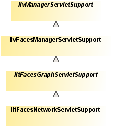
The API
IltFacesGraphServletSupport
The
IltFacesGraphServletSupport determines the JViews TGO specific tiling behavior at the server-side level. By default, it uses as the static layers all the
IlvManagerLayer instances that compose the background of your Network JSF component. For more information on backgrounds, see
Background support.
If a custom strategy is needed for computing the tiled layers, see Developing server-side tiling which gives more information on the relevant server-side API that is need to customize the default behavior.
Managing the session expiration
The user session expires after a certain period of inactivity, usually defined in the Web deployment descriptor.
JViews objects are stored in the HTTP user session. For example, after the user session expiration, queries to update the image will fail.
The beforeSessionExpirationHandler property allows you to add a JavaScript™ handler that will be invoked when the user session is about to expire.
For example, to keep the session alive as long as the browser page is open, use the following code:
<jvtf:networkView [...]
beforeSessionExpirationHandler="view.updateImage();" />
This example shows how to query an image and keep the user session alive.
Note the use of view, the implicit object that represents the view JavaScript proxy. The internal timer is reset only by requests issued by JViews objects. If the application implements other requests that do not refresh the image, this timer could be inaccurate. To reset the timer manually, use the following JavaScript code:
viewID.getObject().resetSessionExpirationTimer();
where viewID is the value of the id property of your view component.
NOTE The beforeSessionExpirationHandler is called two minutes before the actual session expiration time.
Copyright © 2018, Rogue Wave Software, Inc. All Rights Reserved.