Customizing user-defined network links
Describes how to customize the shape, color, and other aspects of user-defined network links.

Lists all the properties you can use to customize a link and shows how to customize the line aspect of the link with an example.
Describes how to customize various aspects of network links.
Describes how to customize the display of a label in a network link representation.
Customizing a link
You can customize a network link using the properties listed in the following table.
CSS properties for network links
Property Name | Type | Default Value | Description |
alternateColor | Color | null | Sets the alternate color. |
animateSpeed | float | 0 | Sets the animate speed. |
arrowColor | Color | Color.black | Sets the arrow color. |
arrowMode | int | ARROW_FILL | Sets the arrow-drawing style. The possible values are: ARROW_FILL ARROW_OPEN ARROW_GRADIENT ARROW_DECOERRATION |
arrowPosition | float | 1f | Sets the position of the arrow as the ratio of the link length. For example, 0.5f is the middle of the link. |
arrowRatio | float | 1f | Sets the size of the arrow proportionately to the length of the link. |
borderColor | Color | null | Sets the border color. |
borderColor2 | Color | null | Sets the lower border color. |
borderLineStyle | float[] | null | Sets the array that represents the lengths of the dash segments for the border. The possible values are: Solid Dot Dash DashDot DashDoubleDot Alternate LongDash DoubleDot or an array that defines a new line style. |
borderLineStylePhase | float | 0f | Sets the dash pattern offset for the border. |
borderWidth | float | 0f | Sets the border width. |
curved | float | 0f | Sets the curved appearance and the smoothness of the spline. |
endCap | int | CAP_SQUARE | Sets the decorations applied to the end of the polyline. The possible values are: CAP_BUTT CAP_ROUND CAP_SQUARE |
internalZoom | float | 1f | Sets the internal scale factor. |
lineJoin | int | JOIN_MITER | Sets the decoration applied when two segments are joined. The possible values are: JOIN_BEVEL JOIN_MITER JOIN_ROUND |
lineStyle | float[] | null | Sets the array that represents the lengths of the dash segments. The possible values are: Solid Dot Dash DashDot DashDoubleDot Alternate LongDash DoubleDot or an array that defines a new line style. |
lineStylePhase | float | 0f | Sets the dash pattern offset. |
lineWidth | float | 5f | Sets the line width. |
maxLineWidth | float | 0 | Sets the maximum line width when zooming in. |
minLineWidth | float | 0f | Sets the minimum line width when zooming out. |
mode | int | MODE_GRADIENT | Sets the link-drawing mode. The possible values are: MODE_TEXTURE MODE_UNICOLOR MODE_GRADIENT MODE_NEON Caution: Do not use the border with the mode ilog.views.sdm.graphic.IlvGeneralLink. MODE_NEON. |
oriented | boolean | false | Sets the link as oriented or not oriented. |
qualityLevel | int | 3 | Controls the quality of the rendering of the link. You can modify this property for faster interaction or high quality printing. The following values achieve the following effects respectively: 0 : The link is rendered as a single line only. 1 : MODE_UNICOLOR is forced, with no border, no wave effect, and a classic arrow. 2 : Gives the effect of 1 with a border. 3 : All, the default value. 4 : Very fine-gradient spectra. 5 : All BasicStroke with float value and no cache. |
wave | String | "0/0" | Sets the wavy outline of the link. Use 0/0 to cancel the wave effect. The value is a formatted string that describes the wave. The format is a/p, where a is an int representing the amplitude of the wave in pixels and p is an int representing the period or length of the wave in pixels. |
How to use network link properties in a user-defined business class
object."test.MyLink" {
oriented: true;
lineWidth: 5;
lineStyle: "4,4,2";
endCap: CAP_ROUND;
wave: "1/2";
}
Customizing various aspects of links
You can customize the following aspects of network links:
NOTE Color values are given as literals or hexadecimal codes. The resulting colors are shown in the figures.
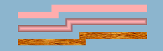
Major appearance modes
The general link has three principal looks associated with the property mode. For the first two looks, the foreground property sets the main color.
Three main looks for links
The properties of the first look shown in the figure are composed as follows:
mode = MODE_UNICOLOR
lineWidth = 10
foreground = pink
The properties of the second look shown in the figure are composed as follows:
mode = MODE_GRADIENT
lineWidth = 10
foreground = pink
The properties of the third look shown in the figure are composed as follows:
mode = MODE_TEXTURE
lineWidth = 10
fillTexture = wood.png
The fillTexture property specifies the URL of an image file to use as a texture in TEXTURE mode. Note that the URL does not use the URL Access Service.
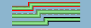
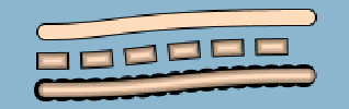
An optional border
A border is painted when the borderWidth property is greater than 0, the default value. The default border color is black. Two other properties control the line style (such as dashes).
Links with simple borders
The properties of the top link in the figure are composed as follows:
lineWidth = 10
foreground = #90EE90
endCap = CAP_ROUND
borderWidth = 4
borderColor = red
The properties of the center link in the figure are composed as follows:
lineWidth = 10
foreground = #90EE90
endCap = CAP_ROUND
borderWidth = 4
borderColor = gray
borderLineStyle = "10,5"
borderLineStyle is expressed as a float array.
The properties of the bottom link in the figure are composed as follows:
lineWidth = 10
foreground = #90EE90
endCap = CAP_ROUND
borderWidth = 2
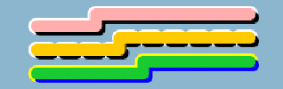
Links with more complex borders
The properties of the top link in the figure are composed as follows:
lineWidth = 10
mode = MODE_UNICOLOR
endCap = CAP_ROUND
lineJoin = JOIN_ROUND
borderWidth = 4
borderColor = white
borderColor2 = black
foreground = #FFAFAF
The properties of the center link in the figure are composed as follows:
lineWidth = 10
mode = MODE_UNICOLOR
endCap = CAP_ROUND
lineJoin = JOIN_ROUND
borderWidth = 4
borderColor = white
borderColor2 = black
foreground = #FFC800
borderLineStyle = "10,10"
borderLineStyle is expressed as a float array.
The properties of the bottom link in the figure are composed as follows:
lineWidth = 10
mode = MODE_UNICOLOR
endCap = IlvStroke.CAP_ROUND
lineJoin = IlvStroke.JOIN_ROUND
borderWidth = 4
borderColor = yellow
borderColor2 = blue
foreground = #1EC830
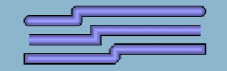
End cap and join style of the stroke
The default stroke parameters are JOIN_MITER and CAP_SQUARE. You can change the end cap and join style, as shown in the following figure.
Different values for stroke parameters
The properties of the top link in the figure are composed as follows:
lineWidth = 10
endCap = IlvStroke.CAP_ROUND
lineJoin = IlvStroke.JOIN_ROUND
borderWidth = 2
foreground = #9A9AFF
The properties of the center link in the figure are composed as follows:
lineWidth = 10
endCap = CAP_BUTT
lineJoin = JOIN_MITER
borderWidth = 2
foreground = #9A9AFF
The properties of the bottom link in the figure are composed as follows:
lineWidth = 10
endCap = CAP_SQUARE
lineJoin = JOIN_BEVEL
borderWidth = 2
foreground = #9A9AFF
Curves
The curved property uses the link points to feed a Bezier function which renders a curved link. Intermediate points show the path for the Bezier computation. With two points, a standard deviation applies, that is, at 1/4 before the end of the link. The curved value is a float between 0f and 1f. A value of 0 means no curve at all (the default), and a value of 1 means the sharpest curve. Use a value of 0.65f for an attractive curve.
Curved links
The properties of the top link in the figure are composed as follows:
lineWidth = 10
endCap = CAP_ROUND
lineJoin = JOIN_ROUND
borderWidth = 2
foreground = #FFDAB9
curved = 0.65
mode = MODE_UNICOLOR
The properties of the center link in the figure are composed as follows:
lineWidth = 10
endCap = CAP_SQUARE
lineJoin = JOIN_ROUND
borderWidth = 2
foreground = #FFDAB9
curved = 0.65
lineStyle = [10,20]
lineStyle is expressed as a float array.
The properties of the bottom link in the figure are composed as follows:
lineWidth = 10
endCap = CAP_SQUARE
lineJoin = JOIN_BEVEL
borderWidth = 6
foreground = #FFDAB9
curved = 0.65
borderLineStyle = [1,10]
borderLineStyle is expressed as a float array.
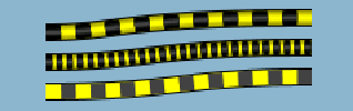
Dashes
Dashes provide interesting effects together with endCap values. Dashes are controlled by the lineStyle property. They are expressed as a float array. Alternate entries in the array represent lengths of the opaque and transparent segments of the dashes.
Note that the dash specification also applies to the border unless the borderLineStyle property overrides it.
Links with dashed line styles
The properties of the top link in the figure are composed as follows:
lineWidth = 10
endCap = CAP_ROUND
lineJoin = JOIN_ROUND
borderWidth = 2
foreground = #55BEF3
lineStyle = [1,15]
The properties of the center link in the figure are composed as follows:
lineWidth = 10
endCap = CAP_ROUND
lineJoin = JOIN_ROUND
borderWidth = 2
foreground = #FFC800
lineStyle = [10,8,20,8]
The properties of the bottom link in the figure are composed as follows:
lineWidth = 10
endCap = CAP_BUTT
lineJoin = JOIN_ROUND
borderWidth = 2
foreground = red
mode = MODE_UNICOLOR
lineStyle = [4,4]
curved = 0.65
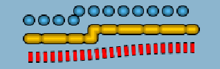
Alternating colors
The alternateColor property toggles the link in alternate mode with the specified color. The segment size equals the thickness of the link. Otherwise, the segment size can be specified with the lineStyle property.
The lineStylePhase property sets the initial offset. If no lineStyle is specified, the phase is proportional to twice the line width. In the following figure, the bottom link starts the alternate color one segment later than the top one.
Links with alternate colors
The appropriate values for the links are as follows.
The properties of the top link in the figure are composed as follows:
lineWidth = 10
endCap = CAP_BUTT
lineJoin = JOIN_ROUND
borderWidth = 2
foreground = yellow
alternateColor = darkGray
curved = 0.65
The properties of the center link in the figure are composed as follows:
lineWidth = 10
endCap = CAP_BUTT
lineJoin = JOIN_ROUND
borderWidth = 2
foreground = yellow
alternateColor = darkGray
curved = 0.65
lineStyle = [4,3]
lineStyle is expressed as a float array.
The properties of the bottom link in the figure are composed as follows:
lineWidth = 10
endCap = CAP_BUTT
lineJoin = JOIN_ROUND
borderWidth = 2
foreground = yellow
alternateColor = darkGray
curved = 0.65
lineStylePhase = 1
mode = MODE_UNICOLOR
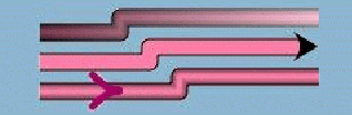
Arrows
There are four modes for representing an arrow controlled by the arrowMode property.
The
ARROW_FILL mode value (the default) draws a filled triangular arrow.
The
ARROW_OPEN mode value draws a two-arm arrow.
The
ARROW_GRADIENT mode value shows an oriented link by smoothly varying the luminosity along the link. The link appears darker near the source and brighter near the target.
The
ARROW_DECORATION mode value delegates the task of displaying the arrow to one of the link decorations.
In the first two modes, the arrowPosition property controls the position of the arrow along the link. Its value is a float between 0 and 1. A value of 0 means the start of the link. A value of 1 means the end of the link (the default). The arrow direction is aligned with the link segment below it.
The property arrowRatio controls the size of the arrow, which is proportional to the width of the link. A float value of 0.5 means the arrow is the same size as the link. The default value 1 means the arrow is twice as wide as the link. This property applies to all four arrow modes.
The default color of an arrow is black. The color can be set by the property arrowColor.
Links with arrows
The properties of the top link in the figure are composed as follows:
lineWidth = 10
endCap = CAP_BUTT
lineJoin = JOIN_ROUND
borderWidth = 2
foreground = #FF82AB
arrowMode = ARROW_GRADIENT
oriented = true
The properties of the center link in the figure are composed as follows:
lineWidth = 10
endCap = CAP_BUTT
lineJoin = JOIN_ROUND
borderWidth = 2
foreground = #FF82AB
arrowMode = ARROW_GRADIENT
oriented = true
mode = MODE_UNICOLOR
arrowMode = ARROW_FILL
The properties of the bottom link in the figure are composed as follows:
lineWidth = 10
endCap = CAP_BUTT
lineJoin = JOIN_ROUND
borderWidth = 2
foreground = #FF82AB
arrowMode = ARROW_OPEN
oriented = true
arrowColor = #A3056E
arrowPosition = 0.2
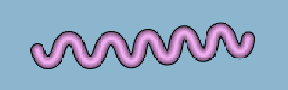
Waves
A wave effect is very effective for representing a wireless connection. The wave specification consists of two numbers in pixels representing the wave amplitude and its period. The property type is String, where two integers separated by a forward slash or solidus (/) represent the amplitude and period respectively. The effect is rendered best with straight lines, but remains compatible with any shape.
The wave effect can also be combined with dashes, border, arrow, and so on.
Link with wave effect
The properties of the link in the figure are composed as follows:
lineWidth = 10
endCap = CAP_ROUND
lineJoin = JOIN_ROUND
borderWidth = 2
foreground = #EEAEEE
wave = 20/30
Animation
A link with dashes (see the lineStyle property) or alternate colors (see the alternateColor property) can be animated. The animation consists of incrementing the lineStylePhase value at regular intervals, so that the dash pattern is shifted at each animation frame. The current implementation updates every 500 ms.
The animateSpeed property controls animation of the link and how much the phase is incremented. If the value is 0, the animation is stopped. Otherwise, the value must be between 0f and 1f and represents a fraction of the dash pattern length. For example, 0.1 means that ten frames elapse before seeing the first frame again. Note that 0.9 represents the same increment but in the reverse direction.
Zoom
The maxLineWidth property sets the maximum width of the line. The link is zoomable only if one edge node is zoomable. Note that the link border cannot be zoomed.
The minLineWidth property sets the minimum width of the line.
Special effects
MODE_NEON is a minor mode that is a variation of MODE_GRADIENT. It displays the link with transparent colors, giving a glowing effect. (This effect works best with larger links and with darker backgrounds.) The border is automatically disabled in this mode. Neon mode could be used to mark link selection, for example.
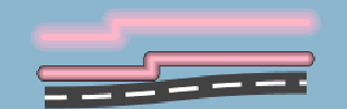
The preceding figures show some of the diversity offered in the appearance of links. By combining some of the properties, you can obtain some special effects, such as the road link in the following figure, where the large border is the same gray color as the link foreground and the white value of the alternateColor property looks like the center line of a road.
Links with special effects
The style of the top link in the figure is composed as follows:
lineWidth = 20
endCap = CAP_ROUND
lineJoin = JOIN_ROUND
foreground = #FFB5C5
mode = MODE_NEON
The properties of the center link in the figure are composed as follows:
lineWidth = 10
endCap = CAP_ROUND
lineJoin = JOIN_ROUND
foreground = #FFB5C5
The properties of the bottom link in the figure are composed as follows:
lineWidth = 15
endCap = CAP_BUTT
lineJoin = JOIN_ROUND
borderWidth = 12
foreground = #404040
borderColor = #404040
alternateColor = white
curved = 0.65
mode = MODE_UNICOLOR
LineStyle = [20,10]
lineStyle is expressed as a float array.
Customizing a link label
The label decoration for a network link is customized using the same properties as for the labels of predefined business objects.
How to use label properties in a user-defined business class
object."test.MyNetworkElement" {
labelBackground: white;
labelForeground: blue;
labelPosition: Right;
label: @name;
labelVisible: true;
}
For a complete list of the available link properties, refer to
Customizing the label of a business object.
Copyright © 2018, Rogue Wave Software, Inc. All Rights Reserved.