
 Lists all the properties you can use to customize a node shape and describes how to customize sizing aspects of the shape.Lists the values of the node properties related to color and shows the effects they give.Lists the properties related to the node border and shows how to use them with an example.Describes how to display an icon in a network node and how to position it with respect to the label.Describes how to customize the display of a label in a network node representation.Describes how automatic resizing of a shape with an icon operates.
Property Name | Type | Default Value | Description |
shapeType | int | ROUND_RECTANGLE | Sets the shape of an ilog.views.sdm.graphic.IlvGeneralNode. The values are those accepted by setShapeType. |
shapeWidth | float | 40 | Sets the width of the shape of an ilog.views.sdm.graphic.IlvGeneralNode. |
shapeHeight | float | 40 | Sets the height of the shape of an ilog.views.sdm.graphic.IlvGeneralNode. Use only when the value of the property keepingAspectRatio is false. |
shapeAspectRatio | float | 1 | Sets the aspect ratio of the shape of an ilog.views.sdm.graphic.IlvGeneralNode. |
keepingAspectRatio | boolean | true | Specifies whether the width/height ratio is preserved by the value of the properties shapeWidth and shapeHeight. |
foreground | Color | Color.darkGray | Denotes the node foreground color. |
background | Color | Color(192,192,192,128) | Denotes the node background color. |
fillStyle | int | SOLID_COLOR | Sets the style used to fill the shape of an ilog.views.sdm.graphic.IlvGeneralNode. The possible values are those defined in ilog.views.sdm.graphic.IlvGeneralNode#setFillStyle : NO_FILL SOLID_COLOR LINEAR_GRADIENT RADIAL_GRADIENT TEXTURE |
fillTexture | Image | null | Sets the texture used to fill the shape of the general node or the general link. |
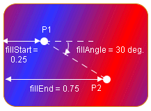
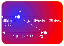
fillAngle | float | 0 | Sets the angle (in degrees) of the gradient used to fill the shape of an ilog.views.sdm.graphic.IlvGeneralNode. |
fillStart | float | 0f | Sets the position where the gradient of a fillColor2 starts; that is, where the color is the first color set by background. |
fillEnd | float | 1f | Sets the position where the gradient of an ilog.views.sdm.graphic.IlvGeneralNode ends; that is, where the color is the first color set by fillColor2. |
horizontalAutoResizeMargin | float | 2f | Sets the margin that is left on both sides of the shape when it is horizontally resized automatically. |
horizontalAutoResizeMode | int | NO_AUTO_RESIZE | Sets the horizontal autoresize mode of an IlvGeneralNode. The possible values are those accepted by ilog.views.sdm.graphic.IlvGeneralNode#setHorizontalAutoResizeMode : NO_AUTO_RESIZE EXPAND_ONLY SHRINK_ONLY EXPAND_OR_SHRINK |
verticalAutoResizeMargin | float | 2f | Sets the margin that is left on both sides of the shape when it is automatically resized vertically. |
verticalAutoResizeMode | int | NO_AUTO_RESIZE | Sets the vertical autoresize mode of an ilog.views.sdm.graphic.IlvGeneralNode. The possible values are: NO_AUTO_RESIZE EXPAND_ONLY SHRINK_ONLY EXPAND_OR_SHRINK |
icon | Image | null | Determines the image used for the icon. |
iconPosition | Bottom | Sets the position of the icon with respect to the label of an IlvGeneralNode. This property is only effective if the label position is equal to IlvDirection.Center, that is, the label is inside the shape. If the label is outside the shape, the icon is always at the center of the shape. The value is one of the static fields of the {@link.ilog.views.IlvDirection} interface. | |
iconVisible | boolean | true | Denotes whether the icon is visible or not in the object. |
borderColor | Color | 120,120,120 | Sets the color of the shape border. |
borderEndCap | BasicStroke | BasicStroke.CAP_BUTT | Sets the end cap style of the shape border. The end cap style controls what the ends of the segments of the border look like when the border is dashed. The possible values are: CAP_BUTT CAP_ROUND CAP_SQUARE |
borderLineJoin | BasicStroke | BasicStroke.JOIN_MITER | Sets the line join style of the shape border. The line join property controls what the angles connecting the segments of the border look like. The possible values are: JOIN_BEVEL JOIN_MITER JOIN_ROUND |
borderMiterLimit | float | 10f | Sets the miter limit of the shape border. The miter limit controls how far the angles of the border are allowed to extend when the angle is very sharp. |
borderWidth | float | 2 | Sets the width of the border of the object. |
borderLineStyle | float[] | null (Solid) | Sets the line style of the shape border. The line style allows you to have a dashed border. For example, setting the line style to 4,8 creates a dashed border with segments of 4 pixels in length separated by spaces of 8 pixels. The line style can contain more than two values to create longer line style patterns. |
borderLineStylePhase | float | 0f | Sets the line style phase of the shape border. This property can be used to adjust the positions of the dashes on the border. This is useful if the dashes look unattractive at the corners of the shape. |
CSS Property and Values | Rendering |
shapeType = RECTANGLE |  |
shapeType = ROUND_RECTANGLE |  |
shapeType = ELLIPSE |  |
shapeType = DIAMOND |  |
shapeType = TRIANGLE_UP |  |
shapeType = TRIANGLE_DOWN |  |
shapeType = TRIANGLE_LEFT |  |
shapeType = TRIANGLE_RIGHT |  |
shapeType = MARKER |  |
You can set the properties shapeWidth and shapeHeight. In this case, the aspect ratio of the shape is not preserved.You can set the property shapeWidth to the desired width and the property shapeAspectRatio to the desired width:height ratio. For example:CSS Property and Values | Rendering |
fillStyle = SOLID_COLOR |  |
fillStyle = LINEAR_GRADIENT |  |
fillStyle = RADIAL_GRADIENT |  |
fillStyle = TEXTURE |  |
In SOLID_COLOR mode, the shape is filled with foreground.In LINEAR_GRADIENT and RADIAL_GRADIENT modes, the gradient starts with foreground and ends with background :CSS Properties and Values | Rendering |
fillStyle = LINEAR_GRADIENT foreground = blue background = red |  |
fillStyle = RADIAL_GRADIENT foreground = blue background = red |  |
 borderWidth specifies the width of the border.borderLineStyle is used to create dashed or dotted borders. It is an array of floating-point values that specify the lengths of the alternate painted and transparent segments.borderEndCap specifies the shape of the ends of the dash segments.borderLineJoin and borderMiterLimit control the appearance of the border at the angles between two segments.
Values | Behavior |
NO_AUTO_RESIZE | Autoresize is disabled. |
EXPAND_ONLY | The node is allowed to grow in the specified direction, but not to shrink. |
SHRINK_ONLY | The node is allowed to shrink in the specified direction, but not to grow. |
EXPAND_OR_SHRINK | The node is allowed to expand or to shrink as needed. |