The BAM Dashboard example
Shows how to create symbols that will be integrated into a Business Activity Monitoring dashboard.

Describes the concept of Business Activity Monitoring (BAM).
Describes the type of dashboard that you are going to create.
Presents the kind of symbols that you will create for the dashboard.
Shows how to create the three progress bar symbols and the stoplight symbol that compose a region symbol.
Explains how to integrate a symbol into a dashboard.
About Business Activity Monitoring
Business Activity Monitoring (BAM) covers a wide range of applications and services. The concept is to offer monitoring and supervision functions to track performance issues for a business. This is usually based on an integration layer and a reporting environment. The integration part gathers important technical and business data, aggregates and correlates information, and delivers Key Performance Indicators. The reporting part enables users to select, present, declutter and analyze the data, based on importance and relevance.
BAM offers operational managers a way to understand how their business is running and to adjust resources dynamically in order to fulfill their objectives, minimize latency and increase revenue.
Definition of the dashboard
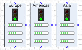
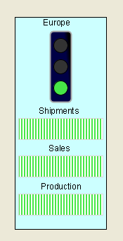
The management request is to create a dashboard to show Key Performance Indicators, namely Production, Supply and Sales. Each indicator will be displayed as a percentage of total capacity. The overall performance for each region will also be illustrated using a stoplight symbol. The following figure shows the dashboard definition.
A dashboard definition
Definition of the dashboard symbols
To create the BAM dashboard shown in figure
A dashboard definition, you will need to create the following symbols:
A progress bar symbol
A stoplight symbol
A region symbol
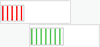
The progress bar will display the percentage of overall capacity being delivered. This percentage is displayed by a bar which changes width and color to show the percentage. The percentage is changed by altering the value of a single integer parameter, progress.
Progress bar states
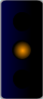
The stoplight symbol indicates the overall state of key performance indicators. It can display three possible states: good, warning or problem. The state displayed represents the levels of key performance indicators. It is changed by altering the value of a single integer parameter, statusvalue.
The warning state in the stoplight symbol
The region symbol uses the progress and stoplight symbols to display key performance indicators and overall status for a business region. It contains the following parameters:
region - a string containing the name of the region
shipments - the percentage of products shipped
sales - the percentage of the sales target achieved
production - the percentage production quota achieved
status - the overall status of the region in regard to shipments, sales and production
Creating the dashboard symbols
Shows how to create the three progress bar symbols and the stoplight symbol that compose a region symbol.
Shows how to extend the progress bar.
Shows how to build the stoplight symbol.
Shows how to create the Region symbol
Explains how to associate parameters of a symbol to parameters of its objects.
Customizing the progress bar
In this section, you will extend the progress bar made in
Working with symbols to match the progress bar defined in
Definition of the dashboard.
In
Transforming symbols using parameters you were shown how to define the transformation necessary for this symbol to display percentage progress. You will now concentrate on updating object graphic styles to match the look and feel defined in the dashboard definition.
Graphic styles define the appearance of an object. They are customized using the Paint tab in the Styling Customizer. The appearance of an object is separated into two parts: the fill style and the stroke style. The fill style is the graphic rendering of anything inside an object, the stroke style defines the object border.
To extend the progress bar, you will proceed in four stages:
Changing the fill style
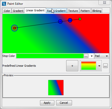
To change the fill style for the basicprogressbar, use the Paint Editor.
1. Open the basicprogressbar symbol from the bampalette.
2. Select the progressbar object in the Symbol Outline pane.
3. Click the Paint tab in the Styling Customizer.
4. Click the button on the right of the Fill Paint field.
The Paint Editor opens.
5. 
The Paint Editor
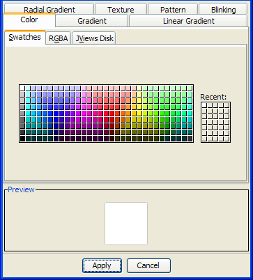
As shown in the figure above, the Paint Editor contains tabs for controlling the color, gradient, texture, and pattern of the object. The color can be set using one of the following options:
Swatches
HSBA (Hue, Saturation, Brightness, Alpha) codes
RGBA (Red, Green, Blue, Alpha) codes
JViews Disk
The gradient can be set using linear, radial or standard tools.
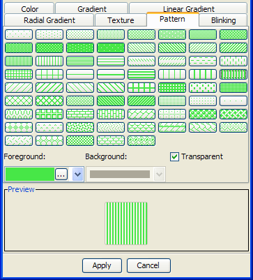
6. Click the Pattern tab.
7. Click the button in the Foreground field.
The Color dialog box opens.
8. Click the RGB tab.
9. Type 71, 231, 71 in the Red, Green, and Blue fields.
10. Click OK.
11. Select the bars pattern as shown in the following figure.
12. 
The Paint Editor pattern chooser
13. Clear the Transparent check box.
14. Click the button in the Background field.
The Color dialog box opens.
15. In the Swatches tab, select the color white in the upper left.
16. Click OK.
17. Click Apply.
The color scheme of the progress bar now matches the dashboard definition in figure
A dashboard definition. Before continuing, save the changes you have made to the symbol by pressing Ctrl+S.
Changing the stroke
The stroke refers to the border surrounding an object.
To change the stroke for the basicprogressbar symbol:
1. Open the basicprogressbar symbol.
2. Select the progressbar object in the Symbol Outline pane.
The Styling Customizer opens on the last tab you used, in this case, the Paint tab.
3. Click the button next to the Stroke paint field.
The Paint Editor opens.
4. Click the Color tab; then click the JViews Disk tab.
5. Use the sliders to select a light gray tone.
6. 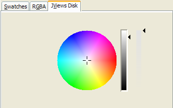
The JViews Disk color chooser
7. Click Apply.
Adding shapes to a symbol
In the dashboard definition, the progress bar advances on a white background. To create this effect, you need to make a background object with the same width and length as the fully extended progress bar.
1. Open the basicprogressbar symbol from the bampalette.
2. Click Add Shape in the toolbar.
The Choose Shape dialog box opens.
3. 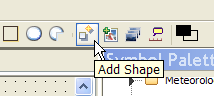
The Add Shape button
4. Select the Rectangle shape and click OK.
The Rectangle object is added to your symbol, it is the current selected object.
5. 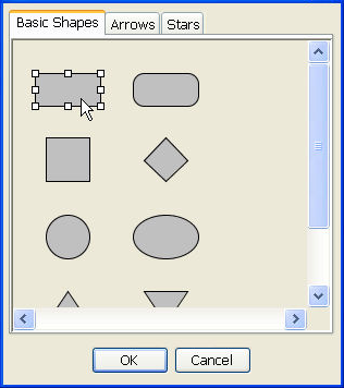
The Choose Shape dialog box
6. In the General tab, change the Attachment Point and Anchor Point to match the following figure.
7. 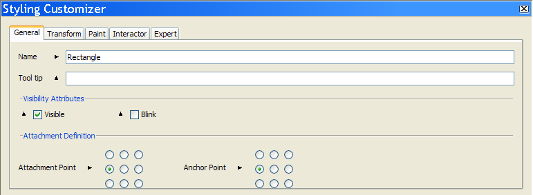
Change the attachment and anchor points
The Rectangle shape is now aligned with the left of the basicprogressbar.
NOTE The direction in which a transformation occurs is controlled by an object’s attachment point. For example, if the object is attached to the base object from the left as in figure
Change the attachment and anchor points, changes in width are reflected by the object expanding to the right of the attachment point.
8. In the Transform tab, type 30 in the Height field.
9. Type 120 in the Width field.
10. In the Paint tab, change the Fill paint color to white using the Paint Editor.
11. Set the Stroke paint to gray.
The basicprogressbar symbol now contains all the objects necessary to match the dashboard definition.
Changing symbol layers
The arrangement of the objects in a symbol is calculated in reference to the base object, in terms of position and layer. As shown in
Adding shapes to a symbol, you can change the relative position of an object. Symbols are made up of objects stored in layers. The base object is the bottom layer, on which all other objects in the Symbol are stacked. Using the Symbol Editor, you can change the level of an object in the layer stack.
In the basicprogressbar symbol, the background image is currently in a layer higher than the progress bar. If you test the symbol, you will see that, as the value of the progress parameter increases, the background rectangle moves to the right.
To rectify this behavior, make the background rectangle the base symbol:
1. Right-click the Rectangle object in the Symbol Outline pane.
2. In the pop-up menu, click Order > Send to Back.
3. In the Confirm New Base dialog box, click Yes.
4. Save the symbol.
The basicprogressbar symbol is now complete. Test the symbol using the procedure described in
Testing your symbol.
Creating the stoplight symbol
The dashboard description found in
Definition of the dashboard requires a stoplight symbol to show the overall status for a region. To achieve this, you need to follow these steps:
Creating a base object
In this section you will be shown how to use object gradients to create the stoplight symbol background.
1. Open the bampalette.
2. Create a new symbol by pressing Ctrl+N.
3. Select and delete the Text object.
4. Select the Shape object.
5. Select Edit > Flip or Rotate > Rotate Left.
6. Select the Paint tab in the Styling Customizer.
7. Click the button in the Fill Paint field.
8. Click the Color tab; then click the RGBA tab.
Change the Red, Green and Blue settings to 0,0,70.
9. Select the Linear Gradient tab.
10. Move the right handle to the middle of the gradient field, as shown in the following figure.
11. 
The linear gradient tab
12. Click Apply.
The stoplight base object is now complete.
13. Create a category stoplights in the bampalette.
14. Save this symbol as stoplightbasic in the stoplights category.
Using shapes to create a light template
The stoplightbasic symbol requires three lights to show the three states allowed. To do this, you create a single light object that is used as a template for the other two lights.
1. Open the stoplightbasic symbol from the bampalette.
3. Select the circle shape.
4. Click OK.
The circle is added to the symbol.
5. In the Transform tab of the Styling Customizer, set the width and height of the circle to 20.
6. In the Paint tab, set the Fill paint color of the circle to black.
7. Change the name of the circle object to light.
Aligning and grouping multiple objects
In the
Using shapes to create a light template section, you created a single black light. You will now use this shape as the template for the other lights.
To create multiple lights:
1. Open the stoplightbasic symbol from the bampalette.
2. Right-click the light object.
3. Click Copy on the pop-up menu.
4. Press Ctrl+V twice.
You now have three light objects: light, light2, light3.
5. Move the light objects so they are aligned next to the base object, as shown in the following figure.
6. 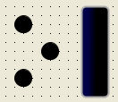
Align objects
7. Select all three lights.
8. Right-click one of the lights.
9. In the pop-up menu, click Align or Distribute > Align Horizontal Center
10. In the pop-up menu, click Align or Distribute > Distribute Vertically.
The lights are now perfectly aligned and distributed.
11. In the toolbar, click Group Selection.
12. 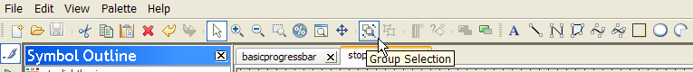
The Group Selection button
13. In the General tab of the Styling Customizer, set the attachment and anchor points to the center point as shown in the following figure.
14. 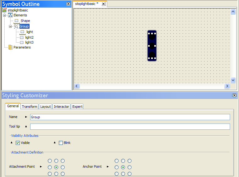
Aligning objects in the stoplight symbol
15. Save the stoplightbasic symbol.
NOTE Each group of objects has a base object separate from the symbol base object.
Setting allowed values for a parameter
The stoplight symbol must always have one active light to display the status of the activity being monitored. This is done by setting conditions on the value of a parameter. A stoplight has three possible states:
Problem
Warning
Good
These states are created by limiting a parameter to values relating only to the states. As the parameter changes value, conditions set on individual objects change their appearance.
To create a parameter with only specific values allowed:
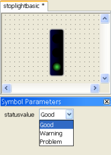
1. Open the stoplightbasic symbol from the bampalette.
2. Create a new Integer parameter, statusvalue.
3. Select the statusvalue parameter in the Symbol Outline pane.
4. Click the Allowed Values button in the Styling Customizer.
5. 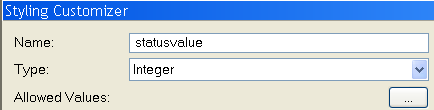
The Allowed Values button
The Value Set Editor is displayed.
6. Click Add.
7. In the Value field, type 0.
8. In the Name field, type Good.
9. Click OK.
10. Add the values 1, Warning, and 2, Problem, by repeating steps 5 to 8.
11. Click Apply.
12. Set the Default Value for statusvalue to Good in the Styling Customizer.
The list of values is displayed in the Allowed Values field.
Setting conditions on an object
A Condition is used to transform the object or objects to which it is bound in either of the following cases:
A parameter changes to a specific state.
The object is selected.
You will use conditions to change the colors of the stoplights as the value of the statusvalue parameter changes.
To set a condition on an object:
1. Open the stoplightbasic symbol.
2. Right-click the light object in the Symbol Outline pane.
3. Select New Condition.
The New Condition dialog box opens.
4. Set the condition in the For Symbols Where pane to read, statusvalue, equals, Problem.
5. Click OK.
The new condition is added under the light object in the Symbol Outline pane. The Styling Customizer displays the properties for this object when the status Problem condition is met.
6. 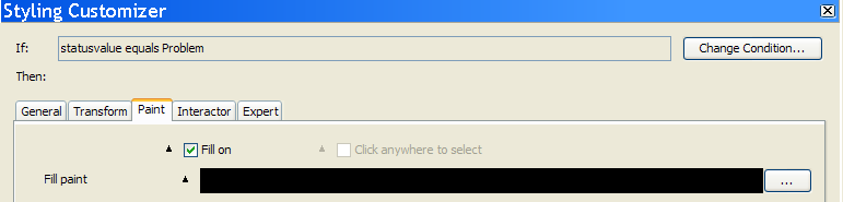
Properties for a condition
NOTE The settings you apply in the Styling Customizer for a condition are applied only when the condition is fulfilled.
7. In the Paint tab, click the ellipsis button next to the Fill paint field.
The Paint Editor opens.
8. Set the RGB settings in the Color tab to 255, 0, 0 and press Enter.
9. Click Apply.
10. Repeat steps 2 to 8 for the light2 and light3 objects using the following values.
Conditions
Object | Condition name | Condition Setting | RGB Value |
light2 | status warning | statusvalue equals warning | 255,153,0 |
light3 | status good | statusvalue equals Good | 71,231,71 |
The stoplightbasic symbol is now complete.
11. Run your symbol in Preview mode to test its functionality.
The stoplightbasic symbol
TIP The green status Good light is active by default when you test the stoplightbasic symbol. This is because the default value for the statusvalue parameter is Good. To change this, select the statusvalue parameter in the Symbol Outline pane and change the state of the Default Value list in the Styling Customizer.
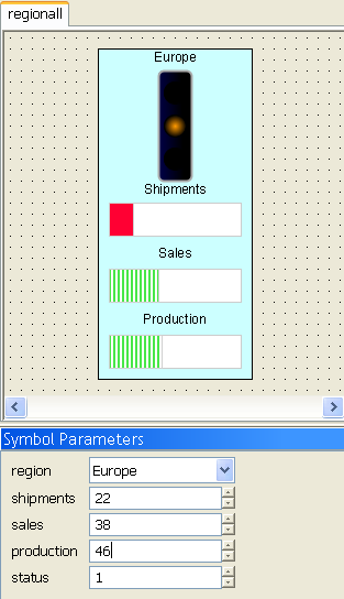
Creating the region symbol
The Region symbol displays the Key Performance Indicators for a sales region. It is made up of the progress bar and stoplight symbols created in
Customizing the progress bar and
Creating the stoplight symbol. The next sections describe:
Creating a background object
1. Open the bampalette.
2. In the toolbar, click New Symbol.
A new symbol is created.
3. Click Rectangle.
4. Drag the mouse in the drawing pane to create the rectangle.
5. In the Transform tab of the Styling Customizer, set the Width field to 130 and the Height field to 300.
6. In the Paint tab, set the Fill Paint style to RGB 204,255,255.
7. Delete the Shape and Text objects.
8. Create a category, regions, in the bampalette.
9. Save the symbol as regionbase in the regions category of the bampalette.
Adding symbols to a symbol
To match the dashboard in
Definition of the dashboard, the Region symbol needs three progress bars to demonstrate shipments, sales and production. You will use the technique shown in
Aligning and grouping multiple objects to make multiple progress bars.
1. Open the regionbase symbol.
2. Drag the basicprogressbar symbol from the Symbol Palettes pane onto the regionbase symbol.
3. In the drawing pane, right-click the basicprogressbar object.
4. From the pop-up menu, select Copy.
5. Press Ctrl+V twice.
You now have three progressbar objects: basicprogressbar, basicprogressbar2, basicprogressbar3.
6. Rename the three progressBar symbols as follows:
shipments
sales
production
7. Align, group and distribute the shipments, sales and production objects on the region background to resemble figure
The region symbol.
8. Drag the stoplightbasic symbol onto the Rectangle object.
9. Rename stoplightbasic to overallstatus.
10. Align and group the objects in the symbol.
11. Save the symbol as regionall in the regions category of the bampalette.
12. 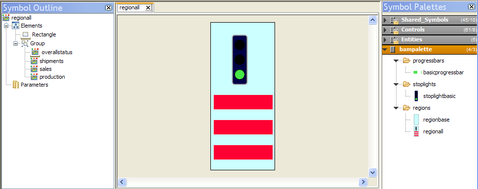
The region symbol
13. Test the regionall symbol.
Adding text to a symbol
When you have multiple indicators in a symbol, use labels to show the data represented by the different symbols.
To display which Key Performance Indicator is being displayed:
1. Open the regionall symbol.
2. In the toolbar, click Text.
3. 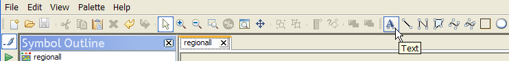
The Text button
4. Click above the shipments progress bar.
A text area is created.
5. In the text area, type shipments.
6. Repeat steps 2 to 4 for the sales and production progress bars.
7. Create a new String parameter called region.
8. Set the region parameter to have the following allowed values:
Americas
Europe
Asia
9. Create an empty text area above the overallstatus object.
To do this, press the space bar after creating the text area.
10. In the Styling Customizer, click the Text tab.
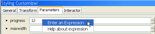
11. Right-click the Label field and click Enter an Expression in the pop-up menu.
12. Press Backspace until the list of values appears, then select @region from the list.
13. Press Enter.
14. Set Alignment to Center.
This text field now displays the default value of the region parameter.
15. Align all the symbols and objects in the regionall symbol.
16. Save and test the regionall symbol.
The improved regionall symbol
Connecting symbol parameters using expressions
The regionall symbol displayed in figure
The improved regionall symbol is composed of three different symbols used to represent different forms of data; this type of symbol is referred to as a composite symbol. You can change the parameter values for symbol objects contained in the region symbol statically.
To change the value of the parameter in the design view:
1. Select the symbol whose parameter value you want to change.
2. Open the Parameters tab in the Styling Customizer.
3. Change the value of the parameter.
Setting a symbol parameter statically
The value remains the same when you run the symbol.
For a composite symbol to be fully effective, you need to change the parameter values for internal symbols dynamically. This is done by creating parameters for the regionall symbol and binding them to parameters contained in internal symbols.
To create parameters for the regionall symbol and bind them to parameters of the internal symbols:
1. In the regionall symbol, create four integer parameters:
shipments
sales
production
status
2. Select the shipments object.
3. Select the Parameters tab in the Styling customizer.
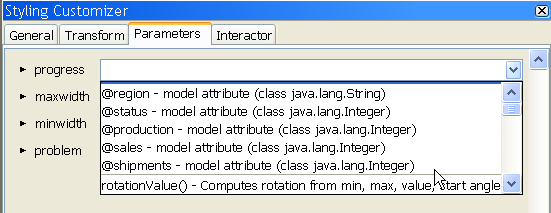
4. Right-click the progress parameter.
A pop-up menu is displayed.
5. In the pop-up menu, click Enter an Expression.
6. 
The expression pop-up menu
7. Delete the value in the progress field.
The list of available parameters and expressions is displayed.
8. Select the @shipments parameter.
The value of the progress parameter for the shipments symbol object is now bound to the shipments parameter of the regionall symbol.
9. 
Select a parameter or expression
10. Bind the sales parameter to the progress parameter of the sales object.
11. Bind the production parameter to the progress parameter of the production object.
12. Bind the status parameter to the statusvalue parameter of the overallstatus object.
You can now alter the appearance of internal symbols by changing the value of top level symbol parameters.
The complete regionall symbol
For more information about expressions, see
Using expressions.
Creating the dashboard
You create the dashboard by importing the region symbol into either the Designer for JViews Diagrammer or the Dashboard Editor.
To create the dashboard:
Import the region symbol into the Designer for
JViews Diagrammer or the Dashboard Editor.
A symbol becomes dynamic when you connect the symbol parameters to real time data. For more information on how to do this, see
Next steps after the Symbol Editor.
Copyright © 2018, Rogue Wave Software, Inc. All Rights Reserved.