Interactors
Introduces the concept of interactors in JViews Diagrammer and explains how to customize them.

Shortly explains what interactors are.
Lists the interactors that are provided in the Designer.
Describes the ways to customize interactors in the Designer.
About interactors
An interactor handles the behavior of the whole display or of an object within it. Predefined interactors are active in the Designer and provide the conventional behavior required for display, navigation, monitoring and editing. These same interactors can be included in your application: they are supplied as JavaBeans™ that are GUI components.
Predefined interactors
The following predefined interactors are active in the Designer for JViews Diagrammer:
Pan, in all modes
Select, in all modes
Zoom, in all modes
Display an info balloon (with the Info Balloon option only)
Expand or collapse nodes (with the Subgraphs option only)
Make link (in Diagram Editing mode only)
Make node (in Diagram Editing mode only)
Edit label (in Diagram Editing mode only)
Customizing interactors
Describes the ways to customize interactors in the Designer.
Lists the options to customize interactors.
Explains how to link a predefined interactor to a parameter of the diagram.
Explains how to obtain a finer control of symbol interactions.
Explains how to define dynamic interactions.
Customization options
To implement customized behavior in your application, choose one of the following options:
Use the Designer to connect a parameter to a predefined interactor
Use the Java™ API to add a custom interactor
This section will concentrate on linking interactors to style rules. For information on how to create customized interactors using the Java API, see
Connecting interactors to diagrams using listeners in
Developing with the JViews Diagrammer SDK.
Linking predefined interactors to parameters
Each symbol has a set of built-in interactors that can be used to make symbols dynamic. For more information, see
Understanding interactors in the
Using the Symbol Editor user documentation. Using the Designer, you can connect the string value of the
push_state internal parameter to a custom data property. You then use style rules to make interactive changes to your diagram as the data property changes value. For example, you can change the symbol used to represent a node when it is clicked.
To change the symbol used to represent a node when it is clicked:
1. Open the Designer.
2. Create a new default document by clicking File > New.
3. Double-click Node 1.
4. Click the New Property icon in the Data Properties pane.
5. 
The New Property Icon
The Property Name window opens.
6. Type status in the Enter the name of the new property field.
7. Click OK.
The status property is now visible in the Data Properties pane.
8. 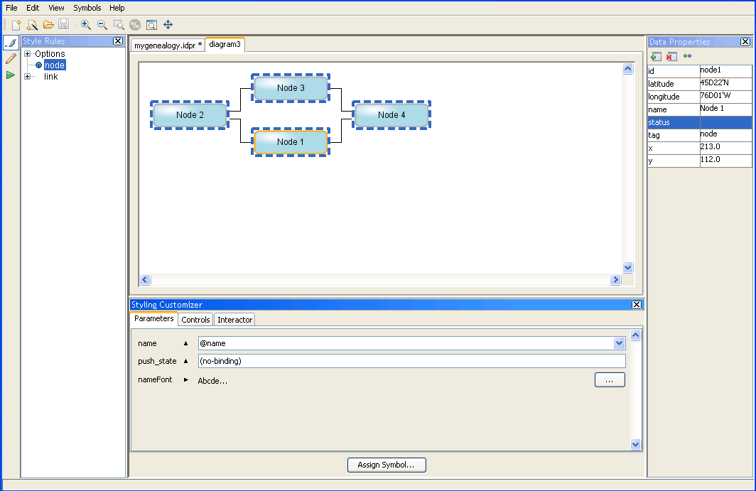
Selecting a node in a default diagram
9. Right-click the push_state field in the Parameters tab of the Styling Customizer.
A pop-up menu is displayed.
10. Select Enter an Expression in the pop-up menu.
11. Delete any text in the push_state field.
A list of available properties and functions appears.
12. 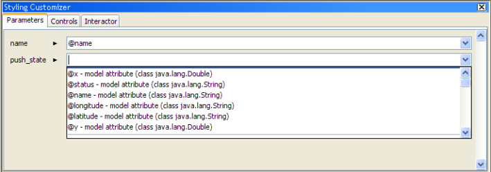
Selecting a string parameter to capture the push_state
13. Select the @status property.
The status property has been created to hold the state of the push_state parameter.
14. Run your diagram in Preview mode and click Node 1, then return to Style Editing mode.
You see that the value of the status property has changed to BUTTON_CLICKED in the Data Properties pane.
To change the current mapping:
1. Go to the Parameters tab.
2. Edit the parameter value.
Controlling interactions using CSS functions
The CSS functions stateInteractor() and numericInteractor() allow you to handle symbol interactions in a finer way.
These functions have two optional parameters. The first parameter is the name of a model attribute that will hold the interaction values both in read and write modes. The second parameter is the initial value, in case the model attribute does not yet exist.
If the first parameter is not specified, then an internal variable is used (actually a property of the graphic object). This can be useful if you do not want the model to be affected by interactions.
These functions are able to call an
ActionListener when interaction is performed. To do so, use
addActionListener() on the function itself. See
addActionListener.
Examples
In the Parameter tab, set the following values to the interactor parameter (like push_state ):
numericInteractor(test, 40): interaction value for a dial or a slider, of type numeric, that modifies the model attribute
test and defaults to 40 if the model has no value defined for
test.
numericInteractor(, 80): interaction value for a dial or a slider, of type numeric, that does not affect the model and defaults to 80.
stateInteractor(state): interaction value for a button, of type string, that modifies the model attribute
state. The default value is given by
state.
Customizing the diagram dynamically
Style Rules change the aspect of a node or link when one of the data properties attains a specific value. In
Linking predefined interactors to parameters, you connected the state of a button to the
@status data property.
To add dynamic customization to a diagram using the Designer, you will use a style rule to change the aspect of a node as the @status property changes, that is, when a user clicks a node:
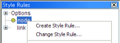
2. Right-click node in the Style Rules pane and click Create Style Rule in the pop-up menu.
3. 
Create Style Rule command
The Create Style Rule Wizard appears.
4. In the Create Style Rule Wizard, click Next.
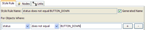
5. In the Style Rule tab, set the following condition:
status does not equal BUTTON_DOWN
6. 
Creating a new style rule
7. Click Finish.
8. Click Assign Symbol in the Styling Customizer.
The Assign Symbol dialog opens.
9. Select the Rectangular symbol.
10. 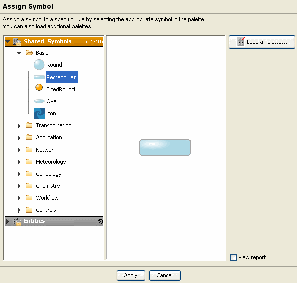
Assigning the rectangular symbol to the style rule
11. Click Apply.
12. Select the status does not equal BUTTON_DOWN rule in the Style Rules pane.
13. Set the value of the push_state field in the Styling Customizer to @status for this rule.
You have created a style rule that ensures the normal node symbol is displayed when a node is not being pressed. To verify that this rule has been correctly applied, validate the CSS.
To validate the CSS:
1. Right-click the status does not equal BUTTON_DOWN rule and select View in the pop-up menu.
The View as CSS dialog appears.
1. 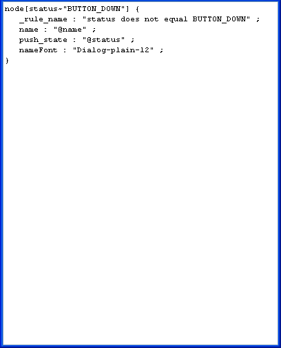
Viewing the CSS of a style rule
2. When you have validated the CSS rule, click OK.
To display a different symbol when a node is pressed down:
1. Right-click node in the Style Rules pane and select Create Style Rule in the pop-up menu.
The Create Style Rule Wizard appears.
2. Click Next.
3. In the Style Rule tab, select status equals BUTTON_DOWN.
4. Click Finish.
5. Select the status equals BUTTON_DOWN rule in the Style Rules pane.
6. Click the Assign symbol button in the Styling Customizer.
The Assign Symbol dialog opens.
7. 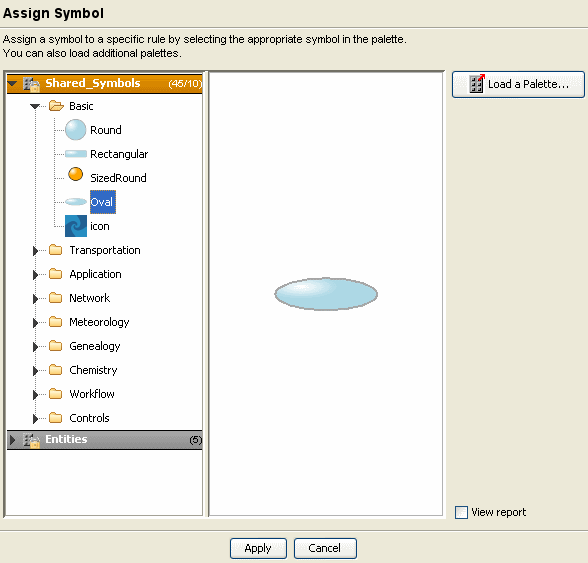
Assigning the Oval symbol to the style rule
8. Select the Oval symbol.
9. Click Apply.
10. Set the value of the push_state field in the Styling Customizer to @status for this rule.
The symbol used to represent a node now changes when any of the nodes in the diagram is clicked.
Copyright © 2018, Rogue Wave Software, Inc. All Rights Reserved.
