Pop-up Menus
A pop-up menu consists of a list of menu items laid out vertically. Pop-up menus are implemented with the class
IlvPopupMenu, a subclass of
IlvAbstractMenu. See
Using IlvAbstractMenu and
Using IlvMenuItem.
Figure 13.3 A Pop-up Menu
This section covers the following topics:
Aligning Item Labels in a Pop-up Menu
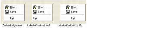
By default, the labels in a pop-up menu are automatically aligned as illustrated by the leftmost popup-menu in
Figure 13.4. However, you can specify your own label offset with the member function
setLabelOffset.
The middle image represents a pop-up menu for which the default alignment mode has been deactivated and no specific label offset has been defined. The rightmost image shows a pop-up menu aligned with a label offset of 40 pixels.
Figure 13.4 Aligning Menu Items Labels
Using Tear-Off Menus
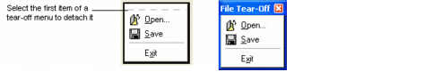
A pop-up menu can be torn off, which means that it can be detached from the menu bar and placed into a floating window. A tear-off menu is represented by a dashed line across its top border.
Figure 13.5 A Tear-Off Menu
You can tear off a pop-up menu by selecting its first item. The first item of a tear-off menu must be of the type
IlvTearOffItem. To set a menu item as a tear-off item, use the
setTearOff member function.
Using the Open Menu Callback
Each time the user opens a pop-up menu, the Open Menu callback is invoked. This callback is particularly useful when you want items in the menu to change according to the state of the application, for example from “Save (Not Needed)” to “Save (Needed)” when there is something to save. The easiest way to achieve this is to set an Open Menu callback that verifies the state of the application and changes the item label accordingly.
You can set an Open Menu callback with the member function
OpenMenuCallbackSymbol. See
Associating a Callback with a Gadget.
Using Checked Menu Items
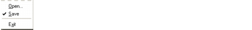
Menu items in pop-up menus can have a small check mark appear beside them (a ✔ for the Microsoft® Windows® style or a small button for Motif®). Check marks are generally used with menu items that represent “on/off” options.
Figure 13.6 A Checked Menu Item
The best place to set a check mark for a menu item is the Open Menu callback. That way the check mark is always correct when the menu is opened. See
Using the Open Menu Callback.
The check mark does not automatically disappear when you select a checked item, you must uncheck the item when necessary. To set a check mark for a menu item, use the member function
setChecked. Use
isChecked to know whether a menu item has a check mark.
Using Stand-alone Menus
Pop-up menus can be used either as submenus or as stand-alone menus. Most stand-alone menus are used as contextual menus, which appear when the user clicks in the workspace (generally with the right mouse button).
Figure 13.7 A Contextual Menu
To use a pop-up menu as a stand-alone menu, use the
get member function.
When the user chooses an item from a contextual menu, the member function
doIt is called.
Note: A contextual menu cannot be a submenu. |
Using Tooltips in a Pop-Up Menu
The menu items in a pop-up menu can be associated with a tooltip. A tooltip is short explanatory text that is displayed when the user places the mouse over its associated menu item.
To set a tooltip for a menu item, use
setToolTip. To disable tooltips, call
useToolTips with its parameter set to
IlFalse.
Version 6.0
Copyright © 2015, Rogue Wave Software, Inc. All Rights Reserved.

