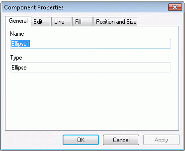

The component property sheet is a series of property pages that allow the user to edit the properties of one or more components. The CODCompPropSheet class encapsulates the functionality of the component property sheet. Each property page in the property sheet has a corresponding class. This section describes each class used to implement the component property sheet.
The component property sheet handles a series of property pages that allow the user to change the attributes of a component or set of components. The pages that appear in this property sheet vary depending on the type of properties that the selected components possess. For example, although a rectangle component can be surrounded by lines and filled with color, it cannot be filled with text. Consequently, there is no text page in the property sheet when a rectangle is the selected object.

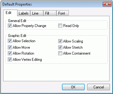
The default property sheet shows a series of property pages like the pages in CODCompPropSheet. This sheet defines a set of default properties for new components. The default properties set the attributes of new components before they are placed on the canvas.
The general property page appears for each component. This is where information such as the component type and its name appears.

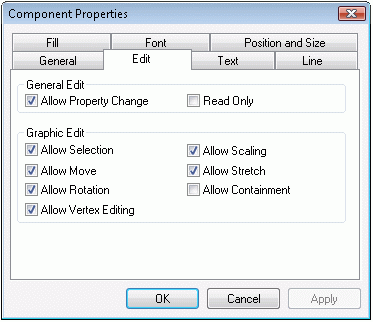
The edit property page contains information about a component's editing restrictions.From this page, the end-user can designate what functions can be performed on the selected component(s).
The line property page contains options the end-user can select to change the appearance of the lines that surround the selected component. The end-user can also set the color, style and width of the component in this dialog box.
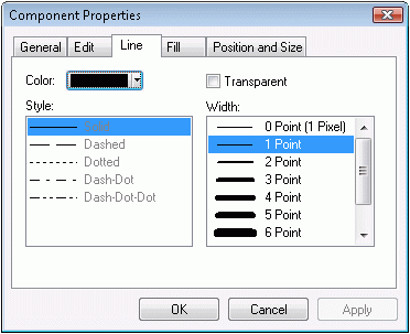
The line style list box appears on the line property page. It displays choices for the style of the line.
The line size list box appears on the line property page. It displays choices for the line width.
The fill property page contains options that determine how the fill of a component appears. The end-user can alter the color and optional hatching settings in this dialog.
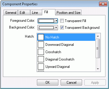
This list box appears in the fill property page. It displays the hatching options for a fill.
From this page, the end user can set the font type, point, color and several other effects, including bold, italic, underline and strikeout.

This list box appears in the font property page. It displays the available True Type fonts.
This list box appears in the font property page. It displays the available point sizes for a font.
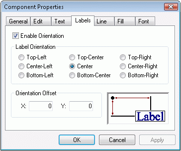
The label property page addresses the orientation properties of labels. You can set a label so that it always appears in a certain position relative to its associated symbol. This property page allows the user to choose that location.
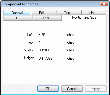
The position and size property page shows the current position and size of a component.
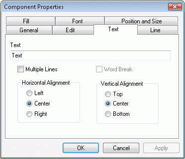
The text component property page allows the user to change the following properties: text value, multi-line text, word break, horizontal alignment, and vertical alignment. The text value is a single-line text edit in which the user can enter a string. The multi-line checkbox toggles between multiple lines of text and single-line text. If multi-line is checked, then the vertical alignment fields are disabled. The horizontal and vertical alignment values are set using radio buttons.
Copyright © Rogue Wave Software, Inc. All Rights Reserved.
The Rogue Wave name and logo, and Stingray, are registered trademarks of Rogue Wave Software. All other trademarks are the property of their respective owners.
Provide feedback to Rogue Wave about its documentation.