
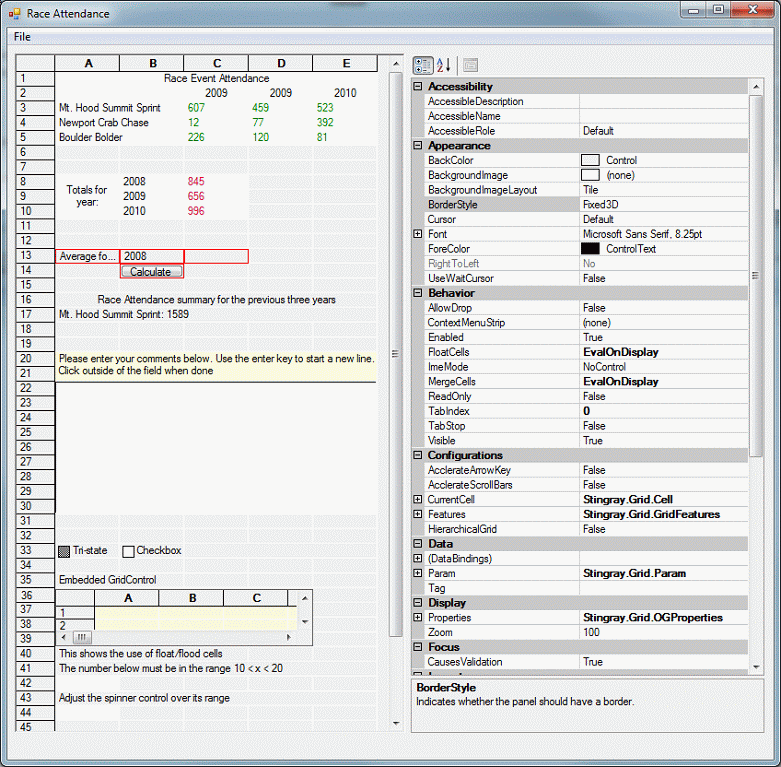
This sample illustrates properties of the Stingray.Grid.Style class by formatting and analyzing data from a series of races. It also demonstrates:
Printing
Print preview
Saving grid data to an HTML file
Event handling
Embedding a properties sheet, so that the grid and cell properties can be manipulated at runtime
Some grid-wide properties can be set only at design time. If you attempt to set them at runtime, an error message is displayed.
At runtime, as you select each cell, the Configurations->CurrentCell group in the properties sheet changes to reflect the properties of the selected cell. You can see and experiment with the properties.
Nearly the entire grid is constructed by code contained within the Form1.FormLoad() method. Look at the source code as you read through this sample. Each major section of the code is identified by // Section #: ..., which matches the following sections.
The application has four major components:
Stingray.Grid.GridControl (called "grid")
System.Windows.Forms.PropertyGrid (called "property grid")
A menu
A System.Windows.Forms.Form (called "form"), on which the first three components are embedded
You can easily embed a grid and property grid in the same form by dragging and dropping both components onto a form, but you need to tie them together so that changes in one are reflected in the other. This is accomplished with a single line:
propertyGrid1.SelectedObject = gridControl1; |
The second section of code formats part of the grid to present the raw data used by the rest of the sample program. It used properties and attributes such as background color, merged cells, and alignment.
A Stingray.Grid.Range object is created and refers to a rectangular region of cells from A1 to E5. Because the range object uses integer indices, A1 translates to the coordinate (1,1) and E5 translates to (5,5). The cells in this range are painted with white as a background color and serve as a table of raw values to be used elsewhere.
The merged cells technique is used to create a center-aligned title for the table. To enable the MergedCells property of the grid:
gridControl1.MergeCells = MergeCellsMode.EvalOnDisplay; |
The title spans the width of the grid and is positioned in the center by filling all five cells with the same value (Race Event Attendance), and by setting the MergeCell and HorzAlign properties of each cell.
To make the process more efficient, a Style object is created, the appropriate properties set, and then applied to the range A1 through A5 (grid coordinates (1,1) through (1,5)) with the call:
gridControl1.SetStyleRange(headerRange, headerStyle); |
Each cell in the range A1..A5 has exactly the same value, but only one copy of the title is displayed because the cells are merged.
To keep the title from being inadvertently changed:
The ReadOnly property, which prevents the Style properties from being changed, is enabled
The Enabled property is disabled, which prevents the cells from being selected
Column titles (such as 2001) and rows names (such as Mt. Hood Summit Sprint) are added. The Style applied to each row title has the EllipseType set to EllipseType.DotEllipse. When you run the application for the first time, you may not see any evidence of "…" in the row titles. You can force the ellipses to appear if you make the 'A' or 'B' columns narrower.
Additional Style attributes applied to the row titles are Enabled (set to false) and ToolTip (set to the same value as the text). Setting Enabled to false stops you from selecting the cell(s). Setting ToolTip to the same value as the text causes a pop up tag to display the full cell text, which is useful if some of the cell is obscured.
The table of raw data is filled in. The Style applied to each of these cells includes green text and allows only numeric values.
The third section shows how to store formulas in a cell.
If you want to store a simple value such as a string or a numeric, do something like this:
gridControl1[3,7].Style.Value = "This is a test"; |
or this:
Style s = new Style(); s.Value = "12.34"; s.TypeOf = StyleValueType.typeNumeric; gridControl1[4,10].Style = s; |
Storing a formula or an expression is a bit different. You cannot do this:
gridControl1[3,7].Style.Value = "=A1+A2+A3"; gridControl1[3,7].Style.TypeOf = StyleValueType.typeExpression; |
or this:
Style s = new Style(); s.Value = "=A1+A2+A3"; s.TypeOf = StyleValueType.typeExpression; gridControl1[4,10].Style = s; |
This behavior may change in future versions of Objective Grid for Microsoft .NET.
To store formulas, use the SetExpressionRowCol method of the GridControl class:
gridControl1.SetExpressionRowCol( 8,3,"=C3+C4+C5" ); |
The expressions stored are of the form =X1+X2+X3. You could just as easily use the form =X1..X3.
The fourth section calculates the average for a selected year.
Select a year from the drop-down box in cell B13 (which may not be visible unless the cell is active). The average for the selected year is placed in the adjacent cell.
The code uses control embedding and event handling —responding to events from a control embedded in a cell. In this case, a push button triggers the calculation based upon a value selected in another control.
The push button control in cell B14 is tied to the private method DispatchLClick(), which is called in response to the event Stingray.Grid.LButtonClickedRowCol. The association of the LButtonClickedRowCol() and the method DispatchLClick() is made by selecting the events list for the GridControl in the property sheet.
Locate the LButtonClickedRowCol event and enter the method name to associate with the event. Once that is done, you can write in the code to test which cell (via row and column) originated the event and respond accordingly.
The last section demonstrates features that are not immediately obvious.
Cell A16 illustrates a better way of creating a title that spans several cells. The first technique (Section 10.5.2) put the same string in several cells, and set the MergeCell property in each of those cells. The following technique does not require storing multiple instances of a string.
Identify which cells to cover with the title, and then call the SetCoveredCellsRowCol() method of the GridControl class. This allows a value in one cell to flow over following cells (for example, the contents of cell A16 can cover cells A17 and A18). The dividing line between the cells is hidden, giving the appearance that cells are one big cell.
Calling SetCoveredCellsRowCol() is not always sufficient. If the title text is too short, only some of the rows are covered. To complete the effect, set the Style.HorzAlign property to Center.
Rows 20 and 21 show text in a cell overflowing cells in multiple rows.
Rows 22 through 30 are set up as a multi-line edit control that accepts user input, including newlines.
Row 33 shows normal and tristate check boxes.
Row 34 is an illustration the flood and float cell style properties.
Cell A36 is an entry field that accepts only numeric values in the range 10<x<20.
Cell A38 is another spin control with a fixed range of 1 through 10.
Cell A42 is another entry field that accepts up to a fixed number of characters.
Copyright © Rogue Wave Software, Inc. All Rights Reserved.
The Rogue Wave name and logo, and Stingray, are registered trademarks of Rogue Wave Software. All other trademarks are the property of their respective owners.
Provide feedback to Rogue Wave about its documentation.