Plotting Table Data
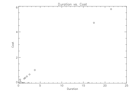
You can plot table data easily using the plot procedures. For example, the following example plots the call duration vs. the cost. The PLOT statement accesses the columns of the table directly, using the basic structure notation, which is:
Variable_Name.Tag_NameFor more information on the relationship between structures and tables, see "Tables and Structures".
This command produces a scattergram that plots the call duration on the X axis against the cost along the Y axis:
PLOT, phone_data.DUR, phone_data.COST, Psym = 4, $
Title = 'Duration vs. Cost', $
XTitle = 'Duration', YTitle = 'Cost'
 |


