Creating and Handling Menus
This section discusses the three basic types of Wave Widgets menus:

Menu bar

Popup menu

Option menu
Menu Bar
A menu bar is a set of buttons that activate menus. When you select a menu button with the mouse, a pulldown menu appears with a set of menu items. A menu item can itself activate another menu, called a pullright menu, as shown in
Menu Bar.
The WwMenuBar function is used to create a menu bar. This function takes two parameters:
menubar = WwMenubar(parent, items)
note | WwMenuBar can only occur once per layout widget on Windows. |
The returned value,
menubar, is the ID of the newly created menu bar widget. The
parent parameter is the widget ID of the parent widget, often the ID of the layout widget. The
items parameter is an unnamed structure containing all of the menu information. For detailed information on the
items parameter, see
"Defining Menu Items with Unnamed Structures".
Popup Menu
A popup menu, shown in
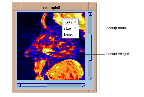
Simple Popup Menu, is a menu that appears when you press the MENU mouse button (usually the right button) while the cursor is positioned inside the menu’s parent widget.
The WwPopupMenu function is used to create a popup menu. This function takes two parameters:
menubar = WwPopupMenu(parent, items)
The
parent parameter is the widget ID of the parent widget. The
items parameter is an unnamed structure containing all of the menu information. For detailed information on the
items parameter, see
"Defining Menu Items with Unnamed Structures".
Option Menu
An option menu, shown in
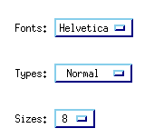
Option Menu, is a menu that displays the current selection. When the user clicks the mouse button (usually the left button) over an option menu button, a menu appears. After making a selection, the button’s text changes to reflect the selection.
The WwOptionMenu function is used to create an option menu. This function takes three parameters:
options = WwOptionMenu(parent, label, items)
The
parent parameter is the widget ID of the parent widget. The
label parameter is a string containing a label for the menu. The
items parameter is an unnamed structure containing all menu information. For details on
items, see
"Defining Menu Items with Unnamed Structures".
Menu Callbacks
When an active menu item is selected, the menu callback is called with the menu’s widget ID as the first parameter and the menu item index (1...n) as the second parameter.
For example, here is a very simple callback routine called MenuCB, which prints a message depending on which menu button is selected.
PRO MenuCB, wid, which
CASE which OF
1: PRINT,'First Button Selected'
2: PRINT,'Second Button Selected'
3: PRINT,'Third Button Selected'
ENDCASE
END
Defining Menu Items with Unnamed Structures
Each of the menus discussed above takes a parameter (items) that contains the menu information. This parameter is defined as an unnamed structure.
An unnamed structure has the following general definition:
x = {, tag_name1: tag_def1, tag_namen: tag_defn}For detailed information on unnamed structures, see the section in Chapter 6 of the PV-WAVE Programmer’s Guide.
The following tag names and tag definitions can be used in the unnamed structure used to define menu items. For an example, see the next section.
 title:'name'
—(optional) Specifies a title for the menu.
 callback:'clbkname'
—The name of the callback routine to be executed when an active menu button is selected. Always place the callback name before the active button’s definition. The active items, which are described below, include
button,
icon,
toggle, and
menubutton.
 button:'labelname'
—The name of a pushbutton on the menu. A pushbutton is a button that calls a callback when selected.
 icon:'bitmap_filename'
—Creates an iconic (graphic) pushbutton. The bitmap filename is the full name of a file containing the icon’s bitmap.
 toggle:'labelname'
—Creates a “toggle” type of button. A toggle button contains a small box to the left of the label. When the button is selected, the box is highlighted. When the button is not selected, the box is not highlighted.
 menubutton:'labelname'
—The name of a menu button on the menu bar, or in the menu for pullright menus.
 menu:structure
—An unnamed structure that defines the contents of menus. For a simple pulldown menu, the structure has only one level. Include pullright menus by embedding additional structures in the top-level structure.
 separator:value
—Separates the previous from the next menu item. Possible values are:

0
—No line

1
—Single line

2
—Double line
 current:index
 (1
– n)—Used only for the option menu. Specifies the item to be selected as current when the option menu is created. This tag must be the last one in the list of tags in the structure definition.
Modifying Menu Items
WwMenuItem lets you dynamically update menus that have already been created. All menu items are placed in a parent menu pane, and the widget ID of the appropriate menu pane can be acquired using the Menus keyword of the WwMenuBar, WwPopupMenu, or WwOptionMenu function.
Example
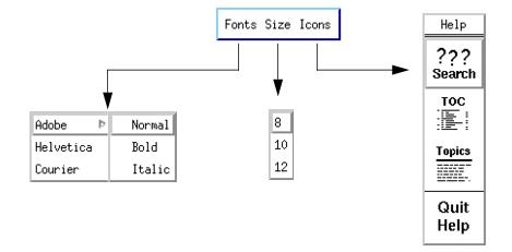
The following example shows the code used to create the items for the menus shown in
Menu Bar with Menus. The menu bar contains three menus:
Fonts,
Size, and
Icons. The contents of these menus are defined by the unnamed structure,
menus, which is then passed to the WwMenuBar function. Note that the first menu,
Fonts, contains a pullright menu called
Adobe. This is defined as a separate unnamed structure embedded in the top-level structure.
top=WwInit('ww_ex5', 'Examples', layout)menus ={,callback:'MenuCB',$; Create menu button “Fonts” on the menu bar.
menubutton:'Fonts',$
; A new menu is created by embedding another unnamed structure
; in the top-level structure. The menubutton tag creates a
; pullright menu called “Adobe”. The pullright menu contains
; the toggle buttons “Normal”, “Bold”, and “Italic”.
menu:{,callback:'MenuCB',$menubutton:'Adobe',$
menu:{,callback:'MenuCB',$
toggle:'Normal',$
toggle:'Bold',$
toggle:'Italic'},$
; Create two more pushbuttons on the Fonts menu.
button:'Helvetica',$
button:'Courier'},$
; Create a second menu button “Size” on the menu bar.
menubutton:'Size',$
menu:{,callback:'MenuCB',$; Create three pushbuttons on the “Size” menu.
button:'8', button:'10', button:'12'},$
; Create a third menu button “Icons” on the menu bar.
menubutton:'Icons',$
menu:{,callback:'MenuCB',$; Do not display a pushpin.
pushpin:0,$
; Create a title for the Icons menu.
title:'Help',$
; Place four icon buttons on the Icons menu. Full pathnames to
; bitmap images are given to produce the icon pictures.
icon:getenv('WAVE_DIR')+ '/xres/wxbm_btn_help_search',$icon:getenv('WAVE_DIR')+ '/xres/wxbm_btn_help_toc',$icon:getenv('WAVE_DIR')+ '/xres/wxbm_btn_help_topics',$; Insert a single-line separator.
separator:1,$
; Place the last icon below the line.
icon:getenv('WAVE_DIR')+ '/xres/wxbm_btn_help_quit'}}; The call to WwMenuBar creates a menu bar. The ‘layout' parameter
; is the widget ID of the parent layout widget. For example:
; example: layout = WwLayout(top, /Horizontal, /Spacing=5).
; The value of the ‘menus' parameter is the multi-level unnamed
; structure defined above.
bar = WwMenuBar(layout, menus)
status=WwSetValue(top, /Display)
WwLoop
Version 2017.0
Copyright © 2017, Rogue Wave Software, Inc. All Rights Reserved.


