Bar chart widget using CLI
Bar chart widgets can display bar charts for a Library, IP, IPV, or Saved query. You can choose to display the bars horizontally (type: "bar") or vertically (type: "column").
You can use the Widget Editor for a simpler way to create bar charts, including making code changes in the Code editor. For more information, see Widget Editor.
Bar chart widget configuration
To display a bar chart on an object, set an attribute on that object with a specific value. You can set the title of the chart with the widgetHeader option. See Widgets for more information.
The attribute value should be a JSON string, with the following fields:
- display: bar
-
widgetHeader (optional): If provided, the markdown enabled text is displayed in the widget header. If omitted, the widget header will not be displayed.
- config: (optional) See the Basic configuration and Axis configuration sections.
- data: Array of dictionaries. Each dictionary will be plotted as a bar chart. Dictionary fields:
- name: Name of the chart
- data: List of numeric data points
- color: (optional) Specify the color of the plot
-
xKeyData: (optional) Array of category names (strings) to display on each tick of an axis of type “category”
Basic configuration
This table lists the basic configuration options for bar charts. Specify these options in the JSON, as child properties of the “config” object (see examples in code below):
| Property name | Description |
|---|---|
| type | Type options: "bar" , "column" |
| theme |
If specified, identifies a theme to use to customize the appearance of the chart. Can be one of:
When a theme is used, the "color" value on the "data" field will be ignored (see above). |
| title | If specified, displays a title for the chart. |
| subtitle | If specified, displays a subtitle for the chart. |
| legendPosition | Legend positions: “top”, “bottom”, “left”, “right” Default: No legend is displayed if “config” object is specified and “legendPosition” is not specified. |
| stacked | Boolean which indicates if the chart data will be stacked (on top of each other) or grouped (side-by-side). Default is true. |
| groupedColumns | Note: Depreciated beginning with IPLM Web 2025.8. Boolean which indicates if the chart data will be stacked (on top of each other) or grouped (side-by-side). Default is false, or stacked. |
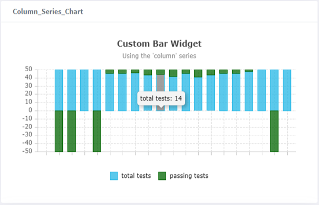
| normalizedTo |
Number to which the totals in a stacked column or bar should be normalized. Default is 0, or disabled. Note: this property is only relevant when stacked is set to true. |
Axis configuration
Specify these options in the JSON, as child properties of the “config” object (see examples in code below):
| Property name | Description |
|---|---|
|
axes: [{ type: <value> }] |
Axis types: “category”, “number”, “log”, |
|
axes: [{ position: <value> }] |
Axis positions: “top”, “bottom”, “left”, “right” |
|
axes: [{ title: <value> }] |
If specified, displays a title for the axis on the chart. |
|
axes: [{ label: { format: <value> } }] |
Format string used when rendering labels for number axes. See the descriptions for these strings in the “Number Label Format String” section at https://www.ag-grid.com/vue-charts/axes/. |
| axes: [{ label: { rotation: <value> } }] | Number of degrees to rotate the axis tick labels. Use to eliminate label over-crowding. Default is 0. |
|
axes: [{ tickCount: <value> }] |
For a “number” - type axis, indicates the desired number of ticks for the axis to use (this is only a hint, and not guaranteed). Default is 10. For a “log” -type axis, can be used to alleviate the problem of tick over-crowding. Not intended to be used for “category” -type axes. |
|
axes: [{ hideTickLabels: <value> }] |
Boolean which indicates whether to show or hide tick labels. Default is false (show tick labels). |
|
axes: [{ base: <value> }] |
For a “log” -type axis, indicates which logarithm base to use. Default is 10 (i.e. base 10, or the common logarithm). |
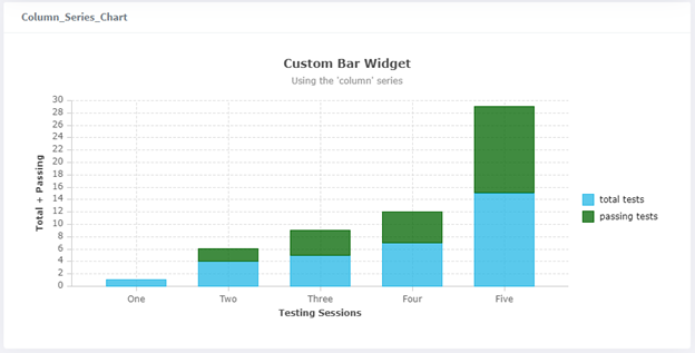
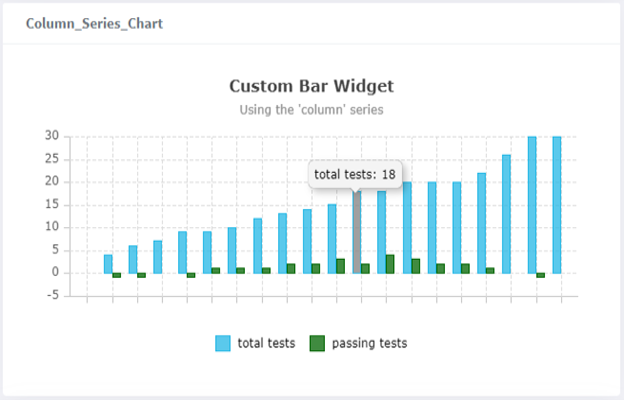
Bar chart widget example - Command line
pi ip attribute set drinks.cosmo@2.TRUNK Column_Series_Chart '{ "display": "bar", "config": { "type": "column", "title": "Custom Bar Widget", "subtitle": "Using the ‘column’ series", "legendPosition": "right" }, "data": [{ "name": "total tests", "data": [0, 4, 6, 7, 9, 9, 10, 12, 13, 14, 15, 18, 18, 20, 20, 20, 22, 26, 30, 30] }, { "name": "passing tests", "data": [0, -1, -1, 0, -1, 1, 1, 1, 2, 2, 3, 2, 4, 3, 2, 2, 1, 0, -1, 0], "color": "darkgreen" }]}'
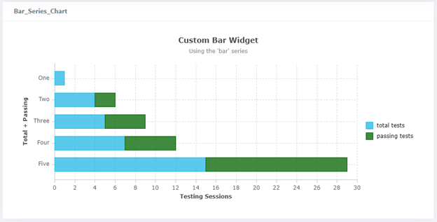
Bar chart widget example - Formatted JSON
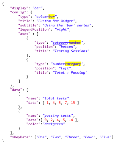
{
    "display": "bar",
    "config": {
        "type": "column",
        "title": "Custom Bar Widget",
        "subtitle": "Using the 'column' series",
        "legendPosition": "right",
        "axes" : [
            {
                "type": "category",
                "position": "bottom",
                "title": "Testing Sessions"
            },
            {
                "type": "number",
                "position": "left",
                "title": "Total + Passing"
            }
        ]
    },
    "data": [
        {
            "name": "total tests",
            "data": [ 1, 4, 5, 7, 15 ]
        },
        {
            "name": "passing tests",
            "data":[ 0, 2, 4, 5, 14 ],
            "color":"darkgreen"
        }
    ],
    "xKeyData": ["One", "Two", "Three", "Four", "Five"]
}
IPLM Web output
This is the result of specifying the stacked property with a false value:
This is the result of specifying the normalizedTo property as 50:
Changing a bar chart from vertical to horizontal bars
The 'type' option (described above) is used to switch between the “column” and “bar” series. If you have no axes configuration, setting a value for the type property is all that’s needed to choose the series, because a default axes configuration is supplied using the “category” and “number” axis types. If an axes configuration exists in the JSON, however, choosing the series also requires swapping the axis types. Here is a simple example of JSON for a Bar Chart widget using the “column” series, and how it would need to change to render a “bar” series instead:
IPLM Web Output