Using IlvToggle

A Toggle Button
This section covers the following topics:
Changing the State and Color of a Toggle Button
The appearance of the state marker changes according to the state of the related toggle or radio button (on or off). To set the state of a toggle button, use the
To set the color of a colored toggle marker,
Toggle and Radio Button Styles
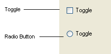
Various Styles of Toggle Buttons
To set the style for a toggle button as radio, use
Displaying a Bitmap on a Toggle Button
IlvToggle instances always display a label, even when they are explicitly requested to display a bitmap. If the toggle button is set to draw a bitmap and if its label is not empty, the IlvToggle instance is displayed with the label on top of the bitmap.
To display a bitmap on a toggle button, use the
Aligning and Positioning the Label
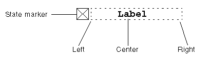
Text Alignment in a Toggle Label
To set the alignment of the label, use the method setTextAlignment.
Changing the Size of the State Marker
You can change the size of the state marker (that is, the height and width of its bounding box) with
Giving a state marker size of 0, sets the state marker size to a default size.
When the Windows® look and feel is selected, changing the marker size has no effect.
Localizing a Toggle Button
The label of toggle buttons can be localized.
See Localizing a Gadget.
Associating a Mnemonic with a Toggle Button
See Associating a Mnemonic with a Gadget Label.
Handling Events and Callbacks
When the user clicks on a toggle button, presses its associated mnemonic letter, or presses the Enter key or the space bar, the state of the button changes and the member function activate is called. This virtual member function calls the Main callback of the toggle button.
See Associating a Callback with a Gadget.
Grouping Toggle Buttons in a Selector
To create radio boxes
Two useful methods of the selector let you know what is selected:
As the class IlvSelector is not a subclass of IlvGadget you must explicitly set the “Selector” interactor to have an interactive selector.
Source Program
#include <ilviews/gadgets/gadcont.h>
#include <ilviews/gadgets/toggle.h>
#include <ilviews/graphics/selector.h>
static void QuitCallback(IlvView* top, IlvAny)
{
IlvDisplay* display = top->getDisplay();
delete top;
delete display;
IlvExit(0);
}
int main(int argc , char* argv[])
{
IlvDisplay* display = new IlvDisplay("Demo", "", argc, argv);
if (!display || display->isBad()) {
IlvFatalError("Couldn’t open display");
delete display;
IlvExit(-1);
}
IlvGadgetContainer* container =
new IlvGadgetContainer(display,
"Demo",
"Demo",
IlvRect(0, 0, 100, 150));
container->setDestroyCallback(QuitCallback);
IlvSelector* selector = new IlvSelector;
IlvToggle* toggle;
toggle = new IlvToggle(display, IlvPoint(10, 10), "Toggle 1");
selector->addObject(toggle);
toggle = new IlvToggle(display, IlvPoint(10, 50), "Toggle 2");
selector->addObject(toggle);
toggle = new IlvToggle(display, IlvPoint(10, 90), "Toggle 3");
selector->addObject(toggle);
container->addObject("Selector", selector);
container->show();
IlvMainLoop();
return 0;
}
Creating the Selector
The selector is created by invoking its constructor:
IlvSelector* selector = new IlvSelector;
Then set the interactor:
selector->setInteractor(IlvInteractor::Get("Selector"));
Adding Toggle Buttons
Each toggle button is created and added to the selector with the addObject method:
IlvToggle* toggle;
toggle = new IlvToggle(display, IlvPoint(10, 10), "Toggle 1");
selector->addObject(toggle);
toggle = new IlvToggle(display, IlvPoint(10, 50), "Toggle 2");
selector->addObject(toggle);
toggle = new IlvToggle(display, IlvPoint(10, 90), "Toggle 3");
selector->addObject(toggle);
Adding the Selector to its Container
container->addObject("Selector", selector);