Using chart renderers
Describes all the possible graphical representations available in the JViews Charts library and a presentation of their implementation.
Describes the Polyline charts.
Describes the Area charts.
Describes the Bar charts.
Describes the Bubble charts.
Describes the High/Low charts.
Describes the Pie charts.
Describes the Scatter charts.
Describes the Stair charts.
Describes the Treemap charts.
Polyline charts
The Polyline charts have the following characteristics:
|
Single class |
|
|
Inherits from |
|
|
Composite class |
|
|
Inherits from |
IlvSinglePolylineRenderer Properties
A single polyline renderer can draw an additional marker for each data point. This marker is an instance of an implementation of the IlvMarker interface, and is set by means of the setMarker method. You can also specify the rendering style of the marker symbol with the setMarkerStyle. By default, the style of the marker is computed according to the style of the renderer.
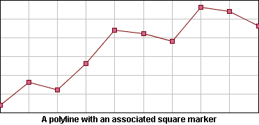
Polyline with a Square Marker Drawn on Each Data Point
IlvPolylineChartRenderer Properties
This renderer supports three representation modes: Superimposed, Stacked, and Stacked100.
Superimposed Mode
Polylines are drawn on top of each other.
Stacked Mode
Polylines are stacked, so that each one displays the contribution of a y-value in a set of several y-values.
Stacked100 Mode
The contribution of a y-value is computed as a percentage of all the y-values for a given x-value.
The representation mode can be set either at construction time specifying a corresponding IlvPolylineChartRenderer mode constant as parameter of the constructor, or by means of the setMode method.
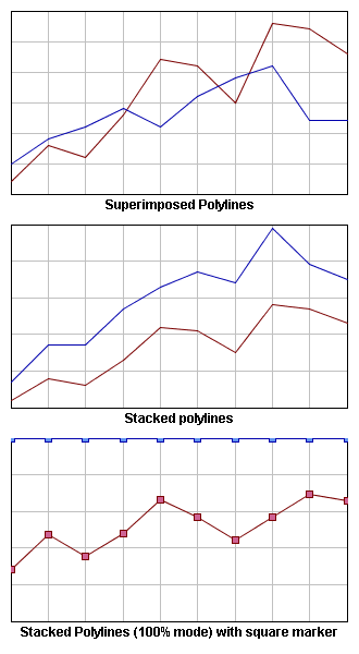
Representation Modes: Superimposed, Stacked, and Stacked100
Area charts
The Area charts have the following characteristics:
|
Single class |
|
|
Inherits from |
|
|
Composite class |
|
|
Inherits from |
IlvSingleAreaRenderer Properties
This class inherits from the IlvSinglePolylineRenderer properties previously listed, except for the graphical representation that represents a data set as an area instead of polylines.
IlvAreaChartRenderer Properties
This class inherits from the IlvPolylineChartRenderer representation modes listed in section IlvPolylineChartRenderer Properties.
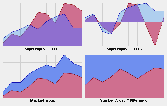
Representation Modes: Superimposed, Stacked, and Stacked100 Mode
Bar charts
The Bar charts have the following characteristics:
|
Single class |
|
|
Inherits from |
|
|
Composite class |
|
|
Inherits from |
IlvBarChartRenderer properties
A bar chart renderer supports five representation modes: Superimposed, Clustered, Stacked, Stacked100, and Stacked Diverging.
Superimposed mode
Bars are drawn on top of each other.
Clustered mode
Bars are laid out in clusters, each cluster representing the set of y-values corresponding to a given x-value. The default cluster width can be modified by means of the setClusterWidth method.
Stacked mode
Bars are stacked, so that each one displays the contribution of a y-value in a set of several y-values.
Stacked100 mode
The contribution of a y-value is computed as a percentage of all the y-values for a given x-value.
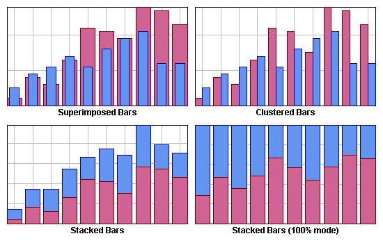
Representation Modes: Superimposed, Clustered, Stacked, and Stacked100 Mode
Horizontal Bar charts can be obtained by reversing the chart projector. For more information, see setProjectorReversed documentation, and the section Projector Properties.
Stacked Diverging mode
Bar are stacked, in a way that accommodate negative values. In this mode, negative values are stacked separately from positive values: positive y values will be stacked together in a bar towards positive values, and negative y values will be stacked together in a bar in the opposite direction.
This rendering mode makes it easy to visually understand negative values.
This mode assumes that there is no particular order among the data sets; the data points belonging to negative y values are reordered, as if they all came before the positive y values.
Also, in this mode, the largest displayed y value is no longer the sum of all y values; rather, it is the sum of all positive y values. This can be confusing for the user.
Customizing the bar width
The width of a bar is determined as a certain percentage of the normal distance of consecutive x values of the data set. By default, this normal distance is computed automatically; this is adequate for data sets for which the x values are all distributed in equal distance. For data sets with irregularities such as holes, this normal distance can be explicitly specified through the method setCategory. The percentage can be specified through the renderer method setWidthPercent.
Bubble charts
The Bubble charts have the following characteristics:
|
Single class |
|
|
Inherits from |
|
|
Composite class |
|
|
Inherits from |
IlvSingleBubbleRenderer Properties
A bubble chart represents a two-dimensional data model as bubbles of variable size. The data model should be described by two data sets, the first data set determining the location of the bubbles, and the second data set determining the size of the bubbles.
IlvBubbleChartRenderer Properties
An IlvBubbleChartRenderer creates one child renderer for every pair of data sets contained in its data source.
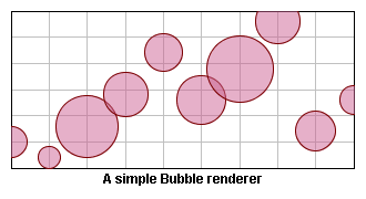
A Bubble Renderer
High/Low charts
The High/Low charts have the following characteristics:
|
Single class |
|
|
Inherits from |
|
|
Composite class |
|
|
Inherits from |
IlvSingleHiLoRenderer Properties
An IlvSingleHiLoRenderer instance renders two data sets that contain corresponding points at the same indices.
This class defines two rendering styles: a rise style and a fall style.
The rise style is used to draw the point pairs for which the first value is less than the second value.
The fall style is used to draw the point pairs for which the first value is greater than the second value.
The possible graphical representations supported by this class are Bar, Arrow, Marked, and Stick, and are illustrated in Graphical Representations: Bar, Arrow, Marked, and Stick:
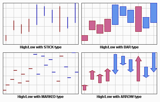
Graphical Representations: Bar, Arrow, Marked, and Stick
IlvHiLoChartRenderer Properties
This renderer supports three representation modes: Clustered, OpenClose, and Candle.
Clustered Mode
This class creates an instance of IlvSingleHiLoRenderer for every pair of data sets contained in its data source, and the creation of the associated legend item is delegated to the child renderer createLegendItems method.
OpenClose Mode
This class handles two pairs of data sets: the first pair for the low/high values, the second pair for the open/close values, each pair being rendered by a child renderer, respectively of type Stick and Marked. In this mode, the legend item creation is directly handled by the composite renderer.
Candle Mode
This class handles two pairs of data sets as for the OpenClose mode, the low/high values being rendered with a Marked child renderer, the Open/Close values with a Bar child renderer. In this mode, the legend item creation is directly handled by the composite renderer.
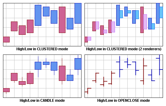
Representation Modes: Clustered, Candle, and OpenClose Mode
Pie charts
The Pie charts have the following characteristics:
|
Single class |
|
|
Inherits from |
|
|
Composite class |
|
|
Inherits from |
IlvSinglePieRenderer Properties
This class renders a data set as a pie chart. Each data point of a data set is rendered as a slice.
Specific slices of an IlvSinglePieRenderer can be exploded from the pie chart using the setExploded method. The explode ratio of a slice can be changed by means of the setExplodeRatio method.
This renderer defines one rendering style for each data point, so that each slice of the pie is drawn using its own rendering style.
IlvPieChartRenderer properties
A Pie chart can be drawn with a hole in its center. This type of chart is called a doughnut chart. The hole size is expressed as a percentage of the available space that the hole will occupy. Pie renderers are usually added to pie charts but can also be used with other chart type (Cartesian for example).
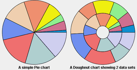
Pie Chart and Doughnut Chart
Scatter charts
The Scatter charts have the following characteristics:
|
Single class |
|
|
Inherits from |
|
|
Composite class |
|
|
Inherits from |
IlvSingleScatterRenderer Properties
This class renders a data set with scattered graphical markers. Markers are simple graphical objects implementing the IlvMarker interface, and markers of predefined type can be retrieved through the IlvMarkerFactory class.
A scatter renderer draws square markers by default. You can change this marker by means of the setMarker method, passing a new IlvMarker instance as parameter.
The marker size can be changed at any time by means of the setMarkerSize method, passing the half-size of the marker as parameter.
IlvScatterChartRenderer Properties
This renderer class displays data sets as several scatter charts. Each data set is drawn by its own child renderer using a specified marker type. The marker used to draw the graphical representations can either be common to all child renderers, specified at construction time, or specific to a child renderer, by changing its own marker. By default, each data set is drawn using square markers.
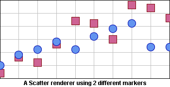
Scatter Renderer Using Two Different Markers
Stair charts
The Stair charts have the following characteristics:
|
Single class |
|
|
Inherits from |
|
|
Composite class |
|
|
Inherits from |
IlvSingleStairRenderer Properties
This class inherits from the IlvSingleAreaRenderer properties, except that the graphical representation represents a transition between two values as a stair instead of straight lines.
IlvStairChartRenderer Properties
This class inherits from the IlvPolylineChartRenderer properties.
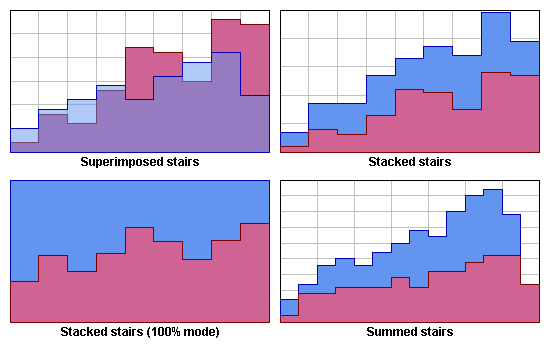
Representation Modes: Superimposed and Stacked Stairs Mode
x_n is x with subscript n, that is, x<sub>n</sub> in HTML.
In stair charts, unlike in other types of charts, the last point of a data set is not represented like the previous data points. Namely, the representation of the data set ends immediately after the last point. This is surprising, but it gives you complete flexibility on how to terminate the data set.
-
If after the last point (x_n, y_n), you want to have a horizontal line of the same size as the one between x_n-1 and x_n, and then have the value drop to 0, you should add a point (2 * x_n - x_n-1, 0) to the data set.
-
If after the last point (x_n, y_n), you want to have a nearly infinite horizontal line at y = y_n, you should add another point to the data set (x_max, y_n) where x_max is 100 or 1000 units away.
In stacked or summed charts, normally the first alternative is used.
Treemap charts
A treemap chart displays objects as rectangles. The important objects are represented by large areas while the less important objects are represented by smaller areas, as illustrated in Treemap Chart.
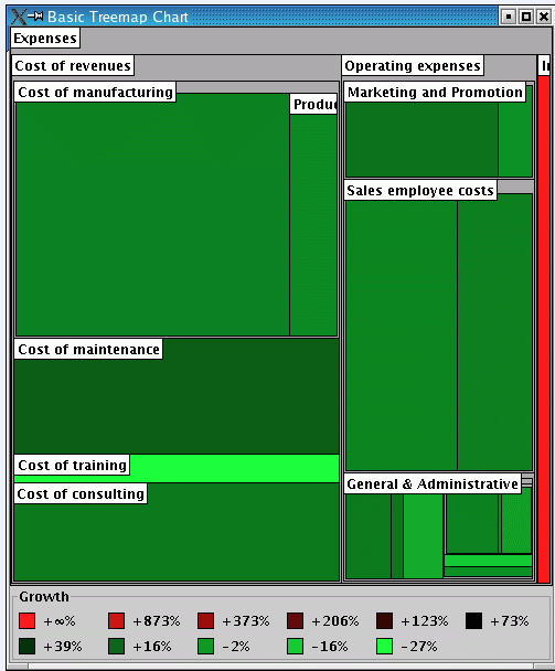
Treemap Chart
In a treemap chart, rectangles relate each other in a containment structure, where each rectangle is part of another rectangle. As illustrated in Treemap Chart, Cost of manufacturing is part of the Cost of revenues, which itself is part of Expenses. Graphically, this relationship is displayed as follows: the rectangle associated with Cost of manufacturing occupies part of the area of the rectangle associated with Cost of revenues, and the latter is part of the area for Expenses.
Expenses is the root of the model: it is not a part of a bigger budget. This is why the Expenses rectangle occupies the entire treemap chart area.
The treemap chart can also be used to display structured data sets with 4 to 10 dimensions of data. (Other types of 2D charts can show data sets with usually up to 3 dimensions of data.) In other words, if you have a table with many rows and 4 to 10 columns, the treemap is the most appropriate chart to display your data.
The treemap chart is a generalization of the pie chart. They share the feature that important objects are represented by large areas and less important objects by smaller areas. But where a pie chart displays a linear list of objects, treemaps display a tree of objects.
The input data of a treemap chart is represented by an IlvTreeTableDataSource instance. See Structure of the extended data model for a description on how to connect to an IlvTreeTableDataSource.
IlvTreemapChartRenderer Properties
The Treemap charts have the following characteristics:
|
Renderer class |
|
|
Inherits from |
Setting the Area Column
The treemap chart can be applied to any entity that can be partitioned into disjointed parts.
In a treemap chart display, the most important setting is the object attribute (or model column) which is translated into the area representing the object.
The area value must meet the following requirements:
-
Must imply the notion of importance: the larger, the more important.
-
Must be >= 0: it is not possible to display a negative area.
-
If several objects are combined into a single object, the area value of this single object is given by the sum of the areas of each object.
Or similarly: If an object is split into two parts, the sum of the areas of the two parts must correspond to the area of the original object.
The area, and its notion of importance, depends on the application domain. Here are a few examples:
-
In finance, the area is the amount of money.
-
For physical solids or liquids, the area is the mass (or volume) of the substance.
-
In network supervision, the area can typically be the number of packets or the amount of transferred data.
-
In a software profiler, the area would correspond to the CPU time spent in a particular line of code or function or source code file.
-
In a file system space analyzer, the area would correspond to the file size.
When the objects are indivisible and have the same importance, you can assign the same area to all objects.
The area values are normalized by the treemap renderer; therefore the scaling of the area values does not matter: the rendering will not change if all area values are multiplied by a fixed constant factor.
The area column is set by means of the methods setAreaColumn or setAreaColumnName.
Setting the Color Scheme
Besides the area, the color is the most visible attribute of an object in a treemap chart.
The expressiveness of the treemap depends on the color column and the color scheme. The color column depends on the type of application. The color scheme is used to distinguish the important properties of the objects.
The color is chosen according to what the user wants to see in the view. It is determined by a model column, called the color column, and a color scheme. The color column yields the numerical values that are represented through the color. The color scheme converts the numerical values into color; it has the ability to emphasize some types of value.
The color scheme is set by means of the method setColorScheme. The color column is set by means of the methods setColorColumn or setColorColumnName.
The color scheme is selected together with the color column. The values of this column are transformed into a color.
-
For a real-valued color column: The color scheme SEQUENTIAL highlights high values. The color schemes DIVERGING_RED_GREEN and similar highlight the extreme values (both high and low). Whereas the color schemes AVERAGE_RED_GREEN and similar do the contrary: They emphasize the average values and don't draw the user's attention to the extreme values.
-
For a color column whose value range wraps around (like an angle or a time-of-day), the color scheme CYCLIC_SEQUENTIAL_HUE is most appropriate.
-
For a discrete-valued color column, that is, when the values are taken from an enumeration, the color scheme QUALITATIVE is most appropriate.
There are also color schemes that do not use a color column at all:
-
CONSTANT which uses a single color,
-
DEPTH which uses the nesting depth within the tree.
|
Color Scheme |
Situation |
|
COLORSCHEME_DEPTH |
To display only the tree structure (through the containment of rectangles). This color scheme does not depend on a table column. |
|
COLORSCHEME_SEQUENTIAL |
When the high values of the column are considered more important than the low values. |
|
COLORSCHEME_SEQUENTIAL_HUE |
When all values of the column are equally important. |
|
COLORSCHEME_CYCLIC_SEQUENTIAL_HUE |
When all values of the column are equally important, and the minimum and maximum values are semantically the same. For example, if the column represents an intraday time: 00:00 h is the same as 24:00 h. |
|
COLORSCHEME_QUALITATIVE |
When the values are just enumerated values and there is no notion of low, high or approximately equal among these values. |
|
COLORSCHEME_DIVERGING_RED_GREEN or COLORSCHEME_DIVERGING_BLUE_YELLOW |
When high and low values are considered more important than the average values. |
|
COLORSCHEME_AVERAGE_RED_GREEN or COLORSCHEME_AVERAGE_BLUE_YELLOW |
When average values are considered more important than the extreme values. |