Styling the Chart Component
Describes how style sheets can be used to customize the appearance of the chart component and its subelements.
Describes the different parts of the chart component and their relevant CSS selectors.
Describes the chart selector.
Describes the chartArea selector.
Describes the chartLegend selector.
Describes the chart3DView selector.
Describes the chartGrid selector.
Describes the chartScale selector.
Shows how to style the chart component.
Describes the chartRenderer selector.
Describes how to reference a scale or a grid in a style rule.
Parts of the chart component
The following table lists the CSS selectors that are defined to reference the different parts of the chart component:
|
Selector |
Description |
Target Class |
|
chart |
The chart component |
IlvChart |
|
chartArea |
The chart area component |
IlvChart.Area |
|
chartLegend |
The chart legend |
IlvLegend |
|
chart3Dview |
The chart 3-D view |
IlvChart3DView |
|
chartRenderer |
The chart renderers |
IlvChartRenderer |
|
chartScale |
The chart scales |
IlvScale |
|
chartGrid |
The chart grids |
IlvGrid |
These selectors can be used to modify the bean properties of the corresponding target class. For example, the following style rules show you how to control the borders and the colors of the chart and the chart area:
chart {
foreground : black;
background : lightyellow;
opaque : true;
border : @#chartBorder;
}
Subobject#chartBorder {
class : 'javax.swing.border.LineBorder(lineColor)';
lineColor : black;
}
chartArea {
plotBackground : oldlace;
}
Styling the chart
The chart selector identifies the Chart component and can be used to control its appearance. Bean Properties for Chart lists the bean properties of the IlvChart class that can be set in the declarations of a CSS style rule.
|
Property |
Type |
Allowed Values |
|
scalingFont |
Boolean |
|
|
antiAliasing |
Boolean |
|
|
antiAliasingText |
Boolean |
|
|
baseTextDirection |
int |
LEFT_TO_RIGHT, RIGHT_TO_LEFT, CONTEXTUAL_DIRECTION, COMPONENT_DIRECTION, INHERITED_DIRECTION |
|
shiftScroll |
Boolean |
|
|
scrollRatio |
Double |
|
|
type |
int |
CARTESIAN,POLAR,RADAR,PIE |
|
projectorReversed |
Boolean |
|
|
defaultColors |
Color[] |
|
|
decorations |
Function ”decorations” |
|
|
renderingType |
int |
BAR, STACKED_BAR, STACKED100_BAR, SUPERIMPOSED_BAR, AREA, STACKED_AREA, STACKED100_AREA, POLYLINE, STACKED_POLYLINE, STACKED100_POLYLINE, SCATTER, STAIR, STACKED_STAIR, STACKED100_STAIR, SUMMED_STAIR, HILO, HILO_ARROW, HILO_STICK, CANDLE, HLOC, PIE,COMBO |
|
dataSource |
IlvDataSource |
|
|
optimizedRepaint |
Boolean |
|
|
dynamicStyling |
Boolean |
|
|
3d |
Boolean |
|
|
interactors |
IlvChartInteractor[] Or Function “interactors” |
|
|
plotAreaBackground |
Color |
|
|
backgroundPaint |
Paint |
|
|
header |
JComponent |
|
|
headerText |
String |
|
|
footer |
JComponent |
|
|
footerText |
String |
|
|
legendVisible |
Boolean |
|
|
legendPosition |
String |
NORTH_BOTTOM, NORTH_WEST, WEST, SOUTH_WEST, SOUTH_TOP, SOUTH_EAST, EAST, NORTH_EAST, ABSOLUTE |
|
foreground |
Color |
|
|
border |
Border |
Styling the chart area
The chartArea selector identifies the Chart Area component and can be used to control the appearance of the portion of the chart.
Chart Area Bean Properties lists the bean properties of the IlvChart.Area class that can be set in the declarations of a CSS style rule.
|
Property |
Type |
|
background |
Color |
|
backgroundPaint |
Paint |
|
border |
Border |
|
bottomMargin |
int |
|
filledPlottingArea |
Boolean |
|
foreground |
Color |
|
font |
Font |
|
leftMargin |
int |
|
opaque |
Boolean |
|
plotBackground |
Paint |
|
plotStyle |
IlvStyle |
|
rightMargin |
int |
|
margins |
Insets |
|
topMargin |
int |
Styling the chart legend
The chartLegend selector identifies the Chart Legend component and can be used to control its appearance. Bean Properties for Chart Legend lists the bean properties of the IlvLegend class that can be set in the declarations of a CSS style rule.
|
Property |
Type |
|
antiAliasing |
Boolean |
|
antiAliasingText |
Boolean |
|
border |
Border |
|
background |
Color |
|
floating |
Boolean |
|
floatingLayoutDirection |
int |
|
followChartResize |
Boolean |
|
font |
Font |
|
foreground |
Color |
|
interactive |
Boolean |
|
location |
Point |
|
movable |
Boolean |
|
paintingBackground |
Boolean |
|
symbolSize |
Dimension |
|
fsymbolTextSpacing |
int |
|
title |
String |
|
transparency |
int |
Styling chart 3-D view
The chart3DView selector identifies the Chart 3-D view and can be used to control its appearance. Bean Properties for Chart 3-D View lists the bean properties of the IlvChart3DView class that can be set in the declarations of a CSS style rule.
|
Property |
Type |
Allowed Values |
|
ZAnnotationRenderer |
IlvLabelRenderer |
|
|
ZAnnotationVisible |
Boolean |
|
|
ZGridVisible |
Boolean |
|
|
ZGridStroke |
Stroke |
|
|
ZGridPaint |
Paint |
|
|
lightLatitude |
double |
|
|
lightLongitude |
double |
|
|
ambientLight |
float |
|
|
projectionType |
int |
OBLIQUE, ORTHOGRAPHIC |
|
elevation |
double |
|
|
rotation |
double |
|
|
depth |
int |
|
|
depthGap |
int |
|
|
zoom |
double |
|
|
autoScaling |
Boolean |
Styling the chart grids
The chartGrid selector identifies the Chart Grid component and can be used to control its appearance. Bean Properties for Chart Grids lists the bean properties of the IlvGrid class that can be set in the declarations of a CSS style rule.
|
Property |
Type |
Allowed Values |
|
drawOrder |
int |
|
|
majorLineVisible |
Boolean |
|
|
visible |
Boolean |
|
|
minorLineVisible |
Boolean |
|
|
majorStroke |
Stroke |
|
|
majorPaint |
Paint |
|
|
minorStroke |
minorPaint |
Styling the chart scale
The chartScale selector identifies the Chart Scale component and can be used to control its appearance. Bean Properties for Chart Scale lists the bean properties of the IlvScale class that can be set in the declarations of a CSS style rule.
|
Property |
Type |
Allowed Values |
|
axisStroke |
Stroke |
|
|
labelFont |
Font |
|
|
labelColor |
Color |
|
|
foreground |
Color |
|
|
drawOrder |
int |
|
|
majorTickSize |
int |
|
|
minorTickSize |
int |
|
|
tickLayout |
int |
TICK_INSIDE, TICK_OUTSIDE, TICK_CROSS |
|
labelOffset |
int |
|
|
titleOffset |
int |
|
|
autoWrapping |
Boolean |
|
|
labelAlignment |
int |
L EFT, CENTER, RIGHT |
|
titleRotation |
float |
|
|
title |
string |
|
|
titlePlacement |
int |
|
|
labelRotation |
float |
|
|
skippingLabel |
Boolean |
|
|
skipLabelMode |
int |
CONSTANT_SKIP,ADAPTIVE_SKIP |
|
visible |
Boolean |
|
|
axisVisible |
Boolean |
|
|
majorTickVisible |
Boolean |
|
|
minorTickVisible |
Boolean |
|
|
labelVisible |
Boolean |
|
|
autoCrossing |
Boolean |
|
|
crossingValue |
double |
|
|
stepsDefinition |
IlvStepsDefinition |
|
|
category |
Boolean |
|
|
annotations |
IlvScaleAnnotation[] |
Styling the Chart Component
You can find the files and the source code of this example in the <installdir>/jviews-charts/samples/style/index.html directory.
This sample displays a chart that loads data from the following an XML file:
<?xml version="1.0" encoding="UTF-8"?>
<?xml-stylesheet type="text/jviews+css" href="simple.css"?>
<!DOCTYPE chartData PUBLIC '-//ILOG//JVIEWS/Chart 1.0' 'chartxml.dtd'>
<chartData version="1.0">
<data>
<labels>Server 1, Server 2, Server 3, Server 4</labels>
<series id="CPU #1" type="double">
<valuesList>90,80,65,78</valuesList>
<property name="color" javaClass="java.awt.Paint">
#ff9d9d-#924242
</property>
</series>
<series id="CPU #2" type="double">
<valuesList>80,55,40,60</valuesList>
<property name="color" javaClass="java.awt.Paint">
#78ff78-#249224
</property>
</series>
<series id="CPU #3" type="double">
<valuesList>50,35,25,20</valuesList>
<property name="color" javaClass="java.awt.Paint">
#98bdff-#476aa9
</property>
</series>
</data>
</chartData>
This data corresponds to a simple log of CPU usage for several servers. The XML file contains a processing instruction that references a style sheet URL. When the XML data source is connected to the chart, the style sheet is automatically applied. Each series in the XML file defines a color property. Next we will see how this property can be used by a CSS declaration.
To describe the contents of a simple style sheet:
-
Specify that a bar chart is used and that the legend is visible:
chart {
legendVisible: true;
renderingType: BAR;
}
-
Tell the chart to use a category x-scale, add a title to the y-scale, and explicitly specify the data limits for the y-axis:
#xScale { category: true; }
#yScale { title: “Usage(%)”; titleRotation: 270;}
#yScale axis { dataMin: 0; dataMax: 100; }
-
Specify that the color used to render a series is equal to its color property, which has been defined in the XML file:
series { color1: @color; }
Style Sheet: First Example shows what the chart looks like with this style sheet:
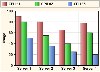
Style Sheet: First Example
The chart renderers
The chartRenderer selector can be used to control the global appearance of renderers used by the chart. This selector supports an index attribute to select the appropriate chart renderer. For example, the following rule hides the first renderer:
chartRenderer[index=0] { visible : false; }
The purpose of the chartRenderer rule is to specify global settings to the top-level renderers that are accessible through the IlvChart.getRenderer method. For example, you can use it to set the mode of a stacked chart:
chartRenderer { stacked100Percent: true; }
The chartRenderer rule cannot be used to customize the child renderers independently. The section Styling the data series explains how renderers can be customized for a specific series or a specific set of points.
Scales and grids
There are two ways to reference a specific scale, or a grid, in a style rule:
-
You can use the axisIndex attribute of the chartScale and chartGrid selectors. This index equals –1 for the x-axis, or corresponds to the index of an y-axis.
-
You can use the xScale, yScale, xGrid and yGrid CSS ID.
Here are a few examples of selector patterns:
// Match the x-scale.
chartScale[axisIndex=”-1”] { ... }
#xScale { ... }
// Match the main y-scale.
chartScale[axisIndex=”0”] { ... }
#yScale { ... }
// Match the x-grid.
chartGrid[axisIndex=”-1”] { ... }
#xGrid { ... }
// Match the main y-grid.
chartGrid[axisIndex=”0”] { ... }
#yGrid { ... }
Each scale object supports an axis child selector, which can be used to customize the associated IlvAxis instance. For example, here is how you can reverse the x-axis:
#xScale axis { reversed: true; }